A Comprehensive Guide to Building Accessible Dropdown Selects
Accessibility is a strategic necessity in the dynamic field of web design, not just a moral obligation. This guide focuses on the critical task of creating an accessible drop-down select that is usable by mouse, keyboard, and screen reader users. Despite the wide use of drop-down selects in web forms, their default components frequently pose difficulties for people with disabilities.

Discover how at OpenReplay.com.
Navigating the drop-down options can be difficult for keyboard users and may not adhere to simple keyboard navigation standards. Individuals who use screen readers may also have difficulty understanding and interacting with the standard SELECT component. These limitations highlight the need for a more inclusive design approach. This guide will delve into strategies for overcoming such challenges, ensuring that users have a consistent experience regardless of their preferred method of interaction.
Semantic HTML and Labeling
Using semantic HTML enhances accessibility for developers because it provides a clear and meaningful structure for web documents. Semantic HTML elements have fundamental meanings that convey the purpose and role of different parts of the content, making it easier for developers and assistive technologies to interpret and present the information appropriately.
Let’s start by creating an HTML markup for our drop-down select component.
<!DOCTYPE html>
<html lang="en">

<head>
  <meta charset="UTF-8">
  </meta>
  <meta http-equiv="X-UA-Compatible" content="IE=edge">
  </meta>
  <meta name="viewport" content="width=device-width, initial-scale=1.0">
  </meta>
  <title>Document</title>
  <link rel="stylesheet" href="./app.css">
  </link>
</head>

<body>
  <div class="form-control">
    <label for="countries">Select Country:</label>
    <div class="custom-select" tabindex="0" role="combobox" aria-haspopup="listbox" aria-expanded="false">
      <div class="selected-option" aria-live="polite" aria-atomic="true" id="selectedOption">Select a country</div>
      <ul class="options-list" role="listbox" aria-labelledby="selectedOption">
        <li>
          <button class="btn" role="option" aria-selected="false">United States</button>
        </li>
        <li>
          <button class="btn" role="option" aria-selected="false">Canada</button>
        </li>
        <li>
          <button class="btn" role="option" aria-selected="false">Nigeria</button>
        </li>
        <li>
          <button class="btn" role="option" aria-selected="false">England</button>
        </li>
        <li>
          <button class="btn" role="option" aria-selected="false">Zimbabwe</button>
        </li>
        <li>
          <button class="btn" role="option" aria-selected="false">Japan</button>
        </li>
        <li>
          <button class="btn" role="option" aria-selected="false">Ireland</button>
        </li>
        <li>
          <button class="btn" role="option" aria-selected="false">Hungary</button>
        </li>
        <li>
          <button class="btn" role="option" aria-selected="false">South Africa</button>
        </li>
        <li>
          <button class="btn" role="option" aria-selected="false">Kenya</button>
        </li>
      </ul>
    </div>
  </div>
  <script src="/app.js"></script>
</body>

</html>
Descriptive and associated labels have been implemented appropriately to ensure clear labeling for screen reader users in the provided HTML code. The <label> element with the attribute for="countries" is associated with the custom select component, enhancing accessibility for screen readers. This association allows assistive technologies to convey the purpose of the select element, making it clear that it pertains to selecting a country.
The drop-down select component is labeled for selecting countries. The list includes countries such as the United States, Canada, Nigeria, England, Zimbabwe, Japan, Ireland, Hungary, South Africa, and Kenya. This drop-down is designed to provide a clear and accessible way for users to choose a country.
 This image shows the drop-down select component; all list items are hidden by default.
Styling for Visibility and Focus
For the benefit of visual users, particularly those who suffer from disorders like low vision, color blindness, or other visual impairments, high contrast styles are essential. If the backdrop and text colors don’t contrast well enough, these users can have trouble understanding the content. A high-contrast design makes the material easier to read and recognize by ensuring a noticeable contrast in brightness and color between the text and its background. This is essential to increase readability, lessen eye strain, and improve the user experience. High-contrast style implementation ensures that information is available to a wider audience through online accessibility guidelines.
Next, create an app.css file to add style to the HTML.
body {
  font-family: "Arial", sans-serif;
  display: flex;
  flex-direction: column;
  align-items: center;
  justify-content: center;
  height: 100vh;
  margin: 0;
}

.custom-select {
  position: relative;
  min-width: 400px;
  border-radius: 7px;
  border: 1px solid #ccc;
  cursor: pointer;
}

.btn {
  background: none;
  width: 100%;
  text-align: left;
  border: none;
  padding: 10px;
}

.selected-option {
  padding: 10px;
}

.options-list {
  list-style: none;
  margin: 0;
  padding: 0;
  position: absolute;
  top: 100%;
  left: 0;
  width: 100%;
  border: 1px solid #ccc;
  display: none;
}

.options-list li {
  cursor: pointer;
}

.options-list button:hover {
  background-color: #f0f0f0;
  cursor: pointer;
}
The HTML elements in the first section of this guide are enhanced with the code provided above, and the final look image is shown below.
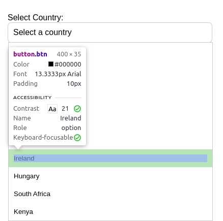 The presented image displays the results of the drop-down selection and provides information about each selected choice. Three aspects need to be noted: the role, the contrast, and the keyboard-focusability. The check mark shows a very good contrast for visually impaired users at contrast number 21, and the role also demonstrates that it is an option that may be focused on.
Next, let’s update the app.css by implementing clear focus styles for keyboard users.
.btn:focus {
  outline: 2px solid #007bff;
  background-color: #f0f0f0;
}
This CSS code is part of styling a custom select component that implements clear styles for keyboard users. The .btn class, associated with the interactive options within the custom select, defines a focus style in the .btn:focus selector. When a button receives focus, it triggers an outline of 2 pixels solid in the color #007BFF and a subtle background color change, background-color: #f0f0f0. This ensures that keyboard users can easily identify and navigate through the selected option, clearly indicating the focused element. Using contrasting colors and a distinct outline helps improve visibility, meet accessibility standards, and enhance the overall user experience for those relying on keyboard navigation.
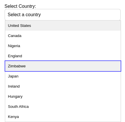 The image provided shows the focused item with a border of blue and a faded background color.
Mouse Interaction
Let’s now incorporate interaction into the select component. The drop-down menu appears when a user clicks on the select country component, and the item is selected and updated on the parent component when they click on any of the items.
To accomplish this mouse interaction, let’s first create an app.js file, to which we will add all the necessary code.
document.addEventListener("DOMContentLoaded", function () {
  const customSelect = document.querySelector(".custom-select");
  const selectedOption = document.querySelector(".selected-option");
  const optionsList = document.querySelector(".options-list");

  customSelect.addEventListener("click", function () {
    optionsList.style.display =
      optionsList.style.display === "block" ? "none" : "block";
    customSelect.setAttribute(
      "aria-expanded",
      optionsList.style.display === "block"
    );
  });

  optionsList.addEventListener("click", function (event) {
    if (event.target.tagName === "BUTTON") {
      selectedOption.textContent = event.target.textContent;
      optionsList.style.display = "none";
      customSelect.setAttribute("aria-expanded", "false");
    }
  });
});
This code explains all the mouse click actions for the dropdown select component. Before running the script, it uses the DOMContentLoaded event to ensure the HTML document has finished loading. The script creates event listeners and picks items with particular classes custom-select, selected-option, and options-list. Clicking the custom choose toggles the choices list’s visibility and appropriately sets the aria-expanded attribute for accessibility. When a button in the choices list is clicked, the options list is hidden, and the button’s textual content becomes the selected option. The dropdown status is reflected in the aria-expanded attribute.
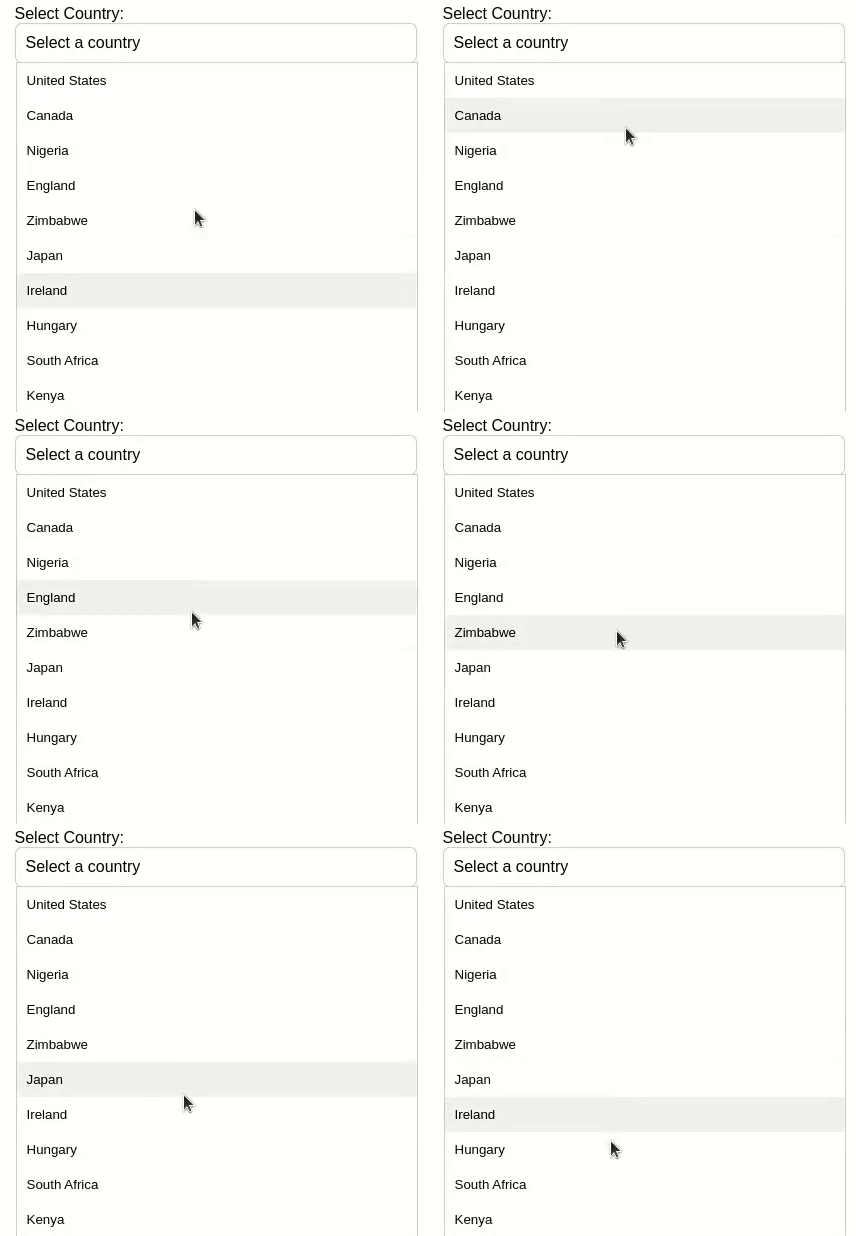 The image above shows the pictorial representation of the mouse interaction.
Keyboard Navigation
The expected behavior for keyboard users interacting with a drop-down select is to use the Arrow Up and Arrow Down keys to move through the available options. Within the drop-down list, pressing Arrow Up should move the selection up, and pressing Arrow Down should move it down. In addition, if the dropdown is open, pressing the Escape key (Esc) should close it, giving users an easy way to dismiss it without choosing. By enabling users to effectively navigate and make selections within the dropdown using only their keyboard, these keyboard interactions improve accessibility.
Next, let’s update the code in the JS file by adding the functionality to create these actions. Copy this code and replace it with what you have in the
app.js file.
document.addEventListener("DOMContentLoaded", function () {
  const customSelect = document.querySelector(".custom-select");
  const selectedOption = document.querySelector(".selected-option");
  const optionsList = document.querySelector(".options-list");
  const btnButtons = document.querySelectorAll(".btn");

  let focusedIndex = -1;
  let isNavigating = false;

  customSelect.addEventListener("click", function () {
    optionsList.style.display =
      optionsList.style.display === "block" ? "none" : "block";
    customSelect.setAttribute(
      "aria-expanded",
      optionsList.style.display === "block"
    );
    updateFocus();
  });

  optionsList.addEventListener("click", function (event) {
    if (event.target.tagName === "BUTTON") {
      selectedOption.textContent = event.target.textContent;
      optionsList.style.display = "none";
      customSelect.setAttribute("aria-expanded", "false");
    }
  });

  customSelect.addEventListener("keydown", function (event) {
    if (event.key === "Enter" || event.key === "") {
      optionsList.style.display =
        optionsList.style.display === "block" ? "none" : "block";
      customSelect.setAttribute(
        "aria-expanded",
        optionsList.style.display === "block"
      );
      updateFocus();
    } else if (event.key === "Escape") {
      optionsList.style.display = "none";
      customSelect.setAttribute("aria-expanded", "false");
    } else if (event.key === "ArrowUp" || event.key === "ArrowDown") {
      if (!isNavigating) {
        isNavigating = true;
        event.preventDefault();
        navigateList(event.key);
      }
    }
  });

  optionsList.addEventListener("keydown", function (event) {
    if (event.key === "Escape") {
      optionsList.style.display = "none";
      customSelect.setAttribute("aria-expanded", "false");
      customSelect.focus();
    } else if (event.key === "ArrowUp" || event.key === "ArrowDown") {
      if (!isNavigating) {
        isNavigating = true;
        event.preventDefault();
        navigateList(event.key);
      }
    } else if (event.key === "Enter") {
      if (focusedIndex !== -1) {
        updateSelectedOption(focusedIndex);
      }
    }
  });

  document.addEventListener("keyup", function () {
    isNavigating = false;
  });

  function updateFocus() {
    btnButtons.forEach((button, index) => {
      if (index === focusedIndex) {
        button.focus();
      } else {
        button.blur();
      }
    });
  }

  function navigateList(key) {
    const lastIndex = btnButtons.length - 1;
    if (key === "ArrowUp" && focusedIndex > 0) {
      focusedIndex = focusedIndex - 1;
    } else if (key === "ArrowDown" && focusedIndex < lastIndex) {
      focusedIndex = focusedIndex + 1;
    } else if (key === "ArrowDown" && focusedIndex === lastIndex) {
      focusedIndex = 0;
    } else if (key === "ArrowUp" && focusedIndex === 0) {
      focusedIndex = lastIndex;
    }
    updateFocus();
  }

  function updateSelectedOption(index) {
    selectedOption.textContent = btnButtons[index].textContent;
    customSelect.setAttribute("aria-expanded", "false");
    optionsList.style.display = "none";
  }
});
The functions updateFocus, navigateList, and updateSelectedOption are defined to manage focus, navigate through options, and update the selected option. The script ensures proper accessibility by dynamically updating the "aria-expanded" attribute, handling keyboard input for opening or closing the drop-down, and navigating through options. The code also prevents repeated navigation by setting a flag isNavigating that is cleared on “key up” events.
The code uses the “ArrowUp” and “ArrowDown” keys for navigation within the options list, “Enter” to select an option, and “Escape” to close the dropdown. It employs event listeners on the custom select and options list, maintaining a consistent and accessible user experience. The updateFocus function also ensures that the focused button is appropriately highlighted during navigation. This code provides an improved custom select dropdown experience with keyboard accessibility.
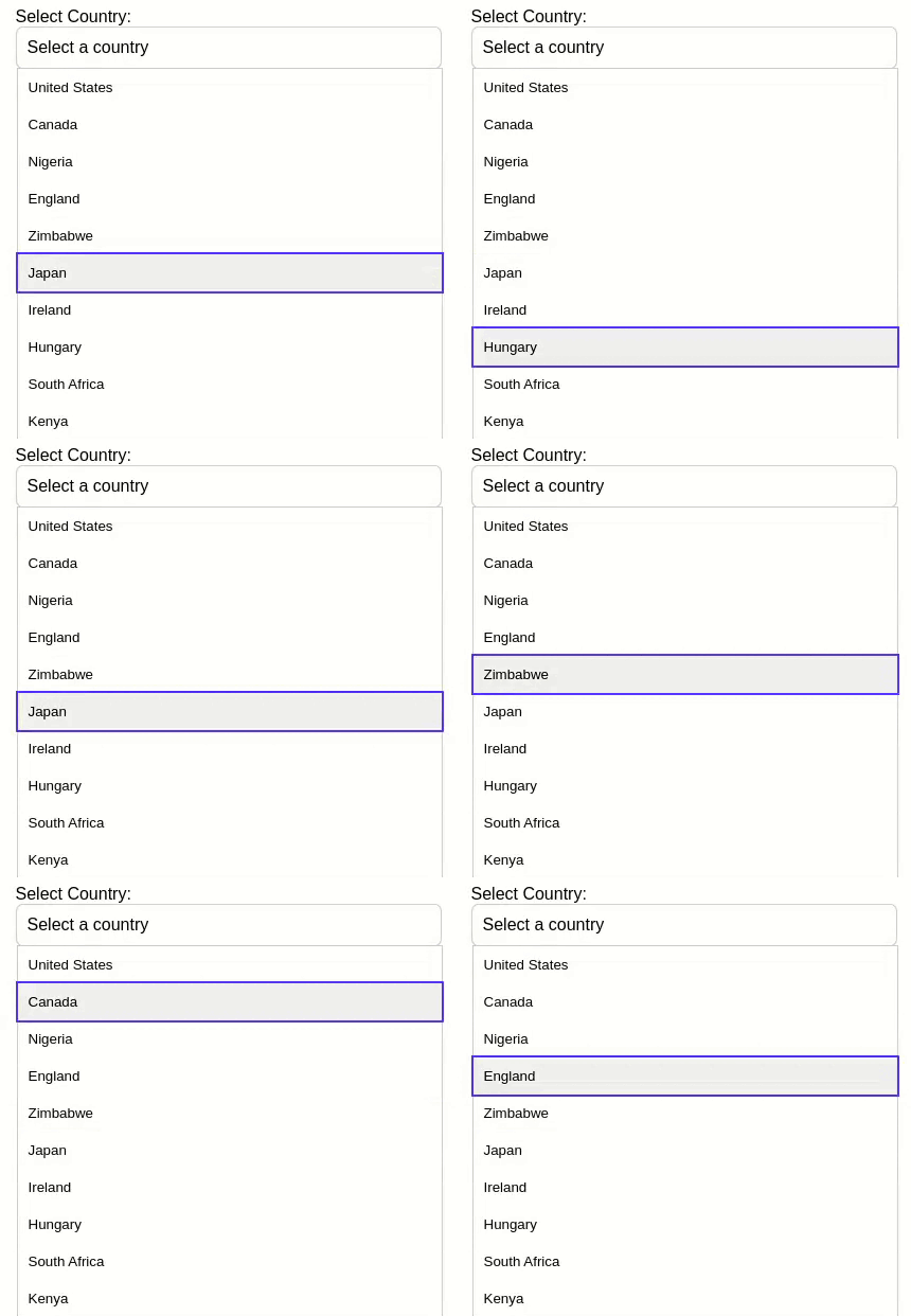 The image provided shows a user using the Arrow Up and Arrow Down keys to navigate the list of items.
ARIA Roles and Attributes
ARIA (Accessible Rich Internet Applications) roles and attributes have been thoughtfully applied to enhance the accessibility of the custom select component. The outermost div with the class custom-select is assigned the role of “combo box,” indicating that it functions as a composite widget with both text input and a list of options. In conjunction with the aria-has popup and aria-expanded attributes, this role communicates to assistive technologies that the custom select has a pop-up list box that can be expanded or collapsed.
The tabindex="0" ensures the custom select is focusable using the keyboard. Within the list box, each option is represented by a button with the role of “option.” The aria-selected="false" attribute indicates that none of the options are initially selected. Additionally, the live region, defined by the div with the class selected-option, employs aria-live="polite" and aria-atomic=" true" attributes. These attributes notify screen readers to politely announce changes to the selected option and treat the live region’s entire content as a single unit when updating, providing a seamless and informative experience for users relying on assistive technologies. These ARIA roles and attributes contribute to a more accessible and inclusive user interface.
Conclusion
In this guide, we explored creating an accessible drop-down component for mouse, keyboard, and screen reader users. By prioritizing semantic HTML, clear labeling, and responsive keyboard navigation, the guide ensures an inclusive experience. The provided JavaScript code exemplifies these principles, and incorporating ARIA roles caters to screen reader users. This concise guide equips developers with essential practices to build universally accessible web interfaces, fostering inclusivity across diverse user interactions.
Truly understand users experience
See every user interaction, feel every frustration and track all hesitations with OpenReplay — the open-source digital experience platform. It can be self-hosted in minutes, giving you complete control over your customer data. . Check our GitHub repo and join the thousands of developers in our community..


