Adding in-app tours to Flutter apps

User Interfaces and app features can be quite complicated to grasp at first sight for new users. Still, with the advent of In-App Tours, specific user interfaces and features can be broken down to users, eliminating the need, stress, and time taken for hectic app exploration.
An in-app tour is a feature that helps users understand and navigate a new app by providing a guided tour of its various features and functions. The tour is typically presented as a series of overlays or pop-ups that appear on the screen, each highlighting a specific feature and providing a brief description or tutorial on how to use it. They can also help introduce users to new features or updates in an existing app.
In this article, we’ll learn how to create an In-app tour using the tutorial_coach_mark package in our Flutter application.
Scaffolding Flutter app
Let’s begin with creating our Flutter project for this application. First, run the command below in your terminal to scaffold a Flutter project.
flutter create tour_appTo go along with this tutorial, we’ll be using the tutorial_coach_mark package. Run the command below to install it.
flutter pub add tutorial_coach_markBuilding User Interface
Let’s start with creating our bank page. To achieve this, create a bank_page.dart file in the lib/ folder and then paste the code block below into it.
import 'package:flutter/material.dart';
import 'package:tour_app/tour_target.dart';

class BankPage extends StatefulWidget {
  const BankPage({super.key});
  @override
  State<BankPage> createState() => _BankPageState();
}

class _BankPageState extends State<BankPage> {
  final moneyKey = GlobalKey();
  final withdrawKey = GlobalKey();
  final investKey = GlobalKey();


  @override
  Widget build(BuildContext context) {
    return Scaffold(
      backgroundColor: const Color(0xFF292D32),
      body: Center(
        child: Container(
          margin: const EdgeInsets.symmetric(horizontal: 30),
          decoration: BoxDecoration(
            boxShadow: [
              BoxShadow(
                  color: Colors.white.withOpacity(0.1),
                  offset: const Offset(-6.0, -6.0),
                  blurRadius: 16.0),
              BoxShadow(
                  color: Colors.black.withOpacity(0.4),
                  offset: const Offset(6.0, 6.0),
                  blurRadius: 16.0),
            ],
            color: const Color(0xFF292D32),
            borderRadius: BorderRadius.circular(12.0),
          ),
          padding: const EdgeInsets.all(20),
          child: Column(
            mainAxisAlignment: MainAxisAlignment.center,
            mainAxisSize: MainAxisSize.min,
            children: [
              Text('Total Amount:\n \$240,000,000',
                  key: moneyKey,
                  style: const TextStyle(
                      color: Color.fromARGB(255, 212, 212, 212),
                      fontWeight: FontWeight.bold,
                      fontSize: 25)),
              const SizedBox(height: 50),
              Row(
                mainAxisAlignment: MainAxisAlignment.spaceBetween,
                children: [
                  ElevatedButton(
                      key: withdrawKey,
                      onPressed: () {},
                      style:
                          ElevatedButton.styleFrom(backgroundColor: Colors.red),
                      child: const Text('Withdraw',
                          style: TextStyle(color: Colors.white))),
                  ElevatedButton(
                      key: investKey,
                      onPressed: () {},
                      style: ElevatedButton.styleFrom(
                        backgroundColor: Colors.green,
                      ),
                      child: const Text('Invest',
                          style: TextStyle(color: Colors.white))),
                ],
              )
            ],
          ),
        ),
      ),
    );
  }
}
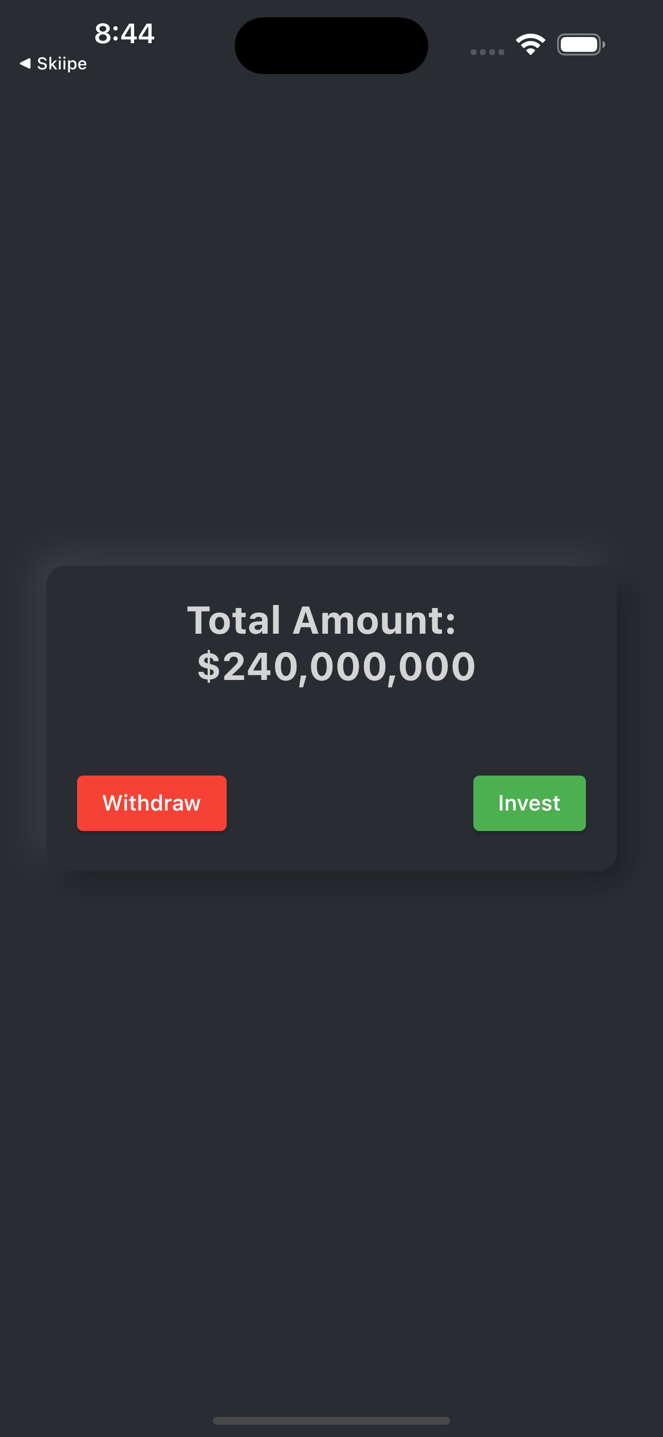
In the code block above, we’re creating the BankScreen page, a stateful flutter widget. The _BankPageState widget overrides a build function that returns a Scaffold widget with a background color of Color(0xFF292D32). Inside the Scaffold widget is the SafeArea widget with a child of Padding that has a Center widget as its child.
Inside the Center widget is the Container widget with a Column widget as its child. The Column widget has children with a Text widget displaying a message, a SizedBox widget for spacing, and a Row widget with two ElevatedButton widgets. The ElevatedButton widgets are labeled “Withdraw” and “Invest,” respectively, and have onPressed callbacks that are currently empty. The Container widget and the Text and ElevatedButton widgets have GlobalKeys assigned to them.
Below is a preview of our BankScreen.

Building Home page
With our bank page done, let’s create our home screen to display some interactive widgets. To accomplish this, navigate to the lib/ folder, create a home_screen.dart file, and paste the code below.
import 'package:flutter/material.dart';
import 'package:tour_app/bank_page.dart';

class HomePage extends StatefulWidget {
  const HomePage({Key? key}) : super(key: key);
  @override
  State<HomePage> createState() => _HomePageState();
}
class _HomePageState extends State<HomePage> {
  final wealthKey = GlobalKey();
  final profileKey = GlobalKey();
  final buttonKey = GlobalKey();
  bool reveal = false;

  @override
  Widget build(BuildContext context) {
    return Scaffold(
      backgroundColor: const Color(0xff040404),
      body: SafeArea(
        child: Padding(
          padding: const EdgeInsets.symmetric(horizontal: 20.0),
          child: Column(
            crossAxisAlignment: CrossAxisAlignment.center,
            children: [
              Row(mainAxisAlignment: MainAxisAlignment.spaceBetween, children: [
                const Text('Home',
                    style: TextStyle(color: Colors.white, fontSize: 22)),
                IconButton(
                    key: bankKey,
                    onPressed: () => Navigator.push(
                        context,
                        MaterialPageRoute(
                            builder: (context) => const BankPage())),
                    color: Colors.white,
                    icon: const Icon(Icons.safety_check_rounded)),
              ]),
              const Spacer(),
              const Text('You are Rich !!',
                  style: TextStyle(
                      fontSize: 26,
                      fontWeight: FontWeight.bold,
                      color: Colors.white)),
              const SizedBox(height: 10),
              Center(
                  child: FlutterLogo(
                      key: wealthKey,
                      size: MediaQuery.of(context).size.height * 0.3)),
              const SizedBox(height: 40),
              ElevatedButton(
                  key: buttonKey,
                  onPressed: () => setState(() => reveal = !reveal),
                  child: const Text('Find out More...')),
              const SizedBox(height: 20),
              Visibility(
                visible: reveal,
                child: Container(
                  padding: const EdgeInsets.all(20),
                  color: Colors.white,
                  child: const Text(
                    'Your Diamond is Worth\n \$34,000,000',
                    textAlign: TextAlign.center,
                    style: TextStyle(
                      fontWeight: FontWeight.bold,
                      fontSize: 22,
                    ),
                  ),
                ),
              ),
              const Spacer(),
            ],
          ),
        ),
      ),
    );
  }
}
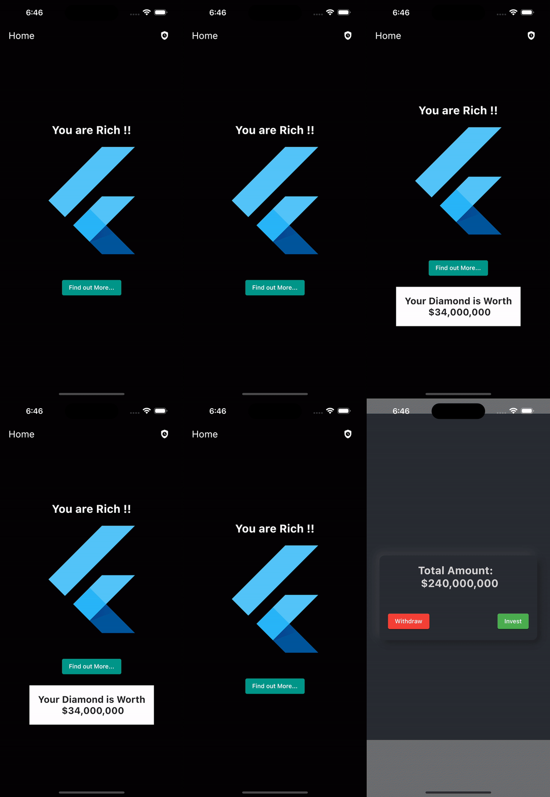
In the code block above, we’ve created several GlobalKey objects in the _HomePageState class, which uniquely identify elements within the widget tree and allow those elements to be manipulated. We’ve also created a boolean variable, reveal, which controls the visibility of a piece of text.
The build method, which is executed whenever the state of the widget changes, returns a Scaffold widget that contains a number of other widgets, including text labels, images, and buttons.
The ElevatedButton widget has an onPressed callback that toggles the value of reveal, which is used to toggle the visibility of the Container widget.
When the button is pressed, it will call setState (() => reveal = !reveal), which will cause the build method to be called again, and the Visibility widget will re-render based on the updated value of reveal, thus making the container with text visible or invisible.
Finally, IconButton displays the safety_check_rounded icon, and when clicked, it routes to the BankPage.
Updating Main.dart
Next, Let’s update our main.dart file to set our initial route to the home screen we created earlier. Copy the code below and replace it with the entire code in the main.dart file.
import 'package:flutter/material.dart';
import 'package:tour_app/home_page.dart';

void main() {
  runApp(const MyApp());
}

class MyApp extends StatelessWidget {
  const MyApp({super.key});
  // This widget is the root of your application.
  @override
  Widget build(BuildContext context) {
    return MaterialApp(
      title: 'In-App Tour',
      debugShowCheckedModeBanner: false,
      theme: ThemeData(
        primarySwatch: Colors.teal,
      ),
      home: const HomePage(),
    );
  }
}
In the code block above, we’re setting our home to the HomePage widget we created earlier. We’ve also updated the title and primarySwatch color to teal.
Next, run the application on an emulator using the below command to review what we’ve done.
flutter run 
Session Replay for Developers
Uncover frustrations, understand bugs and fix slowdowns like never before with OpenReplay — an open-source session replay tool for developers. Self-host it in minutes, and have complete control over your customer data. Check our GitHub repo and join the thousands of developers in our community.
Configuring In-App Tour
Now that our Home screen has been successfully created, let’s configure our in-app tour. To achieve this, create a tour_target.dart file in the lib/ folder and paste the code below.
import 'package:flutter/material.dart';
import 'package:tutorial_coach_mark/tutorial_coach_mark.dart';

List<TargetFocus> addTourTargets({
  required GlobalKey bankKey,
  required GlobalKey wealthKey,
  required GlobalKey buttonKey,
}) {
  List<TargetFocus> targets = [];

  targets.add(
    TargetFocus(
      keyTarget: bankKey,
      alignSkip: Alignment.bottomLeft,
      shape: ShapeLightFocus.Circle,
      radius: 10,
      contents: [
        TargetContent(
          align: ContentAlign.bottom,
          builder: (context, controller) => Container(
            alignment: Alignment.center,
            child: Column(
              crossAxisAlignment: CrossAxisAlignment.center,
              children: const [
                Text('This is your Bank!!',
                    textAlign: TextAlign.center,
                    style: TextStyle(
                      fontWeight: FontWeight.bold,
                      color: Colors.white,
                      fontSize: 20,
                    ))
              ],
            ),
          ),
        )
      ],
    ),
  );

  targets.add(
    TargetFocus(
      keyTarget: wealthKey,
      alignSkip: Alignment.topRight,
      shape: ShapeLightFocus.RRect,
      radius: 10,
      contents: [
        TargetContent(
          align: ContentAlign.bottom,
          builder: (context, controller) => Container(
            alignment: Alignment.center,
            child: Column(
              crossAxisAlignment: CrossAxisAlignment.center,
              children: const [
                Text(
                  'Hey!!\n This is your Worth',
                  textAlign: TextAlign.center,
                  style: TextStyle(
                    fontWeight: FontWeight.bold,
                    color: Colors.white,
                    fontSize: 20,
                  ),
                )
              ],
            ),
          ),
        )
      ],
    ),
  );

  targets.add(
    TargetFocus(
      keyTarget: buttonKey,
      alignSkip: Alignment.topRight,
      shape: ShapeLightFocus.RRect,
      radius: 10,
      contents: [
        TargetContent(
          align: ContentAlign.bottom,
          builder: (context, controller) => Container(
            alignment: Alignment.center,
            child: Column(
              crossAxisAlignment: CrossAxisAlignment.center,
              children: const [
                Text(
                  'Click to find out how much you worth',
                  textAlign: TextAlign.center,
                  style: TextStyle(
                    color: Colors.white,
                    fontWeight: FontWeight.bold,
                    fontSize: 20,
                  ),
                ),
              ],
            ),
          ),
        )
      ],
    ),
  );

  return targets;
}
In the code block above, we create a separate function that returns a list of TargetFocus objects. TargetFocus objects are used to display the tutorial coach mark in the TutorialCoachMark package.
The addTourTarget function is created with three required parameters of GlobalKey type: bankKey, wealthKey, and buttonKey. These GlobalKey objects are used to identify specific elements of the UI in the HomeScreen widget, which the coach marks will be displayed on.
The function then creates four TargetFocus objects, one for each of the keys passed as arguments. Each TargetFocus object defines a target on the UI by specifying the key of the element it should be displayed on, the alignment of the coach mark relative to the target, the shape of the highlight, a radius, and the content of the coach mark.
Finally, the list of all TargetFocus objects are then returned after they are created.
Configuring In-app tour for Bank page
Let’s configure our in-app tour that will be displayed on the bank page. To achieve this, create a bank_tour_target.dart file in the lib/ folder and paste the code below into it.
import 'package:flutter/material.dart';
import 'package:tutorial_coach_mark/tutorial_coach_mark.dart';

List<TargetFocus> addBankTargets({
 required GlobalKey moneyKey,
  required GlobalKey withdrawKey,
  required GlobalKey investKey,
}) {
  List<TargetFocus> targets = [];

   targets.add(
    TargetFocus(
      keyTarget: moneyKey,
      alignSkip: Alignment.bottomLeft,
      shape: ShapeLightFocus.RRect,
      radius: 10,
      contents: [
        TargetContent(
          align: ContentAlign.top,
          builder: (context, controller) => Container(
            alignment: Alignment.center,
            child: Column(
              crossAxisAlignment: CrossAxisAlignment.center,
              children: const [
                Text(
                  'This is your Current amount',
                  textAlign: TextAlign.center,
                  style: TextStyle(
                    fontWeight: FontWeight.bold,
                    color: Colors.black,
                    fontSize: 25,
                  ),
                ),
              ],
            ),
          ),
        ),
      ],
    ),
  );

  targets.add(
    TargetFocus(
      keyTarget: withdrawKey,
      alignSkip: Alignment.topRight,
      shape: ShapeLightFocus.RRect,
      radius: 10,
      contents: [
        TargetContent(
          align: ContentAlign.bottom,
          builder: (context, controller) => Container(
            alignment: Alignment.center,
            child: Column(
              crossAxisAlignment: CrossAxisAlignment.center,
              children: const [
                Text(
                  'You can withdraw your cash!!',
                  textAlign: TextAlign.center,
                  style: TextStyle(
                    fontWeight: FontWeight.bold,
                    color: Colors.black,
                    fontSize: 25,
                  ),
                )
              ],
            ),
          ),
        )
      ],
    ),
  );

  targets.add(
    TargetFocus(
      keyTarget: investKey,
      alignSkip: Alignment.topRight,
      shape: ShapeLightFocus.RRect,
      radius: 10,
      contents: [
        TargetContent(
          align: ContentAlign.bottom,
          builder: (context, controller) => Container(
            alignment: Alignment.center,
            child: Column(
              crossAxisAlignment: CrossAxisAlignment.center,
              children: const [
                Text(
                  'Or, invest it and get a double',
                  textAlign: TextAlign.center,
                  style: TextStyle(
                    color: Colors.black,
                    fontWeight: FontWeight.bold,
                    fontSize: 25,
                  ),
                )
              ],
            ),
          ),
        )
      ],
    ),
  );

  return targets;
}
As seen in the code block above, we are utilizing the same configuration pattern that we previously discussed in the previous section to personalize our bank tour.
Configuring Targets on the Home Screen
With our targets all set, Let’s initialize the tour targets on our Home page. To achieve this, import the Tutorial Coach Mark package and the tour_target file into the Home page.
import 'package:tour_app/tour_target.dart';
import 'package:tutorial_coach_mark/tutorial_coach_mark.dart';
Then, copy and paste the code below into the _HomePageState class.
class _HomePageState extends State<HomePage> {
  final wealthKey = GlobalKey();
  final bankKey= GlobalKey();
  final buttonKey = GlobalKey();
  bool reveal = false;

//-------> Copy from here
  late TutorialCoachMark _tutorialCoachMark;
  void _initialPageTour() {
    _tutorialCoachMark = TutorialCoachMark(
        targets: addTourTargets(
            bankKey: bankKey,
            wealthKey: wealthKey,
            buttonKey: buttonKey),
        colorShadow: Colors.teal,
        paddingFocus: 10,
        hideSkip: false,
        opacityShadow: 0.8,
        onFinish: () => Navigator.push(
            context,
            MaterialPageRoute(
              builder: (context) => const BankPage(),
            )),
        onSkip: () => print('Skipped'));
  }
  void _ShowTour() => Future.delayed(const Duration(seconds: 1),
      () => _tutorialCoachMark.show(context: context));

  @override
  void initState() {
    super.initState();
    _initialPageTour();
    _ShowTour();
  }
//-------> To this point

  @override
  Widget build(BuildContext context) {
  // Other code blocks here
  ...

  }
}
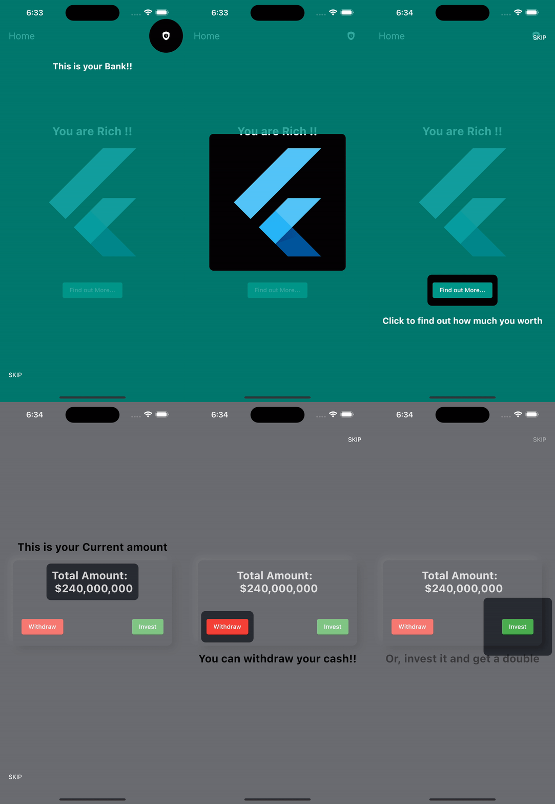
This code creates and shows a tutorial coach mark for our Home screen using the TutorialCoachMark class.
The _initialPageTour method creates an instance of TutorialCoachMark and assigns it to the _tutorialCoachMark variable. It sets several properties of the coach mark, such as the targets that will be highlighted during the tour (which are provided by the addTourTargets method), the color of the shadow, the padding around the focus widget, whether the skip button is hidden, and the opacity of the shadow. It also sets two callbacks, onFinish and onSkip, which will be called when the user finishes the tour or skips the tour, respectively. When the tour finishes, the onFinished callback will navigate to the bank screen.
The _ShowTour method is responsible for showing the coach mark. It uses Future.delayed to delay the showing of the coach mark for 1 second, and then calls the show method on the _tutorialCoachMark object, passing in the context of the widget.
Finally, the initState method is responsible for initializing the coach mark and showing it when the HomePage is first created.
Configuring Targets on Bank Screen
With our home page ready, Let’s initialize the tour targets on our bank page. To achieve this, navigate to the bank_page.dart file and import the bank_tour_targer and tutorial_coach_mark into it.
import 'package:tour_app/bank_tour_target.dart';
import 'package:tutorial_coach_mark/tutorial_coach_mark.dart';
Then, copy the code below into the _BankPageState class.
class _BankPageState extends State<BankPage> {
  final moneyKey = GlobalKey();
  final withdrawKey = GlobalKey();
  final investKey = GlobalKey();

  late TutorialCoachMark _tutorialCoachMark;

  void _initialPageTour() {
    _tutorialCoachMark = TutorialCoachMark(
      targets: addBankTargets(
          moneyKey: moneyKey, withdrawKey: withdrawKey, investKey: investKey),
      colorShadow: Colors.white,
      paddingFocus: 10,
      hideSkip: false,
      opacityShadow: 0.3,
      onFinish: () => print('Finished Tour'),
      onSkip: () => print('Skipped'),
    );
  }

  void _ShowTour() => Future.delayed(const Duration(seconds: 1),
      () => _tutorialCoachMark.show(context: context));

  @override
  void initState() {
    super.initState();

    _initialPageTour();
    _ShowTour();
  }


  @override
  Widget build(BuildContext context) {

  ...
In the code block above, we’re initializing the Tutorial Coach Mark package on our Bank page using the same process used on the home page.
Finally, restart the application to see the final result.

Conclusion
The In-App Tour is an essential feature in mobile development since it’s widely used in the mobile development world to give first-time users instructions, hints, and tutorials on how to use an application without the help of a knowledge base or documentation.
Here is the link to the complete source code on GitHub.

