Advanced Animations with CSS linear()

CSS provides built-in and custom easing functions, but they are intentionally simple. JavaScript was necessary for anything more sophisticated, but a new
linear()easing function now permits more natural animations in CSS alone, as this article shows.

Discover how at OpenReplay.com.
You can apply animated effects in CSS using:
- animations to animate one or more styles over a period, or
- transitions to animate one or more styles between two states, e.g. hovered and non-hovered.
Each requires an easing function to calculate the change in a style over time. The function can vary the speed of change so an element’s animation can accelerate and decelerate.
CSS and many JavaScript libraries define the animation time T as a real number starting at 0 and ending at 1. Your actual animation can occur over any period of time. If you’re 2.5 seconds into a 5-second animation, T is 2.5s / 5.0s or 0.5 - it’s halfway through.
The progress P of an animated property - such as opacity or translate - is determined by an easing function that is passed time T and returns a real number. The function must return 0 when the animation starts (T is 0) and 1 when the animation ends (T is 1), but any other value can be returned otherwise (even something outside the 0 - 1 range).
The simplest possible easing function is linear, which you can write in JavaScript as:
function linear(T) { return T; }The function sets progress P to the same value at time T. If T is 0.123 so is P. Plotting this on a graph gives a straight line:

You cannot (currently) define functions in CSS, so it provides a linear keyword to do the same thing:
animation-timing-function: linear;This can be used to animate any CSS property over any duration, e.g., fade-in by animating the opacity of an element from 20% to 80% over 2 seconds:
animation-name: fadein;
animation-duration: 2s;
animation-timing-function: linear;

@keyframes fadein {
 0% { opacity: 20%; }
 100% { opacity: 80%; }
}
Given a progress value of P (at time T), the value of any animated CSS property is calculated using:
calculatedStyle = P * (endingValue - startingValue) + startingValueThe opacity example above is therefore calculated as:
calculatedStyle = P * (80% - 20%) + 20%At:
-
the start of the linear animation, T is
0so P is also0.opacityis set to0 * (80% - 20%) + 20%which equates to20%. -
1 second in (halfway through the animation), T is
1s / 2s=0.5so P is also0.5.opacityis0.5 * (80% - 20%) + 20%=50%. -
the end of the animation, T is
1so P is also1.opacityis set to1 * (80% - 20%) + 20%=80%.
The browser does all these calculations, so you don’t have to! You just need to know that the opacity starts at 20% and ends at 80% over 2 seconds. The linear function ensures progress occurs at a consistent rate without speeding up or slowing down.
linear easing is a good choice for animating color hues and opacity, but the following example uses it for a 1.5-second translateY between 0px and 300px:
Easing Keywords
The linear ball animation above looks unnatural because, in the real world, objects accelerate and decelerate as they move over time.
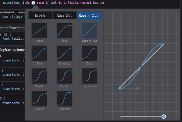
CSS provides more naturalistic easing keywords named ease, ease-in, ease-out, and ease-in-out. For example, ease-in-out accelerates over the first third of the duration to reach a maximum speed, then decelerates over the last third:
Most browser DevTools allow you to examine and change the easing function. Firefox currently has better options than other browsers:

Bézier Curve Easing Functions
All CSS-named easing keywords use Bézier curves to define the shape of the animation. While this is not as flexible as a JavaScript function, you can define Bézier curves with just two control point coordinates, so they can be expressed in CSS alone. The ease-in-out function is identical to:
animation-timing-function: cubic-bezier(0.42, 0.00, 0.58, 1.00);where the first Bézier curve control point is at coordinate (0.42, 0.00) and the second is at (0.58, 1.00). Note:
-
the first x-axis value of both coordinates must be between 0 and 1. This ensures the curve cannot curl back on itself which would give two or more points at the same time T. A coordinate of
-0.2, 0or1.01, 1is therefore invalid, and no animation will occur. -
the second y-axis value of either coordinate can be any number. It’s possible to define curves where the progress P falls outside the normal 0 to 1 range. An element moving between 0px and 100px could therefore go to -20px or 150px at some point during the animation before it reaches its final ending state. In other words: it bounces.
The following example defines cubic-bezier(0.7, 1.9, 0.6, 0.4):
- When time T is 0, progress P is 0.
- When time T is ~0.6, progress P is ~1.0, and the curve reverses.
- When time T is ~0.8, progress P is ~0.8, and the curve reverses again.
- When time T is 1, progress P is 1.
The curve approximates to a single bounce:
Bézier curves can be difficult to create manually, but you can edit them visually in DevTools or use any of the following online tools:
Introducing the linear() Easing Function
Bézier curves are flexible, but the example above still feels unnatural:
- The ball decelerates slightly before the first bounce. Gravity doesn’t work that way!
- In the real world, a dropped ball often bounces more than once before coming to rest.
It’s not possible to define a more realistic Bézier curve because you’re limited to just two control points. Developers would previously resort to JavaScript to create more sophisticated animations and transitions.
The new linear() easing function (not to be confused with the linear named easing keyword) has been available in all browsers since late 2023. It defines an animation curve as a series of stop-point lines. You can add as many stop points as you like to approximate a curve, but 12 points can create an effective, natural-looking three-bounce animation:
linear() function easing Codepen
Pass stop points to the linear() function as a comma-separated list. Each point defines:
-
the animation progress point P (required). This is typically from 0 to 1, but it can go outside those bounds. For example, 1.2 applied to a
translateYproperty would move an element 20% beyond its final resting position at some point during the animation. -
one or two time duration points T (optional). Note that these are from 0% to 100% rather than 0 to 1 as before (possibly so it’s easier to identify them from animation points).
The following examples are identical to the linear keyword because the animation moves from 0 to 1 over a 0% to 100% duration:
linear(0 0%, 1 100%)
linear(0 0%, 0.5 50%, 1 100%)
If you omit the time duration percentage, the browser interpolates the timings. The three animation points below would apply at 0%, 50%, and 100% like above:
linear(0, 0.5, 1)In the following example:
- The first tenth of the animation occurs in the first 25% of the duration.
- The animation remains at the first tenth point until the duration reaches 50%.
- The final 90% of the animation occurs in the last half of the duration.
linear(0, 0.1 25%, 0.1 50%, 1)The following function is identical - notice the two duration points in the same set:
linear(0, 0.1 25% 50%, 1)The ball bounce animation above uses:
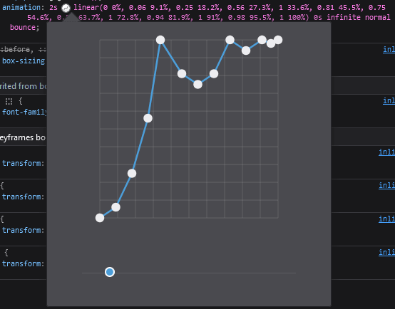
linear(0, 0.06, 0.25, 0.56, 1, 0.81, 0.75, 0.81, 1, 0.94, 1 91%, 0.98, 1)This would be difficult to write manually. I copied the code from the linear generator app, which can convert both JavaScript (perhaps from easings.net) and SVG curves to their linear() function equivalents. The tool also offers options to reduce the number of stop points and round values.
You can also edit linear() points in browser DevTools. Again, Firefox has the edge over others:

Summary
CSS animations and transitions have been available for more than a decade. The techniques are simple to understand, and you won’t always need anything beyond easing keywords or Bézier curve timings. The new linear() easing function provides a viable option when you require more complex effects and would rather not delve into JavaScript.
For more information, refer to:
- MDN CSS animations
- MDN
animation-timing-functionproperty - MDN CSS transitions
- MDN
transition-timing-functionproperty - MDN easing functions
- MDN linear() easing function
- Ceaser CSS Easing Animation tool
- cubic-bezier.com tool
- easings.net tool
- linear() generator
Gain control over your UX
See how users are using your site as if you were sitting next to them, learn and iterate faster with OpenReplay. — the open-source session replay tool for developers. Self-host it in minutes, and have complete control over your customer data. Check our GitHub repo and join the thousands of developers in our community.

