Build beautiful UI components with NextUI

Due to the volume of operations developers perform when developing web applications, they have created a lot of UI frameworks to tackle this challenge. Because of these UI frameworks, no need for developers to continue reinventing the wheel when creating a project. Since we now have many of these frameworks, developers are facing the challenge of knowing the proper framework to use in their projects. In this tutorial, you’ll learn how to build beautiful UI components using NextUI.
What is NextUI, and why use it?
NextUI is a modern React UI framework that allows you to make beautiful and fast websites/applications regardless of your design experience. You can create beautiful UI in your React and Nextjs application with just a little customization in the App.jsx to load the NextUI provider. It has many cool features, which is why it is loved and used by many developers.
- It Is Themeable: NextUI offers you the flexibility to easily customize your UI themes, fonts, and breakpoints.
- It is very fast: NextUI allows you to style your props at runtime, making it perform more than other UI frameworks.
- It has both dark and light themes: NextUI recognizes changes in the HTML theme props to automatically change the theme.
- It has a unique user experience: NextUI has a beginner-friendly learning curve and provides the best developer experience of most UI frameworks.
Starting our app
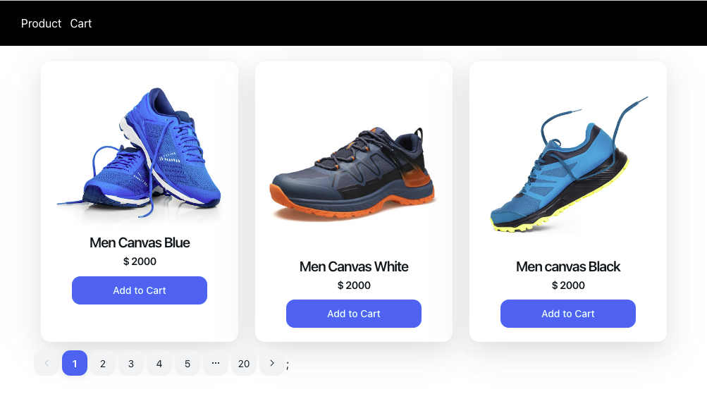
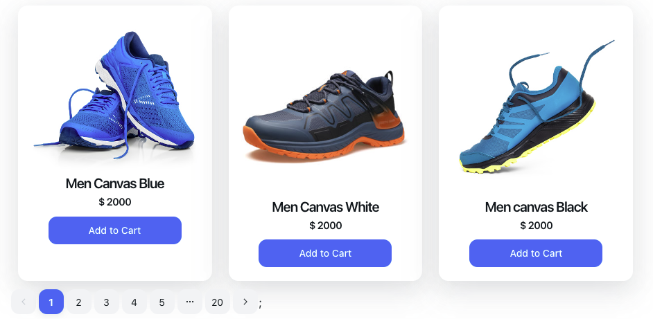
For the demonstrations in this tutorial, we’ll be creating a shopping UI to demonstrate how you can use NextUI in a React project. The UI should look like the one on the screenshot below.

Let’s start by creating a React application with the command below;
npx create-react-app nextui-demo && cd nextui-demoOnce the above has created the React project and installed the required dependencies, start the application with the command below;
npm startWith the React application setup, let’s install NextUI with the command below.
npm install @nextui-org/react react-router-domOnce the installation is completed, set up NextUI to work correctly in your React application by setting up the NextUIProvider at the root of your application. Replace the code in your App.js below.
import * as React from 'react';

// 1. import `NextUIProvider` component
import { NextUIProvider } from '@nextui-org/react';

function App() {
  // 2. Use at the root of your app
  return (
    <NextUIProvider>
      //components goes here
    </NextUIProvider>
  );
}
export default App;
Create the Navbar Component
With NextUI setup for this project, let’s create the Navbar of the application. NextUI has not created the Navbar component yet, so we’ll create our custom one. Create a component folder in the src directory, create a Navbar.jsx file, and add the code snippets below.
import { Link } from "@nextui-org/react";
import "../App.css";

function Navbar() {
  return (
    <div className="Navbar">
      <Link href="/">Product</Link>
      <Link href="/cart">Cart</Link>
    </div>
  );
}
export default Navbar;
In the above code snippet, we created the navbar of the application and used the NextUI Link component to create a link to the Product and Cart components which we’ll be creating shortly.
Then update the App.js file to configure the application’s routes with the code snippet below.
// 1. import `NextUIProvider` component
import { NextUIProvider } from "@nextui-org/react";
import "./App.css";
import { Suspense, lazy } from "react";
import { BrowserRouter as Router, Routes, Route } from "react-router-dom";
import Navbar from "./components/Header";

const Product = lazy(() => import("./components/Product"));
const Cart = lazy(() => import("./components/Cart"));

function App() {
  // 2. Use at the root of your app
  return (
    <NextUIProvider>
      <Navbar />
      <Router>
        <Suspense fallback={<div>Loading...</div>}>
          <Routes>
            <Route path="/" element={<Product />}>
              Product
            </Route>
            <Route path="/cart" element={<Cart />}>
              Cart
            </Route>
          </Routes>
        </Suspense>
      </Router>
    </NextUIProvider>
  );
}
export default App;
In the above code snippet, we created the routes for the Cart and Product component using the react-router-dom we installed at the beginning of this tutorial.
Now update the code in the App.css file to add style to the Navbar component.
.Navbar {
  background-color: black;
  color: white;
  padding: 20px;
  margin-bottom: 10px;
}

.Navbar a {
  margin-left: 12px;
  color: white;
}
Create Product Component
Let’s create the shopping application UI. Let’s start with the Product component. Create a components folder in the src directory, create a Product.jsx file, and add the code snippet below.
import { Grid, Container, Pagination } from "@nextui-org/react";
import { products } from "./data";
import ProductList from "./ProductList";

export default function Product() {
  return (
    <Container>
      <Grid.Container gap={2} justify="center">
        {products.map((product) => (
          <ProductList key={product.id} product={product} />
        ))}
      </Grid.Container>
      <Pagination total={20} initialPage={1} />;
    </Container>
  );
}
In the above code snippet, we import the NextUI components to create the product and import the product data and the ProductList component. We used the Javascript map function to loop through the list of products and pass the product objects as props.
Add custom Data
Let’s create the product data we’ll be displaying to the users. Create a data.js file in the component folder and add the code snippet below.
export const products = [
  {
    id: 1,
    name: "Men Canvas Blue",
    category: "Wears",
    price: 2000,
    status: "In stock",
    image:
      "https://media.istockphoto.com/photos/running-shoes-picture-id1249496770?b=1&k=20&m=1249496770&s=170667a&w=0&h=_SUv4odBqZIzcXvdK9rqhPBIenbyBspPFiQOSDRi-RI=",
    quantity: 10,
  },
  {
    id: 2,
    name: "Men Canvas White",
    category: "Wears",
    price: 2000,
    status: "In stock",
    image:
      "https://p.globalsources.com/IMAGES/PDT/B1185285787/Walking-Shoes-Climbing-hiking-shoes.jpg",
    quantity: 10,
  },
  {
    id: 3,
    name: "Men canvas Black",
    category: "Wears",
    price: 2000,
    status: "In stock",
    image:
      "https://media.istockphoto.com/photos/blue-sneakers-isolated-on-white-background-picture-id1308274455?b=1&k=20&m=1308274455&s=170667a&w=0&h=S3UYmEJ1hUri2rB8jRhJ4wNY31lMrHysLHbl9YD8j_Q=",
    quantity: 10,
  },
];
We created a product array with some product details in the above code snippet.
Create Product list Components
Now let’s create a product list component to display the product data to the user. Create a ProductList.jsx file in the components folder and add the code snippet below.
import {
    Grid,
    Card,
    Text,
    Row,
    Image,
    Button,
  } from "@nextui-org/react";

export default function ProductList({product}) {
  return (
    <Grid xs={4}>
      <Card color="black">
        <Card.Body>
          <Row justify="center" align="center">
            <Image
              objectFit="cover"
              src={product.image}
            ></Image>
          </Row>
          <Row justify="center" align="center">
            <Text h4 size={20} css={{ m: 0 }}>
              {product.name}
            </Text>
          </Row>
          <Row justify="center" align="center">
            <Text h4 size={15} b css={{ m: 0 }}>
             $ {product.price}
            </Text>
          </Row>
          <Row justify="center" align="center">
            <Button css={{ mt: 10 }}>Add to Cart</Button>
          </Row>
        </Card.Body>
      </Card>
    </Grid>
  );
}
In the above code snippet, we used the NextUI Grid component to create a grid layout for our products. Then we used the Card component to wrap the product details and used the Row component to divide the product details to get the expected design. NextUI also allows us to modify the style for the components using the css property.

Open Source Session Replay
OpenReplay is an open-source, session replay suite that lets you see what users do on your web app, helping you troubleshoot issues faster. OpenReplay is self-hosted for complete control over your data.

Start enjoying your debugging experience - start using OpenReplay for free.
Create Cart Component
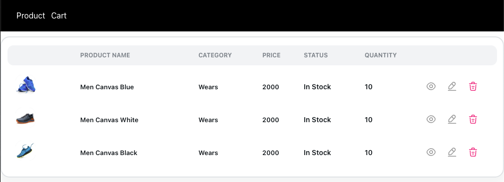
Now let’s create the Cart component to show the products in a user’s cart. Create a Cart.jsx file in the component folder and add the code snippet below.
import { Table, Row, Col, Tooltip, User, Text } from "@nextui-org/react";
import { IconButton } from "./Icons/IconButton";
import { EyeIcon } from "./Icons/EyeIcon";
import { EditIcon } from "./Icons/EditIcon";
import { DeleteIcon } from "./Icons/DeleteIcon";
import { products } from "./data";

export default function Cart() {
  const columns = [
    { name: "", uid: "img" },
    { name: "PRODUCT NAME", uid: "name" },
    { name: "CATEGORY", uid: "category" },
    { name: "PRICE", uid: "price" },
    { name: "STATUS", uid: "status" },
    { name: "QUANTITY", uid: "quantity" },
    { name: "", uid: "actions" },
  ];

  const renderCell = (products, columnKey) => {
    const cellValue = products[columnKey];
    switch (columnKey) {
      case "img":
        return (
          <User squared src={products.image} name={cellValue} css={{ p: 0 }} />
        );
      case "name":
        return (
          <Text b size={13} css={{ tt: "capitalize" }}>
            {cellValue}
          </Text>
        );
      case "category":
        return (
          <Text b size={13} css={{ tt: "capitalize" }}>
            {cellValue}
          </Text>
        );

      case "price":
        return (
          <Text b size={13} css={{ tt: "capitalize" }}>
            {cellValue}
          </Text>
        );

      case "status":
        return (
          <Text b size={14} css={{ tt: "capitalize" }}>
            {cellValue}
          </Text>
        );

      case "quantity":
        return (
          <Text b size={14} css={{ tt: "capitalize" }}>
            {cellValue}
          </Text>
        );
      case "actions":
        return (
          <Row justify="center" align="center">
            <Col css={{ d: "flex" }}>
              <Tooltip content="Details">
                <IconButton
                  onClick={() => console.log("View product", products.id)}
                >
                  <EyeIcon size={20} fill="#979797" />
                </IconButton>
              </Tooltip>
            </Col>
            <Col css={{ d: "flex" }}>
              <Tooltip content="Edit product">
                <IconButton
                  onClick={() => console.log("Edit product", products.id)}
                >
                  <EditIcon size={20} fill="#979797" />
                </IconButton>
              </Tooltip>
            </Col>
            <Col css={{ d: "flex" }}>
              <Tooltip
                content="Delete product"
                color="error"
                onClick={() => console.log("Delete product", products.id)}
              >
                <IconButton>
                  <DeleteIcon size={20} fill="#FF0080" />
                </IconButton>
              </Tooltip>
            </Col>
          </Row>
        );
      default:
        return cellValue;
    }
  };
  return (
    <Table
      bordered
      aria-label="Example table with custom cells"
      css={{
        height: "auto",
        minWidth: "100%",
      }}
      selectionMode="none"
    >
      <Table.Header columns={columns}>
        {(column) => (
          <Table.Column
            key={column.uid}
            hideHeader={column.uid === "actions"}
            align={column.uid === "actions" ? "center" : "start"}
          >
            {column.name}
          </Table.Column>
        )}
      </Table.Header>
      <Table.Body items={products}>
        {(item) => (
          <Table.Row>
            {(columnKey) => (
              <Table.Cell>{renderCell(item, columnKey)}</Table.Cell>
            )}
          </Table.Row>
        )}
      </Table.Body>
    </Table>
  );
}
In the above code snippet, we used the NextUI Table component to create a table to display the products. First, we created an array to store the headers and ids of the columns in the table. We created a renderCell method to display the contents of the text in an array to the table headers. To achieve this, I used the Javascript switch statement to define a header for each table cell. On the actions cell, we display some icons which can be used to delete, update or view the details of a product. The NextUI Table Body component accepts an item which in this case is the product data. The NextUI table component loops through all the items in the data specified in the item props. NextUI has no Icon component yet, so we have to create the custom Icons.
Next, create an icon folder in the component and create a DeleteIcon.js, EditIcon.js, EyeIcon.js, and IconButton.js files. Add the code snippet below to the DeleteIcon.js file.
import { React } from '@nextui-org/react';

export const DeleteIcon = ({
  fill,
  size,
  height,
  width,
  ...props
}) => {
  return (
    <svg
      width={size || width || 24}
      height={size || height || 24}
      viewBox="0 0 20 20"
      fill="none"
      xmlns="http://www.w3.org/2000/svg"
      {...props}
    >
      <path
        d="M17.5 4.98332C14.725 4.70832 11.9333 4.56665 9.15 4.56665C7.5 4.56665 5.85 4.64998 4.2 4.81665L2.5 4.98332"
        stroke={fill}
        strokeWidth={1.5}
        strokeLinecap="round"
        strokeLinejoin="round"
      />
      <path
        d="M7.08331 4.14169L7.26665 3.05002C7.39998 2.25835 7.49998 1.66669 8.90831 1.66669H11.0916C12.5 1.66669 12.6083 2.29169 12.7333 3.05835L12.9166 4.14169"
        stroke={fill}
        strokeWidth={1.5}
        strokeLinecap="round"
        strokeLinejoin="round"
      />
      <path
        d="M15.7084 7.61664L15.1667 16.0083C15.075 17.3166 15 18.3333 12.675 18.3333H7.32502C5.00002 18.3333 4.92502 17.3166 4.83335 16.0083L4.29169 7.61664"
        stroke={fill}
        strokeWidth={1.5}
        strokeLinecap="round"
        strokeLinejoin="round"
      />
      <path
        d="M8.60834 13.75H11.3833"
        stroke={fill}
        strokeWidth={1.5}
        strokeLinecap="round"
        strokeLinejoin="round"
      />
      <path
        d="M7.91669 10.4167H12.0834"
        stroke={fill}
        strokeWidth={1.5}
        strokeLinecap="round"
        strokeLinejoin="round"
      />
    </svg>
  );
};
Add the code snippet below to the EditIcon.js file.
import { React } from '@nextui-org/react';

export const EditIcon = ({
  fill,
  size,
  height,
  width,
  ...props
}) => {
  return (
    <svg
      width={size || width || 24}
      height={size || height || 24}
      viewBox="0 0 20 20"
      fill="none"
      xmlns="http://www.w3.org/2000/svg"
      {...props}
    >
      <path
        d="M11.05 3.00002L4.20835 10.2417C3.95002 10.5167 3.70002 11.0584 3.65002 11.4334L3.34169 14.1334C3.23335 15.1084 3.93335 15.775 4.90002 15.6084L7.58335 15.15C7.95835 15.0834 8.48335 14.8084 8.74168 14.525L15.5834 7.28335C16.7667 6.03335 17.3 4.60835 15.4583 2.86668C13.625 1.14168 12.2334 1.75002 11.05 3.00002Z"
        stroke={fill}
        strokeWidth={1.5}
        strokeMiterlimit={10}
        strokeLinecap="round"
        strokeLinejoin="round"
      />
      <path
        d="M9.90833 4.20831C10.2667 6.50831 12.1333 8.26665 14.45 8.49998"
        stroke={fill}
        strokeWidth={1.5}
        strokeMiterlimit={10}
        strokeLinecap="round"
        strokeLinejoin="round"
      />
      <path
        d="M2.5 18.3333H17.5"
        stroke={fill}
        strokeWidth={1.5}
        strokeMiterlimit={10}
        strokeLinecap="round"
        strokeLinejoin="round"
      />
    </svg>
  );
};
Add the code snippet below to the EyeIcon.js
import { React } from '@nextui-org/react';

export const EyeIcon = ({
  fill,
  size,
  height,
  width,
  ...props
}) => {
  return (
    <svg
      width={size || width || 24}
      height={size || height || 24}
      viewBox="0 0 20 20"
      fill="none"
      xmlns="http://www.w3.org/2000/svg"
      {...props}
    >
      <path
        d="M12.9833 10C12.9833 11.65 11.65 12.9833 10 12.9833C8.35 12.9833 7.01666 11.65 7.01666 10C7.01666 8.35 8.35 7.01666 10 7.01666C11.65 7.01666 12.9833 8.35 12.9833 10Z"
        stroke={fill}
        strokeWidth={1.5}
        strokeLinecap="round"
        strokeLinejoin="round"
      />
      <path
        d="M9.99999 16.8916C12.9417 16.8916 15.6833 15.1583 17.5917 12.1583C18.3417 10.9833 18.3417 9.00831 17.5917 7.83331C15.6833 4.83331 12.9417 3.09998 9.99999 3.09998C7.05833 3.09998 4.31666 4.83331 2.40833 7.83331C1.65833 9.00831 1.65833 10.9833 2.40833 12.1583C4.31666 15.1583 7.05833 16.8916 9.99999 16.8916Z"
        stroke={fill}
        strokeWidth={1.5}
        strokeLinecap="round"
        strokeLinejoin="round"
      />
    </svg>
  );
};
Finally, add the code snippet below to the IconButton.js file.
import { styled } from "@nextui-org/react";
[[](https://)](https://)
export const IconButton = styled("button", {
  dflex: "center",
  border: "none",
  outline: "none",
  cursor: "pointer",
  padding: "0",
  margin: "0",
  bg: "transparent",
  transition: "$default",
  "&:hover": {
    opacity: "0.8",
  },
  "&:active": {
    opacity: "0.6",
  },
});
You can now click on the cart link to navigate to the Cart components.

Conclusion
If you make it to this point, you should be able to build beautiful UI components with NextUI. I started by introducing you to NextUI and why you should use it in your React/Nextjs project. I went on to create a demo shopping application for demonstration. Feel free to learn more about NextUI from the official documentation and extend the application’s features.
