
Bento Box: A Refreshing Layout Approach for Websites


Websites have mostly used the same layouts for a long time: grids, columns, and menus at the top. These work okay but can feel boring and don’t always grab people’s attention. This article unveils the “Bento Box” layout, a unique approach that brings order, clarity, and a touch of fun to website design. You will discover how this method can improve your site’s user experience and leave a lasting impression.

Discover how at OpenReplay.com.
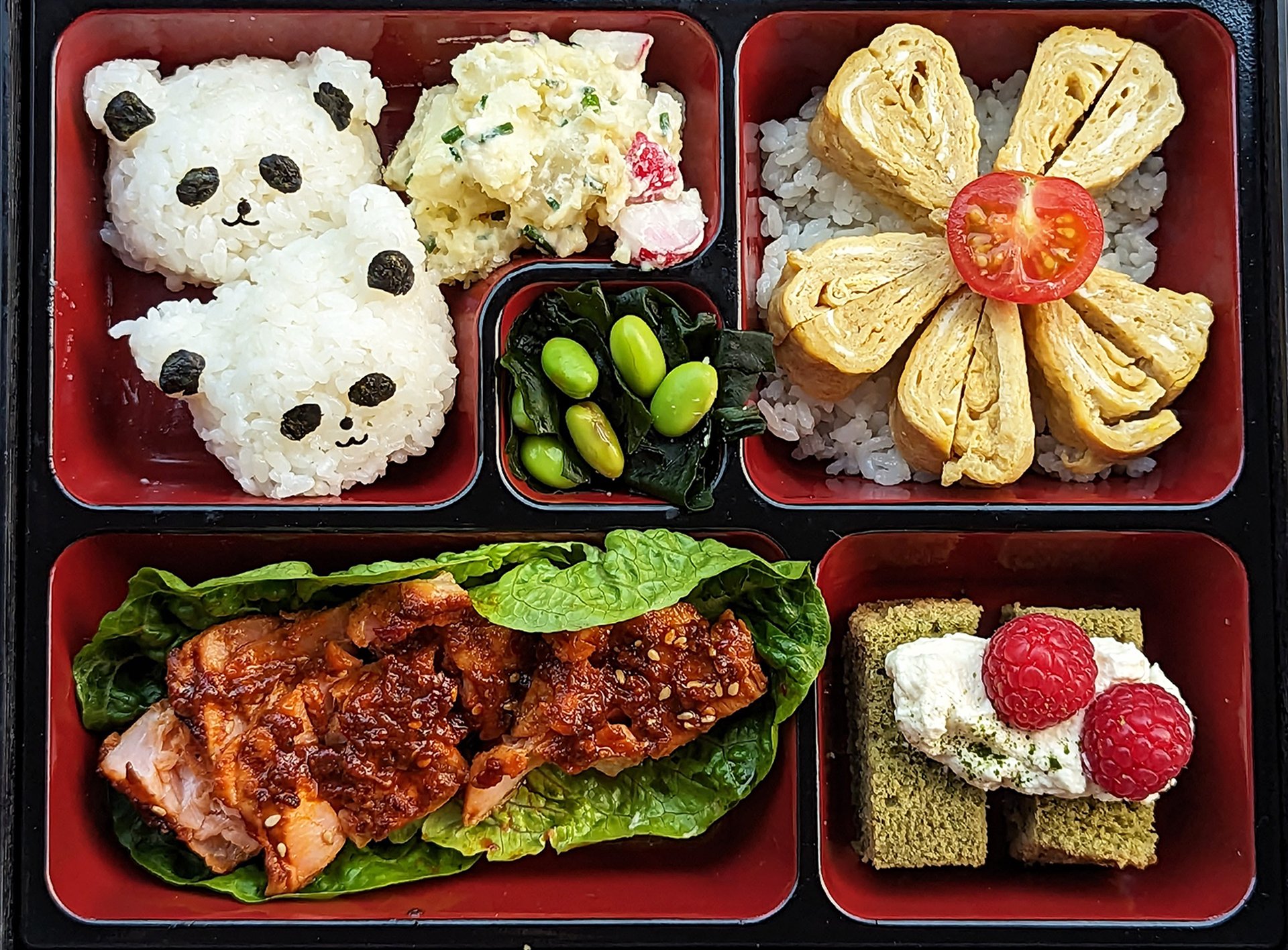
Imagine your website as a lunchbox, with sections for different types of food. That’s the basic idea behind Bento Box Design. Designers thought, “Why not use this concept for websites?” Just like the compartments in a lunchbox keep things organized, separate sections on a webpage can do the same. This can make the website easier to use and maybe even more enjoyable to look at. We could have separate areas for text, pictures, videos, and buttons.
This layout prioritizes clarity and organization, ultimately enhancing the user experience (UX).
Origin of Bento Box Design
The term “bento” originates from “bentoori,” meaning “convenient” or “something carried for one’s ease.” Its roots date back to the 11th century when warriors transported portable meals in wrapped gourds or wooden boxes. By the 15th century, lacquered wooden boxes emerged as the norm, featuring compartments to keep different foods separated and fresh.
During the Edo period (1603-1867), bento culture flourished, evolving beyond a mere lunch-packing method for work or travel. It became a delightful way to savor food during social gatherings like hanami (cherry blossom viewing) or tea ceremonies. The bento box evolved from a practical item to a symbol of culinary finesse and thoughtful presentation.
Why a Well-Designed Website Layout Matters
A website’s layout serves as the foundation of a user’s experience. Picture a well-organized store where everything is clearly labeled and easy to locate. That’s the essence of a good website layout. Users shouldn’t struggle to find information; it should be logically presented, with clear menus and headers guiding them seamlessly. This coherence prevents users from feeling disoriented and frustrated, ensuring a smooth journey through the website.
However, layout goes beyond mere information retrieval. A thoughtfully designed layout has the power to captivate users and keep them engaged. Envision a visually enticing store with captivating displays leading you through its products. Website layouts can achieve a similar effect. Strategic use of white space, balanced elements, and logical flow can transform browsing into an engaging exploration, enticing users to delve deeper into the website’s content.
Ultimately, a well-crafted layout fosters trust. A professional and orderly website layout conveys meticulous attention to detail, positively reflecting on the brand or organization. Just as a well-maintained store instills confidence in its products, a well-designed layout builds trust with users, increasing their likelihood of engaging with the website and its offerings.
Benefits of Using Bento Box Design
Bento box layouts offer several benefits for websites:
- Improved User Experience: Content is well-organized and easily accessible. Users can locate what they’re looking for by rapidly scanning the website. Users may easily navigate and stay on course with the help of clear calls to action and straightforward navigation.
- Increased Engagement: Information is organized into digestible chunks that help users stay focused and avoid being overwhelmed. To prevent boredom, there is something in various parts for everyone. The layout’s design sparks curiosity, encouraging exploration of different sections.
- Adaptable Design: This layout can be customized to work with various content types, from text and images to videos. The grid-based structure ensures the website looks good and functions well on all devices, from desktops to phones.
While the Bento Box layout offers a clear and appealing approach, it’s not without its challenges. Too many sections can make your website look messy and confuse visitors. It’s important to find a balance between showing information and keeping things visually appealing. Bento box layouts also take some planning. Designers need to figure out how many sections to use and how to arrange them so everything is easy to find and use.
Core Principles of Bento Box Design
At the core of creating Bento Box Design are the following foundational principles:
- Modular Sections: The layout is divided into distinct sections, like compartments in a bento box. Each section contains a specific content type, like text, images, videos, or calls to action. This modularity allows for flexibility and customization.
- Clear Separation: Just like the compartments in a bento box prevent food from mixing, clear separation between sections in a Bento Box Design website improves organization. Users can easily scan the page and understand where to find specific information.
- Bite-Sized Content: Bento Box Design encourages presenting information in clear, concise chunks. Think of it like bite-sized pieces of food – easy to digest and understand. This makes the website user-friendly and avoids overwhelming visitors.
Examples of Bento Box Layouts
Here are some examples of Bento Box Layouts:
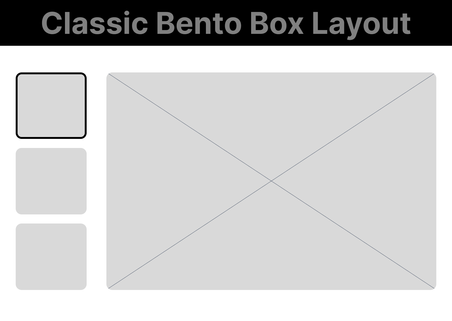
Classic Bento Box Layout
This is the most basic and common bento box layout. It features a grid-based structure with several sections of equal size. This layout is perfect for showcasing a variety of content types, such as images, text, and calls to action. A good user of this kind of website layout is Walmart.
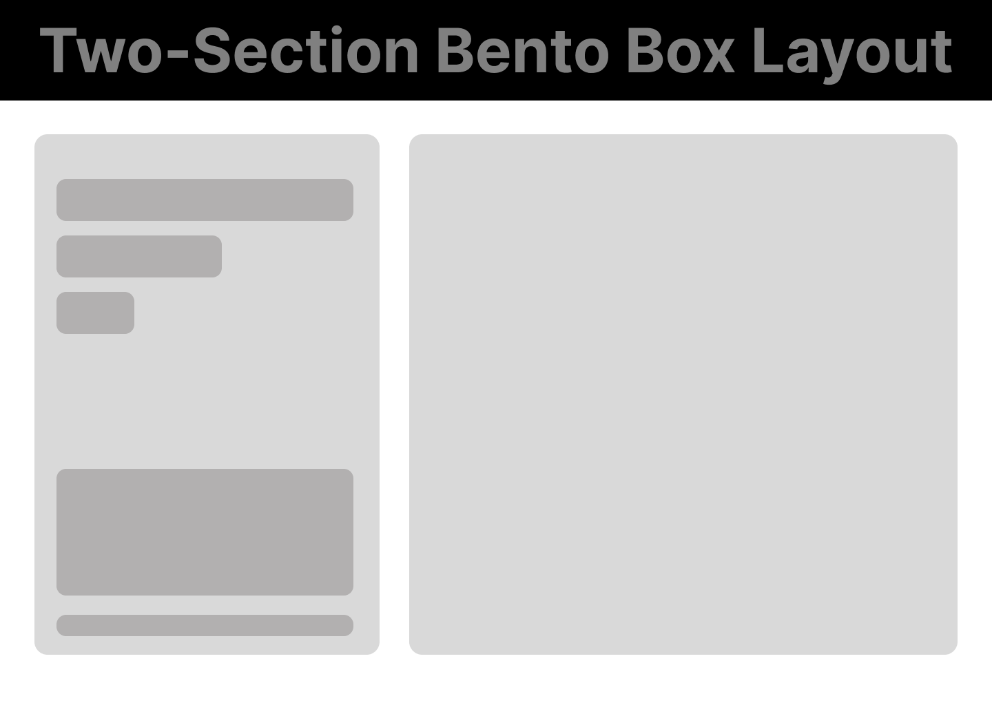
Two-Section Bento Box Layout
This layout divides the screen into two main sections. This can be used to create a strong contrast between two different pieces of information or to highlight a specific call to action. A good user of this kind of website layout is Material Design.
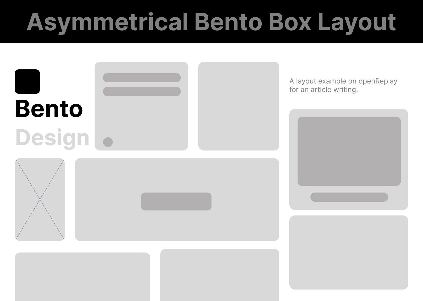
Asymmetrical Bento Box Layout
This layout breaks away from the traditional grid structure and uses sections of different sizes. This can be a great way to create a more dynamic and visually interesting website. Iconwerk exemplifies the effective utilization of this website layout style.
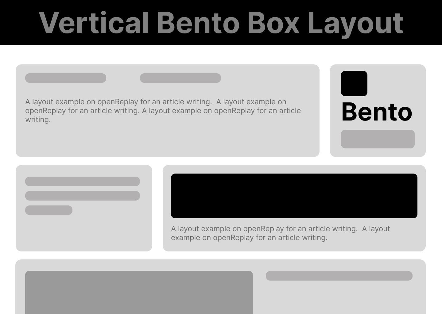
Vertical Bento Box Layout
This layout stacks the sections on top of each other, which can be a good option for websites with a lot of content. Linear showed this beautifully.
Case Studies: Bento Box Websites in Action
Let’s take a look at some real-world examples to see how Bento Box design is implemented on actual websites.
Material Design
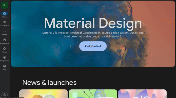
We’ll examine material design, a site dedicated to Google’s Material Design System, and analyze how it applies Bento Box principles to enhance user experience. The material design website exemplifies a successful Bento Box implementation.
Here’s how:
- Clear Information Hierarchy: The layout features a prominent hero section showcasing the latest Material Design updates. Below, neatly stacked sections house various content types – guidelines, components, and resources.
- Strategic CTAs: Calls to action like “Get Started” or “Explore Components” are strategically placed within each content section, guiding users towards their desired action.
- Effortless Navigation: A persistent navigation bar at the top provides easy access to all major sections, while clear headings within each section further enhance navigation.
How does this impact User Experience?
A well-implemented Bento Box layout can positively affect user experience. It helps users easily understand the website’s structure and find information efficiently. Clear navigation prevents confusion, and noticeable calls to action encourage user interaction.
Procreate
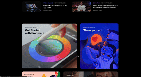
Procreate’s website has a Bento Box designed for creative minds. The first compartment, the hero section, is a large and eye-catching image showcasing the latest app update and stunning pieces of artwork created with Procreate. This grabs attention and sets the creative tone.
Lifting the lid further reveals additional compartments, each neatly organized with a clear purpose. One compartment labeled “Sketch, Paint, Create” dives into the app’s core functionalities. Another highlights “Procreate Pocket,” the iPhone version, while a third showcases “Procreate Dreams,” the animation app. This compartmentalization mimics the Bento Box approach, keeping information clear and easy to find for users.
However, the Bento Box approach isn’t a one-size-fits-all solution. Websites with a vast amount of content can overwhelm users if everything is crammed into Bento Boxes. The structured nature, while beneficial for organizations, can also feel restrictive for websites seeking a more creative or unconventional design aesthetic.
In essence, the Bento Box layout offers a powerful tool to enhance user experience, but it’s crucial to consider its limitations to ensure it aligns with the website’s overall goals and content needs.
Implementing Bento Box Design: A Practical Guide
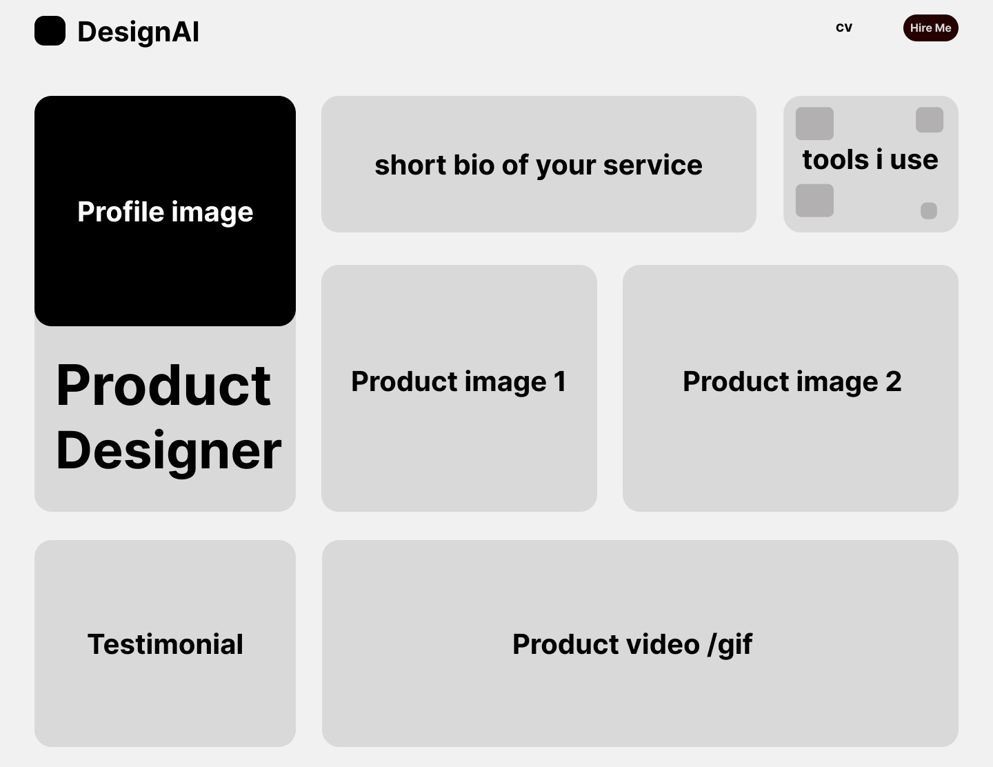
Let’s create a portfolio website using the bento box; here’s a practical guide to get you started:
Step 1: Planning & Content Structuring
Start by listing all the content your website requires. For a portfolio website, this might include:
- Headings and subtexts
- Profile image
- Project listings (work images or videos)
- Tools used for work
- Area for testimonials
Next, prioritize and organize this content into sections, considering what’s most important for users and how the sections will flow logically. Additionally, follow the Bento Box approach by breaking down longer text passages into smaller, more digestible chunks with clear headings and bullet points for a user-friendly experience.
Like this:
Step 2: Design Considerations
When designing your Bento Box website, prioritize visual appeal by incorporating high-quality images and relevant videos for each content section. Consistency in color schemes and fonts across the website maintains a cohesive appearance.
Also, ensure responsiveness by designing your website to adapt smoothly to various screen sizes, catering to users accessing your site from desktops, tablets, and smartphones. Embrace white space to prevent overcrowding and maintain readability; strategically incorporating space between sections enhances organization and improves content comprehension for users.
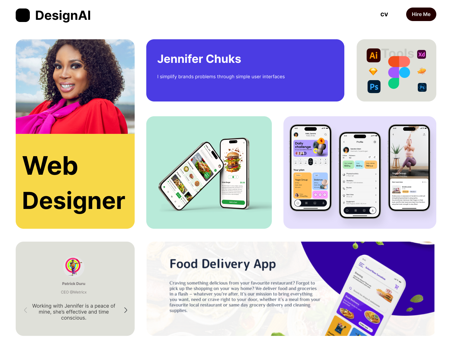
This is the result from our portfolio website demonstration after adding text, colors, images, and videos to our wireframe:
Step 3: Tools & Resources
For the tools and resources needed for your Bento Box layout. Consider wireframing tools like Figma or Adobe XD. They help you plan your layout visually before you start coding, making it easier to experiment with different arrangements.
You can also check out Content Management Systems (CMS) like WordPress or Wix. They offer user-friendly features for creating sectioned layouts. Pick one that matches your technical skills and website requirements.
You can also look online for websites using the Bento Box layout. They can inspire your own design choices and show how different industries use this layout.
Conclusion
In summary, Bento Box Design has turned out to be a winner in creating websites that are easy to use and keep visitors engaged. By understanding what it does well (organized sections, clear calls to action) and where it might not be the best fit (tons of information, unique website styles), website creators can decide if it’s the right recipe for their website’s goals. Remember, a well-designed Bento Box website is like a delicious and organized lunchbox – a satisfying experience for anyone visiting the site!
Resources
Here are some articles and tutorials for additional learning and practice.
- For Bento Box resources and tools, check here.
- For how to design and build Bento Box Grids, check here.
- Tutorial on how to create a responsive Bento Grid UI web, check here.
- Understanding The Bento Layout Trend, check here.
Truly understand users experience
See every user interaction, feel every frustration and track all hesitations with OpenReplay — the open-source digital experience platform. It can be self-hosted in minutes, giving you complete control over your customer data. . Check our GitHub repo and join the thousands of developers in our community..
