Building a Dictionary App including Audio Pronunciation
Knowing how to pronounce words correctly is a must when learning a foreign language. This article will show you how to use React to build a dictionary app that will also speak words out loud as an aid to learning.

Discover how at OpenReplay.com.
In the realm of language learning apps like dictionaries, the quest for fluency often hinges on a crucial element: impeccable audio pronunciation. Just as sculptors rely on a fine chisel, language learners depend on accurate pronunciation to improve their understanding and communication skills. This is where high-quality audio pronunciations come into play. Learners are no longer left deciphering sounds from text alone. They become immersed in the language’s symphony, attuned to the rhythm, intonation, and subtle nuances that bring words to life. This fosters accuracy, boosts confidence, and transforms the struggle to grasp spoken language into a joyful dance of comprehension.
In this project, we will build an interactive dictionary app using React. Unlike traditional dictionary apps, the focus will extend beyond text-based definitions and include audio pronunciation of the words.
Project Setup
We will create a new React project using the create-react-app. This tool offers a streamlined process for initializing React applications with all the essential configurations already in place. Here’s how we can proceed:
- Install Node.js and npm
Before creating our React project, ensure that Node.js and npm (Node Package Manager) are installed on your system. You can download and install them from the official Node.js website.
- Create a new React project
Open your terminal or command prompt. Navigate to the directory where you want to create your React project. Run the following command to create a new React project using create-react-app.
npx create-react-app interactive-dictionary-appReplace interactive-dictionary-app with your preferred project name. This command will initialize a new React project with the specified name in a directory.
- Navigate to the project After the project is created, navigate to the newly created directory
cd interactive-dictionary-app- Install Tailwind Tailwind will be used for the styling, so ensure you have it installed. To do that, run this command.
npm install -D tailwindcss
npx tailwindcss init
There are a few setups to ensure tailwind works on the project. Visit the Docs to understand better.
- Start the development server
After navigating to your project directory, Start the development server.
npm start- Verify the project structure
Once inside the project directory, you’ll find the following folders.
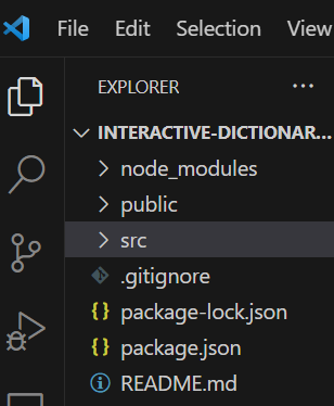
Project Structure
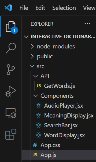
The project structure consists of several components and modules responsible for the app’s functionality. Here’s an overview of the main components:
-
API module (
GetWords.js): This module fetches word definitions and audio pronunciations from an external API. Here is the link to the API -
AudioPlayercomponent: Responsible for rendering an audio player interface to play word pronunciations. -
MeaningDisplaycomponent: Displays the meanings, parts of speech, definitions, examples, and synonyms of a word. -
SearchBarcomponent: Provides a search bar interface for users to input their search queries. -
WordDisplaycomponent: Renders the word itself, its phonetic transcription, and pronunciation audio player. -
App component: The main component responsible for orchestrating the interactions between the other components and managing the application state.
Now, let’s explore each component and module in detail, examining their functionality and how they interact.
API module (GetWords.js)
This component is responsible for fetching data from an external API. Let’s examine its implementation details, and its interactions with the rest of the application will be covered later in the article.
export async function fetch_words(word) {
  const dictionaryApi = `https://api.dictionaryapi.dev/api/v2/entries/en/${word}`;
  try {
    // Fetch data from the API
    const response = await fetch(dictionaryApi);
    // Parse the JSON response
    const data = await response.json();
    // Return the fetched data
    return data;
  } catch (error) {
    // Handle errors
    console.error("Error fetching data:", error);
  }
}
We define an asynchronous function named fetch_words. This function takes a single parameter named word, which represents the word entered by the user. Inside the function, we construct the API URL dynamically. We achieve this by leveraging template literals to insert the user-entered word into the dictionaryApi variable, which holds the base URL for the API. This combination creates the complete API endpoint specific to the user’s input. Following the URL construction, we utilize the fetch function to make a GET request to the constructed API endpoint. This request retrieves the data associated with the user-entered word from the external dictionary API. We then parse the JSON response using response.json() and return the fetched data.
If there are any errors during the fetching process, we catch them and log them to the console. This API module serves as the foundation for retrieving words, definitions, and audio pronunciations, which will be used by other components in our application.
App component
The App component serves as the main entry point for our React application. It imports several components used in the application and a function for fetching data from an external API.
import React, { useState } from "react";
import Search from "./Components/SearchBar";
import Meaning from "./Components/MeaningDisplay";
import { fetch_words } from "./API/GetWords";
import Word from "./Components/WordDisplay";

function App() {
  const [data, setData] = useState({});
  const [loading, setLoading] = useState(false);
  const [searchInitiated, setSearchInitiated] = useState(false);
  async function fetch_data(word) {
    try {
      setLoading(true);
      setSearchInitiated(true);
      const get_data = await fetch_words(word);
      setData({ ...get_data[0] });
      setLoading(false);
    } catch (error) {
      console.log(error);
    }
  }
  return (
    <div className="m-16">
      <Search callback={fetch_data} />
      {loading ? (
        <p className="mt-18 font-bold text-2xl">Loading...</p>
      ) : (
        <>
          {searchInitiated && Object.keys(data).length === 0 ? (
            <p className="mt-18 font-bold text-2xl">No Words Found</p>
          ) : (
            <>
              <Word data={data} />
              <Meaning data={data} />
            </>
          )}
        </>
      )}
    </div>
  );
}
export default App;
Let’s break down its structure and functionality.
import React, { useState } from "react";
import Search from "./Components/SearchBar";
import Meaning from "./Components/MeaningDisplay";
import { fetch_words } from "./API/GetWords";
import Word from "./Components/WordDisplay";
We import the necessary React hooks and components from their respective files. This includes the SearchBar, MeaningDisplay, and WordDisplay components, as well as the fetch_words function from the GetWords API module.
function App() {}
export default App;
Next, the App component is defined as a functional component named App and exported using the export default App.
const [data, setData] = useState({});
const [loading, setLoading] = useState(false);
const [searchInitiated, setSearchInitiated] = useState(false);
Here, we defined different states to manage the application state.
data: Stores the data fetched from the API.
loading: Tracks whether data is currently being fetched.
searchInitiated: Tracks whether a search query has been initiated.
async function fetch_data(word) {
  try {
    setLoading(true);
    setSearchInitiated(true);
    const get_data = await fetch_words(word);
    setData({ ...get_data[0] });
    setLoading(false);
  } catch (error) {
    console.log(error);
  }
}
We define an asynchronous function named fetch_data that takes a word parameter. On search, we set the loading and searchInitiated state variables to true to indicate that data fetching has started.
We use the fetch_words function to fetch data from the API based on the provided word parameter. Once the data is fetched successfully, we update the data state variable with the fetched data. If an error occurs during the fetch process, we catch the error and log it to the console.
return (
  <div className="m-16">
    <Search callback={fetch_data} />
    {loading ? (
      <p className="mt-18 font-bold text-2xl">Loading...</p>
    ) : (
      <>
        {searchInitiated && Object.keys(data).length === 0 ? (
          <p className="mt-18 font-bold text-2xl">No Words Found</p>
        ) : (
          <>
            <Word data={data} />
            <Meaning data={data} />
          </>
        )}
      </>
    )}
  </div>
);- We return Javascript, which represents the user interface of the component.
- We render the
SearchBarcomponent and pass thefetch_datafunction as a callback prop. - We conditionally render different elements based on the current state:
If loading is true, we display a loading message.
If searchInitiated is true and no data has been fetched, we display a message indicating that no words were found.
If data has been fetched successfully, we render the WordDisplay and MeaningDisplay components, passing the fetched data as prop which we will still use in the children component.
Search component
The Search component provides a user interface for entering words to search for their definitions and pronunciations.
import React, { useState } from "react";
import { AiOutlineSearch } from "react-icons/ai";
import { LiaTimesSolid } from "react-icons/lia";

function Search({ callback }) {
  const [word, setWord] = useState("");
  const [icon, setIcon] = useState("search");

  function handleKeyDown(e) {
    if (e.key === "Enter" && word) {
      callback(word);
      setIcon("cancel");
    }
  }
  function handleIconClick() {
    if (icon === "cancel") {
      setWord("");
      setIcon("search");
    }
    if (icon === "search" && word) {
      callback(word);
    }
  }
  function handleChange(e) {
    setWord(e.target.value);
  }
  return (
    <div className="relative mb-4 mt-5 ml-1 sm:ml-0">
      <input
        onKeyDown={handleKeyDown}
        onChange={handleChange}
        value={word}
        placeholder="Search a word"
        className="border-solid focus:outline-none border-5 rounded-lg w-full bg-slate-100 text-slate-950 px-2 p-2 placeholder-slate-950 font-bold"
      />
      <button
        className="absolute top-2.5 right-3 translate-y-1 cursor-pointer text-violet-600"
        onClick={handleIconClick}>
        {icon === "search" ? <AiOutlineSearch /> : <LiaTimesSolid />}
      </button>
    </div>
  );
}
export default Search;
Let’s walk through the code above:
import React, { useState } from "react";
import { AiOutlineSearch } from "react-icons/ai";
import { LiaTimesSolid } from "react-icons/lia";
We started by importing useState from React and two icons for the search and cancel buttons from the React icons library.
To make the react icons work in your code, you have to install react icons on your terminal using the following command.
npm install react-iconsNext is defining a functional component.
function Search({ callback }) {}
export default Search;
A functional component named Search is defined. The callback prop is a function passed from the parent component, the App Component. We can directly access the callback prop within the component. The callback function is responsible for handling the user input, typically by making an API request to fetch data based on the entered word. The export default Search makes it visible to other modules.
const [word, setWord] = useState("");
const [icon, setIcon] = useState("search");
We use the useState hook to declare two state variables, word and icon, and their corresponding setter functions, setWord and setIcon. useState("") initializes the word state variable with an empty string, and useState("search") initializes the icon state variable with the value “search”.
function handleKeyDown(e) {
  if (e.key === "Enter" && word) {
    callback(word);
    setIcon("cancel");
  }
}
We define a function handleKeyDown that takes an event parameter e representing a key press event. This function is called when a key is pressed within the input field. The condition e.key === "Enter" && word checks if the Enter key is pressed and if the word state variable is not empty. If both conditions are met, we call the callback function passed as a prop with the current value of the word state variable. We also set the icon state variable to “cancel” to change the icon displayed in the search button. Recall that the callback function is from the parent component, the App. The callback, refers to the fetch_data function, which handles the logic.
function handleIconClick() {
  if (icon === "cancel") {
    setWord("");
    setIcon("search");
  }
  if (icon === "search" && word) {
    callback(word);
  }
}
The handleIconClick function here toggles the search icon between “search” and “cancel” when clicked. If the current icon state is “cancel”, it resets the word state to an empty string and changes the icon state back to “search”. If the icon state variable is set to “search” and the word state variable is not empty, we call the callback function with the current value of the word state variable.
function handleChange(e) {
  setWord(e.target.value);
}
We define a function handleChange that updates the word state variable whenever there is a change in the input field. The e.target.value represents the current value of the input field.
return (
  <div className="relative mb-4 mt-5 ml-1 sm:ml-0">
    <input
      onKeyDown={handleKeyDown}
      onChange={handleChange}
      value={word}
      placeholder="Search a word"
      className="border-solid focus:outline-none border-5 rounded-lg w-full bg-slate-100 text-slate-950 px-2 p-2 placeholder-slate-950 font-bold"
    />
    <button
      className="absolute top-2.5 right-3 translate-y-1 cursor-pointer text-violet-600"
      onClick={handleIconClick}>
      {icon === "search" ? <AiOutlineSearch /> : <LiaTimesSolid />}
    </button>
  </div>
);
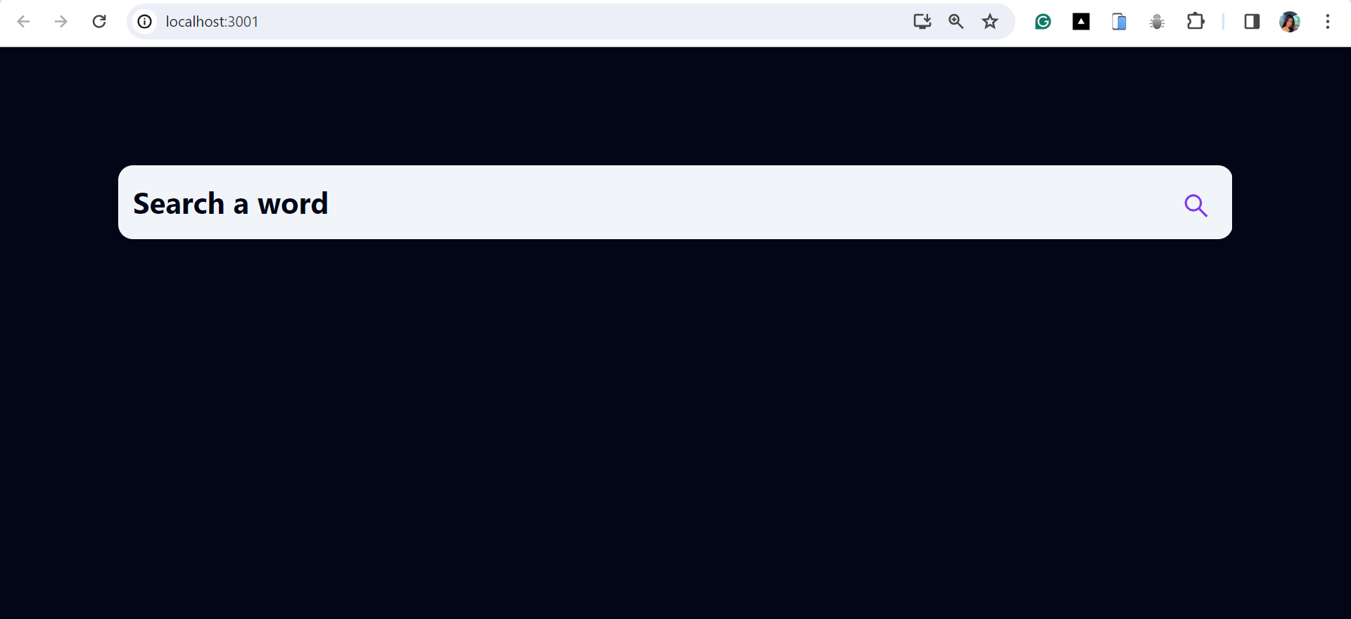
Finally, we return the javascript code that represents the UI of the Search component. This includes an input field for entering search queries and a button for initiating or canceling the search operation. The onKeyDown, onChange, and onClick event handlers are attached to the respective elements to handle user interactions.
We should have a search input that looks like this, which handles our search queries.
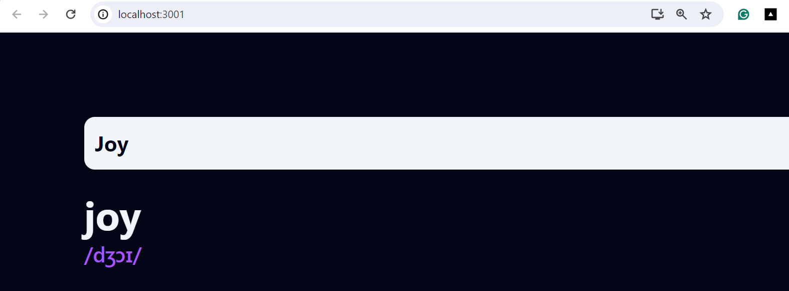
WordDisplay component
The WordDisplay component renders the word along with its phonetic pronunciation, if available. It uses state and effect hooks to dynamically manage and update the phonetic information.
import React, { useEffect, useState } from "react";
import AudioPlayer from "./AudioPlayer";

function Word({ data }) {
  const [phonetic, setPhonetic] = useState({});
  useEffect(() => {
    if (data.meanings) {
      const filteredPhonetics = data.phonetics.filter(
        (phonetic) => phonetic.audio !== ""
      );
      setPhonetic({ ...filteredPhonetics[0] });
    }
  }, [data]);
  return (
    <div className="mb-4 flex justify-between">
      {data.meanings && (
        <>
          <div>
            <div>
              <h2
                className="font-bold text-3xl text-slate-100
            ">
                {" "}
                {data.word}
              </h2>
            </div>
            <div>
              <p className=" text-purple-500 font-medium">
                {phonetic.text ? phonetic.text : data.phonetic}
              </p>
            </div>
          </div>
          {phonetic.audio && (
            <div>
              <AudioPlayer audioFile={phonetic.audio} />
            </div>
          )}
        </>
      )}
    </div>
  );
}
export default Word;
Let’s break down the code and understand how they work and what they do.
import React, { useEffect, useState } from "react";
import AudioPlayer from "./AudioPlayer";
We start by importing the necessary react hooks that will be needed, which are useState and useEffect. The AudioPlayer component will also be used here.
function Word({ data }) {}
export default Word;
This line declares a functional component named Word. The component accepts a single prop named data, which contains information about the word to be displayed. The line export default Word makes it visible to other modules.
const [phonetic, setPhonetic] = useState({});This line declares a state variable named phonetic using the useState hook. The state will hold the phonetic pronunciation for the word.
useEffect(() => {
  if (data.meanings) {
    const filteredPhonetics = data.phonetics.filter(
      (phonetic) => phonetic.audio !== ""
    );
    setPhonetic({ ...filteredPhonetics[0] });
  }
}, [data]);
This useEffect hook is used to perform side effects in the component. It runs after every render and accepts a function as its first argument. In this case, the effect is triggered whenever the data prop changes. Inside the function, we check if meanings are available in the data, filter out phonetics with audio files, and set the first filtered phonetic as the state.
return (
  <div className="mb-4 flex justify-between">
    {data.meanings && <>(/* Content */)</>}
  </div>
);
This code checks if the meanings property exists in the data object before rendering its contents. If data.meanings is truthy, the content inside the bracket is rendered.
  <div>
    <h2 className="font-bold text-3xl text-slate-100 ">{data.word}</h2>
  </div>
  <div>
    <p className="text-purple-500 font-medium">
      {phonetic.text ? phonetic.text : data.phonetic}
    </p>
  </div>
For the content, the word and its phonetic pronunciation are rendered. If phonetic text is available, it’s displayed; otherwise, we want to use the default phonetic text directly from the data.
{
  phonetic.audio && (
    <div>
      <AudioPlayer audioFile={phonetic.audio} />
    </div>
  );
}
This part checks if an audio file is available for pronunciation. If phonetic.audio is true, an AudioPlayer component is rendered with the audio file passed as a prop.
This is how the word and its phonetic transcription will be rendered.
AudioPlayer component
The AudioPlayer component provides a simple interface for playing audio files. It consists of a button. When clicked, it initiates playback of the specified audio file. The component encapsulates the logic for audio playback and can be easily reused in the application.
import React from "react";
import { BsFillPlayFill } from "react-icons/bs";

function AudioPlayer({ audioFile }) {
  const playMusic = () => {
    const audio = new Audio(audioFile);
    audio.play();
  };
  return (
    <>
      <button
        onClick={playMusic}
        className="bg-purple-200 rounded-full w-14 h-14 flex justify-center items-center mt-2">
        <BsFillPlayFill className="  text-purple-500 w-7 h-7" />
      </button>
    </>
  );
}

export default AudioPlayer;
Let’s look at the logic in this component and how the codes work.
import React from "react";
import { BsFillPlayFill } from "react-icons/bs";
So, First, we want to import React and an icon that will be used as the play button icon.
function AudioPlayer({ audioFile }) {}
export default AudioPlayer;
Then, we have our functional component for playing the phonetic audio. The component accepts a single prop named audioFile, which is the URL of the audio file to be played. Remember, this prop comes from the parent, which is the WordDisplay component.
const playMusic = () => {
  const audio = new Audio(audioFile);
  audio.play();
};
This code defines a function named playMusic that creates a new Audio object with the provided audio file URL and calls the play method to start playback.
return (
  <>
    <button
      onClick={playMusic}
      className="bg-purple-200 rounded-full w-14 h-14 flex justify-center items-center mt-2">
      <BsFillPlayFill className="  text-purple-500 w-7 h-7" />
    </button>
  </>
);
This code renders a button element that triggers the playMusic function when clicked. Inside the button, the BsFillPlayFill icon from the react-icons library represents the play icon.
The audio button should be rendered this way whenever an audio file is available in the dictionary API.

MeaningDisplay component
The MeaningDisplay component renders a word’s meanings along with its part of speech, definitions, examples, synonyms, and source URLs. It dynamically generates these based on the data provided via prop in the parent component in the App.js.
import React from "react";

function Meaning({ data }) {
  console.log("Received data in meaning component:", data);
  return (
    <div>
      {data.meanings && (
        <>
          {data.meanings.map((meaning, index) => (
            <>
              <div key={index}>
                <div className="flex items-center">
                  <h2 className="mb-3 font-bold">{meaning.partOfSpeech} </h2>
                  <p className="border-b border-gray-400 grow ml-2"></p>
                </div>
                <p className=" mb-3 text-slate-400">Meaning</p>
                {meaning.definitions.map((definition) => (
                  <>
                    <h2 className=" mb-2 mx-4">{definition.definition} </h2>
                    {definition.example && (
                      <h2 className="mx-4  text-slate-400">
                        {definition.example}
                      </h2>
                    )}
                  </>
                ))}
              </div>
              {meaning.synonyms.length > 0 && (
                <div className="relative mb-4 ">
                  <p
                    className=" text-slate-400
              ">
                    Synonyms
                  </p>
                  <div>
                    <h2 className="absolute bottom-0 left-20 text-purple-700 font-medium ">
                      {meaning.synonyms[0]}
                    </h2>
                  </div>
                </div>
              )}
            </>
          ))}
          <div className="relative mt-4">
            <p className="border-b border-gray-400 mb-3"></p>
            <p className=" text-slate-400 font-thin">Source</p>
            <div>
              <p className="absolute bottom-0 left-16 ">{data.sourceUrls[0]}</p>
            </div>
          </div>
        </>
      )}
    </div>
  );
}

export default Meaning;
This is an overview of the MeaningDisplay component. Let’s look at how it works.
function Meaning({ data }) {}
export default Meaning;
A functional component named Meaning is declared. The component accepts a single prop named data, which contains information about the whole content of the Dictionary API.
return <div>{data.meanings && <>/* Contents */</>}</div>;This code checks if the meanings property exists in the data object before rendering its contents.
{
  data.meanings.map((meaning, index) => <div key={index}></div>);
}
Then, we map over the array of meanings in the data prop and render each meaning. Each meaning is wrapped in a <div> element with a unique key based on its index.
<h2 className="mb-3 font-bold">{meaning.partOfSpeech}</h2>Here, part of speech (e.g., noun, verb) of the word’s meaning is displayed. The part of speech is gotten from the meaning object in the current iteration.
{
  meaning.definitions.map((definition) => (
    <div key={definition.definition}>
      <h2 className="mb-2 mx-4">{definition.definition}</h2>
      {definition.example && (
        <h2 className="mx-4 text-slate-400">{definition.example}</h2>
      )}
    </div>
  ));
}
This code maps over the array of definitions for each meaning and renders them. Each definition is displayed along with an optional example, if available.
{
  meaning.synonyms.length > 0 && (
    <div className="relative mb-4">
      <p className="text-slate-400">Synonyms</p>
      <div>
        <h2 className="absolute bottom-0 left-20 text-purple-700 font-medium">
          {meaning.synonyms[0]}
        </h2>
      </div>
    </div>
  );
}
This part checks if there are any synonyms available for the current meaning. If synonyms exist, the first synonym is displayed.
<p className="absolute bottom-0 left-16">{data.sourceUrls[0]}</p>This line displays the dictionary entry’s source URL. It assumes that the source URL is available as the first item in the sourceUrls array within the data prop.
Voila! We’ve brought our vision to life, crafting an interactive dictionary equipped with audio pronunciation. This user-friendly tool empowers exploration and learning, empowering users to confidently navigate the fascinating world of languages. The link to the GitHub Repo is here.
Conclusion
The Dictionary app leverages an API integration to provide users with comprehensive word definitions, synonyms, parts of speech, phonetics, and pronunciation. Through state management in React, we ensure smooth communication between components, enabling seamless updates and interactions. User interaction and input handling are prioritized, with a user-friendly search feature facilitating easy word lookup.
Overall, the application offers key features such as real-time word search, dynamic definition display, and audio pronunciation playback. You can explore further customization options, such as implementing dark mode/light mode themes, different styling, font selector features, and more.
Understand every bug
Uncover frustrations, understand bugs and fix slowdowns like never before with OpenReplay — the open-source session replay tool for developers. Self-host it in minutes, and have complete control over your customer data. Check our GitHub repo and join the thousands of developers in our community.

