Building Your Own Blog with Nuxt Content and Tailwind

Hey there, and welcome to this tutorial. This will be an in-depth guide on creating your own personal blog using Nuxt, a meta-framework built on top of VueJS. Nuxt is designed for developer productivity, and includes lots of great features out of the box to help us create awesome websites. We’re also gonna be using TailwindCSS to style our blog and make it look 🔥
What we’ll be building
We’re gonna be building a static blog website with NuxtJS and TailwindCSS. We’re gonna use the Nuxt Content module to allow us to easily write and display blog posts using Markdown. By using Nuxt Content, we can supercharge our posts by including HTML or even Vue components inside the markdown files, providing us a seamless and flexible authoring experience to create awesome content - without needing a Content Management System (CMS).
We’re gonna add tags and images to our posts and present them in a nice grid on our homepage. Additionally, we’ll add a Table of Content to each individual blog post so users can easily navigate our content. And using the Tailwind Typography plugin, we’ll style our blog posts nicely including syntax highlighting for code snippets. Finally, we’ll make sure our blog posts has the proper meta information so Google and social platforms can index our content.
This is what the homepage of our blog will look like:
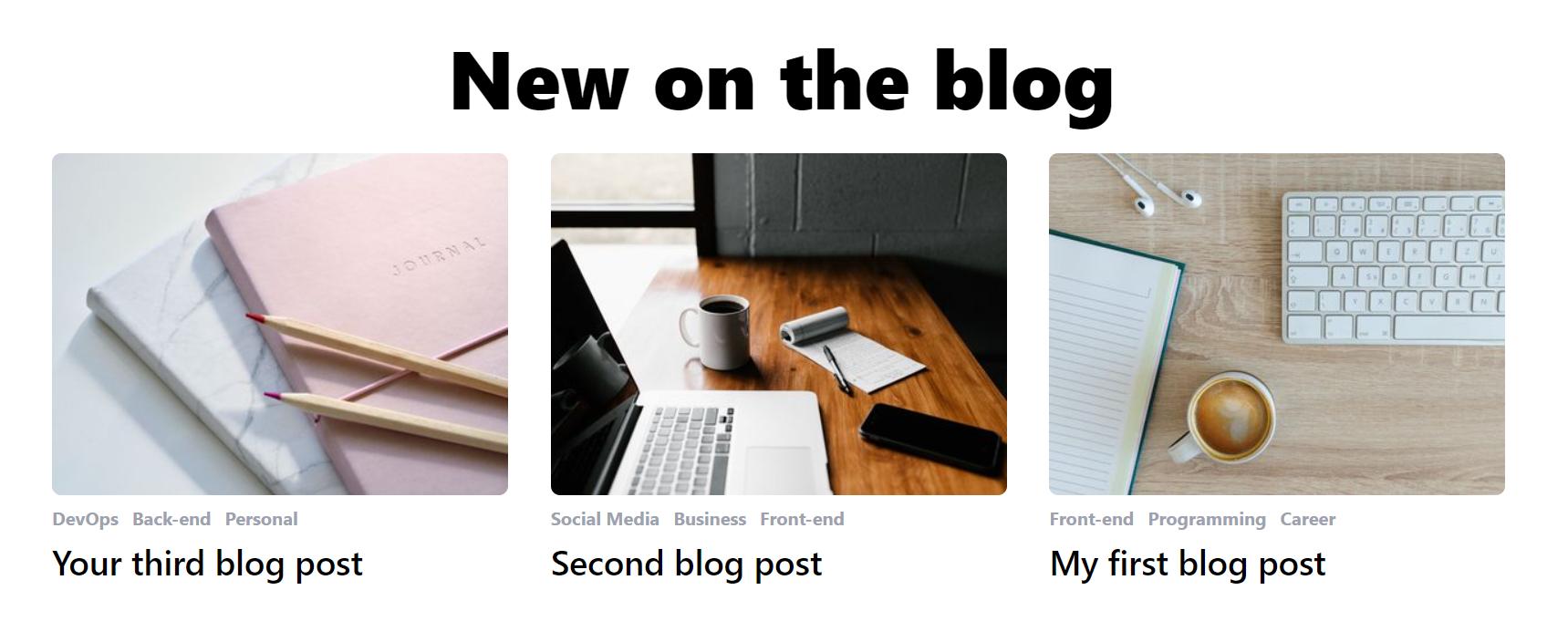
And then our blog posts will show their image, tags, ToC and content like so:

Let’s get started!
Setup with create-nuxt-app
To setup the project, make sure you have NodeJS installed on your machine, as well as access to a terminal (any terminal will do). You’ll also need either Yarn or npm (comes with NodeJS)
Start by running:
npx create-nuxt-app nuxt-content-blogThis will ask you a bunch of questions to help you setup the project. Feel free to pick any options you like, but for simplicity, this is what I went with:
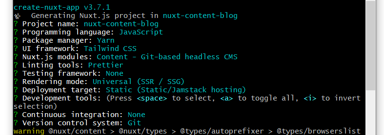
The key thing is that you add the “Content - Git-based headless CMS” module, as that’s the module that will be driving our blog. You can also pick another styling framework if you prefer, but I’m gonna use Tailwind CSS as it provides awesome results and a really nice workflow. It’ll also be helpful when we get to styling our blog post content.
When it’s done, you can cd into the project. Open it with your favourite editor (I use VS Code) and run yarn dev (or npm run dev). Open your browser and head to localhost:3000 to get greeted by the Nuxt welcome screen:

Now go back to your editor, where Nuxt has set up some files and folders for us to use:
- The
pagesfolder will include any routes/pages in your application (more on that later). - The
componentsis what we will use to store our smaller components that pages can use. - The
staticfolder is where we’ll be putting all the images needed for our blog posts. - The
contentfolder is because we’re specifically using the Nuxt Content module, and we’ll use it to contain all our individual blog posts. Nuxt has even made an examplehello.mdfile we can get started with.
Last piece of the setup, if this is your first time working with Vue, you’ll also want to install the Vetur extension in VsCode. Just search for it in the Extensions Panel and install it, as it’ll give you a bunch of awesome features and quality of life improvements when writing Vue code.
Creating and displaying blog posts with Nuxt Content
Now we’re ready to start building! Let’s start by adding a few more posts. We’ll use something called frontmatter (which comes automatically with Nuxt Content) to describe some basic data about each of our posts. If you open up hello.md, the frontmatter is the information between the dashes at the top:
---
title: Getting started
description: 'Empower your NuxtJS application with @nuxt/content module: write in a content/ directory and fetch your Markdown, JSON, YAML and CSV files through a MongoDB like API, acting as a Git-based Headless CMS.'
---
We’re gonna be adding some fields to our frontmatter, so rename hello.md to first-post.md and make it look like the following:
---
title: My first blog post
image: first-post.jpg
tags:
  - Front-end
  - Programming
  - Career
---
Now, copy paste this post in the same directory to create a couple more. Update their filename, title, image path and tags to something else to make them unique:
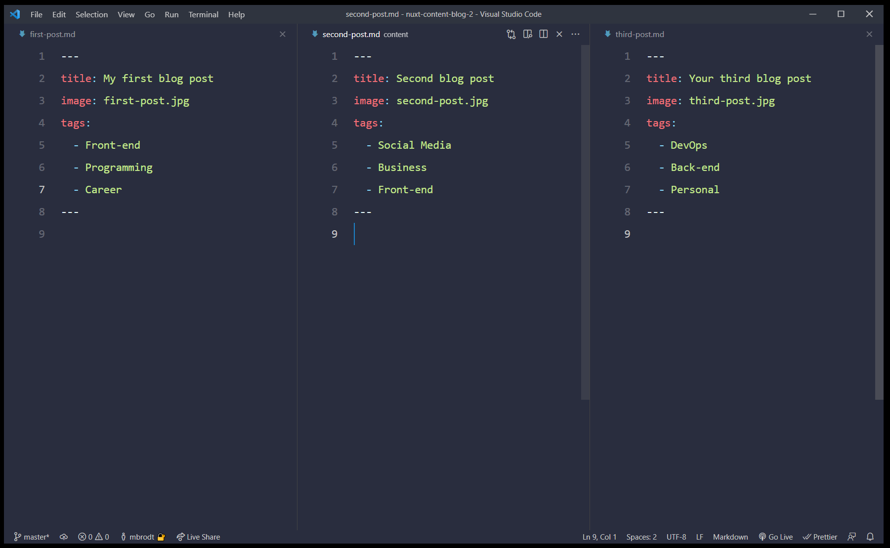
The image key refers to an image path, and can be any URL on the web. In this case, I’ve added 3 random images from Unsplash in my static folder. These images will then be available at localhost:3000/first-post.jpg for example. Just make sure the name of the file matches the path provided exactly, and that the images are inside the static folder.
Display post info on homepage
Next up, we’re gonna show links to our posts on the homepage, which we’ll do in the index.vue file. We’re gonna use an built-in Nuxt function called asyncData to fetch the post data and make them available to our homepage.
We’ll add this function to our <script> tag:
export default {
  async asyncData({ $content }) {
    const posts = await $content()
      .only(['title', 'image', 'tags', 'slug'])
      .sortBy('createdAt', 'desc')
      .fetch()

    console.log("posts", posts)

    return {
      posts,
    }
  },
}
Here we’re using the $content feature from Nuxt to load in some post data (the title, image, tags and slug of each post). We then sort them in descending order (newest first), and call fetch() to execute the function. Finally we’re returning posts, which exposes the post data to our template as an array of posts. Check the console to see all the data we just grabbed:
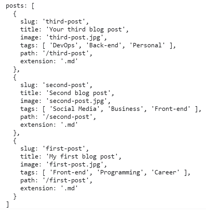
Let’s update our template to show the title of each post (still in index.vue):
<template>
  <div>
    <h1 class="text-7xl font-black text-center">New on the blog</h1>
    <div v-for="post in posts" :key="post.title">
      <h2 class="mt-2 text-3xl font-semibold">{{ post.title }}</h2>
    </div>
  </div>
</template>
If all went well, you should see your 3 post titles on the screen - and remember that this title is coming directly from the frontmatter of each individual post, so feel free to update the titles to something else. We’re also fetching the slug, image and tags as we’ll need those in a bit.
Creating post routes
Of course we want each post to have it’s own page to display the body content, tags, image etc. We’ll do that by creating a dynamic route in Nuxt.
Inside your pages folder, create a new folder called blog. Then, create a single file called _slug.vue inside the blog folder. This will be our dynamic route that will display an individual post. Add the following code:
<template>
  <h1>{{ post.title }}</h1>
</template>

<script>
export default {
  async asyncData({ $content, params }) {
    const post = await $content(params.slug).fetch()
    return { post }
  },
}
</script>
Now what’s going on here? Because we named the file _slug.vue and put it inside a blog folder, Nuxt will render this page component whenever it hits a URL at /blog/something. And when it does, the params object in asyncData will have access to the slug (the part of the URL after blog/, in this case “something”). We then use that slug to fetch a single post using the $content feature again. By returning post, we expose this data to the template, just like we did on the homepage when fetching all the posts.
To verify that it works, visit localhost:3000/blog/first-post and you should see the post title “My first blog post” on the screen. Because first-post is the slug, that slug gets matched up with our markdown file first-post.md.
Creating proper post previews
Now that we know our blog post routes are working, let’s go back to index.vue and make our post previews more appealing and actually link them to the individual posts. Let’s update the post loop to use a new PostPreview component that we’ll create in a second, and pass each post object to this component. We’ll also wrap the loop in a list with some grid classes to make them align nicely. With these changes, our template in index.vue should look like this:
<template>
  <div>
    <h1 class="text-7xl font-black text-center">New on the blog</h1>
    <ul class="grid grid-cols-3 gap-8 mt-8">
      <PostPreview v-for="post in posts" :key="post.slug" :post="post"></PostPreview>
    </ul>
  </div>
</template>
Let’s then create the PostPreview.vue component inside the components folder. This component will accept a post object as a prop, and then display the post image and title, and act as a link to the post itself. We’ll even use another cool new Nuxt feature to get optimized images called Nuxt Image.
Paste the following in your PostPreview.vue file:
<template>
  <li class="transition-all duration-500 ease-in-out">
    <a :href="`/blog/${post.slug}`">
      <nuxt-img
        class="rounded-lg"
        :src="post.image"
        preset="preview"
        width="400"
        height="300"
      />
      <ul v-if="post.tags" class="flex space-x-3 mt-2">
        <li class="text-gray-400 font-bold" v-for="tag in post.tags" :key="tag">
          {{ tag }}
        </li>
      </ul>
      <h2 class="mt-2 text-3xl font-semibold">{{ post.title }}</h2>
    </a>
  </li>
</template>

<script>
export default {
  props: {
    post: Object,
  }
}
</script>
Now when you look at the homepage, you’ll see the title of each post along with its tags. But now they work as links so you can click each one and go to that post’s page.
To get the images working, we’ll need to install the @nuxt/image module. Do that by running:
yarn add @nuxt/image
Then, head into your nuxt.config.js and add it to your buildModules array (alongside the Tailwind module that was automatically installed in setup):
buildModules: [
    '@nuxtjs/tailwindcss',
    '@nuxt/image'
],
Finally, add the following to nuxt.config.js as well. This will tell @nuxt/image to optimize for different screen sizes and add a preset we’ll use in our PostPreview:
image: {
screens: {
  xs: 320,
  sm: 640,
  md: 768,
  lg: 1024,
  xl: 1280,
  xxl: 1536,
  '2xl': 1536,
},
presets: {
  preview: {
    modifiers: {
      fit: 'cover',
      format: 'jpg',
      width: 400,
      height: 300,
    },
  },
},
}
Reload the homepage, and you should now see our images show up:

Adding a layout
Great! But the page itself could use some max width to make it look better. There’s many ways we could do this, but let’s use another Nuxt feature: Layouts.
Create a new folder in the root of your project called layouts. Inside that, create a file called default.vue and paste the following in there:
<template>
  <div class="min-h-screen w-screen pt-24">
    <div class="max-w-7xl mx-auto">
      <Nuxt />
    </div>
  </div>
</template>

<script>
export default {}
</script>
Now all our pages will follow this layout and won’t span the entire page. The <Nuxt /> component is a special component that will render the content of the page we’re currently on (either the homepage or a blog page in our case). With this new layout, our homepage looks a bit tighter:

Displaying post content
Now that we got a nice looking homepage, let’s move on to the actual blog posts in our _slug.vue file. There’s gonna be a lot going on here, so start by setting your template up like this, and we’ll break it down bit by bit:
<template>
  <article class="grid grid-cols-12 pb-24">
    <nuxt-img
      class="rounded-lg col-start-3 col-span-8 w-full"
      :src="post.image"
      width="768"
      height="509"
    />

    <div class="w-full col-start-1 col-span-12 grid grid-cols-12">
      <nav class="mt-8 col-span-2 shadow-2xl rounded-lg p-4 self-start">
        <ul class="space-y-2">
          <li v-for="link of post.toc" :key="link.id">
            <NuxtLink
              class="uppercase tracking-wider text-gray-500 hover:underline"
              :to="`#${link.id}`"
              >{{ link.text }}</NuxtLink>
            >
          </li>
        </ul>
      </nav>
      <div class="col-start-4 col-span-6 w-full">
        <div>
          <NuxtLink to="/" href="/" class="block text-gray-400 mt-8">← Go Back</NuxtLink>
          <ul v-if="post.tags" class="flex space-x-3 mt-2">
            <li
              class="text-gray-400 font-bold"
              v-for="tag in post.tags"
              :key="tag"
            >
              {{ tag }}
            </li>
          </ul>
          <h1 class="text-5xl font-black mt-2">{{ post.title }}</h1>
        </div>
        <nuxt-content class="mt-4 prose max-w-none" :document="post" />
      </div>
    </div>
  </article>
</template>
Firstly, we’re including the post image on top of the page to catch the attention of our reader. Then we add a Table of Content using a special key on our post object that Nuxt Content has added for us called toc. This key is an array with ID’s of every headline that’s part of the body content. We use this to add <NuxtLinks> linking to each headline by their ID:
<nav class="mt-8 col-span-2 shadow-2xl rounded-lg p-4 self-start">
  <ul class="space-y-2">
    <li v-for="link of post.toc" :key="link.id">
      <NuxtLink
        class="uppercase tracking-wider text-gray-500 hover:underline"
        :to="`#${link.id}`"
        >{{ link.text }}
      </NuxtLink>
    </li>
  </ul>
</nav>
Next up, we have some code to display a link back to the homepage, the tags of the post, and the title:
<div>
  <NuxtLink to="/" class="block text-gray-400 mt-8">← Go Back</NuxtLink>
  <ul v-if="post.tags" class="flex space-x-3 mt-2">
    <li
      class="text-gray-400 font-bold"
      v-for="tag in post.tags"
      :key="tag"
    >
      {{ tag }}
    </li>
  </ul>
  <h1 class="text-5xl font-black mt-2">{{ post.title }}</h1>
</div>
And finally, a single (but very important!) line of code:
<nuxt-content class="mt-4 prose max-w-none" :document="post" />This is where we tell Nuxt Content that we want to render the entire body of each blog post. To test it out, let’s head over to first-post.md and fill in some example content, right below the frontmatter:
# h1 Heading

## h2 Heading

### h3 Heading

#### h4 Heading

##### h5 Heading

###### h6 Heading

## Emphasis

**This is bold text**

_This is italic text_

~~Strikethrough~~

## Blockquotes

> Example of a very smart quote here

## Lists

Unordered:

- Create a list by starting a line with `+`, `-`, or `*`
- Sub-lists are made by indenting 2 spaces:
  - Marker character change forces new list start:
  - Ac tristique libero volutpat at

Ordered:

1. Lorem ipsum dolor sit amet
2. Consectetur adipiscing elit
3. Integer molestie lorem at massa

## Code

Inline `code`

Block code "fences"

```js
var foo = function (bar) {
  return bar++
}

console.log(foo(5))
```

## Links

[link text](http://dev.nodeca.com)

[link with title](http://nodeca.github.io/pica/demo/ 'title text!')
This is just some example markdown to test how everything looks when we write it as part of a post.
When you save the file and head to your post page, you should see all the newly added content. You’ll also notice that it’s basically unstyled and doesn’t look great. That’s because Tailwind removes most default HTML styling to make it easier to work with and avoid browser inconsistencies.
But luckily, we can install a plugin to provide even better typography defaults. Run:
yarn add @tailwindcss/typography
To use this plugin, create a tailwind.config.js file in the root of your project and add the following:
module.exports = {
  purge: [
    './components/**/*.{vue,js}',
    './layouts/**/*.vue',
    './pages/**/*.vue',
    './plugins/**/*.{js,ts}',
    './nuxt.config.{js,ts}',
  ],
  darkMode: false, // or 'media' or 'class'
  theme: {
    extend: {},
  },
  variants: {
    extend: {},
  },
  plugins: [require('@tailwindcss/typography')],
}
All this code is Tailwind specific, so don’t mind if it doesn’t make sense to you. But the key is in the plugins array, where we require our newly installed typography plugin. Restart your dev server and head back to the blog post - you should see the content looking MUCH better with great typographic defaults 🔥
Open Source Session Replay
OpenReplay is an open-source, session replay suite that lets you see what users do on your web app, helping you troubleshoot issues faster. OpenReplay is self-hosted for full control over your data.
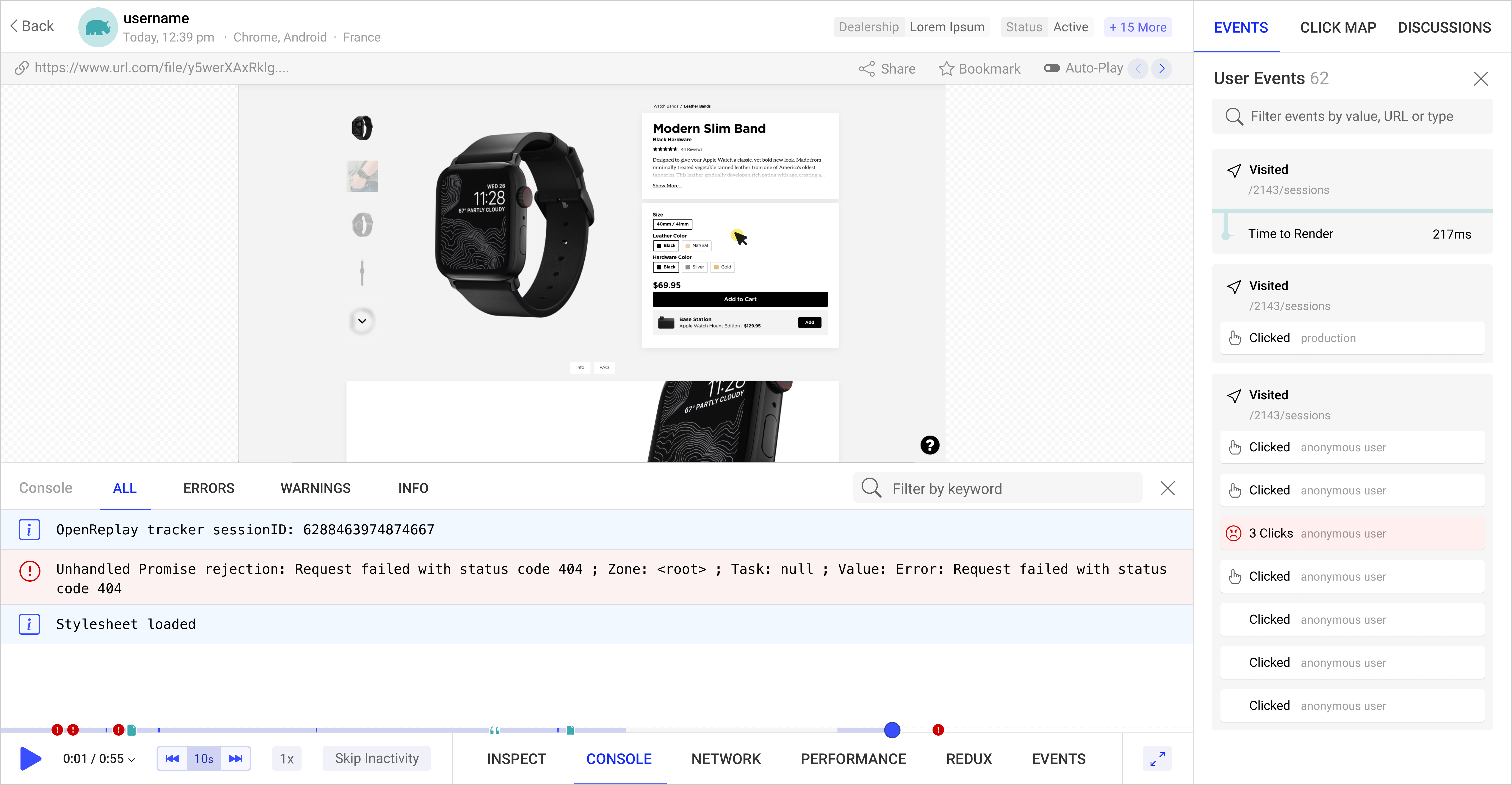
Start enjoying your debugging experience - start using OpenReplay for free.
Additional content features
Now we got a basic blog up and running, and can start writing real posts using markdown - but like I mentioned earlier, Nuxt Content includes even more cool features.
Live Editing
One of those is called Live Editing, and you can use it by simply double-clicking on the rendered nuxt-content component in the browser. This will open a textarea directly on the page where you can update your content. When you click outside this area, the changes are saved to the actual file. Check out the link to see it in action or try it yourself!
Including HTML and Vue components in posts
Because of Nuxt Content, the markdown files in our content folder basically gets super powers. We can include any random HTML in here if we’d like. In your second-post.md, add this HTML code:
<div class="bg-blue-400 w-full h-64 text-white text-4xl flex justify-center items-center">
  This is a blue box
</div>
Now you’ve got a blue box, directly in your blog post. And we can even take it a step further and include entire Vue components! Say you have a Newsletter.vue component that’s a form for readers to sign up to your newsletter. You can easily include that too by just adding:
<newsletter></newsletter>
anywhere in your markdown. NB: The component name has to be kebab-cased and you must include both the opening and closing tag (unlike in .vue files where you could write <Newsletter />)
All put together, you could have a post with this content:
This is some random intro text

<div class="bg-blue-400 w-full h-64 text-white text-4xl flex justify-center items-center">
This is a blue box
</div>

Lorem ipsum dolor sit amet consectetur adipisicing elit. Temporibus nesciunt quidem voluptatem ipsa, doloribus aliquid ipsam sequi? Ipsum architecto, animi sunt quod iste iusto nemo exercitationem impedit odit id voluptatum.

<newsletter></newsletter>
And it would get rendered in the browser as:
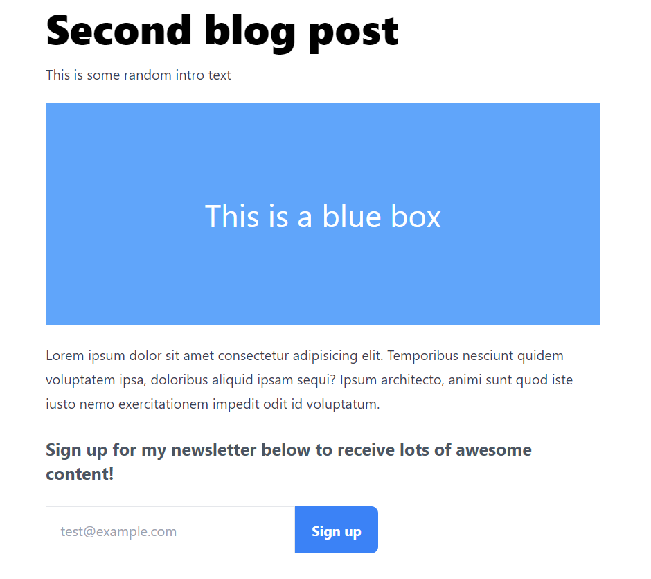
Sweet! These features allow us to create more engaging blog posts, since we can basically include anything we’re able to do with Vue right inside our posts 🚀
Meta tags, SEO and social links
I’d say we’ve got a pretty solid basic blog setup here! You can write content using markdown, HTML and Vue components, and everything looks nice and smooth. But one thing I often feel is overlooked when building your own blog, is thinking about how you’re actually gonna acquire readers.
Now that your blog is up and running and you start writing content, you wanna make it easy for interested people to find it - and one of the best ways for this is through SEO (Search Engine Optimization).
SEO is basically how Google and other search engines can index your content and present it to people searching for certain keywords or phrases. It’s an entire science, but there’s a few things you can do to boost your SEO. At the same time, we can add some information to make links to our posts look good when sharing it on social media.
Search engines and social media platforms look for this information by parsing the <head> tag of any given website. They look for specific meta tags that we’re gonna add using another feature of Nuxt, the head() function. The head() function works by returning an object that will be injected into the page’s actual <head> tag.
So to do that, we’re gonna add the head() function below asyncData in our _slug.vue file. Make it look like this:
head() {
    return {
      title: this.post.title,
      meta: [
        // Open Graph
        { hid: 'og:title', property: 'og:title', content: this.post.title },
        { hid: 'og:type', property: 'og:type', content: 'article' },
        {
          hid: 'og:image',
          property: 'og:image',
          content: `https://my-site.com/${this.post.image}`,
        },
        // Twitter Card
        {
          hid: 'twitter:title',
          name: 'twitter:title',
          content: this.post.title,
        },
        {
          hid: 'twitter:card',
          name: 'twitter:card',
          content: 'summary_large_image',
        },
        {
          hid: 'twitter:image',
          name: 'twitter:image',
          content: `https://my-site.com/${this.post.image}`,
        }
      ]
    }
}
This will set the page title to be equivalent to the title of the post. It’ll also use the post title to set proper meta tags for Open Graph (Facebook) and Twitter. And for both of these, it’ll also set the meta image to be the image from the post.
NB: Remember to update https://my-site.com/ to the actual root domain of your own website.
With these in places, Google will have an easier time parsing our content and we’ll have good looking preview cards when sharing links to our posts on social media.
Additional features
Whew, you made it to the end! I’d say we got a pretty solid foundation for our blog going here - but there’s still a bunch of stuff that would make it even better. That’s why I encourage you to play around with some of these additional features and see if you can add them on your own:
- Add a description to each blog post. This could be used to show 1-2 lines of the post on the preview card. You can also use it to add additional meta tags to make Google even more likely to index your content properly.
- Add a tag filtering system. Right now we only got 3 posts, but in the future you might have way more. It would be nice if the homepage had a list of all available tags, that the user could use to filter the posts down to their interests.
- Make it responsive. Our layout currently is only optimized for large screens, so you could add additional styling to make it look great on mobile too.
- Page transitions. The blog works fine as it is, but it would be cool to have some animation when entering a blog post or going back to the homepage to achieve a better “look & feel”.
- Build a real site around your new blog. The blog you just built is good, but it would be even better if you could integrate it as a part of your portfolio website with proper navigation, other content etc.
- Deploy it to Netlify. A blog is no good if nobody can read it - so I strongly encourage you to push the code to GitHub and deploy it live to Netlify for the world to see!
Conclusion
Thank you for reading! I hope you enjoyed the tutorial and learned a thing or two about Nuxt and creating a blog using Nuxt Content and the cool features it has to offer.
To learn more about Nuxt, checkout the official website at NuxtJS.org.
And finally, I’d love to know your thoughts on this article and Nuxt / Nuxt Content in general. So feel free to hit me up on Twitter at @madsbrodt with any feedback you might have.
Until next time!
