Clipping and Masking Properties in CSS
Have you ever browsed a website and been drawn to an image popping out from a cool shape or text that fades smoothly? Those stunning visuals are all thanks to the capabilities of clipping and masking in CSS, and this article will tell you all about that.

Discover how at OpenReplay.com.
In simple terms, clipping and masking give you control over how elements appear on your web pages. Clipping is like using shape cutters to define the outline you want your image or text to show. Masking, on the other hand, is like placing a special filter over your element, revealing parts based on luminosity, color, or transparency.
These techniques are powerful tools for web designers. They allow you to create unique layouts that grab users’ attention, highlight specific content in an interesting way, and achieve eye-catching effects that make your website stand out.
This article is here to help you master these techniques! We’ll explain clipping and masking in simple terms, explore various methods, and show you how to use them to create impressive visuals for your web projects. Get ready to take your web design skills to the next level!
Understanding Clipping in CSS
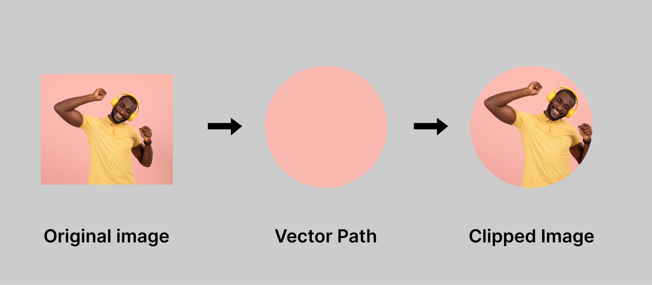
Imagine you’re making a collage and want to cut out specific shapes from pictures. Clipping in CSS works in a similar way, letting you define the exact shape you want an element, like an image, to show through on your web page. It’s like using Shape cutters for the digital world!
There are different ways to clip elements:
- Rectangle: This is the classic choice, perfect for creating clean, sharp edges. Think of a photo gallery displaying all the images in neat squares.

- Circle: Want to add a softer touch? Circular clipping lets you create images with rounded edges, like cute profile pictures or bubbly buttons.

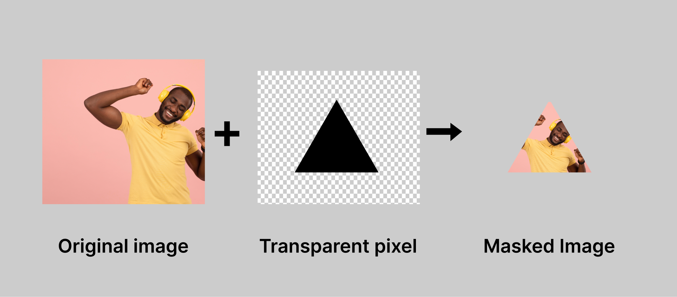
- Polygon: Feeling adventurous? Polygonal clipping allows you to define more complex shapes with multiple sides. Imagine showcasing a product image in a star shape, creating a speech bubble with jagged edges, or even a heart-shaped image for a Valentine’s Day campaign.

We use special CSS properties like clip-path to make this clipping magic happen. This property lets you define the shape to which you want to clip your element. We might also use overflow to control what happens to any part of the element that falls outside the clipping area – hide it completely or let it peek through a bit.
Mastering Masking in CSS
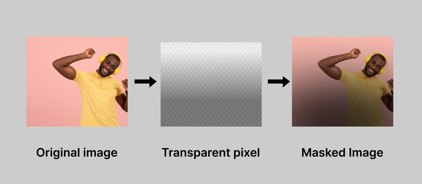
Clipping lets you define shapes, but masking adds another layer of creative control. Imagine holding a transparency film over your element – parts you leave clear show through perfectly, while areas you make opaque get hidden. Masking in CSS works similarly, letting you reveal specific parts of an element based on transparency or color.
Here are some cool ways to use masking:
Alpha Masking
This technique uses the transparency information already built into some image formats (like PNGs) as a mask. Darker areas in the mask image hide parts of your element, while lighter areas let them shine through. Think of creating a faded border around an image using a black-to-white gradient mask.
Code structure:
mask-image: linear-gradient(), or url(), or image();
mask-mode: alpha;
Luminance Masking
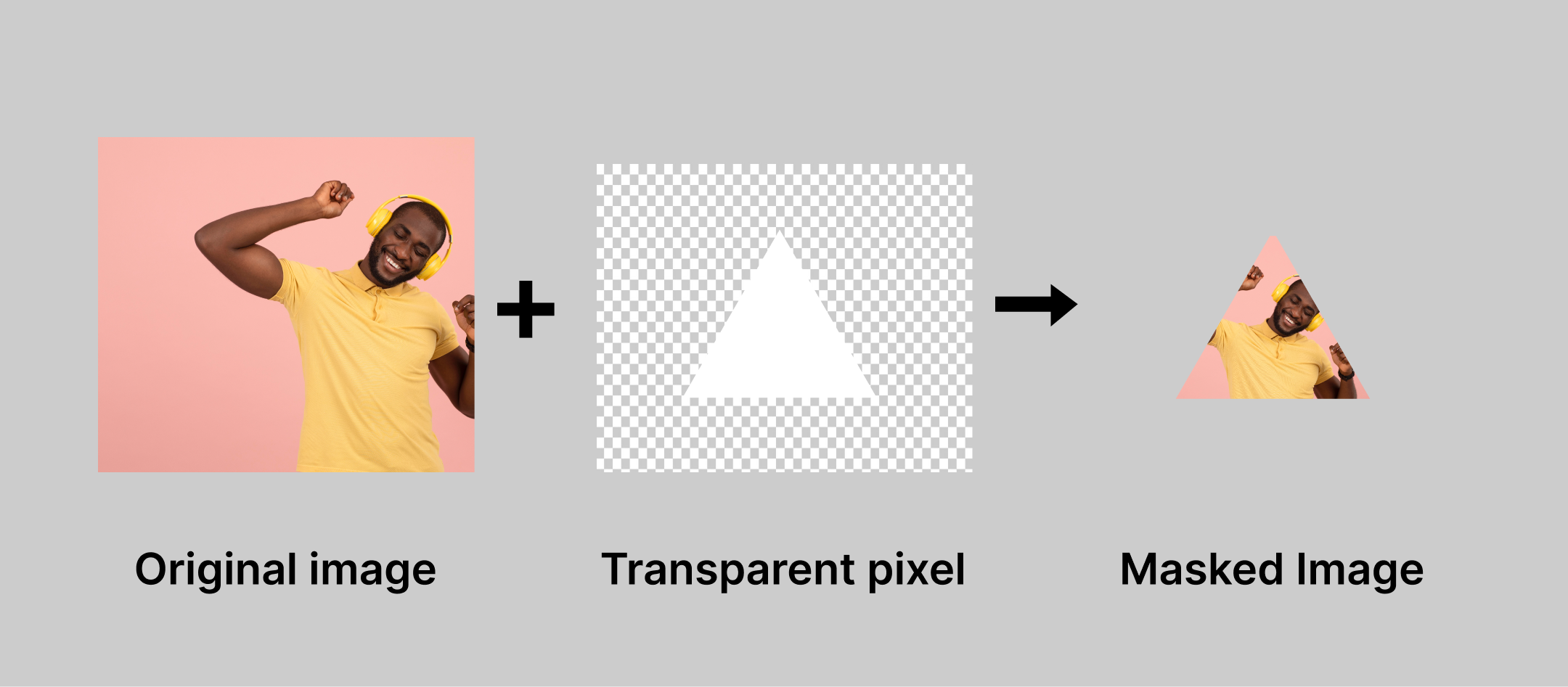
This approach uses an image’s brightness levels as a mask. Brighter areas of the mask image reveal parts of your element, while darker areas hide them. Imagine revealing text smoothly as the user scrolls down the page using a gradient mask that goes from dark to light.
Code snippet:
.luminance-masked-img {
  mask-image: linear-gradient(to bottom, rgba(0, 0, 0, 1) 0%, rgba(0, 0, 0, 0) 100%);
  mask-mode: luminance;
}
Color Masking
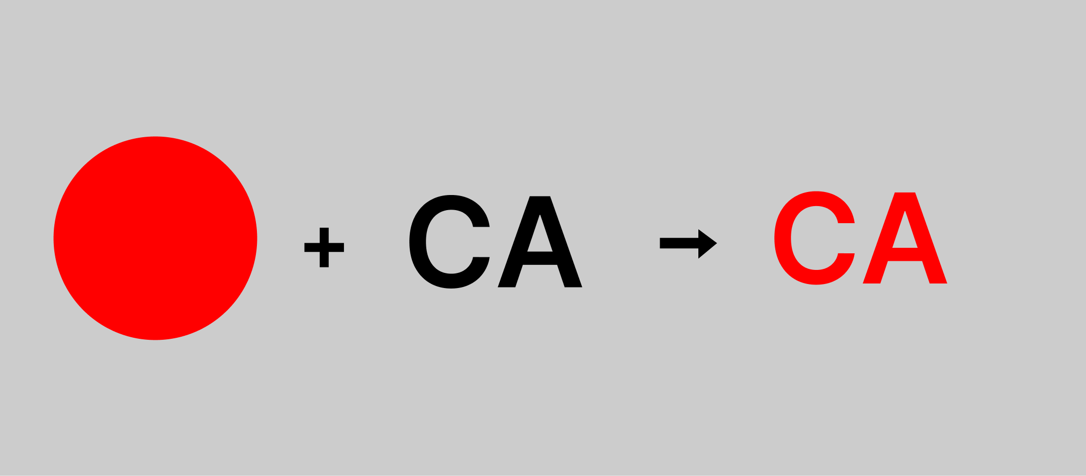
Here, you define a specific color as the “reveal color” in the mask. Parts of your element that match that color will be visible, while everything else gets hidden. Imagine creating a funky text effect where only letters with a specific color (like red) are displayed on a patterned background.
Code snippet:
.color-masked-text {
  mask-image: url("color-mask.png");  /* Mask image with the reveal color */
  -webkit-mask-color: red; /* Define the reveal color as red */
}
To unleash these masking powers, we use properties like mask-image which tells the browser what image (or gradient) to use as the mask. We might also use mask-type to define how the mask interacts with the element’s colors.
Other masking properties include:
| Properties | Descriptions |
|---|---|
Mask-clip | This property defines the mask’s shape that will be applied to the element. It can take various values like border-box, content-box, ellipse, or even a path defined using url() for an SVG. |
Mask-composite | This property determines how the masked element interacts with the background behind it. It controls blending modes like source-over, source-in, and others. |
Mask-image | This property specifies the image or gradient that will be used as the mask. You can use url() to reference an image file or define gradients directly in CSS. |
Mask-mode | This property defines how the transparency information in the mask image is interpreted. The most common value is match-source, which works well for PNG masks with alpha channels. |
Mask-origin | This property sets the origin point for the mask relative to the element. It can be set to border-box, content-box, or specific keywords like padding-box. |
Mask-position | This property defines the initial placement of the mask image within the element’s mask positioning area. It accepts values like center, top left, or offsets along the x and y axes. |
Mask-repeat | This property controls how the mask image is repeated if it’s smaller than the element it’s masking. It can take values like repeat, space, round, or no-repeat. |
Mask-size | This property sets the size of the mask image in relation to the element. It accepts values like auto, contain, cover, or specific lengths. |
Practical Demonstration: Creating a Clipping and Masking Effect
Now that you’ve grasped the power of clipping and masking, let’s use them to create a stunning photo gallery with unique effects! Imagine a gallery where some photos peek through playful shapes, while others have a cool faded border. Buckle up because we’re about to bring this vision to life with code!
Step 1: Setting Up the Stage
First, we need some basic HTML to structure our gallery. Here’s a simple code snippet to get us started:
<div class="photo-gallery">
  <img src="image1.jpg" alt="Image 1">
  <img src="image2.jpg" alt="Image 2">
  <img src="image3.jpg" alt="Image 3">
  </div>
This code creates a container element with the class photo-gallery and adds three image elements with their corresponding source paths and alt text.
Step 2: Clipping with Style
Let’s add some clipping magic to make our photos stand out. We’ll use two different techniques:
- Circular Clipping (Image 1): We’ll transform the first image into a cool circle.
- Polygonal Clipping (Image 2): We’ll create a unique star shape for the second image.
Here’s the CSS code to achieve these effects:
.photo-gallery img {
  width: 200px; /* Adjust width as needed */
  height: 200px; /* Adjust height as needed */
}

.photo-gallery img:nth-child(1) {
  border-radius: 50%; /* Creates a circle with 50% rounded corners */
  /* Alternative for a perfect circle using clip-path: */
  clip-path: circle(50%);
}

.photo-gallery img:nth-child(2) {
  clip-path: polygon(0% 0%, 100% 0%, 50% 86.6%); /* Creates a star shape */
}
We establish a base width and height for all images to ensure consistent sizing across the gallery. For the first image, achieving a circle is possible through two methods: border-radius: 50% (a simpler but less precise approach) or clip-path: circle(50%) (offering greater precision for intricate shapes). The second image leverages clip-path with a defined polygon to create a star shape. Feel free to play with the percentages in the polygon function to create different shapes.
Your final result should look something like this:

Step 3: Masking with Finesse
Now, let’s add some masking finesse to our remaining image (Image 3). We’ll create a cool faded border effect using an alpha mask.
Here’s the CSS code:
 .photo-gallery img:nth-child(3) {
  mask-mode: alpha;
  display: block;
  margin: 50px auto;
  -webkit-mask-image: linear-gradient(black, white, transparent);
  mask-image: linear-gradient(black, white, transparent);
  -webkit-mask-mode: alpha;

 }
The mask-image is a gradient that goes from fully opaque black at the edges to fully transparent white in the center. With mask-mode: alpha; enabled, this creates a faded border effect because the black part of the mask hides the image, while the transparent part allows the image to show through, creating a gradual fade.
The blacker the area in the mask image, the more it will hide the corresponding part of the element in your photo gallery. Conversely, the whiter the area, the more it will allow the element to show through, creating a smooth fading effect.
If done properly, your result should look something like this:

Your result should be a slightly faded version of your original image (image3.jpg) due to the alpha masking effect.
Conclusion
Well done! You’ve just explored clipping and masking in CSS, which basically means you can do some neat stuff with shapes and visibility on your website.
Remember, clipping helps you choose specific shapes for elements to show through, while masking lets you control what’s visible based on transparency or color. With these tools, you can create unique layouts, draw attention to content in interesting ways, and make your website look really cool.
And the best part? There’s so much more you can do! Experiment with different shapes and techniques to be more creative and make your web designs truly stand out.
Here are some resources to keep your learning journey going:
- Dive deeper with interactive tutorials that let you practice clipping and masking techniques in a hands-on environment.
- CSS Reference Websites: Bookmark Comprehensive resources that provide detailed explanations of clipping and masking properties, along with code examples and compatibility information.
- Design Inspiration Galleries: Seek inspiration from other designers who are pushing the boundaries of clipping and masking to create awe-inspiring website experiences.
- Resources for CSS auto clip-path maker.
Truly understand users experience
See every user interaction, feel every frustration and track all hesitations with OpenReplay — the open-source digital experience platform. It can be self-hosted in minutes, giving you complete control over your customer data. . Check our GitHub repo and join the thousands of developers in our community..


