Creating a collapsible component for React

Collapsible components put long sections of information under a block, which enables users to expand and access its features. The uniqueness of being a developer is implementing anything to be built in a particular way. In our case, we want animated collapsible components. Though libraries like react-collapse could help, you may want to build these things yourself.
This article was written to highlight the simple use case of the useState() and useRef() hooks in React. We will make simple React collapsible components, useful for all kinds of applications. This collapsible element can be shown or hidden by clicking a button. I’m going to assume that you know the basics, like how a component works, how useState() works, and how to set up React. I will only focus on building to help beginners who would like to know how useRef() works.
Project
We need to create a component called collapsible, and we need to import it into our main App.js component.
import React from 'react';
const Collapsible =()=>{
    return(
        <div><h1>collapse</h1></div>
    )
}
export default Collapsible;
import React from 'react';
import Collapsible from './collaosible';
import './App.css';
function App() {
return (
<div className="App">
<Collapsible/>
<hr />
<Collapsible/>
<hr />
<Collapsible/>
</div>
);
}
export default App;Features of a collapsible in React
Defining various build features before building them helps the building process go a lot smoother and is a good practice. The first question a developer should be able to answer is, what am I doing? Then, how can I put up the logic to actualize what I’m doing?
In our case, a collapsible will need a toggle button and a boolean state to manage this button. This button’s sole purpose is to be able to toggle, but what exactly is it toggling? This is where a div comes in.
First, set our state default to false:
const [open, setOPen] = useState(false);Then, wrap the div to be toggled with curly brackets to enable us to use Javascript logic:
const Collapsible = () => {
  const [open, setOPen] = useState(false);
  return (
    <div>
      <button>toggle</button>
      {open && <div>toggle me</div>}
    </div>
  );
};
I briefly want to call your attention to something. The ”&&” operator here is used to determine the part of the JSX that needs to be true, but the div is certainly not a boolean, so how do we determine if it is true? In Javascript, anything that holds a value as long as it is not undefined is automatically considered true. When the code above runs, if it’s false, the div will not be completed, but if it’s true, due to the ”&&” operator, it will. Remember that our default value for the state is false, so let’s see what it runs below.
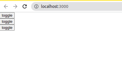
We can see the div got hidden. We need an onclick() event to set our state to true so we can see hidden details.
const toggle = () => {
  setOPen(!open);
};

return (
  <div>
    <button onClick={toggle}>toggle</button>
    {open && (
      <div className="toggle">
        <h4>toggle</h4>
      </div>
    )}
  </div>
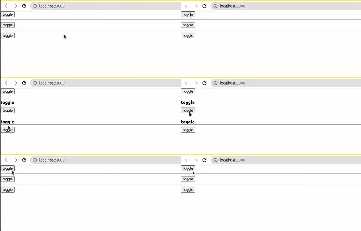
);
This is a very basic way of doing this. In the next part of this tutorial, we will go into animations and use useRef() to implement them.
Properties and children
When a button is clicked in a collapsible, we see details displayed. We need to get this done by adding properties and details to our component in the React way. This part of the article will discuss the fundamentals of properties and children in React. Props (properties) are arguments passed into React components and are used to send data from the mother component to its children. You can read more on props here.
We go into our JSX to add properties that can be accessed anywhere in our application.
return (
  <div className="App">
    <Collapsible label="Introduction" />
    <hr />
    <Collapsible label="Prerequisite" />
    <hr />
    <Collapsible label="Goals " />
  </div>
);
We will pass the props as an argument in our collapsible component.
const Collapsible = (props) => {}Then call it in our JSX:
<div>
    <button onClick={toggle}>{props.label}</button>
</div>
children is an in-built prop, which can be passed on to every component used to render the content included between the opening and closing tags of a component. These tags can carry various tags like the H1, p tag, a form, and many more, which makes it a lot easier to add and pass content in React.
<Collapsible label="Introduction">
  <h1>introduction</h1>
  <p>
    The collapsible component puts long sections of the information under a
    block enabling users to expand or collapse to access its details.
  </p>
</Collapsible>
<hr />
<Collapsible label="Prerequisite">
  <h1>Prerequisite</h1>
  <p>
    I am going to assume that you know the basics like how a component works,
    how useState works, and how to set up React. I will only focus on building
    the project and though this is for an absolute beginner who would like to
    know how useEffect and useRef work.
  </p>
</Collapsible>
<hr />
<Collapsible label="Goals ">
  <h1>Goals</h1>
  <p>
    This article will teach you more about the useState hook, useRef hook, and
    animation in React; we will make simple React collapsible components, useful
    for all kinds of apps. This collapsible element can be shown or hidden by
    clicking a button.
  </p>
</Collapsible>
You can access this in your component using;
<div>
  {open &&
  <div className="toggle">{props.children}</div>
  }
</div>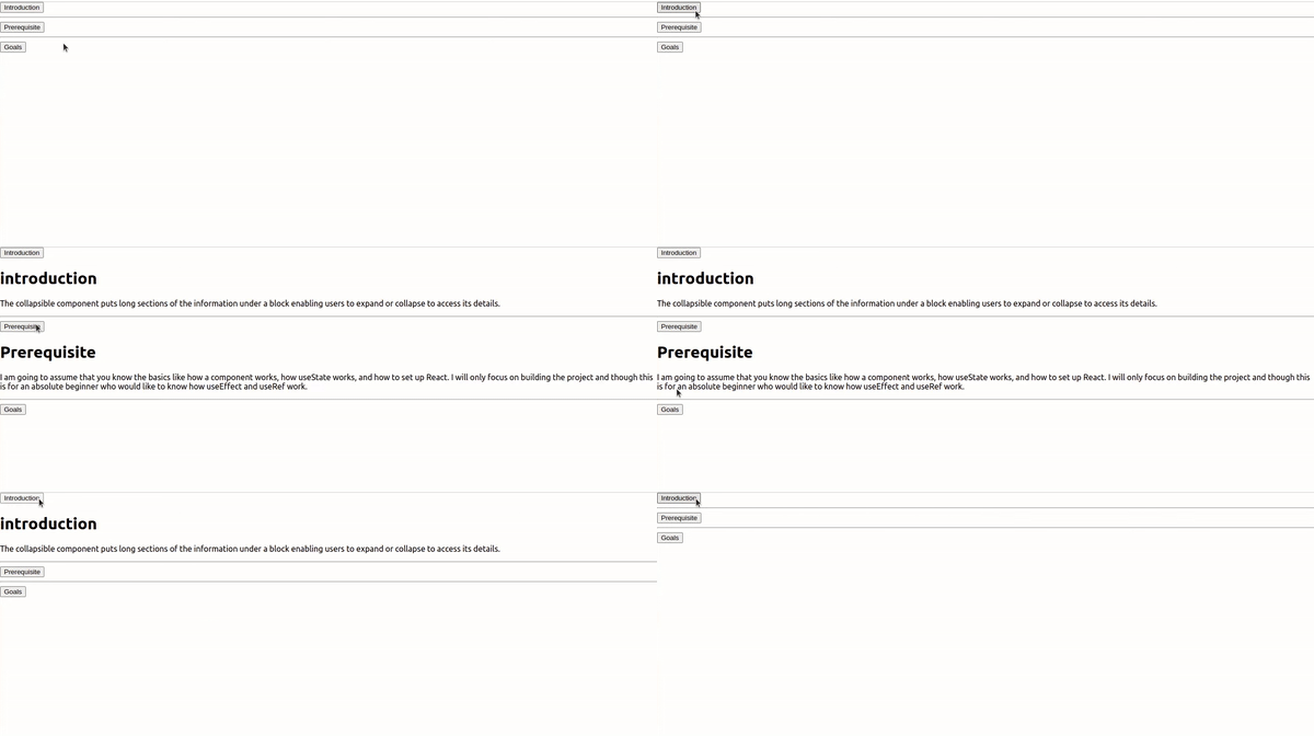
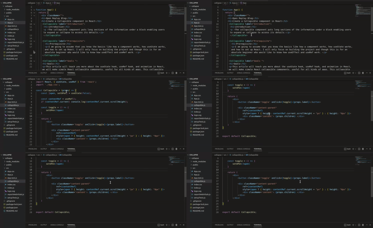
I talked about how properties are passed from App.js to other components, and the video below shows how it’s done while the cursor focuses on the main details.
Open Source Session Replay
OpenReplay is an open-source, session replay suite that lets you see what users do on your web app, helping you troubleshoot issues faster. OpenReplay is self-hosted for full control over your data.

Start enjoying your debugging experience - start using OpenReplay for free.
Collapsible Animation with useRef() and scrollHeight
We need two important concepts.
-
useRef(): According to React Docs: React references returns a mutable ref object whose .current property is initialized to a past argument (initialValue). The returned object will persist for the entire lifetime of the component. useRef is used to set a focus on an element, and it doesn’t cause a re-render. Setting up a focus in React is likened to attaching an Id to an element and using the
.getElementbyIdto manipulate the dom in vanilla Javascript. -
scrollHeight: The scrollHeight value is equal to the minimum height the element would require to fit all the content in the viewport without using a vertical scrollbar.
In vanilla Javascript, we can pick elements by attaching an ID to them, but React has its hook for that called userRef().
We will need scrollHeight and useRef() because we can’t go ahead attaching different heights to our collapsible; we just want a minimum or a maximum height whenever our animation displays. To start, we need to wrap our content in a div;
<div className={open ? "content-show" : "content-parent"}>
    <div className='content'> {props.children} </div>
</div>
And style it ;
.content {
    border: 1px solid rgb(128, 123, 123);
    padding: 0.5rem;
    border-radius: 5px;
}

.content-parent {
    height: 0px;
    overflow: hidden;
    transition: height ease 0.9s;
}

.content-show {
    height: 200px;
}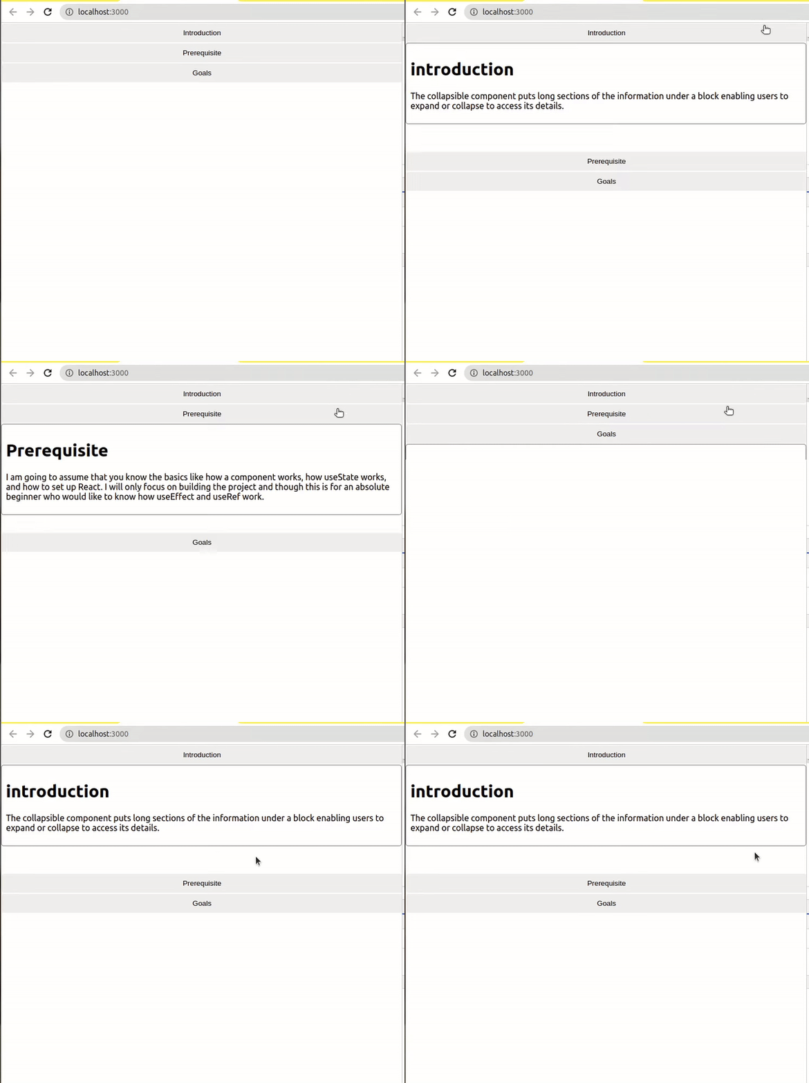
There is a space below the content, making it look slightly messy. We will get that fixed with scrollHeight and useRef(). We could also use the Auto in CSS, but the tricky part is that it takes away our animation. We need to get the exact height of each content, so we can at least be able to animate it.
const contentRef = useRef();
if (contentRef.current) console.log(contentRef.current.scrollHeight);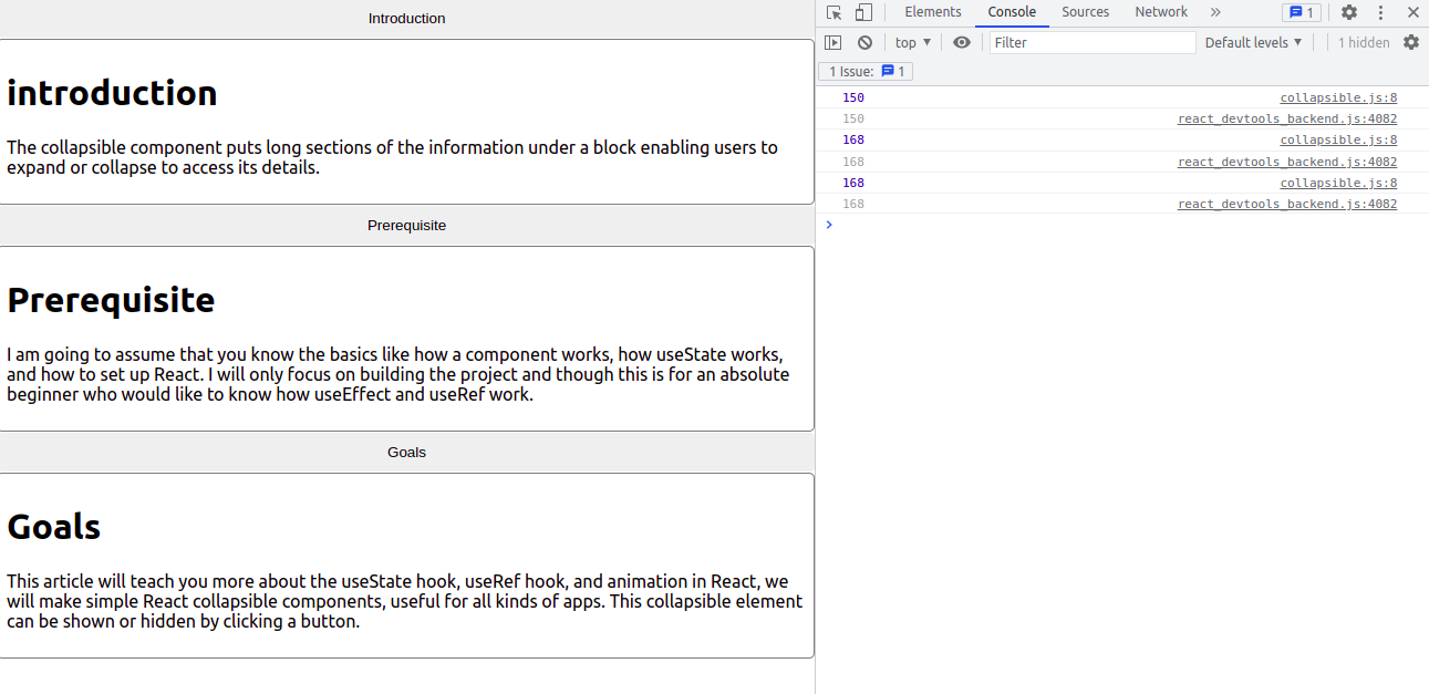
Now that we have the exact height to be 168 and 150, we can now make the content work with the exact values. We can set it to if it's open() then return the exact value, else return nothing.
<div className="content-parent">
  ref={contentRef} style={open ? { height: contentRef.current.scrollHeight +
  "px" } : { height: "0px" }}>
  <div className="content">{props.children}</div>
</div>
We can now remove the content-show class as it’s of no use.
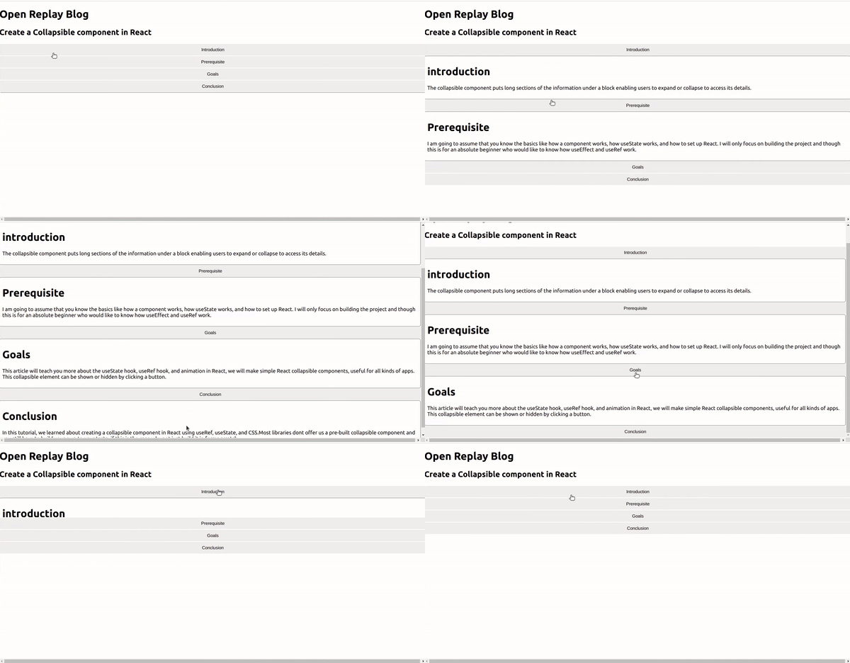
Conclusion
In this tutorial, we learned about creating a collapsible component in React using useRef() and useState(), and CSS. Most libraries don’t offer us a pre-built collapsible component, and you still have to build your own to your taste. If this is the case, why not just build it from scratch?
More details on the useRef()- https://blog.openreplay.com/build-a-react-timer-application-with-useref.
