Creating a theme in a Gatsby application with Stitches

Gatsby is a popular React framework used to build webpages and apps. Its design prioritizes security, scalability, and performance. Gatsby is supported by a large ecosystem, which includes Plugins for integrating services, themes for simple configuration, and Recipes for automating routine tasks. In this tutorial, you’ll learn how to create a theme in Gatsby with Stitches.
To get started with this tutorial, ensure you have the following
- Node.js version 14 or later installed
- yarn package manager installed.
- Prior Knowledge of Stitches
- Prior Knowledge of Gatsby
We also assume you have installed Gatsby’s CLI globally; do npm install -g gatsby-cli if not.
What is Stitches?
Stitches is a React framework that allows you to confidently create and style reusable components. It includes support for other frameworks such as Vue, Svelte, and Vanilla HTML. Stitches was created to help developers avoid unnecessary prop interpolations at runtime, improving application performance. Let’s start by creating a new Gatsby application.
gatsby new gatsby-site https://github.com/gatsbyjs/gatsby-starter-hello-worldThe above command will clone the Gatsby starter application with the folder structure below.
📦gatsby-site
┣ 📂src
 ┃ ┗ 📂pages
 ┃ ┃ ┗ 📜index.js
 ┣ 📂static
 ┃ ┗ 📜favicon.ico
 ┣ 📜.gitignore
 ┣ 📜.prettierignore
 ┣ 📜.prettierrc
 ┣ 📜LICENSE
 ┣ 📜README.md
 ┣ 📜gatsby-config.js
 ┣ 📜package-lock.json
 ┗ 📜package.json
Setup and Configuring Stitches
Now let’s configure Stitches with your Gatsby application. First, you must install the Gatsby plugin for styling with Stitches with the command below.
yarn add gatsby-theme-stitches @stitches/reactOnce the installation is completed, open the gatsby-config.js file and add Stitches to the array of plugins with the code snippet below.
module.exports = {
  /* Your site config here */
  plugin: ['gatsby-theme-stitches'],
}
At this point, you are ready to start styling your Gatsby application with Stitches. There are two ways around this.
- You can choose to create your config by shadowing the
gatsby-theme-stitches/src/configmodule - You can import the properties directly into your application.
import { styled } from 'gatsby-theme-stitches/src/config';To use the first method, create a gatsby-theme-stitches/config.js file and add the following configurations.
import { createStitches } from '@stitches/react';

// You should export all properties
export const {
  styled,
  css,
  globalCss,
  keyframes,
  getCssText,
  theme,
  createTheme,
  config,
} = createStitches({
   theme: {
    colors: {
      black500: "hsl(0, 0%, 0%)",
      white500: "hsl(0, 0%, 100%)",
      gray500: "hsl(206,10%,76%)",
      blue500: "hsl(206,100%,50%)",
      purple500: "hsl(252,78%,60%)",
      green500: "hsl(148,60%,60%)",
      red500: "hsl(352,100%,62%)",
    },
    space: {
      1: "5px",
      2: "10px",
      3: "15px",
    },
    fontSizes: {
      1: "12px",
      2: "13px",
      3: "15px",
    },
    fonts: {
      untitled: "Untitled Sans, apple-system, sans-serif",
      mono: "Söhne Mono, menlo, monospace",
    },
    borderRadius: {
      1: "5px",
      2: "10px",
      3: "15px",
    },
    borders: {
      1: "1px solid #ccc",
      2: "2px solid #ccc",
      3: "3px solid #ccc",
      4: "none",
    },
    paddings: {
      1: "5px",
      2: "10px",
      3: "15px",
    },
    margins: {
      1: "5px",
      2: "10px",
      3: "15px",
    },
    widths: {
      1: "100%",
      2: "50%",
      3: "25%",
    },
  },
});
In the above code snippet, you have exported all the available Stitches properties, so you can import and use them. Then we defined the themes for the elements in our application, and we’ll use the theme properties to style our elements.
Create and style custom elements.
Let’s go ahead and use Stitches to create the style for the elements we’ll use in our Gatsby application. For separation of concern sake, we’ll create a components folder in the project’s root directory for all the element’s styles. Create a new file named Button.js in the component folder and add the code snippets below.
import { styled } from '../../stitches.config';

export const Button = styled("button", {
   // base styles
  display: "block",
  border: "$4",
  borderRadius: "$1",
  color: "$white500",

  variants: {
    size: {
      sm: {
        fontSize: "13px",
        height: "25px",
        paddingRight: "10px",
        paddingLeft: "10px",
      },
      lg: {
        fontSize: "15px",
        height: "35px",
        paddingLeft: "15px",
        paddingRight: "15px",
      },
    },
    bg: {
      primary: {
        backgroundColor: "#2196f3",
        "&:hover": {
          backgroundColor: "#64b5f6",
        },
      },
      secondary: {
        backgroundColor: "#009688",
        "&:hover": {
          backgroundColor: "#4db6ac",
        },
      },
      danger: {
        backgroundColor: "#f44336",
        "&:hover": {
          backgroundColor: "#ef9a9a",
        },
      },
      success: {
        backgroundColor: "#4caf50",
        color: "white",
        "&:hover": {
          backgroundColor: "#a5d6a7",
        },
      },
    },
  },
});
In the above code snippet, we imported the styled properties from the Stitches config file, allowing us to customize the component. We used the properties we defined in our theme to add the base style of the element using the $ symbol followed by the theme properties. Then we used the variants property to define the styling for the component’s background color (bg) and size (size).
Next, create a Container.js and add the code snippets below.
import { styled } from "@stitches/react";

export const Container = styled("div", {
   // base styles
  display: "flex",
  flexDirection: "column",
  justifyContent: "center",
  padding: "$2",
  backgroundColor: "$white500",

  variants: {
    fd: {
      column: {
        flexDirection: "column",
      },
      row: {
        flexDirection: "row",
      },
    },
    size: {
      sm: {
        width: "100%",
        height: "50px",
      },
      lg: {
        width: "100%",
        height: "60px",
      },
    },
    align: {
      center: {
        alignItems: "center",
      },
      left: {
        alignItems: "flex-start",
      },
      right: {
        alignItems: "flex-end",
      },
    },
  },
});
In the Container component, we base style themes and define the styling to align and set the size of the container using the variant property. Next, create an Image.js file and add the code snippet below.
import { styled } from "@stitches/react"

export const Image = styled("img", {
  display: "block",
  width: "$1",
  height: "auto",
  maxWidth: "100%",
  maxHeight: "100%",
  margin: "0 auto",
  variants: {
    size: {
      sm: {
        width: "50%",
        height: "50%",
        maxWidth: "100%",
        maxHeight: "100%",
        margin: "0 auto",
      },
      lg: {
        width: "100%",
        height: "auto",
        maxWidth: "100%",
        maxHeight: "100%",
        margin: "0 auto",
      },
    },
  },
})
We also defined the styling to have a large and small image, the style to change the image alignment, and the themes were applied to the base styles. Next, create a Header.js file and add the code snippet below.
import { styled } from "@stitches/react";

export const Header = styled("nav", {
  // base styles
  display: "flex",
  flexDirection: "row",
  justifyContent: "space-between",
  alignItems: "center",
  padding: "$2",
  backgroundColor: "$white500",
  borderBottom: "1px solid #e6e6e6",

  variants: {
    size: {
      sm: {
        width: "100%",
        height: "50px",
      },
      lg: {
        width: "100%",
        height: "60px",
      },
    },
    bg: {
      primary: {
        backgroundColor: "#2196f3",
        "&:hover": {
          backgroundColor: "#64b5f6",
        },
      },
      secondary: {
        backgroundColor: "#009688",
        "&:hover": {
          backgroundColor: "#4db6ac",
        },
      },
      danger: {
        backgroundColor: "#f44336",
        "&:hover": {
          backgroundColor: "#ef9a9a",
        },
      },
      success: {
        backgroundColor: "#4caf50",
        "&:hover": {
          backgroundColor: "#a5d6a7",
        },
      },
    },
  },
});
Next, create a Card.js file and add the code snippets below.
import { styled } from "@stitches/react";

export const Card = styled("div", {
  display: "flex",
  justifyContent: "center",
  flexDirection: "column",
  padding: "$1",
  margin: "$2"

  variants: {
    align: {
      center: {
        alignItems: "center",
      },
      left: {
        alignItems: "flex-start",
      },
      right: {
        alignItems: "flex-end",
      },
    },
    boder: {
        none: {
            border: "none"
        },
        solid: {
            border: "solid 1px #e6e6e6"
        }
    }
  },
});
Next, add a new file, Input.js, with the code snippet below.
import { styled } from "@stitches/react";

export const Input = styled("input", {
  display: "block",
  marginBottom: "10px",

  variants: {
    size: {
      sm: {
        fontSize: "13px",
        height: "25px",
        paddingRight: "10px",
        paddingLeft: "10px",
      },
      lg: {
        fontSize: "15px",
        height: "35px",
        paddingLeft: "15px",
        paddingRight: "15px",
      },
    },
  },
});
The above code snippet has an Input element to handle users’ input. In the above Input component, we want large and small inputs, and we defined the styles for that using the variants property. Next, add a new file, Text.js, and add the code snippet below.
import { styled } from "@stitches/react";

export const Text = styled('p', {
    fontFamily: '$mono',
    color: '$black5000',

    variants: {
      size: {
        1: {
          fontSize: '10px',
        },
        2: {
          fontSize: '12px',
        },
        3: {
          fontSize: '14px',
        },
      },
    },
  });
In the above code snippet, we created a component to allow us to add and style a paragraph.
Open Source Session Replay
OpenReplay is an open-source, session replay suite that lets you see what users do on your web app, helping you troubleshoot issues faster. OpenReplay is self-hosted for full control over your data.

Start enjoying your debugging experience - start using OpenReplay for free.
Creating Blog App
Now that we’ve styled the elements we need for this application, let’s go ahead and create a blog. First, we need to update the pages/index.js file to import all components we just created with the code snippet below.
import { Button } from "../components/Button"
import { Input } from "../components/Input"
import { Card } from "../components/Card"
import { Text } from "../components/Text"
import { Header } from "../components/Header"
import { Image } from "../components/Image"
import { Container } from "../components/Container"
Next, we’ll use the component to update the Home component with the code snippet below.
export default function Home() {
  const [modal, setModal] = useState(false)

  const showModal = () => {
    setModel(!model)
  }
  return (
    <>
      <Container>
        <Header bg="primary">
          <Text size="1">My Blog App</Text>
          <Button bg="secondary" size="sm" onClick={showModal}>
            New Blog
          </Button>
        </Header>
        {model && (
          <Card boder="solid">
            <Text size="1">Titile:</Text>
            <Input />
            <Text size="1">Content</Text>
            <Input />
            <Text size="1">Cover Image</Text>
            <Input />
            <Button bg="primary" size="sm">
              Post
            </Button>
          </Card>
        )}
        <Text>Blog Posts</Text>
      </Container>
      <Container fd="row">
        {blogs.map(blog => (
          <Card boder="solid">
            <Image src={blog.cover} size="lg" />
            <Text size="3">{blog.title}</Text>
            <Text size="1">{blog.content}</Text>
            <Text size="1">{blog.date}</Text>
          </Card>
        ))}
      </Container>
    </>
  )
}
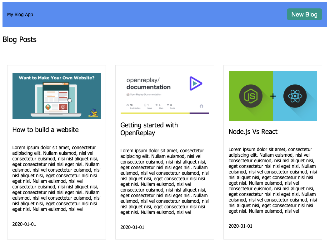
In the above code snippet, we updated the Home component using the components we styled using Stitches. We applied the styles we wanted to each component used in our Home component. We have a form input field that will be toggled to hide or show it using the Modal state variable. Then we looped through the blog details we’ll be creating shortly using the map function and rendered them to the user.
Finally, add the following blog array objects to the Home component.
...
  const blogs = [
    {
      title: "How to build a website",
      content:
        "Lorem ipsum dolor sit amet, consectetur adipiscing elit. Nullam euismod, nisi vel consectetur euismod, nisi nisl aliquet nisi, eget consectetur nisl nisi eget nisi. Nullam euismod, nisi vel consectetur euismod, nisi nisl aliquet nisi, eget consectetur nisl nisi eget nisi. Nullam euismod, nisi vel consectetur euismod, nisi nisl aliquet nisi, eget consectetur nisl nisi eget nisi. Nullam euismod, nisi vel consectetur euismod, nisi nisl aliquet nisi, eget consectetur nisl nisi eget nisi. Nullam euismod, nisi vel",
      cover:
        "https://www.hostgator.com/blog/wp-content/uploads/2017/09/MakeOwnWebsite.png",
      date: "2020-01-01",
    },
    {
      title: "Getting started with OpenReplay",
      content:
      "Lorem ipsum dolor sit amet, consectetur adipiscing elit. Nullam euismod, nisi vel consectetur euismod, nisi nisl aliquet nisi, eget consectetur nisl nisi eget nisi. Nullam euismod, nisi vel consectetur euismod, nisi nisl aliquet nisi, eget consectetur nisl nisi eget nisi. Nullam euismod, nisi vel consectetur euismod, nisi nisl aliquet nisi, eget consectetur nisl nisi eget nisi. Nullam euismod, nisi vel consectetur euismod, nisi nisl aliquet nisi, eget consectetur nisl nisi eget nisi. Nullam euismod, nisi vel",
      cover:
        "https://opengraph.githubassets.com/2ddbe84dccfbcc774b1c9861dd327d2efd7e1cd49964dc01229c181bea751e60/openreplay/documentation",
      date: "2020-01-01",
    },
    {
      title: "Node.js Vs React",
      content:
      "Lorem ipsum dolor sit amet, consectetur adipiscing elit. Nullam euismod, nisi vel consectetur euismod, nisi nisl aliquet nisi, eget consectetur nisl nisi eget nisi. Nullam euismod, nisi vel consectetur euismod, nisi nisl aliquet nisi, eget consectetur nisl nisi eget nisi. Nullam euismod, nisi vel consectetur euismod, nisi nisl aliquet nisi, eget consectetur nisl nisi eget nisi. Nullam euismod, nisi vel consectetur euismod, nisi nisl aliquet nisi, eget consectetur nisl nisi eget nisi. Nullam euismod, nisi vel",
      cover:
        "https://miro.medium.com/max/1400/1*CpDidbInbG4Er_0j_hknFQ.jpeg",
      date: "2020-01-01",
    },
  ]
...
Test the application
With the blog demo application created, let’s go ahead and test it out. Run the commands to change the directory to the project folder and start the application.
cd gatsby-site
gatsby develop
Then navigate to http://localhost:8000/, and you should see the output below on the index page.

Conclusion
By building a blog demo application, you’ve learned how to create a theme UI in a Gatsby application with Stitches. First, we started with an introduction to Gatsby and Stitches, and you learned how to configure Stitches with Gatsby and style some components. Now that you know how to integrate Gatsby and Stitches, how would you style your next Gatsby application?
