Creating Accordions with just HTML and CSS

Accordions are an essential component of modern web design. But can you create a stunning one without needing any JavaScript.? With just HTML and CSS, you can enhance the user experience of your website by creating a dynamic and interactive accordion. So whether you’re a seasoned web developer or starting, you will come away from this article with the knowledge you need to create a beautiful and functional accordion using only HTML and CSS.
An accordion is a user interface element that allows users to expand or collapse content sections within a web page or application. It usually consists of a list of headings or titles you can click to show or hide the content associated with each heading.
The accordion allows only one section to be open at a time, meaning that when a user clicks on a different heading, any previously open section will be automatically closed.
Importance of accordions in web design
The following are why it is essential to use accordions on our web pages:
-
They are helpful when a lot of content needs to be organized in a compact space on a web page.
-
They allow the user to quickly scan through the headings and expand only the sections that interest them without being overwhelmed by too much information on the page.
-
They make web content more accessible to users.
-
They can help organize information by providing a way to group related content, making it easier to navigate and understand.
-
They can be styled in several ways to fit the brand’s aesthetics and make the site look more visually appealing.
Creating an Accordion with HTML and CSS
Accordion menus are usually used in web and mobile applications and websites with a lot of information to present in a structured way.
Accordions can also be customized with various styles and effects to provide a more engaging and interactive experience for the user.
Let us look at how we can create them using only HTML and CSS:
HTML tags for creating an accordion
With HTML5, you can use the details and summary tags to create accordions. The details tag is a wrapper containing the accordion content and is initially collapsed.
The summary tag is used as the accordion header or title and is visible on the page, except the accordion is clicked. The details element expands when users click on it to display the accordion’s content.
Here is how you can use the details and summary tags:
<details>
  <summary>Accordion Header</summary>
  Accordion Content
</details>
You can use the p tag to contain the content of an accordion item. The content is typically hidden by default and is only revealed when the accordion item is clicked. It can include HTML elements like text, images, videos, or other interactive elements.
Here is how to use the p tag to contain the accordion’s content:
<details>
  <summary>Accordion Header</summary>
  <p>Accordion Content</p>
</details>
Note: It is optional to use the p tag, as you can use other HTML tags to contain the content of the accordion item, depending on the type of content you want to use.
Creating the accordion structure
To structure an accordion, follow these ways:
-
Wrap the content of each accordion item in a
detailselement. -
Add a
summaryelement inside eachdetailselement to serve as the header or title for the accordion item. -
Add the content for each accordion item with the
ptag inside adivelement, which should be a child of thedetailstag. -
You must repeat the steps above for each accordion item you want to create.
Here is an example of how to structure accordions:
<details>
  <summary>Accordion Item 1</summary>
  <div>
    <p>Content for Accordion Item 1</p>
  </div>
</details>

<details>
  <summary>Accordion Item 2</summary>
  <div>
    <p>Content for Accordion Item 2</p>
  </div>
</details>

<details>
  <summary>Accordion Item 3</summary>
  <div>
    <p>Content for Accordion Item 3</p>
  </div>
</details>
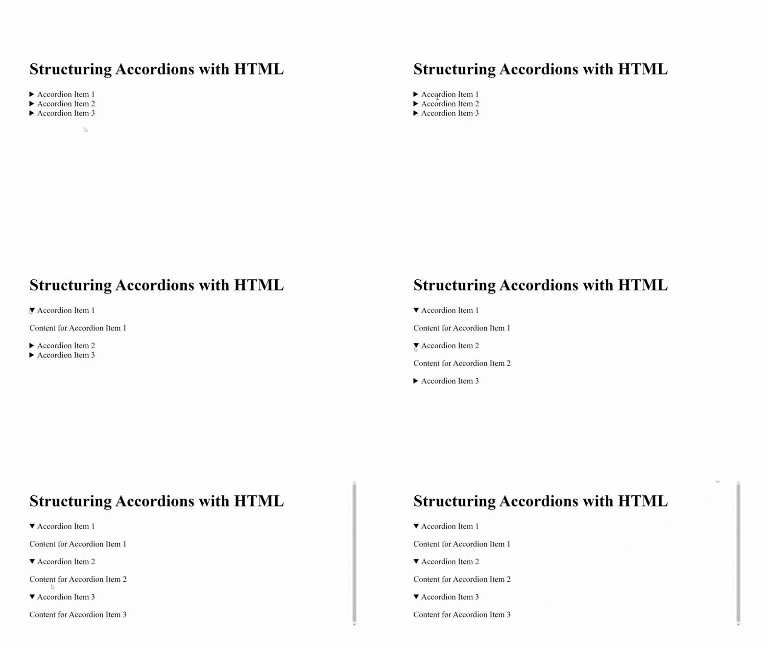
Here is the outcome:

In this example, each details element represents an accordion item, and the content for each item is in the div element inside the details element. The summary element is the header for each accordion item, and the p element holds the content for each accordion item.
When you load the page, all the accordion items will be collapsed, and the corresponding details element of any header of an accordion item you click on will expand to reveal the content inside the div element.
Session Replay for Developers
Uncover frustrations, understand bugs and fix slowdowns like never before with OpenReplay — an open-source session replay tool for developers. Self-host it in minutes, and have complete control over your customer data. Check our GitHub repo and join the thousands of developers in our community.
Styling accordions headers and content
In styling the headers and content of an accordion, there are many possibilities depending on your choice. Therefore, the style you apply for the headers and content of an accordion will depend on the specific design and functionality of your accordion.
You can style the following ways:
-
Use the appropriate CSS selectors to target only the headers or content you want to style. You can use the tag names (e.g.,
summary), class names (e.g.,.accordion-header), or IDs (e.g.,#accordion-header-1) to select the elements. -
To achieve the desired look and feel, you can use any CSS property to style the elements, such as font size, weight, background color, border, margin, padding, etc.
-
You can use the
cursor: pointerstyle to show the headers are clickable. -
Using the
summary:focusandsummary:hoverstyles, you can also change the header’s background when focused or hovered over. -
You can indicate that the
detailselement is in the “open” state by changing the background color of thesummaryelement using thedetails[open] summaryselector.
Let us see how we can use CSS to transform the look of the accordion:
<!DOCTYPE html>
<html>
  <head>
    <style>
      summary {
        background-color: purple;
        color: white;
        cursor: pointer;
        padding: 20px;
      }

      details {
        border: 3px solid blue;
        border-radius: 5px;
        margin: 10px;
      }

      details[open] summary {
        background-color: brown;
      }
    </style>
  </head>
  <body>
    <h1>Styling Accordion with CSS</h1>
    <details>
      <summary>Accordion Item 1</summary>
      <div>
        <p>Content for Accordion Item 1</p>
      </div>
    </details>
    <details>
      <summary>Accordion Item 2</summary>
      <div>
        <p>Content for Accordion Item 2</p>
      </div>
    </details>
    <details>
      <summary>Accordion Item 3</summary>
      <div>
        <p>Content for Accordion Item 3</p>
      </div>
    </details>
  </body>
</html>
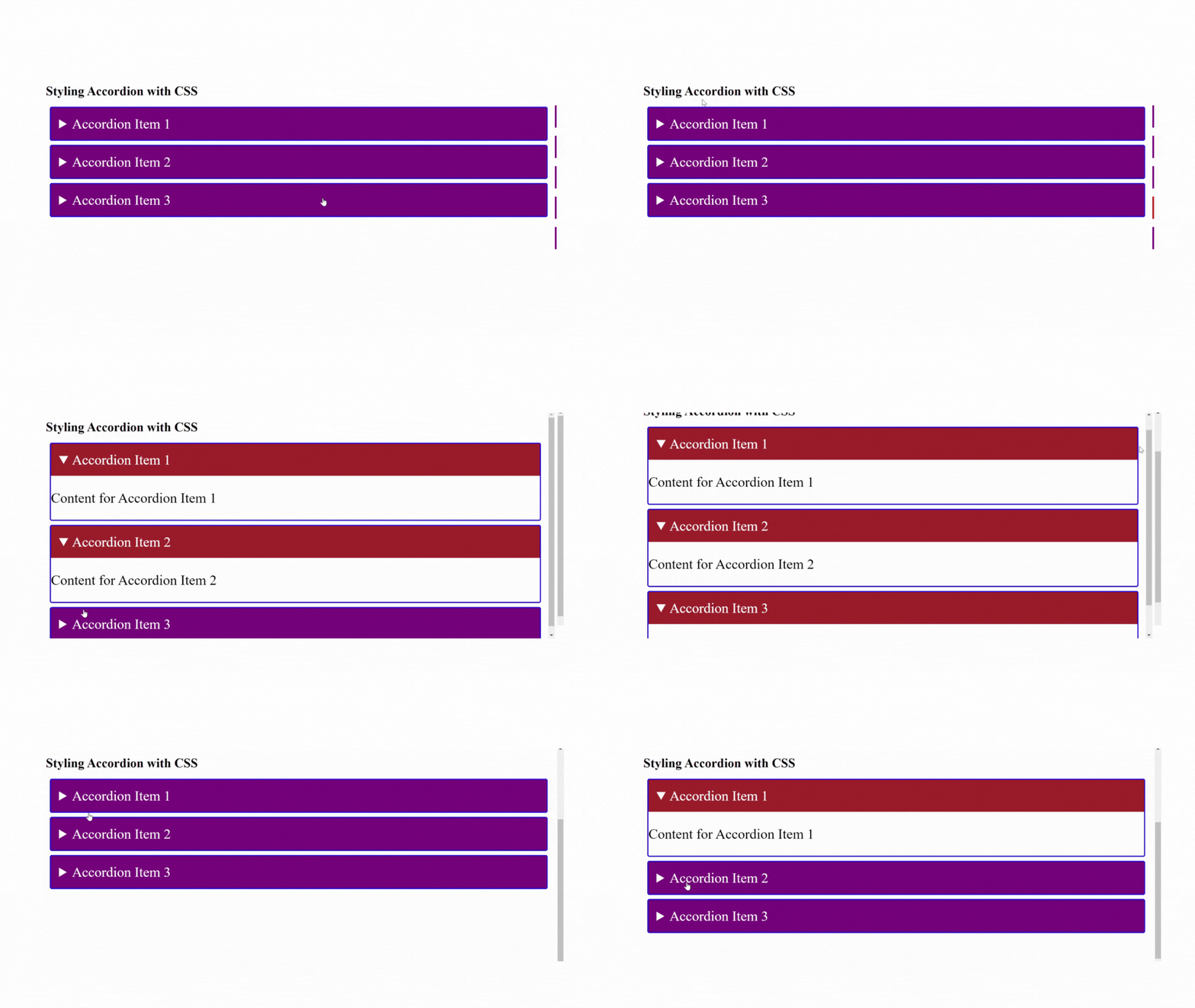
The outcome:

The example includes three details elements, each with a summary tag that acts as the header and a div tag containing the section’s content.
Some selectors target the summary and details elements to set styles for the accordion headers and content, such as the background color, padding, and border.
The details[open] summary selector changes the background color of the header to brown when you open any header.
Practical example of creating an accordion for frequently asked questions with HTML and styling with CSS
<!DOCTYPE html>
<html>
  <head>
    <style>
      summary {
        font-size: 25px;
        font-weight: bold;
        cursor: pointer;
        margin: 10px;
        padding: 10px;
        color: white;
        background-color: purple;
      }

      details > p {
        padding: 5px;
        font-size: 20px;
        font-weight: bold;
        border: 30px;
      }

      summary:focus,
      summary:hover {
        background-color: red;
      }
    </style>
  </head>
  <body>
    <h1>Example of a Frequently Asked Questions Accordion</h1>
    <details>
      <summary>Do I need to register before I can buy the products?</summary>
      <p>Yes, you do. Create an account so you can see our products</p>
    </details>
    <details>
      <summary>How long does it take to receive my order?</summary>
      <p>It can take 14 days to receive your orders</p>
    </details>
    <details>
      <summary>What happens if a product is not what I ordered?</summary>
      <p>You can request for return of the product through our email for product return</p>
    </details>
    <details>
      <summary>How do I request a refund for the wrong product?</summary>
      <p>You can request a refund through the email we will send to you after the product has been successfully returned</p>
    </details>
    <details>
      <summary>How long will it take to get a refund?</summary>
      <p>It can take 3-5 working days after we have verified the returned order</p>
    </details>
  </body>
</html>
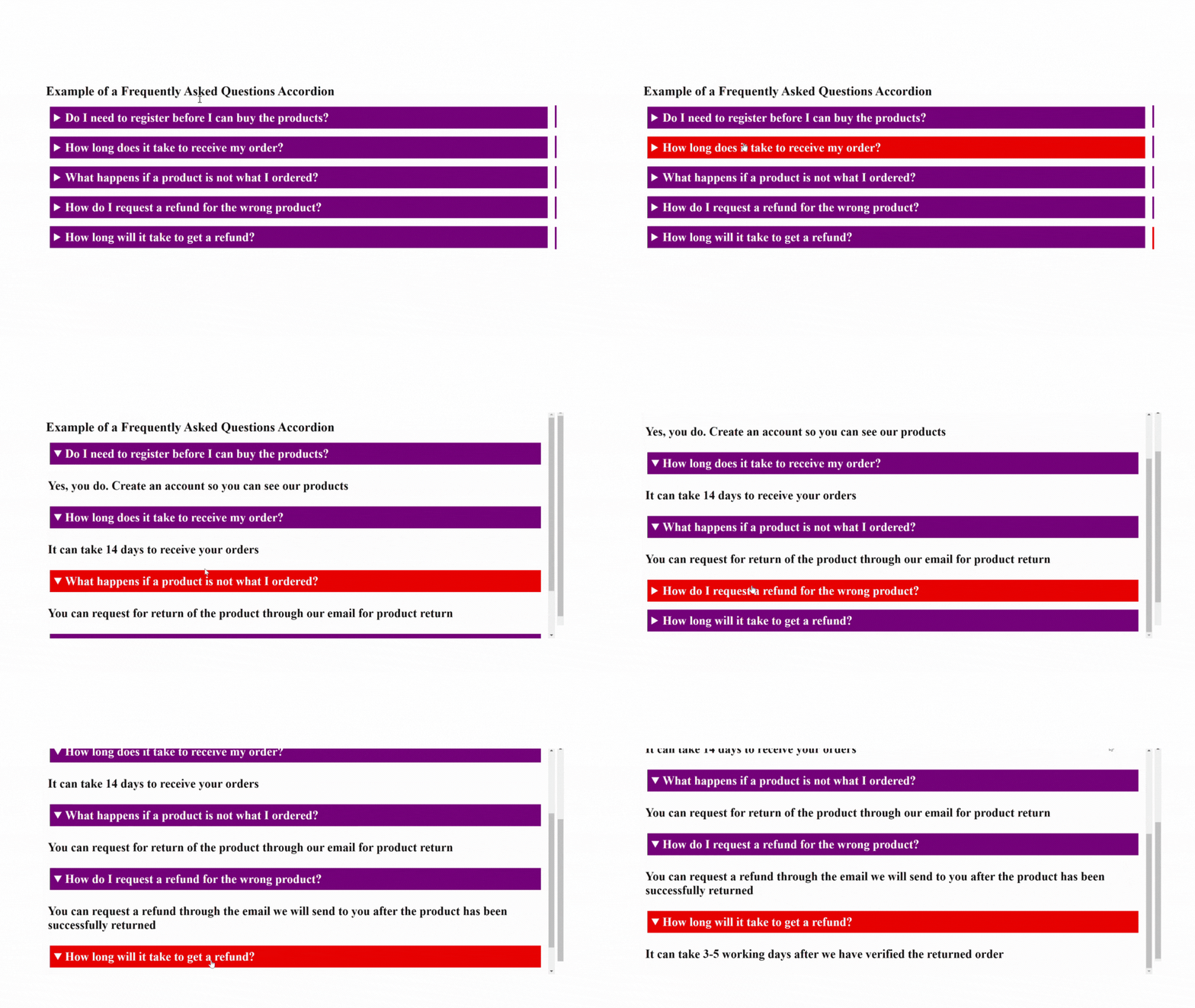
Here is the outcome:

In this example, five questions FAQ accordion has been created with their respective answers.
The details tag defines each question, with the question in the summary tag and the answer in the p tag. Also, CSS was used to style the summary and p tags to make them more readable and visually appealing.
Notice that when a header is focused or hovered over, the background color changes to red and when you click on a header the content is displayed.
Improving Accordion Functionality
It is necessary to consider accessibility when creating accordions because it ensures everyone can access and use them, including people with disabilities. This promotes inclusivity and ensures that no one is excluded from the information or functionality provided by the accordion, and Improved user experience leads to higher engagement.
Steps to make accordions accessible
The following are ways you can make accordions on your web page accessible:
-
Use Semantic HTML for your accordions. The
detailsandsummarytags for creating accordions help to provide a clear and structured way to mark up content on a web page, making it more accessible and understandable to users. -
Provide clear and concise headings for each section of the accordion to make it easy for users to understand the content of each section.
-
Ensure that the headings accurately describe the content within the accordion section.
-
If your accordion has links, use descriptive link text that accurately describes the destination or purpose of the link.
-
Ensure that users can navigate through your accordion using only the keyboard by using the tab key to move between focusable elements and the enter key to activate them.
-
Use the
aria-expandedandaria-controlsattributes to provide additional context and clarify which accordion section is currently open. This is particularly important for users of assistive technologies such as screen readers. -
Ensure sufficient color contrast between the text and the background of your accordion to ensure that users with low vision can read the content.
-
Test the accordion with assistive technologies such as screen readers, speech recognition software, and keyboard-only navigation to ensure it is fully accessible.
Conclusion
Creating an accordion with HTML and CSS is an excellent way to add interactivity to your website without needing JavaScript. By using semantic HTML tags and following accessibility best practices, you can create an accessible and user-friendly accordion. Also, adding some basic CSS styling will enable you to customize your accordion’s look to match your website’s design.

