CSS for Print: Designing Web Content for Physical Output
The demand for web-to-print functionality continues to grow across various industries, and users often require the ability to print web content for offline access or archival purposes. However, designing web content for physical output presents unique challenges that differ from designing for digital screens. This article explores how to design web content for print using CSS to overcome challenges and create a print-optimized experience.

Discover how at OpenReplay.com.
While the digital world thrives, the need for physical copies persists. Designing web content for printing offers several advantages:
-
Offline Access: Not all users have constant access to digital devices or reliable internet connections. Enabling users to print web content gives them offline access, making information more accessible and inclusive.
-
Customization: Print design allows for a level of customization and personalization that digital design often can’t match. Users can add annotations, highlight important sections, or organize content in a preferred format. This level of flexibility enhances the user experience and utility of printed materials.
-
Archiving: Printing web content allows users to create physical copies for archival, documentation, or reference purposes. This is particularly valuable for educational materials, legal documents, receipts, and reports.
-
Enhanced Readability: In some cases, users may find reading lengthy content on paper rather than on a screen easier.
-
Regulatory Requirements: In many industries, such as finance, healthcare, and legal sectors, regulatory requirements mandate the provision of printable versions of web content for compliance and record-keeping purposes.
Differences Between Designing for Digital Screens and Physical Print
While both digital and print design aim to communicate information visually, the way we approach them differs significantly due to each medium’s inherent limitations and functionalities. It is essential to understand these differences to create effective print-optimized web content.
Unlike digital design, where layouts can adjust to any screen size, print design works with a fixed canvas in a specific portrait or landscape orientation. While digital designs leverage the vast RGB color spectrum for rich visuals, print design is limited by the CMYK (Cyan, Magenta, Yellow, Key Black) color model, requiring careful color selection to avoid unwanted variations in print.
Digital content thrives on interactivity with features like scrolling and clicking. Print media, however, is static, relying on precise navigation and well-organized elements to communicate information effectively.
Resolution is a crucial consideration for digital design, with elements needing optimization for various device pixel densities. On the other hand, print design demands high-resolution images to prevent pixelation and blurry visuals in the final output.
The core focus of digital design is user engagement and interactivity, often achieved through animations, hover effects, and calls to action. In contrast, print design prioritizes readability and clarity, emphasizing effective use of typography, white space, and layout for optimal information presentation.
Challenges in Designing Web Content for Physical Outputs
Designing for print presents distinct challenges compared to digital screens. You must address these challenges to seamlessly transition from digital to physical mediums.
Some of the common challenges include:
-
Fixed Page Size: Unlike responsive web design, printed content has a fixed page size and orientation (portrait or landscape). Layouts need to adapt to fit these constraints.
-
Limited Color Palette: Printers typically use a CMYK, which has a smaller range of colors than the RGB (Red, Green, Blue) spectrum used on screens. This can lead to color variations in the printed output.
-
Media Compatibility: Images and media types optimized for digital viewing may not translate well to print. Print optimization involves selecting high-resolution images, adjusting color profiles, and ensuring media formats are compatible with print processes.
-
Lack of Interactivity: Printed content lacks the interactive elements on websites. Navigation menus, hover effects, and animations must be replaced with static alternatives.
-
Page Breaks and Pagination: Long-form content designed for scrolling on digital screens may need to be paginated for print. Managing page breaks and content flow to avoid awkward breaks or fragmented content is essential for a cohesive print reading experience.
-
Resolution Roadblock: Those crisp images that look fantastic on your screen might turn pixelated and blurry in print. High-resolution images (typically 300 DPI or higher) are crucial for clean and sharp visuals in printed outputs.
-
Accessibility Considerations: Accessibility features like alt text for images, structured headings, and screen reader compatibility must be preserved in print formats to ensure accessibility for users with accessibility needs.
We’ve explored the hurdles of designing web content for print. But fear not! CSS emerges as our trusty weapon to overcome these limitations and craft a print-optimized experience.
Let’s delve into how CSS empowers us to tackle these challenges:
Using Media Queries to Target Print-Specific Styles
Media queries are potent tools in CSS for applying different styles based on various conditions, such as screen size, device orientation, or print media. When targeting print-specific styles, media queries enable you to customize the appearance of a document specifically for printing.
Here’s how media queries can be used to target print-specific styles:
@media print {
  /* Your print-specific styles here */
}
The @media print rule initiates a media query targeting styles specifically for printing scenarios. Any CSS styles placed within the curly braces will only be applied when the document is printed.
Print Headers and Footers
Have you ever flipped through a book or document and noticed consistent headers and footers gracing each page? That’s the magic of print headers and footers! They enhance the professionalism of your printed content and provide valuable information like page numbers, website URLs, or company logos.
Headers and footers are essential in print design, providing context, navigation, and branding information on printed pages. CSS offers powerful tools for adding headers and footers to printed content.
Here’s how you can incorporate headers and footers using CSS:
The Positioning Approach
You can leverage the position property to fix headers and footers to the top and bottom of the page, respectively.
Here is how to do this:
@media print {
 /* Header Styling */
 .header {
  position: fixed;
  top: 0;
  left: 0;
  right: 0;
 }

 /* Footer Styling */
 .footer {
  position: fixed;
  bottom: 0;
  left: 0;
  right: 0;
 }
}
Here, we wrap the styles within a @media print block to ensure they only apply when printing the document and define classes like .header and .footer for styling the header and footer content, respectively. Setting position: fixed on elements with top: 0 for headers and bottom: 0 for footers will make them stick to those positions on every printed page. Then, adjust left: 0 and right: 0 to span the entire width of the page.
Table Approach
This method utilizes the power of HTML tables. By wrapping your content in a table, you can define separate sections for the header (<thead>), body (<tbody>), and footer (<tfoot>). Browser magic takes care of repeating the header and footer rows on every printed page.
Here’s an example:
<table>
 <thead>
  <tr>
   <th>Header Cell</th>
  </tr>
 </thead>
 <tbody>
  <tr>
   <td>Body Cell</td>
  </tr>
 </tbody>
 <tfoot>
  <tr>
   <td>Footer Cell</td>
  </tr>
 </tfoot>
</table>
Here, we wrap our content within an HTML table, with the <thead> section defining the header row that you can repeat on every printed page, the <tbody> section holding your main content, and the <tfoot> section defining the footer row that will also be repeated on every printed page.
You can choose the proper method based on your preference. The positioning method offers more flexibility regarding styling and placement, while the table method is more straightforward to implement and works well for basic headers and footers.
You can also integrate additional approaches for achieving headers and footers using the approaches below:
Using the @page Rule
CSS provides the @page rule, which allows you to define styles specifically for printed pages. To create a header, you can use the @page rule with the @top-center, @top-left, or @top-right descriptors followed by the content you want to include in the header, as shown below:
@page {
  @top-center {
    content: "Header content here";
  }
}
Similarly, you can create footers using @bottom-center, @bottom-left, or @bottom-right descriptors, as shown below:
@page {
  @bottom-center {
    content: "Footer content here";
  }
}
Adding Page Numbers
You can include page numbers in headers or footers using the content property and the counter() function in CSS. Define a counter in your CSS stylesheet and increment it for each printed page.
Here is an example:
@page {
  @bottom-right {
    content: "Page " counter(page);
  }
}
Here, the @bottom-right descriptor specifies where the content should be placed on the printed page. In this case, it indicates that the content (“Page ” counter(page)) should be placed at the bottom-right corner. The content: "Page " counter(page); line defines the content to be displayed in the specified location, with "Page " being a static text string that will appear before the page number and counter(page) automatically incrementing each printed page. It represents the page number.
Note: You won’t see the page number displayed on the web page using counter(page) during the printing preview because it generates the page number specifically for the printed output. This functionality doesn’t translate directly to displaying the page number on the web page itself.
Practical Example for Optimizing Header and Footer for Physical Output
Imagine you’re to create a printed user manual or technical guide for a tech device, optimizing the web page header and footer for print readability and presentation. Here is how you can do this:
<!-- Header -->
<header>
<h1>Tech Solutions</h1>
</header>
<!-- Main content -->
<main>
<section>
<h2>User Manual: XYZ Tech Device</h2>
<p>Model: XYZ-1000</p>
<p>Version: 2.0</p>
<h3>Features:</h3>
<ul>
<li>Wireless connectivity</li>
<li>High-definition display</li>
<li>Touchscreen interface</li>
<li>Advanced security features</li>
</ul>
</section>
</main>
<!-- Footer -->
<footer>
<p>Tech Solutions © 2024. All rights reserved.</p>
</footer>body {
font-size: 25px;
background-color: #dc9999;
}
/* Styles for printed pages */
@media print {
/* Header */
header {
position: fixed;
top: 0;
left: 0;
right: 0;
text-align: center;
background-color: #ccc;
border-bottom: 2px solid #ee1b1b;
}
/* Footer */
footer {
position: fixed;
bottom: 0;
left: 0;
right: 0;
background-color: #ccc;
text-align: center;
border-bottom: 2px solid #ee1b1b;
font-size: 30px;
}
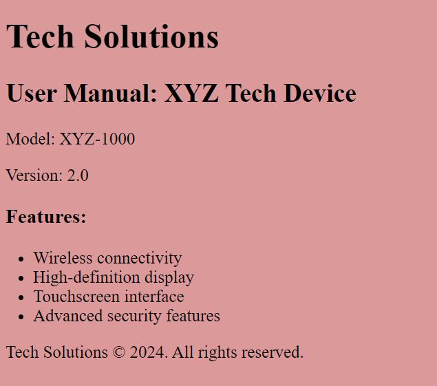
}Here is the output for the web page display:
Here is the output for the printing preview:
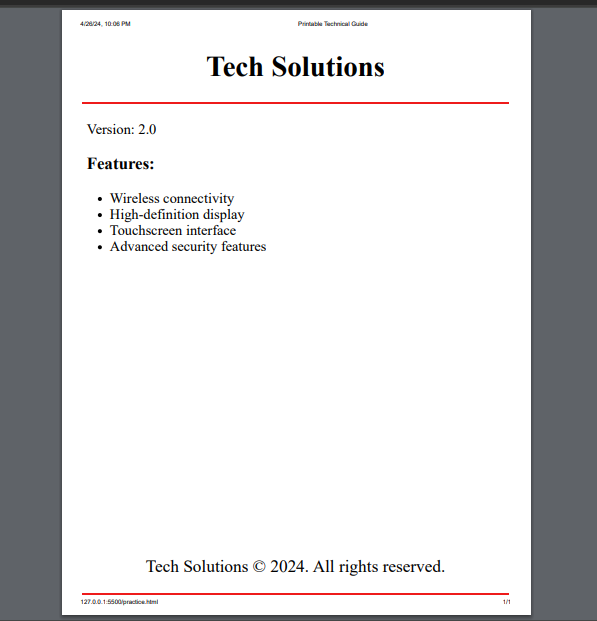
The @media print query targets printing styles specifically. Within this query, the header is positioned fixed at the top of the page (position: fixed) with a centered text alignment. It also has a 2px solid red bottom border (border-bottom: 2px solid #ee1b1b). Similar to the header, the footer is positioned fixed at the bottom of the page with a centered text alignment, background color, and a 2px solid red bottom border. Additionally, the font size of the footer text is increased to 30px for better visibility.
On the web page, the content is positioned to the left, but in the printing preview, the header and footer are placed to the center, and the styles applied are evident, as opposed to the web page display version.
Page Break Control
This section will explore techniques for controlling page breaks in the printed output of your HTML documents. Controlling page breaks in printed output and specifying page breaks within long documents are essential aspects of optimizing web pages for print.
Here are some techniques and examples to demonstrate how to achieve this:
Using CSS page-break Properties
You can use CSS properties like page-break-before, page-break-after, and page-break-inside to control page breaks. This method utilizes the @media print media query to target styles specifically for printing scenarios.
For example, to force a page break before an element, you can use page-break-before: always;. Also, within the media query, you can use the page-break-after property on specific elements to force a page break to occur after that element.
Here is how you can use @media print with page-break-after:
@media print {
  .page-break {
    page-break-after: always;
  }
}
In this example, any element with the class “page-break” will force a page break after it when printed.
Manual Page Breaks
You can insert a <br> element with the style page-break-after: always within your HTML code to manually trigger a page break at that point.
Here is an example of how to do this:
<p>Content before the page break...</p>
<br style="page-break-after: always;">
<p>Content after the page break...</p>
This example inserts a <br> element with page-break-after: always to force a page break after the first paragraph.
While most modern browsers support page-break-after, there might be slight differences in interpretation across different versions and browsers. Testing in your target browsers is recommended.
Alternatively, you can use a <div> element with the class “page-break” and define the page-break-after property in your CSS using the @media print query:
<div class="page-break"></div>@media print {
.page-break {
page-break-after: always;
}
}This approach offers more flexibility for styling the element around the page break if needed.
Demonstrating Page Breaks Insertion
Assuming you need to control the page breaks to optimize the printing of lengthy content such as books, reports, or manuals. Here’s an example demonstrating how to insert page breaks within a long document:
<h1>Chapter 1: Introduction</h1>
<p>
  Lorem ipsum dolor sit ameft consectetur adipisicing elit. Obcaecati rem ipsa
  odio repudiandae quos, non porro modi expedita natus placeat quis suscipit
  vitae recusandae voluptatibus saepe commodi adipisci repellat incidunt illo
  dolore amet nisi ipsam maxime fugit? Similique praesentium tempora illo
  deserunt soluta. Animi accusantium corrupti beatae adipisci recusandae in
  quidem numquam, officiis odit illum nam rerum sit sed? Esse labore
  perspiciatis voluptatem eum optio enim quo at est nihil laborum.
</p>
<div class="page-break"></div>

<h1>Chapter 2: Detailed Explanation</h1>
<p>
  Lorem ipsum dolor, sit amfet consectetur adipisicing elit. Sapiente vero quos
  dolores mollitia reprehenderit dignissimos tempore animi, cum, veniam suscipit
  ullam ea dolorem enim at non ex! Animi magni eaque molestias eos expedita
  praesentium doloribus ratione! In accusantium suscipit nemo ad harum eligendi,
  eveniet sit optio atque ullam inventore assumenda, corrupti pariatur, quo quae
  saepe delectus. Error quo accusamus id fugit sit libero alias minima beatae
  quia dicta unde architecto aperiam, quis enim quaerat consectetur nulla quae
  laborum, culpa aspernatur dignissimos quos ipsum quam ex. Suscipit, accusamus
  ea voluptates mollitia ipsum quibusdam reprehenderit? Mollitia, eaque atque
  nihil doloribus aperiam numquam!
</p>
<div class="page-break"></div>

<h1>Chapter 3: Conclusion</h1>
<p>
  Lorem, ipsum dolor sit ameft consectetur adipisicing elit. Vel, quas eius
  veritatis commodi, quis architecto ullam ab eaque quos hic fugiat itaque illo
  reprehenderit pariatur ratione praesentium possimus aut nostrum magnam numquam
  ea nobis? Molestiae praesentium nulla vel possimus dolore, voluptate incidunt
  impedit excepturi labore dolorem quae porro voluptatum harum doloribus itaque
  aperiam in atque assumenda eveniet est, provident alias ab.
</p>
body {
font-size: 19px;
background-color: #dc9999;
}
@media print {
.page-break {
page-break-after: always;
}
h1 {
font-size: 38px;
}
p {
font-size: 33px;
}
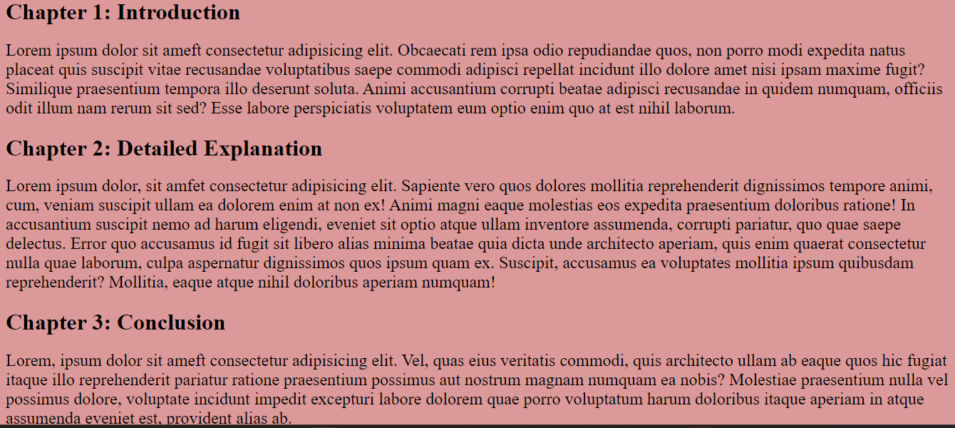
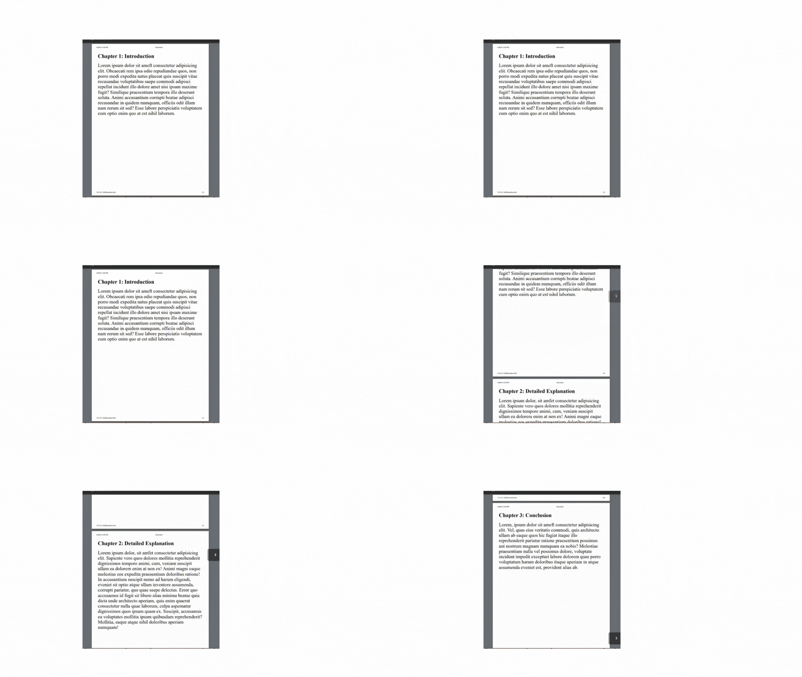
}Here, the .page-break class is used to apply the page-break-after: always; property, ensuring that a page break occurs after each chapter. When you print this document or preview it in print mode, you should see each chapter starting on a new page due to the page break specified after each <div class="page-break"></div> element, as shown below.
Here is the output as displayed on the web page:
Here is the previewed output for printing:
Content Adjustment
Content adjustment for printing involves hiding or modifying specific elements to improve the printed output. Here are some techniques for hiding or modifying content for printing purposes:
- You can achieve this using
@media printwith CSS. This method leverages the@media printmedia query to target styles specifically for printing scenarios. Within the media query, you can use CSS properties likedisplay: none;to hide unwanted elements on the printed page.
Here is an example:
@media print {
  .navigation-bar,
  .footer {
    display: none; /* Hide navigation bars and footers */
  }
}- You can also modify web element styles specifically for printing using the
@media printmedia query. Here is an example:
<body>
  <p id="content">This content will appear on both screen and print.</p>
</body>
@media print {
p#content {
font-size: 18px; /* Adjust font size for printing */
}
}In this example, the #content paragraph will have a larger font size (18px) when printed. You can use various CSS properties within the @media print block to modify the content’s appearance for printing, such as font size, font weight, color, and margin.
- Let’s look at a practical example to demonstrate how to hide navigation bars and footers for printing using
@media print:
<header>
<h1>This is the Document Title</h1>
</header>
<nav>
<ul>
<li><a href="#">Home</a></li>
<li><a href="#">About</a></li>
<li><a href="#">Contact</a></li>
</ul>
</nav>
<main>
<h1>Main Content</h1>
<p>This is the main content of the document.</p>
<p>This is another paragraph with more content.</p>
</main>
<footer>
<h1>Footer section</h1>
<p>© 2024 My Company Name</p>
</footer>body {
font-family: Arial, sans-serif;
background-color: #dc9999;
}
header,
main,
footer {
padding: 0.5em;
}
p {
font-size: 28px;
}
nav {
background-color: #bbd4e5;
padding: 30px;
}
nav li {
display: inline-block;
margin-right: 15px;
font-size: 24px;
}
/* Hide navigation bar and footer for printing */
@media print {
nav,
footer {
display: none;
}
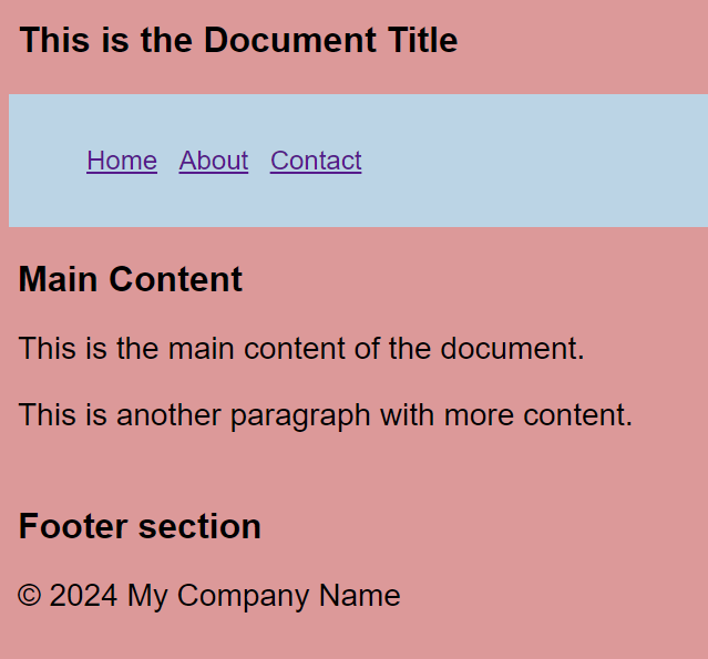
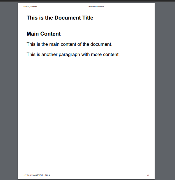
}In the above example, the @media print block, the nav and footer elements, are set to display: none, which hides them from the printed output. This ensures that these elements are not included in the printed version of the document, just as seen in the output below:
Here is the web page display:
Here is the previewed output for printing:
Typography for Printing
You can incorporate effective typography practices to enhance the readability and user experience of your printed documents. Here is an example:
@media print {
  body {
   font-size: 12pt; /* Adjust font size for print */
   margin: 0; /* Remove default margins */
  }
}
Here, the body selector targets the <body> element of your HTML document, setting font-size: 12pt; which sets the font size to 12 points for all text within the <body> when the page is printed. Point (pt) is a unit of measurement commonly used in print media. The margin: 0; property sets the margin of the <body> element to 0 when printing. By setting the margin to 0, you remove any default margins that may be applied by the browser or user agent, ensuring that the content starts from the edge of the page.
Let’s look at a practical example demonstrating how to modify web elements for print:
<h1>Main Heading</h1>
 <p>This is a paragraph of text.</p>
 <h2>Subheading</h2>
 <p class="important-text">This text is important and should stand out.</p>
body {
font-size: 24px; /* Set default font size */
background-color: #dc9999;
}
.important-text {
font-size: 26px; /* Larger font size for important text */
font-weight: bold;
color: #ee1b1b; /* Red color for emphasis */
}
/* Print-specific styles */
@media print {
body {
font-size: 38pt; /* Adjust font size for print */
margin: 0; /* Remove default margins */
font-family: Arial, Helvetica, sans-serif;
}
.important-text {
color: #1217a2; /* Change color for print */
font-size: 28pt;
font-style: italic;
}
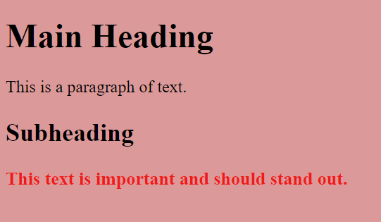
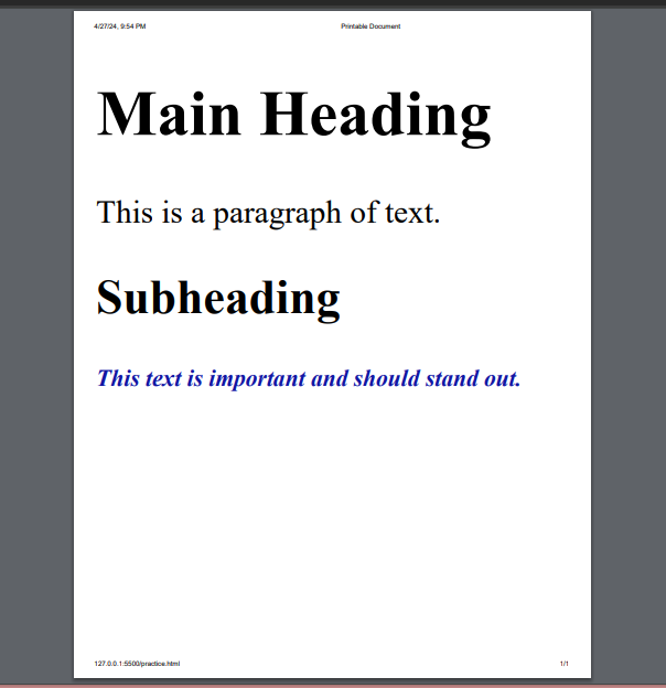
}This example displays on the screen with a default font size of 24 pixels, a background color of #dc9999, and emphasized text in red (#ee1b1b) at a font size of 26 pixels with bold weight. It has a larger font size of 38 points, a dark blue color (#1217a2) for emphasized text, and emphasized text in italic style at a font size of 28 points on print. The font family for the print version will be Arial, Helvetica, and sans-serif.
Here is the output as displayed on the web page:
 Here is the previewed output for printing:
Print Optimization Considerations
When preparing content for print, several crucial factors come into play to ensure the best possible output. This section delves into critical considerations for print optimization, including color management, typography, layout optimization, and image optimization techniques. Understanding and implementing these considerations can significantly enhance the quality and readability of printed materials.
Here are some strategies and guidelines:
-
Color Management: You need to address discrepancies between monitor color gamuts and printer capabilities. Ink and paper variations can also affect color representation. To ensure color consistency, calibrate your monitor, use the CMYK color model, and utilize soft proofing features in design software. Also, Ensure high contrast between text and background, avoid low-contrast color combinations, and prioritize clear fonts for optimal readability.
-
Typography: Selecting appropriate fonts and sizes impacts readability. For body text, prioritize clear, easy-to-read fonts like Arial or Helvetica. Use serif fonts like Times New Roman sparingly for emphasis and avoid decorative or script fonts. Also, maintain adequate line spacing, use left-aligned text for body content, implement sufficient margins, and test your typography choices in print.
-
Layout Optimization: Optimize layout for print by adjusting page size, margins, and orientation to suit different print formats. Utilize CSS media queries to modify layout properties for print, controlling page breaks and columns for improved presentation.
-
Image Optimization: Understand that resolution (PPI) affects image quality in print. Most printers require at least 300 PPI for good results. Use high-resolution images, resize using quality-preserving methods (bicubic interpolation), consider lossless image formats like PNG or TIFF, and test resized images at the desired print size.
Conclusion
This detailed guide has explored various aspects of print optimization, empowering you to create documents that are not only informative but also visually appealing and ready for high-quality print output. By following these guidelines and implementing the recommended techniques, you can optimize the quality and professionalism of your printed materials. Remember to test your print output regularly to refine your optimization approach and ensure a successful outcome.
Gain control over your UX
See how users are using your site as if you were sitting next to them, learn and iterate faster with OpenReplay. — the open-source session replay tool for developers. Self-host it in minutes, and have complete control over your customer data. Check our GitHub repo and join the thousands of developers in our community.


