CSS in Emails: Crafting Cross-Client Compatible Layouts

Email design can be a significant challenge due to the wide variety of email clients and their different support for modern web technologies. Cross-client compatible layouts/designs are those emails that render uniformly and work properly among different email clients, devices, and OS. Having compatible layouts in emails is important because they can enhance engagement, increase open rates, and drive clicks and conversions. This article explores how to use CSS to ensure compatibility across email clients.

Discover how at OpenReplay.com.
There is a long legacy of email clients supporting CSS compared to web browsers. As new features and standards are implemented by browsers, full/native support in email clients has become much slower to update. Simply put, some CSS properties and techniques that work well on websites might not function correctly when used in emails.
For instance, web developers can link external stylesheets to style entire websites, but email developers need to use inline styling—CSS applied directly to HTML elements—due to the constraints of legacy software worldwide.
To craft email layouts that render smoothly across different email clients, you need some careful considerations:
-
Know the repeating CSS properties and selectors supported by most email clients.
-
Using email-safe CSS declarations to steer clear and avoid unsupported features.
-
Using responsive design techniques within email constraints.
-
Email client/device testing.
-
Fallbacks and progressive enhancement strategies for both the front-end and back-end side.
Inline styles
Using inline styles is one of the most basic tricks for building an email layout that works for every client. In mainstream web development, we prefer using external stylesheets. However, email clients generally support styling applied directly to HTML elements.
Here are some benefits of inline styles for email design:
Reliability: Inline style elements are more reliable and less prone to rendering issues than external stylesheets, which may not always be predictable.
- Predictability: For basic inline styles, most email clients are more consistent than with advanced CSS selectors and properties.
Progressive enhancement: Inline style provides a strong foundation and can easily be increased with more general CSS when the browser supports it.
To create an email layout with inline styles, you have to:
-
Stick with basic CSS properties and values that are email-safe.
-
Apply styles only to elements in the HTML document.
-
Always test in email clients.
Here’s how to create a button with consistent styling across email clients using inline styles.
<a href="https://example.com"
   style="
 background-color: #4CAF50;
 color: white;
 padding: 14px 25px;
 text-align: center;
 text-decoration: none;
 display: inline-block;
 font-size: 16px;
 margin: 4px 2px;
 cursor: pointer;">
 Click Me!
</a>
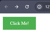
The code above creates a green button with white text. The inline styles define the button’s background color, text color, padding, alignment, and other properties to ensure it looks the same on any screen size.
The output of the code will look like this:

CSS properties for email development
It is very important to know the level of support for various properties when maintaining an email across different clients. Many CSS features may be well-supported, but others could still be limited or only have partial implementation. In this section, we will explore the right CSS properties for designing emails.
Here are some key CSS properties and their general email support:
Font styles and text properties
Text properties or font styles are those style attributes that define how the text appears on a web page.
They include:
-
font-family: Specify the font to be used. Use consistently available fonts like Arial, Helvetica, or sans-serif. -
font-size: This syntax determines the size of your text. For example,font-size: 16px;. -
color: This sets the color of your text. For example,color: #333;. -
font-weight: Defines the thickness of the text. For example,font-weight: bold;
Background properties
CSS background properties are used to set the background of an element on the web.
They include:
-
background-color: Sets the background color of elements. For example,background-color: #f0f0f0;. -
background-image: Add a background image if necessary. For example,background-image: url('image.jpg');.
Box model properties
The box model properties deal with the spacing and size of elements on a web page.
They include:
-
padding: Adds space inside an element (e.g.,padding: 1rem;). -
margin: Adds space outside of an element (e.g.,margin: 2rem;). -
border: Define borders (e.g.,border: 1px solid #ccc;).
Positioning and display
Positioning and display refers to how elements are positioned and displayed on the page and how they interact with other elements.
They include:
-
text-alignment: Align text within an element (e.g.,text-align: center;). -
display: Usedisplay: block;,display: inline;to control how elements behave.
Media queries
A media query is a CSS technique that applies styles based on specific conditions, such as screen size, device type, or orientation. It is used basically for responsive design. Simply put, media queries can be used to adjust styles to fit a given screen size (e.g., @media screen and (max-width: 700px) { ... }).
Example:
<!DOCTYPE html>
<html>
<head>
  <style>
    body {
      font-family: Arial, sans-serif;
      font-size: 16px;
      color: #fff;
      background-color: teal;
 }

    .container {
      padding: 20px;
      margin: 10px;
      border: 1px solid #ccc;
      text-align: center;
      font-size: 4rem;
 }

    @media screen and (max-width: 700px) {
      .container {
        font-size: 2rem;
 }
 }
  </style>
</head>
<body>
  <div class="container">
    <p>Media query -- CSS in emails</p>
  </div>
</body>
</html>
The media query in the above code will only apply these CSS styles when the screen width is 700px or below. It will match the .container class, with the text-size 2rem when the screen width is less or equal to 700px.
The output of the code will look like this:

Layout with tables
Tables are a powerful choice for organizing content because various email clients support them. Unlike websites, emails have limitations when it comes to using advanced CSS for creating layouts. In most cases, tables are relevant to creating layouts in emails.
To create a responsive email design with tables, you will start with a main table(parent) that holds everything. The table should be set to 100% width to adjust to the screen size but not wider than 600px, the standard email width. Inside this parent table, you can have more tables that act like columns. The inner tables should also be 100% width so they will stack on small screens and sit appropriately on larger screens.
Let’s explore the key considerations for using tables to create responsive email layouts.
Structuring tables for responsive design
To create a responsive email layout with tables, keep in mind to structure the table elements carefully.
Here’s an example of a two-column layout email design:
<table width="100%" cellpadding="0" cellspacing="0" border="0" style="font-family: Arial, sans-serif; color: #333;" class="full-width">
  <tr>
    <td width="50%" style="padding: 20px; background-color: #f5f5f5;">
      <h2 style="color: #007bff;">Featured Product</h2>
      <img src="https://via.placeholder.com/300x200" alt="Product Image" style="max-width: 100%; height: auto; display: block; margin-bottom: 10px;">
      <h3 style="color: #333;">Premium Leather Backpack</h3>
      <p style="font-size: 16px;">Lorem ipsum dolor sit amet consectetur adipisicing elit. Dolor iusto ipsum dolore fugiat non architecto expedita qui exercitationem pariatur officia eum accusamus blanditiis a, culpa animi. Hic vero et, sapiente magni iste magnam consequuntur! Omnis!</p>
      <a href="#" style="display: inline-block; background-color: #007bff; color: #fff; text-decoration: none; padding: 10px 20px; border-radius: 5px; font-size: 14px;">Buy Now</a>
    </td>
  </tr>

  <tr>
    <td width="50%" style="padding: 20px; background-color: #f5f5f5;">
      <h2 style="color: #007bff;">Trending Collection</h2>
      <div style="display: flex; justify-content: space-between; margin-bottom: 20px;">
        <div style="width: 48%;">
          <img src="https://via.placeholder.com/150x200" alt="Product 1" style="max-width: 100%; height: auto; display: block; margin-bottom: 10px;">
          <h4 style="color: #333; font-size: 16px;">Summer Dress</h4>
          <p style="font-size: 14px;">Lightweight and breezy, perfect for warm weather</p>
          <a href="#" style="display: inline-block; background-color: #007bff; color: #fff; text-decoration: none; padding: 8px 16px; border-radius: 5px; font-size: 12px;">Shop Now</a>
        </div>
        <div style="width: 48%;">
          <img src="https://via.placeholder.com/150x200" alt="Product 2" style="max-width: 100%; height: auto; display: block; margin-bottom: 10px;">
          <h4 style="color: #333; font-size: 16px;">Casual Shirt</h4>
          <p style="font-size: 14px;">Soft and comfortable, perfect for everyday wear</p>
          <a href="#" style="display: inline-block; background-color: #007bff; color: #fff; text-decoration: none; padding: 8px 16px; border-radius: 5px; font-size: 12px;">Shop Now</a>
        </div>
      </div>
    </td>
  </tr>
</table>
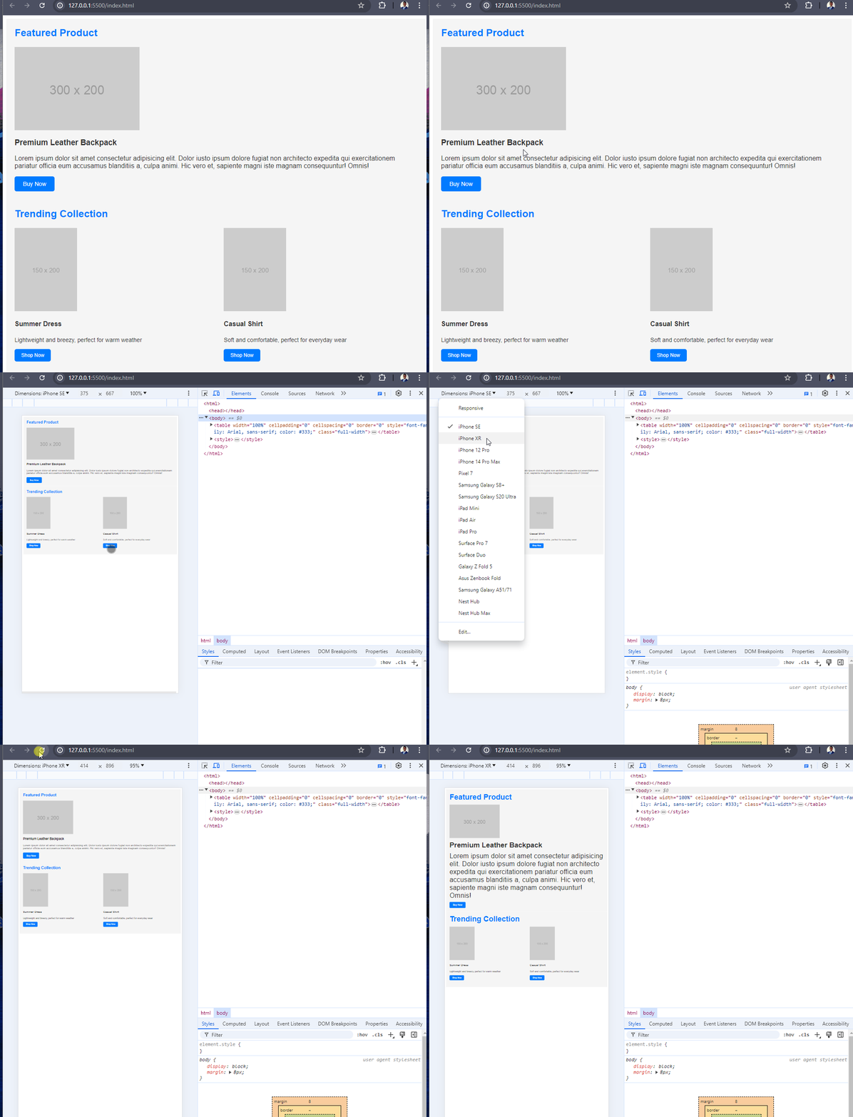
The code example creates a two-column table layout within a responsive email design. The outer table is styled to a width of 100% and a maximum width of 600px, ensuring the container fits on smaller screens.
The first column has the “Featured Product” section with an image, product details, and a call-to-action button. The second column shows a “Trending Collection” with two product previews, each with an image, title, description, and a “Shop Now” button. The table cells are styled with a light gray background and a slightly darker font color, which makes them look neat visually.
Here’s the output:

Media queries
Media query, as said earlier, is basically about creating responsive designs on web pages. In email design, media queries allow developers to structure their emails to fit on any device. Media queries apply different styles based on the user’s device, such as width, height, or orientation. However, you should note that not all email clients support media queries, so they should be used as an enhancement rather than a must-use.
Here’s an example of how to use media query in an email template:
<table class="email-container" style="background-color: teal; padding: 2rem;">
  <tr>
    <td class="column">
      <h2>Welcome to our Newsletter</h2>
      <p>In this edition, we have exciting news and updates to share with you.</p>
    </td>
    <td class="column">
      <img src="newsletter-image.jpg" alt="Newsletter Image" style="max-width: 100%; height: auto;">
      <p>Check out our latest product feature and see how it can benefit you.</p>
    </td>
  </tr>
</table>

<style type="text/css">
  /* Default styles that are applied to all clients */
  .email-container {
    width: 100%;
    max-width: 600px;
 }

  /* Media query for screens smaller than 600px */
  @media screen and (max-width: 600px) {
    .email-container {
      width: 100%;
      padding: 0 10px;
 }

    .column {
      display: block;
      width: 100%;
      max-width: none !important;
 }
 }
</style>
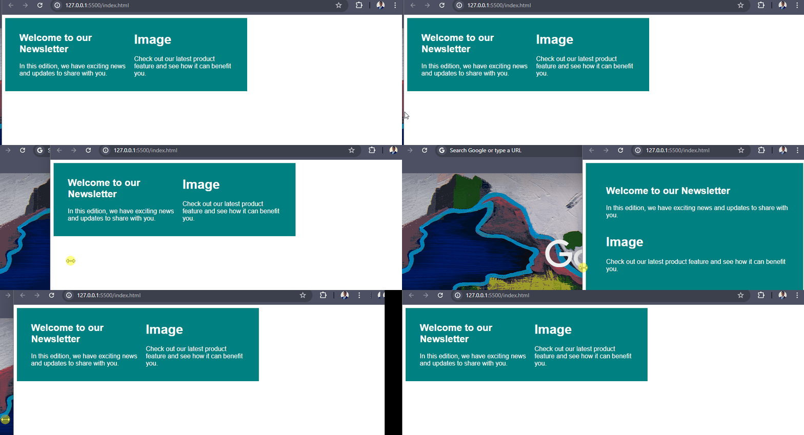
In the code above, the email layout uses a responsive table structure with two columns. The default styles set the width and max-width of the email container, while the media query adjusts the layout for smaller screens, which will make the columns stack vertically. Also, the background color is set to teal, providing consistent visual branding.
Here’s the output of the code:

Testing
Testing is an essential part of the email development process, especially if you want to prevent render issues and deliver a smooth user experience. Email clients and platforms render emails differently, so it is important to test your email code in as many environments as possible.
Here are a few important things to keep in mind when testing your emails:
-
Email Client Compatibility: Send your email to popular and used email clients like Gmail, Outlook, Apple Mail, and native apps on iOS/Android. That way, you can address all rendering and compatibility issues.
-
Device Compatibility: Testing your email across desktop, laptop, tablet, and smartphone devices can help you ensure your design and content adapt to all screens (tablets, mobiles) or resolutions.
-
Dark Mode Testing: As more email clients and operating systems support a dark mode, you should check how your emails look in a dark theme. Ensure your email is legible and adaptable in light and dark mode.
-
Accessibility: Make sure it is up to accessibility standards for users with certain disabilities like screen readers or color blindness. Examples include correctly writing
alttext for images, ability-aware color contrast, and plain language. -
Spam Testing: Ensure your code does not trigger any spam filters or blacklists, which could prevent your message from reaching the intended recipients.
-
Consistent Rendering: Make sure your email looks the same in every email client/device without layout issues, broken images, or display problems with elements.
Now, to fast-track the testing process, you will use a combination of online tools, email client emulators, and real device testing. Consider using apps like Litmus, Email on Acid, or BrowserStack. These apps will help simulate your email design on different clients and devices. Also, using them will help you identify and address issues before sending your campaign.
Fallbacks
It is essential to remember that not all email clients support the latest web technologies and CSS features. To provide a standard user experience, we need to implement fallback strategies on styles or elements that are not supported.
Here are some techniques for providing fallbacks in email design:
Basic, Standards-Compliant HTML: Use only simple HTML elements and avoid using advanced or experimental features. This will ensure that your content displays correctly in various email clients.
-
Fallback images: If you are using CSS-based layouts or background images, use fallback images that can be visible in where these features don’t support email clients. This can be achieved by adding the inline source of the fallback image as a normal element under the HTML block.
-
Inline Styles: Email clients have better support for inline styles compared to external or embedded styles. So, make sure to include all your important styles inline inside the HTML email content for maximum compatibility.
-
Fallback Fonts: Web fonts are not supported by all email clients, so be sure to include a fallback. Always include a fallback font stack that is widely supported by the system fonts.
Here’s an alternative font-family.
font-family: 'Roboto', Arial, sans-serif;-
Media Queries: In emails, media queries are not supported in all email clients, so make sure you have a good fallback design.
-
Responsive Images: Make your images both responsive and easy to scale between desktops and mobile devices. Use the
<picture>element or thesrcsetattribute to provide different image sources for different screen sizes.
Note: These fallback strategies are handy to start with. They will help you create emails that render consistently in various email clients and provide a seamless experience for your recipients.
Conclusion
Responsive design and thorough testing should be considered when creating an email layout that has to display perfectly on a large spectrum of email clients across devices. To take advantage of what the next few years will bring, utilizing all these resources and staying informed as well as adaptable in how we design emails is more important than ever.
Truly understand users experience
See every user interaction, feel every frustration and track all hesitations with OpenReplay — the open-source digital experience platform. It can be self-hosted in minutes, giving you complete control over your customer data. . Check our GitHub repo and join the thousands of developers in our community..

