CSS Pseudo-classes

A keyword added to a selector in CSS that specifies a particular state of a marked element is known as a pseudo-class. CSS pseudo-classes allow you to specify properties and apply styles to selectors based on their state and external factors.
In keeping with the definition, CSS Pseudo-classes are referred to as classes because the rule applies to elements that share the same state.
As an illustration, the pseudo-class :lang() will only choose an element based on the language of its content.
Notably, Pseudo elements can be used to style a certain portion of an element, as opposed to Pseudo-classes.
We will learn about CSS pseudo-classes in this article, including some of the most popular ones.
Syntax
A colon : and the name of a pseudo-class are appended to a tag to declare a CSS pseudo-class (It is also necessary to note that CSS Pseudo class names are not case-sensitive.).
HTML content associated with a tag will automatically receive the pseudo-class.
Here is a brief explanation of what pseudo-class syntax looks like:
tag: pseudo-class {
Property: value;
}
Frequently used Pseudo-classes
We will be looking at some commonly used pseudo-classes:
:link:visited:hover:active:focus
Create a new file, style.css, and paste the code block below:
body {
  display: flex;
  justify-content: center;
  align-items: center;
  height: 100vh;
}

a {
  color: black;
  text-decoration: none;
  font-size: 50px;
  font-weight: 700;
}
Create an HTML file and paste the code block below:
<!DOCTYPE html>
<html lang="en">
  <head>
    <meta charset="UTF-8" />
    <meta http-equiv="X-UA-Compatible" content="IE=edge" />
    <meta name="viewport" content="width=device-width, initial-scale=1.0" />
    <link rel="stylesheet" href="style.css" />
    <title>Demo for pseudo classes</title>
  </head>

  <body>
    <ul>
      <li><a href="https://wordpress.org" target="_blank">Wordpress</a></li>
      <li><a href="https://adobe.com" target="_blank">Adobe</a></li>
      <li><a href="https://mozilla.org" target="_blank">Mozilla</a></li>
      li><a href="https://feedburner.org" target="_blank">Feedburner</a></li>
      <li><a href="https://slideshare.net" target="_blank">Slideshare</a></li>
      <li><a href="https://wikimedia.org" target="_blank">Wikimedia</a></li>
    </ul>
  </body>
</html>
The above code block will be used to show the usage of the different pseudo-classes
:link
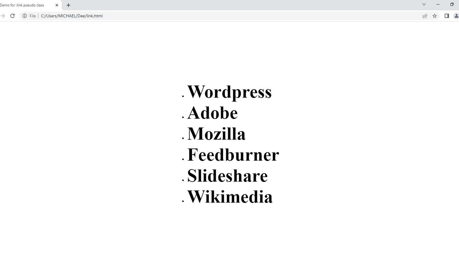
The :link pseudo-class is used to style and pick out links on a website that have not yet been clicked by the user. It matches every :unvisited anchor<a> element that has a <href>attribute.
It is important to understand that an element can be both :active and:visited in order for the :link pseudo-class to function.
The style set by the :linkpseudo-class can be overridden by pseudo-classes like:active, :visited,:hover
There is a :link rule that must be followed before all other link-related rules to style links properly, and it must be specified in the following sequence:
:link ➔ :visited ➔ :hover ➔ :activeIt shall be referred to as the LVHA order throughout this article.
Syntax
tag:link { property: value }Example
a:link {
  color: black;
}
Output

:visited
A :link that has been visited is described by the : visited pseudo-class.
The : visited pseudo-class can only be applied to anchor <a> elements that include the <href> attribute, just like the : link pseudo-class.
The :visited pseudo-class can assist users in distinguishing between :visited and :unvisited links.
The :visited pseudo-class and specific scripting can be used to retrieve a user’s web browsing history.
As a result, there are restrictions on the styles that can be set for a :visited link.
Browsers, for instance, won’t permit a page’s background picture to be changed. By blocking these scripts from accessing and also obtaining links that have been visited from the web page, these restrictions aid in protecting users’ privacy.
Nevertheless, the following styles are permitted, and they are:
:color:background-color:outline color:column rule color
All other styles are inherited from the’:link’pseudo-class.
Overall, the :visited pseudo-class is a useful tool for web designers to enhance the usability of their websites, but it should be used with care to respect user privacy and security.
Syntax
tag:visited { property: value }Example
a:visited {
  color: red;
}
Output
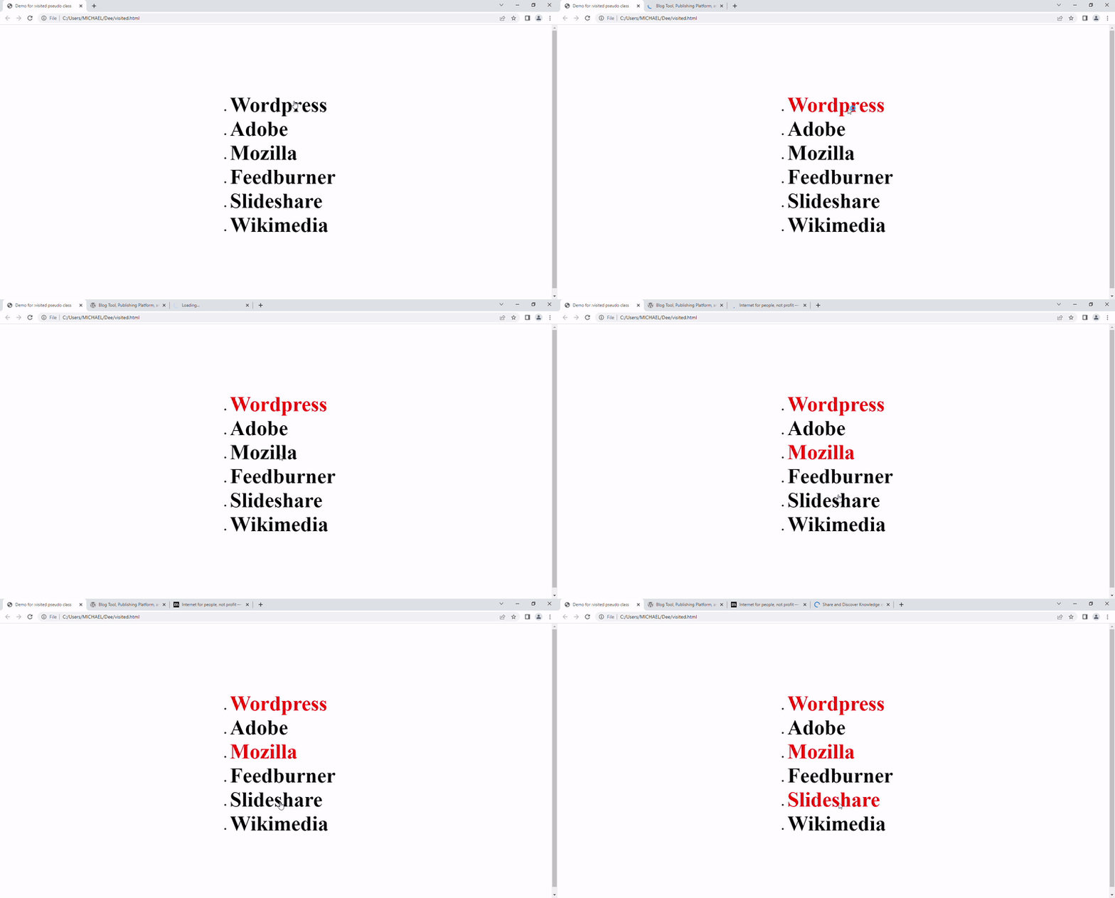
As shown below, each link that has been :visited has a color shift from black, which represents an :unvisited link, to red, which denotes the link has been clicked.

Session Replay for Developers
Uncover frustrations, understand bugs and fix slowdowns like never before with OpenReplay — an open-source session replay tool for developers. Self-host it in minutes, and have complete control over your customer data. Check our GitHub repo and join the thousands of developers in our community.
:hover
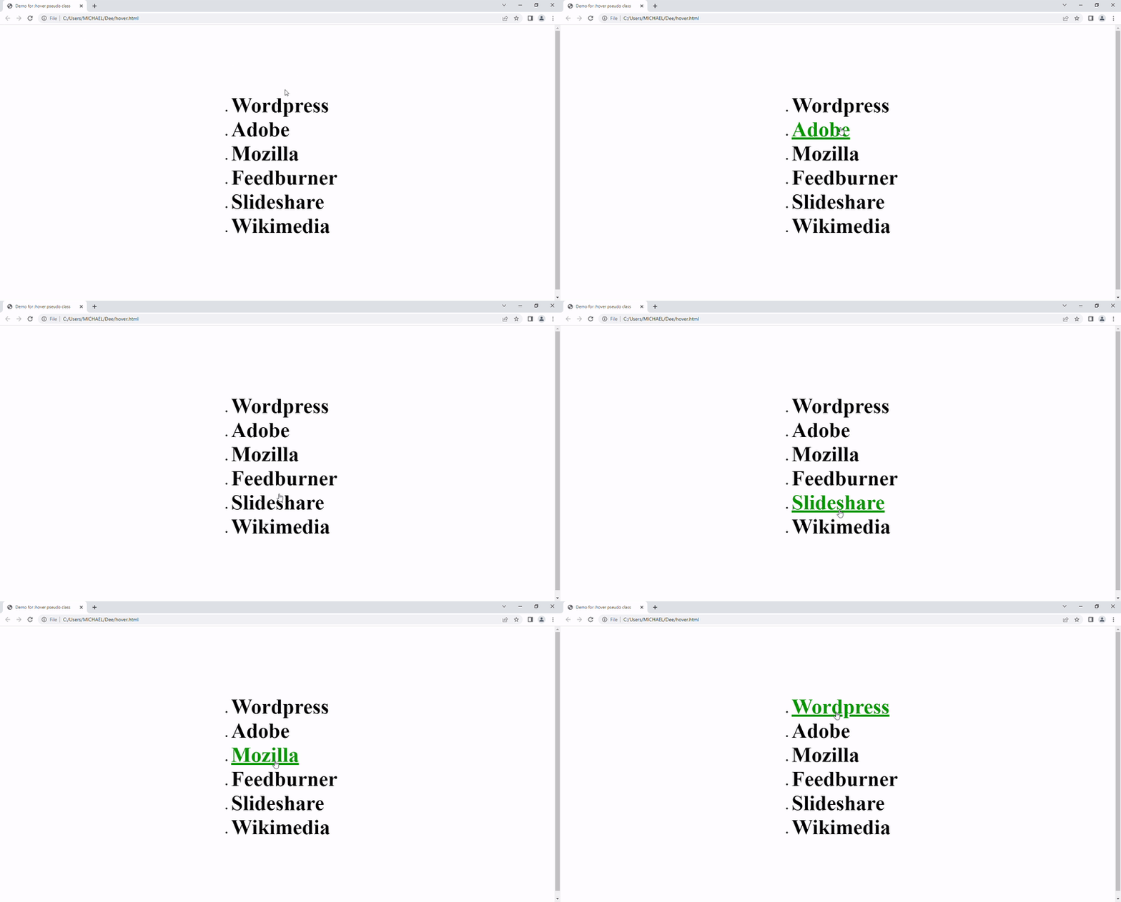
When an element is hovered over by the user, the:hover pseudo-class adds additional effects and matches with it.
The user frequently gets visual cues when they hover over an element, and if necessary, they have the choice to activate it.
The : hover pseudo-class becomes effective after the : link and :visited pseudo-classes are applied before it, thereby ensuring complete compliance with the LVHA order.
On touchscreens, the : hover pseudo-class might provide difficulties.
Depending on the browser, it may never match, just match briefly after the user touches the element, or match even after the user stops touching until the user touches another element.
The :hover is the most used pseudo-class in CSS.
Syntax
tag:hover { property: value }Example
  a:hover {
  color: green;
  text-decoration: underline;
}
Output

:active
The element is displayed as being in an active state using the : active pseudo-class. This pseudo-class is most frequently linked to the <a>element and <button>. The elements that are contained within an activated state are another common target of the pseudo-class.
When a user clicks an element with the mouse, the action is referred to as “activating” in CSS. It is an ephemeral, transitory state. Once the user stops clicking on an element, the element will no longer be activated.
Syntax
tag:active{ property: value }Example
a:active {
  color: goldenrod;
}
Output

:focus
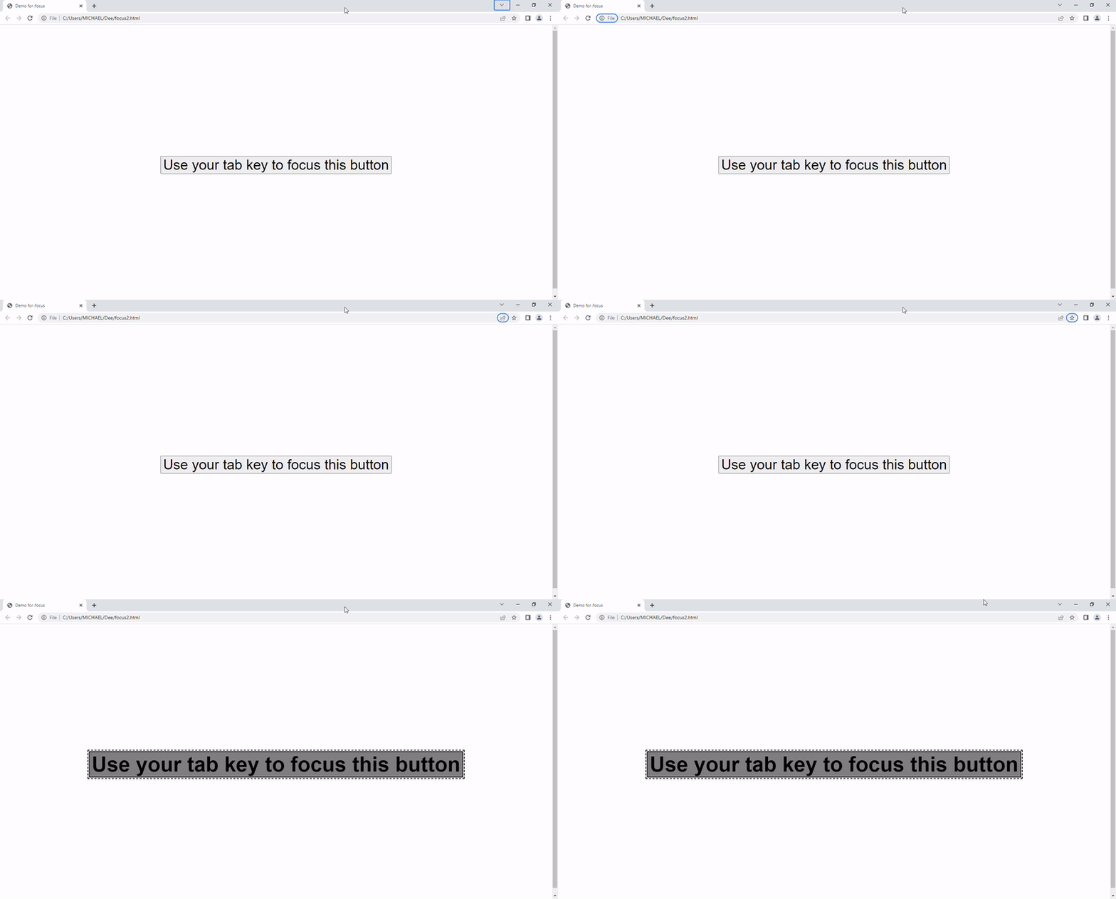
An element that has been the subject of focus is described by the : focus pseudo-class. It is used to style an element that is currently being selected with the mouse or activated by the keyboard.
When an element is selected and available for text input, it is said to be in “focus” (like when the cursor is blinking). Keyboard users can tab into them while using the mouse to focus on them.
Syntax
tag:focus{ property: value}Example
<!DOCTYPE html>
<html lang="en">
  <head>
    <meta charset="UTF-8" />
    <meta http-equiv="X-UA-Compatible" content="IE=edge" />
    <meta name="viewport" content="width=device-width, initial-scale=1.0" />
    <link rel="stylesheet" href="style6.css" />
    <title>Demo for :focus</title>
  </head>
  <body>
    <div class="wrapper">
      <button class="button">Use your tab key to focus this button</button>
    </div>
  </body>
</html>
.button {
font-size: 40px;
}
.button:focus {
outline: 2px dashed black;
outline-offset: 2px;
background-color: gray;
font-size: 60px;
font-weight: 600;
}Output

Conclusion
In conclusion, CSS pseudo-classes are powerful tools for styling web pages, allowing developers to target specific elements based on their state or position in the document tree.
They can be used to add special effects, improve accessibility, and create interactive user experiences. It is important to understand how to use them effectively in order to create efficient and maintainable stylesheets.
Additionally, some pseudo-classes may not be supported by older browsers, so it is important to test your stylesheets thoroughly across multiple platforms and devices.

