Custom Animated Circular Progress in React Native

In a mobile app, progress indicators are an essential component that helps users understand how long an action will take and whether it is complete. A well-designed progress indicator can significantly improve the user experience of an app by providing feedback and reducing uncertainty.
In this tutorial, I will be working you through the steps involved in creating a circular progress bar in your React Native project. This promises to be straightforward, easily integrated and understood. I’ll start by setting up a new React Native project and installing the React Native Reanimated 2 libraries. Next, I’ll define the structure and appearance of the circle progress bar component. I’ll then delve into the implementation of the progress bar using React Native Reanimated 2, covering areas such as animating the progress arc and customizing the appearance of the component. You can get the complete source doe for this project here.
Prerequisite
This tutorial will require you to understand JavaScript and can work with React Native. You should have also set up your computer following the directions from the React Native environmental setup page. This setup involves the installation and configuration of an Android and iOS emulator for the testing of your React Native project.
Preparatory Steps
In this project, we will be building a circular progress bar that will appear and load when a button is clicked and after some seconds, it’ll be unmounted from the screen. The circles and tick in this project will be created with the react-native-svg library while the animations will be implemented with the react-native-reanimated library but before that, we will require that some processes are put in place. These steps include:
-
Creating a new React Native project: Once you have React Native CLI installed, you can create a new React Native project by running the following command:
npx react-native init projectName. ReplaceprojectNamewith the name of your project. -
Installing react-native-reanimated 2 & react-native-svg: To use React Native Reanimated 2 and react-native-svg in your project, you need to install them using npm. You can install it by running the following command in your project’s root directory:
npm install react-native-reanimated react-native-svg. To complete the configuration, add the code below to the babel.config.js file.
module.exports = {
 //Add this
  plugins: ['react-native-reanimated/plugin']
  }
Run the project on your Android emulator by running npx react-native run-android.
- Installing pods (iOS only): If you’re developing for iOS, you’ll need to install the required pods using CocoaPods. You can do this by running the following command in your project’s iOS directory:
cd ios && pod install. You should now run this project on your iOS emulator using the commandnpx react-native run-iosfrom your project’s root directory.
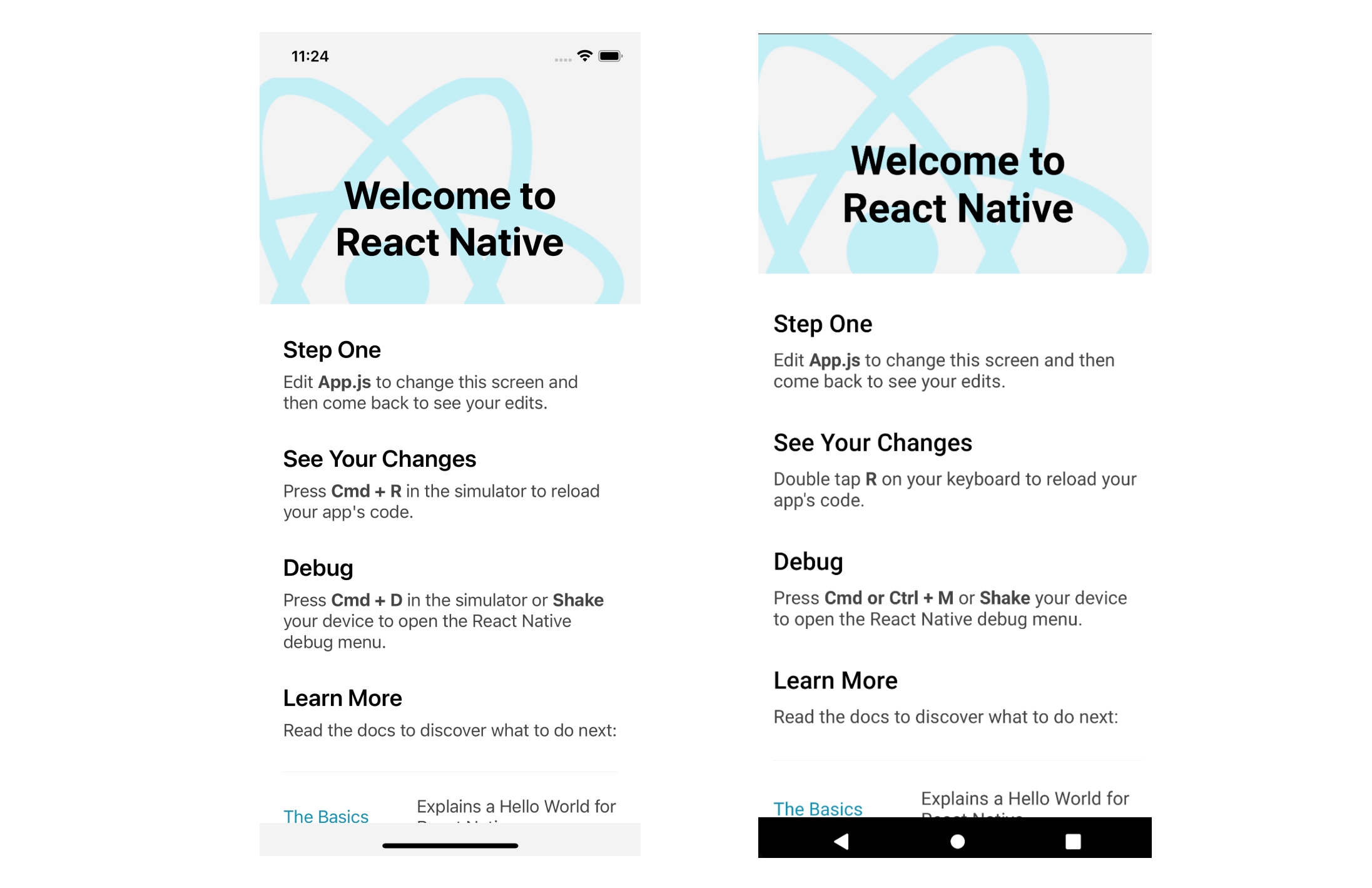
You will learn more about getting started with React Native here but If you have run the processes correctly, you should have your emulators displayed as shown:
Defining the Circle Progress Bar Component
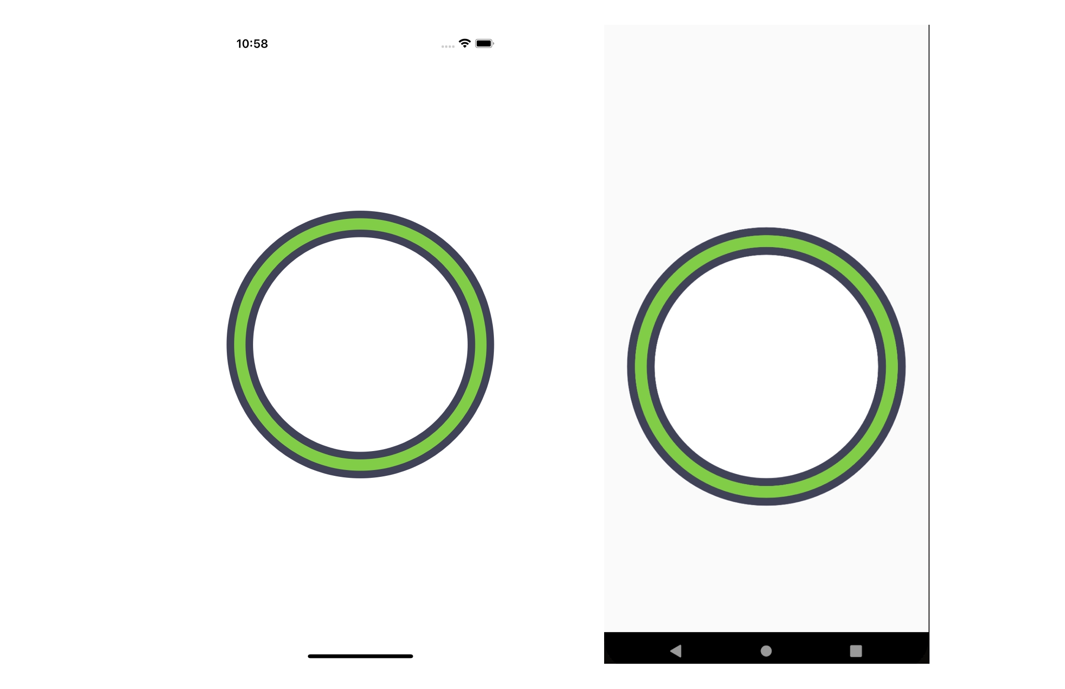
The Circle Progress Bar component will be defined in the app.js file. This component will consist of the inner and outer circle and the tick. Right now, we will create the first circle. We will use the Dimensions module of React Native to retrieve the screen width and height and assigns them to width and height respectively.
After this, we will declare and initialize constant variables to define the shape and size of the circle for the progress bar. These variables are Circle_Length and Radius. Circle_Length is the circle’s circumference, and Radius is the circle’s radius. Circle_Length is assigned a value of 1000, which represents the length of the circle in pixels. Radius is calculated as the value of Circle_Length divided by 2 times Pi (2 * Math.PI). This calculation is used to find the radius of a circle from its circumference. The code to implement what’s been described above is as follows but before all that, the modules should be imported as shown:
import { Dimensions, View, TouchableOpacity } from "react-native";
import { Svg, Circle } from "react-native-svg";
import Animated, {
  useAnimatedProps,
  withSpring,
  useAnimatedStyle,
  useSharedValue,
  withDelay,
  withTiming,
} from "react-native-reanimated";
Add the following after the import statements outside the app component.
const {width, height} = Dimensions.get('screen');
const Circle_Length = 1000;
const Radius = Circle_Length / (2 * Math.PI);
Next, we will define the two circles within an SVG component. The for each circle component are:
cx: This prop defines the x-coordinate of the center of the circle. In this case, the x-coordinate is set to half of the width of the screen, which positions the center of the circle horizontally in the middle of the screen.
cy: This prop defines the y-coordinate of the center of the circle. In this case, the y-coordinate is set to half of the height of the screen, which positions the center of the circle vertically in the middle of the screen.
r: This prop sets the radius of the circle. In this case, it’s set to the Radius value, which is calculated as the Circle_Length divided by 2 times pi.
stroke: This prop sets the color of the stroke (outline) of the circle. In this case, two different colors are used for the two circles: “#404258” and “#82CD47”.
fill: This prop sets the color to fill the interior of the circle. In this case, one circle is filled with white “#fff”, and the other is set to “transparent” to allow the background to show through.
strokeWidth: This prop sets the width of the stroke of the circle. In this case, one circle has a width of 35, while the other has a width of 15.
strokeDasharray: This prop sets the length of the dash of the stroke, making it a dashed line. In this case, it’s set to Circle_Length to ensure that the dash fits the full circumference of the circle.
strokeLinecap: This prop sets the style of the ends of the dash. In this case, it’s set to “round” to give the ends of the dash a rounded appearance. The code is below:
const App = () => {
return (
  <View style={{ flex: 1, alignItems: "center", justifyContent: "center" }}>
    <Svg>
      <Circle
        cx={width / 2}
        cy={height / 2}
        r={Radius}
        stroke="#404258"
        fill="#fff"
        strokeWidth={35}
      />
      <Circle
        cx={width / 2}
        cy={height / 2}
        r={Radius}
        stroke="#82CD47"
        strokeWidth={15}
        fill="transparent"
        strokeDasharray={Circle_Length}
        strokeLinecap="round"
      />
    </Svg>
  </View>
);
};
By the end of this implementation, your emulators should be showing up like this:
Lastly, before animating some components, we should create the tick and this will be done using the Path module from the SVG library. To place the tick on a circular light green background, we will create a view, apply the solid color to it, and have a border radius of 150 to make it round. Then, the next SVG component will be the path we will use to create the tick. The code to implement as described is below. Please insert this code after the previous block of code:
  <View
    style={{
      height: 250,
      position: "absolute",
      width: 250,
      bottom: 210,
      backgroundColor: "#54B435",
      borderRadius: 150,
    }}
  />
  <Svg
    viewBox="0 0 40 40"
    style={{
      height: 110,
      position: "absolute",
      width: 110,
      bottom: 280,
      backgroundColor: "transparent",
      transform: [{ scale: 2 }],
    }}
  >
    <Path
      d="M12.5 20l5 5 9-9"
      stroke={"#fff"}
      strokeWidth={3}
      fill="#54B435"
      strokeLinecap="round"
    />
  </Svg>
If you followed along accordingly, you should have your emulators showing something similar to the screens below:
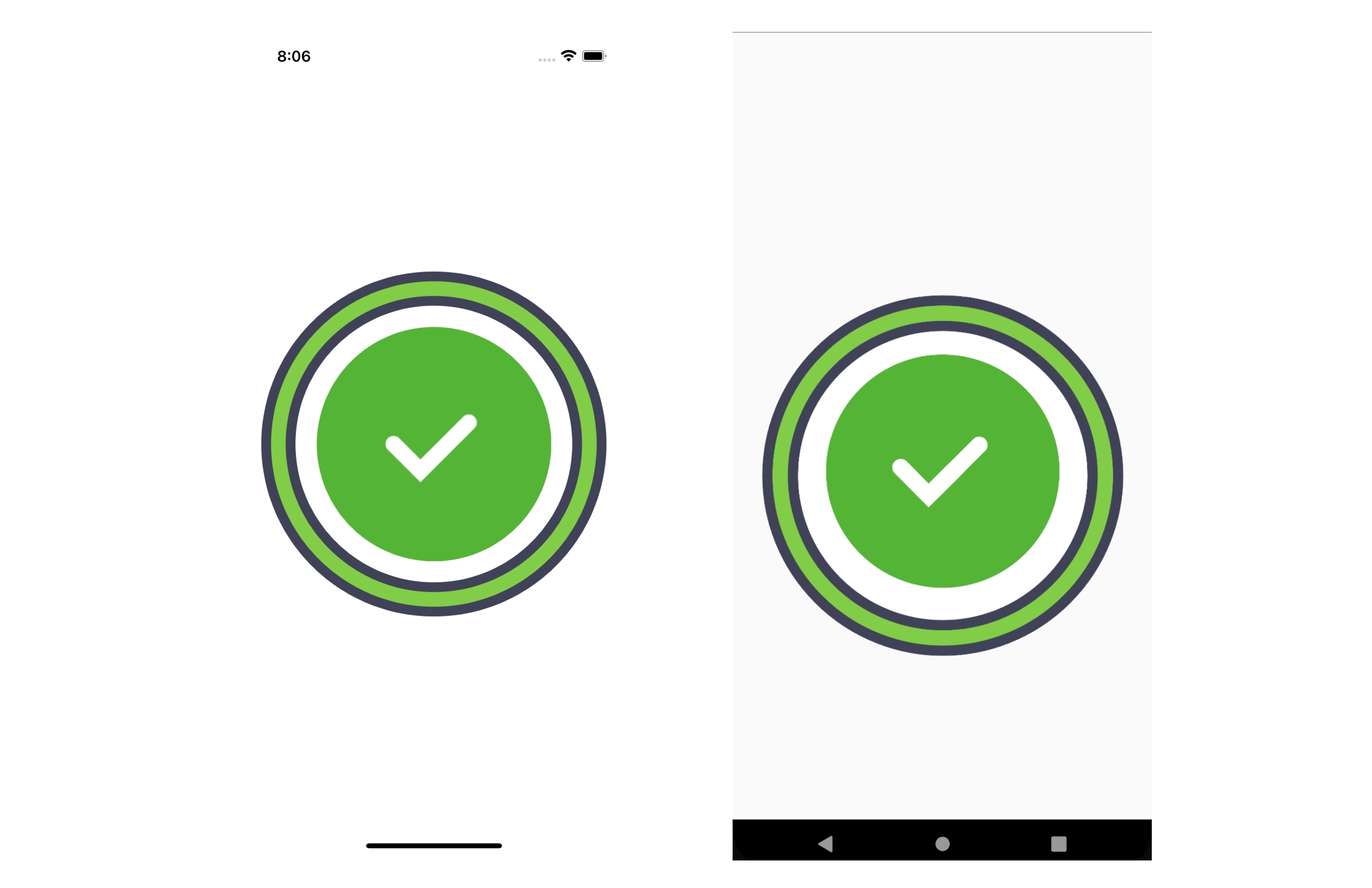
With a close look, you will notice that an extra style of bottom is added to the last view component and the SVG component. The reason for this is that the inner tick and its background have a position of absolute and that doesn’t display properly on Android but with the help of the top, right, left, or bottom style, we can get it to display as it’s supposed. While iOS contains and displays properly, it’s not the same for Android. Due to this concern, if you are working on iOS, you will have some distortion but removing the style, bottom will fix it for you and you should have the same result as shown.
Creating and Integrating Animations into the Components
The components for this project are all in place but there’s no liveliness without the animation. First of all, the outer circle should show up like it’s loading. For this to be implemented, We need to understand some concepts with the circle. The concepts are strokeDashArray and strokeDashOffset.
The strokeDashArray is a way to define a pattern of dashes or gaps in a stroke. It could be in little sizes or a big chuck. We have set the strokeDashArray for the outer circle which we are animating to the circle length. This is because we want the outer circle to be made up of one dash. This makes it easy for us to animate it because we can for instance animate it from 0 to 1 and the whole process can be the animation. Now the second concept is the strokeDashOffset. This is prop is used to define the portion of a shape that is drawn initially and can be animated over time which will make the entire shape appear drawn.
To set this in place, we will create a progress value using the useSharedValue hook then, using the useAnimatedProps hook, we will create a set of animated properties. The Circle_Length constant is the circumference of a circle and the progressCircle.value is a shared value that holds the current progress of the animation. The product of Circle_Length and progressCircle.value is used to calculate the strokeDashoffset value, which determines how much of the stroke of a path should be offset and not drawn.
Lastly, for these effects to be visible, we will be using the useEffect hook to define the animation such that the progressCircle.value will gradually change from 0 to 1 over 2 seconds. The code to implement all these is below but before this can be effected on a component, we need to convert it from a normal component to an animated component.
To convert the circle component, insert the code below before the app component. This code creates a new component called AnimatedCircle which is an animated version of the Circle component.
const AnimatedCircle = Animated.createAnimatedComponent(Circle);Now, update the second circle component to AnimatedCircle instead of just Circle. Then we will declare a constant called progressCircle and the animatedProps, attach the animatedProps as the value to the animatedProps prop in the AnimatedCircle component and define the animation within the useEffect hook.
const progressCircle = useSharedValue(1);
const animatedProps= useAnimatedProps(() => ({
  strokeDashoffset: Circle_Length * progressCircle.value,
}))

React.useEffect(() => {
  progressCircle.value = withTiming(0, {duration: 2000})
}, [])
Update the AnimatedCircle component accordingly.
...
<AnimatedCircle
  cx={width / 2}
  cy={height / 2}
  r={Radius}
  stroke="#82CD47"
  strokeWidth={15}
  fill="transparent"
  strokeDasharray={Circle_Len}
  animatedProps={animatedProps}
  strokeLinecap="round"
/>;
...
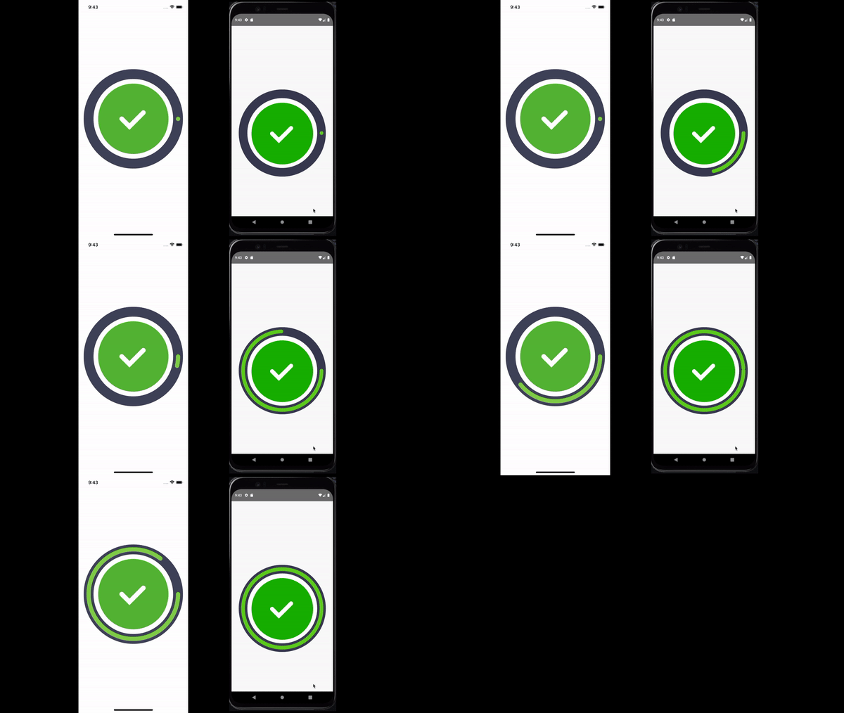
If you followed as shown and described above, you should have something like this showing on your emulators:
Session Replay for Developers
Uncover frustrations, understand bugs and fix slowdowns like never before with OpenReplay — an open-source session replay tool for developers. Self-host it in minutes, and have complete control over your customer data. Check our GitHub repo and join the thousands of developers in our community.
Fixing up the Tick
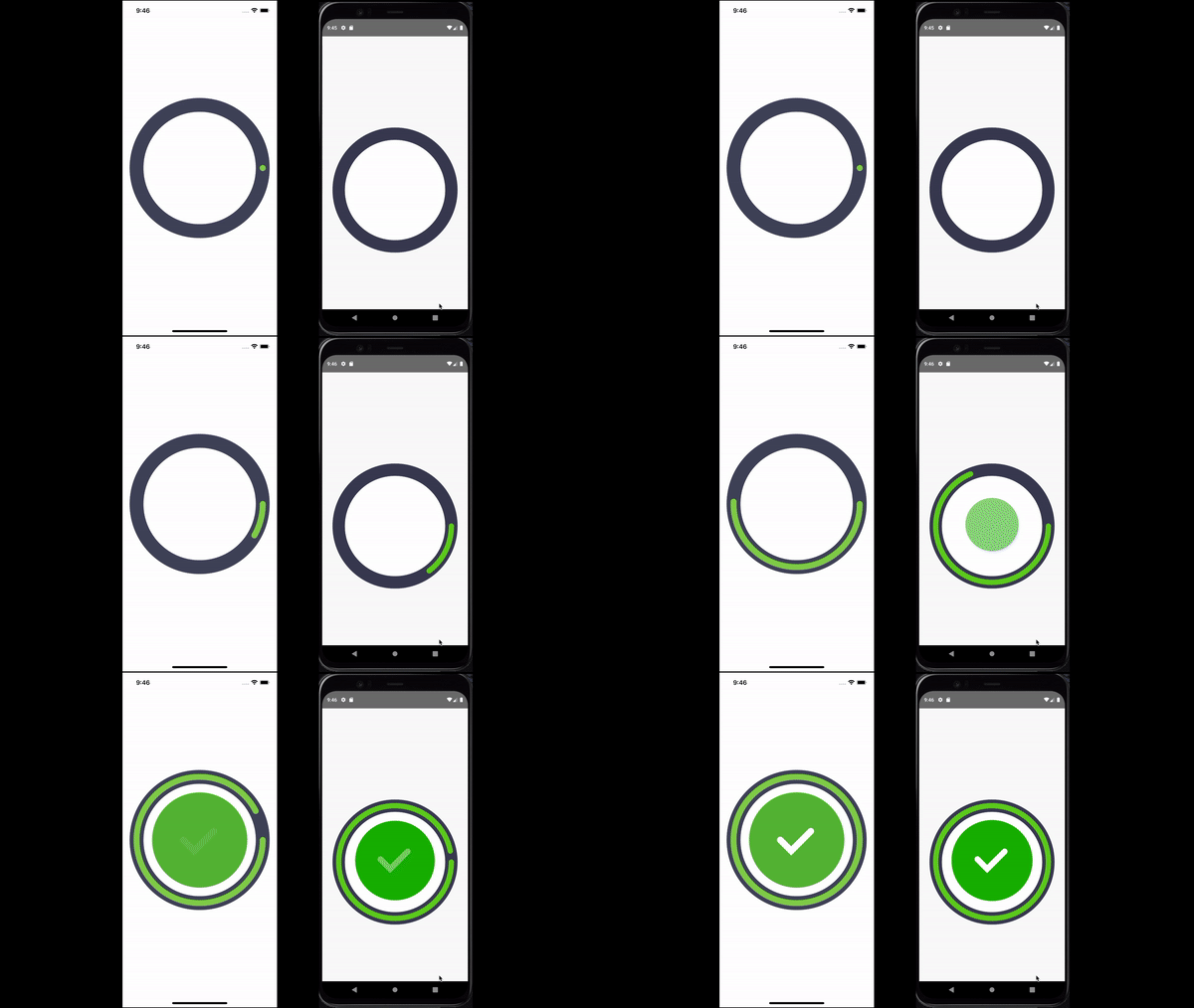
The tick is planned to pop as the circle’s stroke is rounding up. It will be in a solid color background that will scale up and pop while its opacity animates from zero to 1.
The first area to work on is to create a shared value for the tick’s background, the tick’s scale, and the tick’s opacity. The code:
const tickScale = useSharedValue(1);
const bckgrd = useSharedValue(0);
const tickOpacity = useSharedValue(0);
Next, we will convert the Path component to an AnimatedPath component. The code:
const AnimatedPath = Animated.createAnimatedComponent(Path);Then using the useAnimatedStyle hook, we will declare two animated styles which we will attach to the tick background and the path respectively.
const bckgrdAnimatedStyle = useAnimatedStyle(() => {
  return {
    opacity: bckgrdOpacity.value,
    transform: [{scale: tickScale.value}]
  }
})


const tickAnimatedStyle = useAnimatedStyle(() => {
  return {
    opacity: tickOpacity.value,
  }
});
Then we will update the components to Animated.View for the tick background and AnimatedPath for the path component after which the declared bckgrdAnimatedStyle and tickAnimatedStyle will be attached to the respective components. The code:
<Animated.View
 style={[{
    ...
    },
    bckgrdAnimatedStyle,
    ]}/>
    <Svg viewBox='0 0 40 40'
     style={{
     ...
     transform: [{scale: 2}]
      }}>
    <AnimatedPath
     ...
     style={tickAnimatedStyle}
     strokeLinecap="round"
     />
</Svg>
Now, update the useEffect hook with the code below:
...
tickScale.value = withDelay(1000, withSpring(80));
  bckgrdOpacity.value = withDelay(1000, withTiming(1));
  tickOpacity.value = withDelay(1500, withTiming(1, {duration: 500}) );
  ...
If you followed as shown, your emulators should be displaying something like this:
Adding the Button
To round this project up, we will implement a button so that onPress, the circular progress bar will be mounted and the animation will happen then after a few seconds, the progress bar will be unmounted from the screen.
To do this, we will use the React useState hook to create a loading state and a setLoading function. By default, this state will be false but once the button is clicked, it will be made true which will usher in our animation, and after 3 seconds, the loading state will be set to false and the animation will be unmounted.
Add the code below within the app component, at the top:
const [loading, setLoading] = React.useState(false);To create the button, use the code below:
<TouchableOpacity
  onPress={() => mountAnimation()}
  style={{
    bottom: 80,
    position: "absolute",
    width: width * 0.7,
    height: 60,
    backgroundColor: "#54B435",
    borderRadius: 15,
    alignItems: "center",
    justifyContent: "center",
  }}
>
  <Text style={{ fontSize: 20, color: "white", textTransform: "uppercase" }}>
    Show Animation
  </Text>
</TouchableOpacity>;
Since we are using a button, clear the useEffect hook and add the code below:
const mountAnimation = () => {
  progressCircle.value = withTiming(0, { duration: 2000 });
  tickScale.value = withDelay(1000, withSpring(80));
  bckgrdOpacity.value = withDelay(1000, withTiming(1));
  tickOpacity.value = withDelay(1500, withTiming(1, { duration: 500 }));
  setLoading(true);
  setTimeout(() => {
    setLoading(false);
    progressCircle.value = withTiming(1, { duration: 500 });
    tickScale.value = withDelay(500, withSpring(0));
    bckgrdOpacity.value = withDelay(500, withTiming(0));
    tickOpacity.value = withDelay(500, withTiming(0, { duration: 500 }));
  }, 3000);
};
This function sets the loading state to true and after 3 seconds, it sets it to false and resets all the values to default on the animation.
Then using conditional rendering, we will organize the components following as shown:
return (
  <View style={{ flex: 1, alignItems: "center", justifyContent: "center" }}>
    {loading ? <>...</> : null}
    <TouchableOpacity
      onPress={() => mountAnimation()}
      style={{
        bottom: 80,
        position: "absolute",
        width: width * 0.7,
        height: 60,
        backgroundColor: "#54B435",
        borderRadius: 15,
        alignItems: "center",
        justifyContent: "center",
      }}
    >
      <Text
        style={{ fontSize: 20, color: "white", textTransform: "uppercase" }}
      >
        Show Animation
      </Text>
    </TouchableOpacity>
  </View>
);
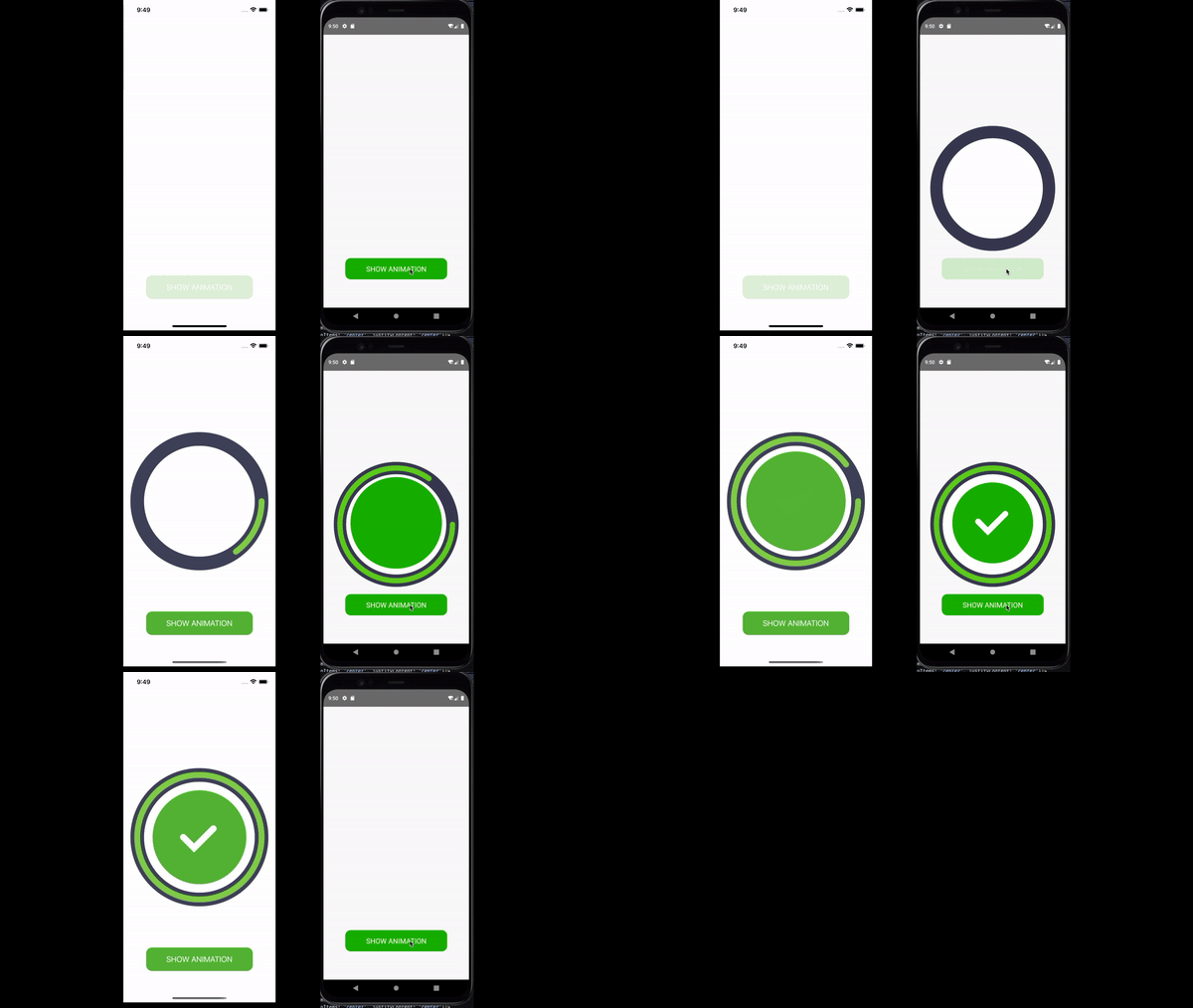
Here’s what your Android and iOS emulators should be showing you if you followed through.
Conclusion
Finally, creating a custom circular animation in React Native can be a fun and challenging task. While you can just install a module to implement this, you should know how to create it for yourself and never have to depend on any module for it and I am sure that by following the steps outlined in this article, you can create a custom circular animation that adds a unique touch to your app and enhances the overall user experience. With a little bit of creativity, the possibilities are endless, so go ahead and bring your ideas to life!


