Design Engaging Landing Pages for Effective Conversions

Getting and keeping users’ attention in today’s fast-paced digital world is a constant struggle for companies and organizations. With so many distractions competing for their time and clicks, effectively engaging visitors and guiding them towards performing a task or buying a product is more critical than ever. This guide will explore the fundamentals of creating engaging landing pages that captivate your audience and boost your conversion rates.

Discover how at OpenReplay.com.
Landing pages are single-page websites designed for specific purposes like gathering contact information or promoting products/services. Unlike multi-page sites, they concentrate on one main action, often utilized in promotions to direct people toward a response. With their simple layout, landing pages highlight the main goal, aiming to increase conversions.
Landing pages typically fall into one of numerous categories, such as:
- Landing pages for lead generation: These are created to gather users’ contact information, frequently by providing rewards in return for email addresses.
- Click-Through Landing Pages: These pages usually offer more information or incentives to get users to click through, to direct them to a particular page on the website where they can complete a desired activity.
- Product or Service Landing Pages: These concentrate on providing a single offering in detail to persuade visitors to buy it or find out more.
- Event Registration Landing Pages: By displaying event details and registration forms, these are used to advertise and streamline webinar or conference sign-ups.
- 404 Error Landing sites: By providing useful navigation or suggesting pertinent alternate information, these sites aim to keep visitors who arrive at broken links.
Importance of Conversion Rates and Effect of Landing Pages on User Interaction and Retention
Conversion rates are like the digital marketing scorecard, showing how many website visitors do what you want, like buying stuff or signing up for newsletters. Understanding and improving these rates is super important for making the most of your marketing efforts. A high conversion rate means you’re doing a great job convincing people to take action, which boosts sales and grows your business. But if your rates are low, it’s a sign that you need to tweak your messages, design, or who you’re targeting.
Your landing pages need to be really interesting to get people interested, engaged, and coming back for more. Well-designed pages with clear instructions and engaging content make it easier for visitors to do what you want. When people like what they see on your page, they’re more likely to stick around and do what you ask, which builds trust and keeps them coming back for more.
Alignment with Business Goals and Target Audience
Landing pages should be crafted to align with the business’s objectives: lead generation, sales, brand awareness, or product promotion. Understanding the target audience’s demographics, behaviors, and preferences is crucial for designing landing pages that resonate and drive action.
Effective landing pages incorporate clear and compelling CTAs strategically placed to capture attention and encourage engagement. By aligning landing pages with business goals and target audience preferences, businesses can maximize the effectiveness of their digital marketing efforts and achieve higher conversion rates.
Key Elements of Engaging Design Landing Page
Landing pages serve as your online storefront and are the initial point of contact for visitors who may become leads or customers. However, with so much competition online, how can you create a page that motivates visitors to take action and genuinely engages them? Let’s examine the essential components:
Creating Headlines and Subheadings That Grab Attention
Since your headline is the first thing readers will see, it must be precise, concise, and compelling. Use powerful verbs, emphasize the advantages, and speak to your audience’s concerns. Subheadings should direct readers across the page and provide further context for the headline.
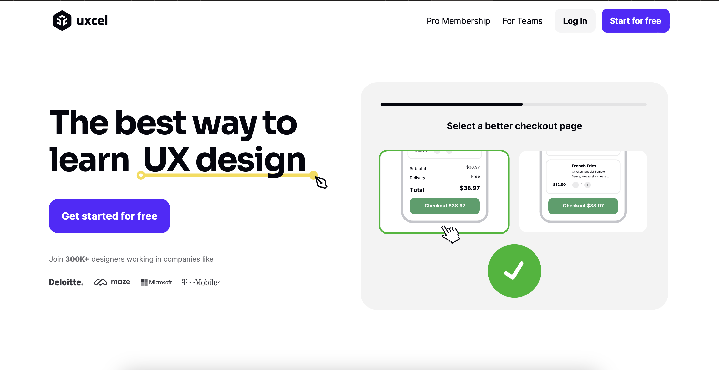
Example: UXcel.com’s headline, “The best way to learn UX design,” communicates the website’s topic succinctly and clearly without needing a subtitle. It is actionable, precise, and targets a major issue for its target audience.
Creating Visually Captivating Layout Designs
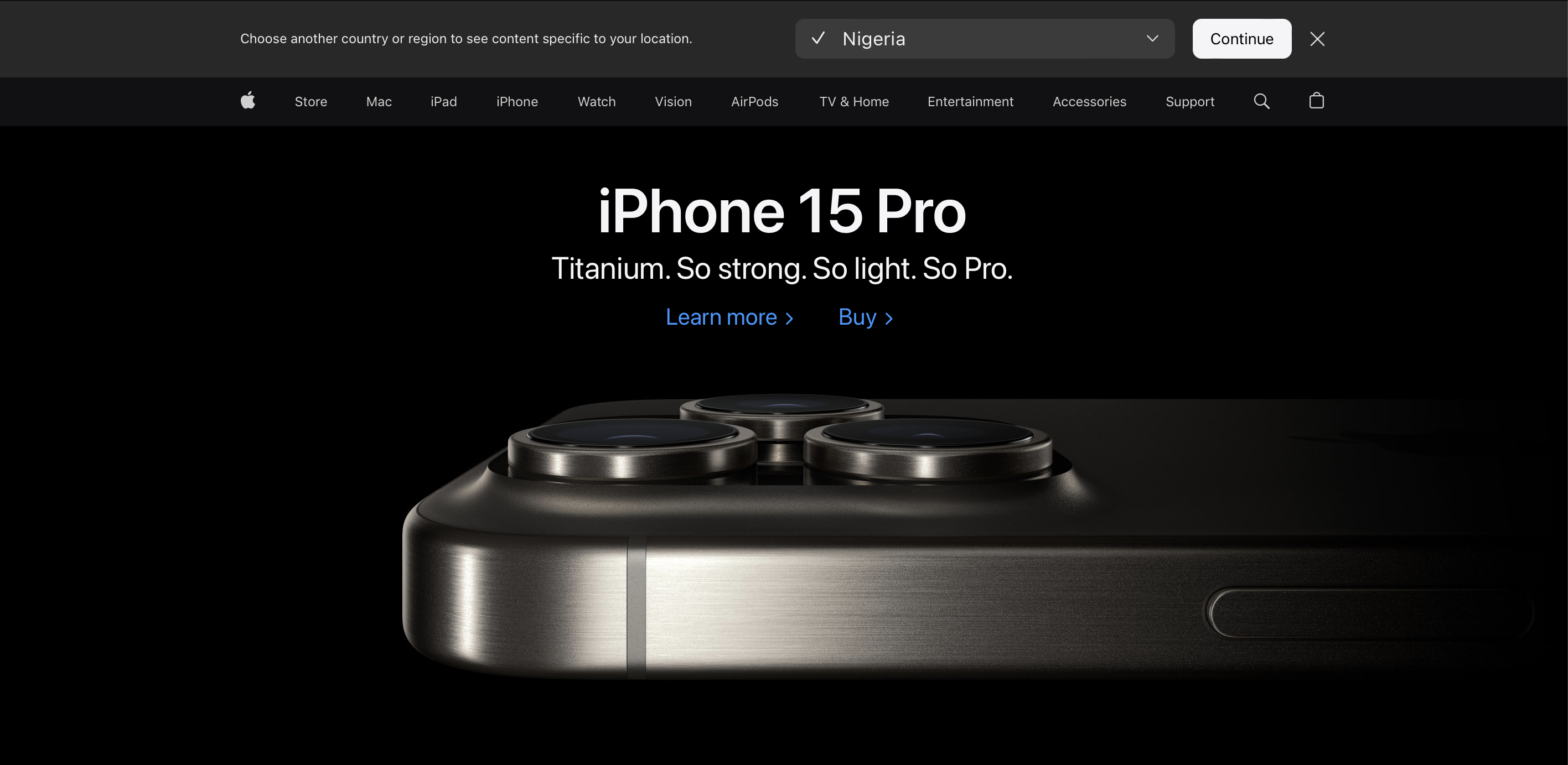
Use high-quality, original images and videos to create visually appealing website layouts aligned with your brand. Keep the layout clean, establish a clear visual hierarchy, and utilize white space effectively. If necessary, include subtle animations and maintain design consistency. Respect copyright by only using original content.
Example: Apple.com demonstrates this beautifully. Their landing pages feature stunning product visuals, minimalist design, and subtle animations that create a premium and consistent brand experience.

Implementing Persuasive Copywriting Techniques
Your landing page’s copy should be convincing, succinct, and easy to read. Talk to your audience’s wants and desires, emphasize the benefits, and use powerful verbs. Use persuasive strategies, including scarcity, urgency, and social evidence, to inspire action.
Example: Let’s look at apple.com some more. It is excellent at emphasizing the product’s advantages and successfully arousing desire. Customer testimonials and product awards function as social proof, generating a sense of urgency around their “Limited Edition” goods and encouraging conversions.
Designing User-Friendly Navigation
Creating navigation that’s easy for users to understand and use is important. Keep it simple, avoiding extra menus or links that might distract visitors from your main message.
Example: Tesla.com has user-friendly navigation. Their landing page highlights car features and the call to action, with minimal navigation options to keep visitors focused.

Step-by-Step Walkthrough for Improving a Landing Page
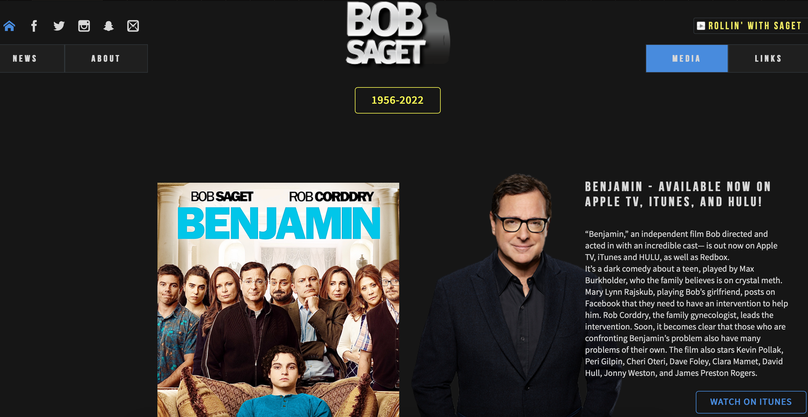
Let’s put theory into practice by dissecting a landing page and offering solutions. We’ll use bobsaget.com as an example. This website exhibits various issues with headlines, hierarchy, spacing, and effective communication. We will focus on improving its key elements for better engagement and conversion.
Step 1: Headlines
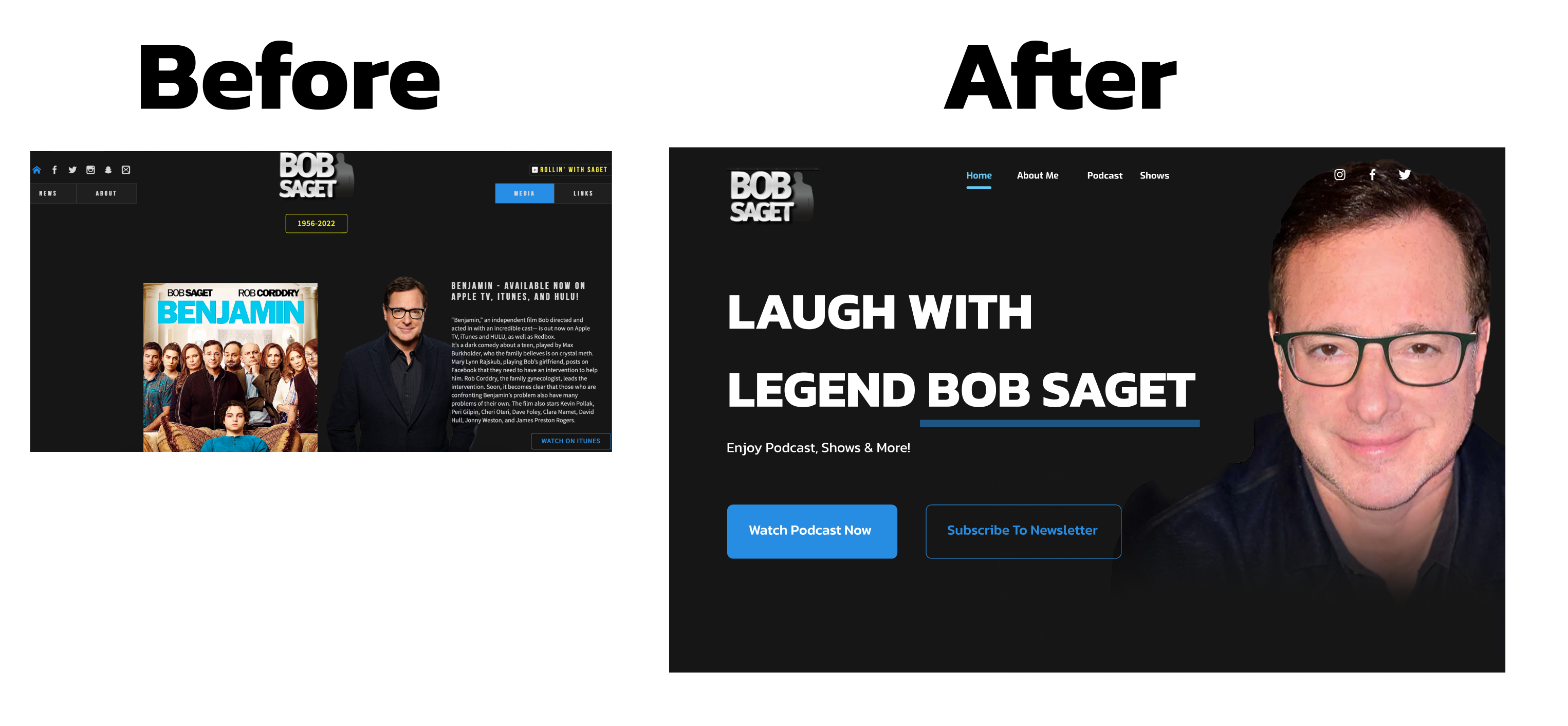
Let’s replace “Bob Saget” with a benefit-driven statement like “Laugh with Legend Bob Saget: Podcast, Shows & More!”
Step 2: Imagery, Navigation, CTA
Let’s feature a high-quality, engaging image of Bob Saget, preferably one where he’s performing or interacting with fans. Use clear, bright CTAs like “Watch Podcast Now,” “Buy Tickets,” or “Subscribe to Newsletter.” Ensure the navigation is also concise.
Before-and-After Comparison
Witness how simple tweaks turned bobsaget.com from bland to brilliant!
Dos and Don’ts for Effective Landing Page Design
Tips for Crafting Winning Landing Pages
- Do:
- Prioritize mobile responsiveness.
- Ensure clear and concise copywriting.
- A/B test different elements for optimization.
- Don’t:
- Use stock photos or poorly designed graphics.
- Include distracting navigation elements.
- Neglect clear value proposition and CTA placement.
Conclusion
In summary, landing pages are important for promoting your offers and attracting the right audience to achieve your goals. Even though they might seem simple, well-designed landing pages can make a big difference in your business results.
This guide has covered some key tips for creating effective landing pages, such as making them easy to use, using eye-catching images, and making sure your CTA is bright and visible to engage action. Remember, landing pages should always change and improve based on how people interact with them.
Most importantly, understand your audience and give them what they need. A landing page with valuable content relevant to your visitors will build trust and encourage them to take action. Keep testing and improving your landing pages to get more leads and conversions.
Additional Resources
For further reading and exploration to deepen your understanding and proficiency in landing page design, you can check out these resources below:
- The Anatomy of a Landing Page, check here.
- Tips for designing the perfect landing page: check here.
- How to design a focus landing page, check here.
Truly understand users experience
See every user interaction, feel every frustration and track all hesitations with OpenReplay — the open-source digital experience platform. It can be self-hosted in minutes, giving you complete control over your customer data. . Check our GitHub repo and join the thousands of developers in our community..

