Exploring Chakra UI with React

Chakra UI elevates UI development with component-based design and can be used to great advantage in React, as this article shows.

Discover how at OpenReplay.com.
User Interface (UI) development is a crucial aspect of building modern web applications. It involves creating the visual elements that users interact with, ensuring a seamless and engaging experience. UI development encompasses designing and implementing components, layouts, and interactions that collectively form the user interface.
Chakra UI is an open-source React component library that facilitates the creation of highly customizable and responsive user interfaces. It offers a collection of accessible, styled components that seamlessly integrate into React applications, adhering to design system principles to promote consistency and efficiency.
Component-based design has emerged as a sea change in UI development, advocating for the decomposition of the user interface into modular, reusable components. Each component encapsulates specific functionality or visual elements, fostering maintainability, scalability, and code reusability. This systematic approach enables developers to manage complex UIs efficiently. Here are some key features and advantages of component-based-design:
-
Reusability: Components can be reused across different application parts, promoting a consistent and cohesive design.
-
Maintainability: Changes or updates can be made to individual components without affecting the entire application, simplifying maintenance.
-
Scalability: As the application grows, component-based design facilitates adding new features and functionalities with minimal impact on existing code.
-
Collaboration: Developers can work on different components concurrently, fostering collaboration and speeding up the development process.
Integrating Chakra UI with React
Integrating with a React project involves a few straightforward steps:
- Create a new React app using Create React App or other preferred method.
npx create-react-app chakra-react-website
cd chakra-react-website- Install Chakra UI and Emotion (which is used by Chakra UI) by running:
npm install @chakra-ui/react @emotion/react @emotion/styled framer-motion- Modify index.js to include ChakraProvider:
// src/index.js
  import React from 'react';
  import ReactDOM from 'react-dom';
  import { ChakraProvider } from '@chakra-ui/react';
  import App from './App';

  ReactDOM.render(
    <ChakraProvider>
      <App />
    </ChakraProvider>,
    document.getElementById('root')
  );
Exploring basic components
Now, let’s create and explore some basic components provided by Chakra.
- Header Component (
Header.js):
// src/Header.js
import React from 'react';
import { Box, Heading } from '@chakra-ui/react';

const Header = () => {
  return (
    <Box bg="purple.500" p={6} color="white" mb={2}>
      <Heading as="h1" size="2xl">
        My Awesome Website
      </Heading>
    </Box>
  );
};

export default Header;
This component defines the header section of the website, rendering a styled Box component with a purple background and a Heading component displaying the website title.
- Main Component (
Main.js):
// src/Main.js
import React from 'react';
import { Box, Container, Text } from '@chakra-ui/react';

const Main = () => {
  return (
    <Container maxW="container.lg" mt={2}>
      <Box p={6} borderWidth="1px" borderRadius="lg" mb={2}>
        <Text fontSize="xl">
          Welcome to my website! This is the main section.
        </Text>
      </Box>
    </Container>
  );
};

export default Main;
This component represents the main content section of the website. Here, components like Container are used to constrain the width of the content, set to a large container width with some top margin. Box is another UI layout component that creates a structured content area, including padding, border width, and border radius for styling the main section. Text, A component for displaying text with a specified font size. Button, represents a button with Chakra UI’s styling applied, featuring a margin top and colored using the “green” color scheme.
- Footer Component (
Footer.js):
// src/Footer.js
import React from 'react';
import { Box, Text } from '@chakra-ui/react';

const Footer = () => {
  return (
    <Box bg="purple.500" p={6} color="white" mt={2}>
      <Text textAlign="center" fontSize="lg">© 2024 My Awesome Website. All rights reserved.</Text>
    </Box>
  );
};

export default Footer;
This component defines the footer section of the website. It renders a Box component; inside the Box, there’s a Text component displaying copyright information with a blue background.
- App Component (
App.js):
// src/App.js
import React from 'react';
import { ChakraProvider, Flex, Box } from '@chakra-ui/react';
import Header from './Header';
import Main from './Main';
import Footer from './Footer';

function App() {
  return (
    <ChakraProvider>
      <Flex direction="column" minHeight="100vh">
        <Header />
        <Main />
        <Footer />
      </Flex>
    </ChakraProvider>
  );
}

export default App;
Finally, this is the application’s root component. It wraps the Header, Main, and Footer components within a Flex component, creating a flexible container with a column layout and occupying the full viewport height.
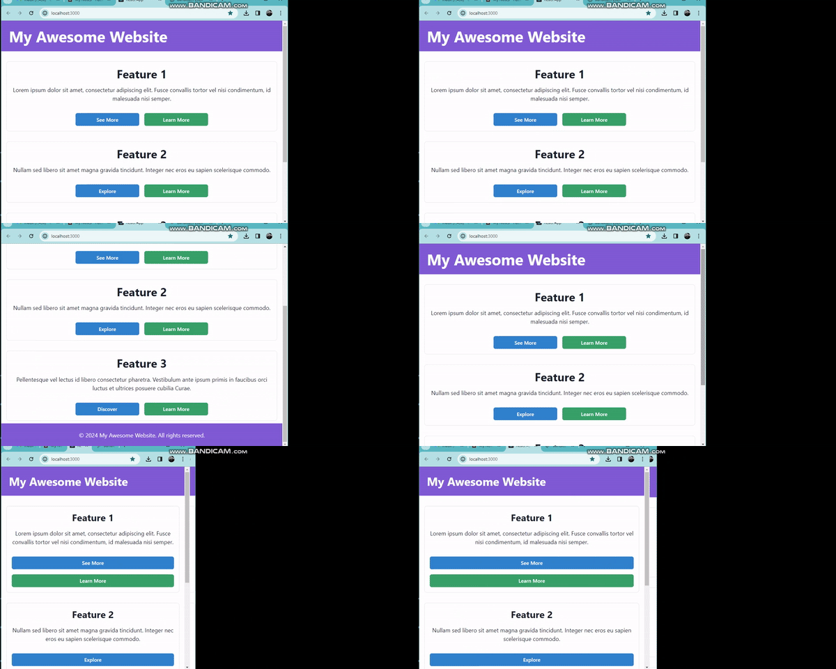
Finally, we should have an output like this :

How Chakra UI Facilitates Component-Based Design
It streamlines UI development through:
-
Abstraction of Styles: Abstracting away the intricacies of styling by providing predefined, customizable components. This allows developers to focus on building functionalities rather than spending excessive time on styling details.
-
Theme Configuration: Offering a theme-based approach, it enables developers to customize the look and feel of components globally, ensuring a consistent design language throughout the application.
-
Responsive Design: Providing responsive components out of the box for seamless adaptation to various devices.
-
Accessibility: Prioritizing accessibility by incorporating best practices into its components. This ensures that the application is usable by a diverse audience, including individuals with disabilities.
Building a Simple UI Component with Chakra UI and React
Let’s Add a Button Component to Main.js:
// src/Main.js
import { Box, Container, Text, Button } from '@chakra-ui/react';

const Main = () => {
  return (
    <Container maxW="container.lg" mt={2}>
      <Box p={6} borderWidth="1px" borderRadius="lg" mb={2}>
        <Text fontSize="xl">
        Button component using Chakra UI and React.
        </Text>
        <Button mt={4} colorScheme="green">Learn More</Button>
      </Box>
    </Container>
  );
};

export default Main;
This code demonstrates the use of a Button component styled with Chakra. Overall, this Main component renders a structured content area with a message and a button.

Showcasing Reusability and Scalability
To demonstrate reusability and scalability, let’s create a new component called FeatureSection that incorporates the same structure and styling as the existing Main component but with different content. This will showcase how components can be reused and scaled within our application.
import React from 'react';
import { Box, Container, Text, Button, Flex, Heading, Stack, useMediaQuery } from '@chakra-ui/react';
import { motion } from "framer-motion";

const FeatureSection = ({ title, description, buttonText }) => {
  const [isLargerThan768] = useMediaQuery("(min-width: 768px)");

  return (
    <Container maxW="container.lg" mt={8}>
      <motion.div
        initial={{ opacity: 0 }}
        animate={{ opacity: 1 }}
        transition={{ duration: 0.5 }}
      >
        <Box p={4} borderWidth="1px" borderRadius="lg">
          <Flex justifyContent="center" alignItems="center">
            <Heading as="h2" size="xl" textAlign="center">
              {title}
            </Heading>
          </Flex>
          <Text fontSize="lg" textAlign="center" mt={4}>
            {description}
          </Text>
          <Stack spacing={4} direction={isLargerThan768 ? "row" : "column"} justifyContent="center" mt={8}>
            <motion.div whileHover={{ scale: 1.05 }}>
              <Button colorScheme="blue" w={isLargerThan768 ? "200px" : "100%"} borderRadius="md">
                {buttonText}
              </Button>
            </motion.div>
            <motion.div whileHover={{ scale: 1.05 }}>
              <Button colorScheme="green" w={isLargerThan768 ? "200px" : "100%"} borderRadius="md">
               Learn More
              </Button>
            </motion.div>
          </Stack>
        </Box>
      </motion.div>
    </Container>
  );
};

export default FeatureSection;
In this FeatureSection component, we’ve made the content dynamic by accepting props such as title, description, and buttonText. This allows us to reuse this component with different content throughout our application.
In the App component, multiple instances of FeatureSection are added to demonstrate scalability.
// src/App.js
import React from 'react';
import { ChakraProvider } from '@chakra-ui/react';
import Header from './Header';
import FeatureSection from './FeatureSection';
import Footer from './Footer';

function App() {
  return (
    <ChakraProvider>
      <Header />
      <FeatureSection
        title="Feature 1"
        description="Lorem ipsum dolor sit amet, consectetur adipiscing elit. Fusce convallis tortor vel nisi condimentum, id malesuada nisi semper."
        buttonText="see More"
      />
      <FeatureSection
        title="Feature 2"
        description="Nullam sed libero sit amet magna gravida tincidunt. Integer nec eros eu sapien scelerisque commodo."
        buttonText="Explore"
      />
      <FeatureSection
        title="Feature 3"
        description="Pellentesque vel lectus id libero consectetur pharetra. Vestibulum ante ipsum primis in faucibus orci luctus et ultrices posuere cubilia Curae."
        buttonText="Discover"
      />
      <Footer />
    </ChakraProvider>
  );
}

export default App;
This code has a Container component with a max width used to contain the feature section, the motion.div component from framer-motion used to provide animation effects inside the motion.div, a Box component is used to create a container with padding, border, and border radius. A Heading component that renders the title with specified size and alignment, wrapped inside a Flex component for centering horizontally. A Text component that displays the description text with specified font size and alignment. A Stack component is used to stack the buttons in a row or column based on the screen size. Within the Stack, two motion.div components wrap the Button components. These components use the whileHover prop from framer-motion to scale the buttons on hover.

By reusing the FeatureSection component with different content and adding multiple instances within our App component, we demonstrate how components can be scaled up to accommodate various features or sections within our application.
Impact on UI Development
Component-based development with Chakra UI accelerates the development process by providing a library of ready-to-use components. This approach fosters a faster development workflow and enhances code consistency. By consistently using components, developers ensure code uniformity, making it easier for them to collaborate and understand each other’s code.
Conclusion
Exploring Chakra UI and React together demonstrates the power of component-based design in elevating UI development. Chakra UI provides a comprehensive set of ready-to-use components that streamline the development process and promote consistency in design. By embracing component-based design principles, developers can create maintainable, scalable, and accessible user interfaces.
Gain Debugging Superpowers
Unleash the power of session replay to reproduce bugs, track slowdowns and uncover frustrations in your app. Get complete visibility into your frontend with OpenReplay — the most advanced open-source session replay tool for developers. Check our GitHub repo and join the thousands of developers in our community.

