Exploring CSS Units

From pixels to percentages to seconds, each CSS unit type offers unique capabilities, empowering developers to create visually captivating and responsive web experiences. Exploring CSS units unveils a world where precision meets creativity, and by mastering CSS units, developers become masters at bringing their design visions to life, as this article will show.

Discover how at OpenReplay.com.
CSS units are the cornerstone of web design and development, providing developers with the means to specify the dimensions and timings within the stylesheet with certain precision. A look at the code snippet below shows you various CSS units, including pixels(px), rem, viewport-height(vh), percentages(%), seconds(s), and degrees(deg). As seen below, CSS units are typically preceded by number values to show the extent being measured.
body {
  height: 100vh;
  width: 100%;
  display: flex;
  justify-content: center;
  align-items: center;
}
div {
  height: 6rem;
  width: 10rem;
  border: 1px solid red;
  border-radius: 10px;
  transform: rotate(90deg);
  transition: transform 0.3s ease;
}
div:hover {
  transform: rotate(0deg);
}
Often, when discussing CSS units, we only focus on length-based units. However, although length-based units are the most important, other non-length-based units are also included in this discussion; this is buttressed by the code snippet above, which shows seconds(’ s) and degrees(deg`) as CSS units, too.
CSS units encompass a diverse range of measurement types, each with unique characteristics and use cases. In this article, we will embark on a journey to explore the intricacies of CSS units, from absolute and relative units to viewport-based and other specialized units, such as those based on time, angles, resolution, and more. By delving into the nuances of these units, we aim to equip ourselves with the knowledge and tools necessary to craft more responsive and visually engaging web experiences.
Importance of CSS Units
The aim of CSS units aligns with that of any other unit: to establish a standard and ensure precision in measurements. However, CSS units serve specifically within the web design and development space. The variety of CSS units ensures that there is always an appropriate unit to tackle the challenges that come with crafting web designs and layouts. Following this, some notable advantages of using CSS units include:
- Responsive Design: CSS units enable the creation of responsive layouts that adapt seamlessly to various screen sizes and devices, ensuring a consistent user experience.
- Flexible Styling: By using relative units, developers can maintain scalability and flexibility in their designs, allowing for easier adjustments and updates.
- Accessibility: Proper use of CSS units improves accessibility by ensuring that text and other elements are appropriately sized and spaced for all users.
- Performance Optimization: Choosing the appropriate CSS units can impact performance, with some units offering better rendering efficiency than others.
- Cross-Browser Compatibility: CSS units help mitigate issues related to cross-browser compatibility by providing a standardized approach to specifying dimensions and layout properties.
Types of CSS Units
The various CSS units can be grouped into the following four categories listed below:
- Absolute units
- Relative units
- Viewport-based units
- Specialized units The first three (3) categories are predominantly for length-based units, and the last category will serve for our discussion on non-length-based CSS units. In the upcoming sections, we will look at these units individually, what they are, their examples, and their use cases.
Absolute Units
Absolute units represent fixed measurements that remain constant regardless of screen size or device resolution. For example, specifying an element’s width as 200px ensures it will always render 200 pixels wide on all screens and devices, providing pixel-perfect control over layout elements. The most practical example of absolute units in web development is the pixel. Other absolute units are built around the idea of the pixel and are mostly print-related.
Pixels (px)
Pixels are the most commonly used unit for defining absolute lengths in CSS. 1px represents a single dot on a screen or device display. When you specify a size using CSS pixels, you define an exact measurement. For example, if you set the width of a <div> element to 200px, it will always be 200 pixels wide, no matter what device or screen it is viewed on.
Although pixels are widely used for creating fixed-size layouts due to their simplicity and precision, it is worth noting that they may not always render consistently across different screens and devices. Variations in pixel density, known as pixel-per-inch (PPI), can lead to differences in how pixels are displayed. For example, pixels on high-resolution displays (e.g., Retina displays) have a higher density of pixels per inch of screen compared to standard displays, resulting in smaller physical sizes. However, pixels remain a convenient choice for many design scenarios where absolute precision is needed.
Print-related CSS units
Print-related CSS units are primarily used to specify dimensions and layouts in printed documents. These units allow developers to control how content is rendered on physical paper or when printing web pages. These units include:
| Print-related units | Details |
|---|---|
Inches (in) | This is a unit of length commonly used in print media and design. 1in is equivalent to 96 pixels on most screens, based on the standard display resolution of 96 pixels per inch (PPI). |
Centimeters (cm) | Centimeters are another unit of length commonly used in print media and design, especially in regions where the metric system is used. 1cm is equivalent to approximately 37.8 pixels on most screens, based on the standard display resolution of 96 pixels per inch (PPI). |
Millimeters (mm) | Millimetres are smaller units of length commonly used in print media and design.1mm is equivalent to approximately 3.78 pixels on most screens, based on the standard display resolution of 96 pixels per inch (PPI). Like in and cm, mm is primarily used for specifying print dimensions or physical sizes rather than web design. |
Points (pt) | Points are a unit of length commonly used in typography and print media. 1pt is equivalent to 1/72 of an inch or approximately 0.75 pixels on most screens, based on the standard display resolution of 96 pixels per inch (PPI). Points are often used for specifying font-size in print design, but they are less commonly used in web design due to the variability of screen sizes and resolutions. |
Picas (pc) | Picas are a unit of length commonly used in typography, especially in print media. 1pc is equivalent to 12 points. Similar to points. |
Using print-related CSS units in web layouts is very uncommon and frankly not advised. They may not provide consistent results across devices and may lead to unpredictable rendering, making them less practical, especially for responsive design.
Code Demo Showing Absolute unit
The simple code below shows a 300px by 300px div with a class name of container.
<!DOCTYPE html>
<html lang="en">
  <head>
    <meta charset="UTF-8" />
    <meta name="viewport" content="width=device-width, initial-scale=1.0" />
    <title>Relative Units Example</title>
    <style>
      .container {
        width: 300px;
        height: 300px;
        background-color: purple;
      }
    </style>
  </head>
  <body>
    <div class="container"></div>
  </body>
</html>
Output on Mobile screen view
The code block above will render on a mobile screen, as shown in the image below:
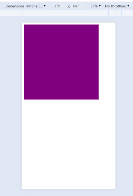
On a mobile screen, the div takes up exactly 300px by 300px and occupies nearly the whole width of the 375px mobile screen.
Output on Desktop screen view
The code block above will render on a desktop screen, as shown in the image below:
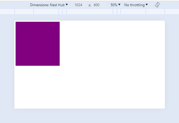
On a desktop screen, the div takes up the same 300px by 300px and occupies a much smaller portion of the whole screen since the desktop screen width of 1024px is much larger than 300px.
Use Cases for Absolute Units
Absolute units are perfect for any situation requiring precise control across all rendering boards. These cases include:
- Fixed Element Sizing: Absolute units like pixels (
px) are commonly used for defining fixed sizes of elements such asborders,stroke-width, andfont-sizeswhen precise control is required and scaling for various screens may not be as important. - Image Dimensions: Setting image dimensions using absolute units ensures consistent display across various screen sizes and resolutions.
- Media Queries: Absolute units are commonly used to define breakpoints when using media queries to enforce responsive design across various screen sizes.
Absolute units offer unparalleled precision, and while this is advantageous in some scenarios, as described in the use cases, it has a major drawback: Absolute units often pose challenges in responsive design as they do not adapt to varying viewport sizes.
Relative Units
Relative units in CSS provide a way to define sizes based on the size of another element (usually one of the parent elements). The main examples of relative units are:
| Relative Units | Details |
|---|---|
em | The em unit is relative to the font-size of the element itself. For example, if the font-size of an element is 16px, 1em is equal to 16px, 0.5em is equal to 8px, and so on. This unit is particularly useful for setting sizes relative to the text size. |
rem | Similar to em, but instead of being relative to the font-size of the current element, it is relative to the font-size of the root element (typically the html element). This makes rem more predictable and easier to manage, especially in large projects with deeply nested elements. |
percentage (%) | The percentage unit is relative to the size of the containing element. For example, if a div element has a width of 300px and you set its child element’s width to 50%, the child element will be 150px wide. The percentage is one of the most versatile and commonly used CSS units. |
New developers often have difficulty understanding the difference between ems and rems. This article link provided should be of immense help to clarify that confusion - Ems vs Rems. It is also worth noting that some authorities classify viewport-based units under relative units.
Code Demo Showing Relative units
The simple code below shows a div with a class name of container containing three children divs with a class name of box whose widths occupy different percentages relative to the container width. The container itself has a width half the size of the body of our HTML document.
<!DOCTYPE html>
<html lang="en">
  <head>
    <meta charset="UTF-8" />
    <meta name="viewport" content="width=device-width, initial-scale=1.0" />
    <style>
      html {
        font-size: 2px;
      }
      .container {
        width: 50%;
        height: 200px;
        padding: 2rem;
        background-color: gold;
        display: flex;
        gap: 2rem;
      }
      .box {
        width: 20%;
        height: 100%;
        margin-bottom: 1rem;
        background-color: purple;
      }
      .box-1 {
        width: 60%;
      }
    </style>
  </head>
  <body>
    <div class="container">
      <div class="box box-1"></div>
      <div class="box box-2"></div>
      <div class="box box-3"></div>
    </div>
  </body>
</html>
Output on Mobile screen view
The code block above will render on a mobile screen, as shown in the image below:
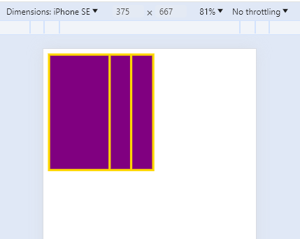
The container div takes up 50% of the mobile screen and the box divs take up 60%, 20% and 20% of the parent container respectively.
Output on Desktop screen view
The code block above will render on a desktop screen, as shown in the image below:
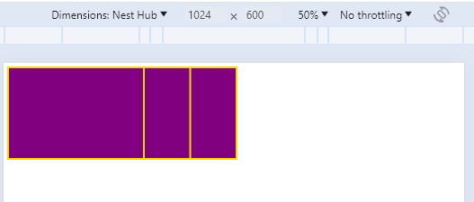
The images above show that the container div and the box divs are all rendered to a scale relative to the device screen unlike absolute units. Hence, the relative units are more screen- and device-responsive.
Also, we notice the very small padding, which is unusual for what a padding of 2rem is expected to look like by default. This illustrates how rem is based on the font-size of the root element. Typically, this font-size is set to 16px by default, but by setting it to 2px, we get much smaller values per rem.
Use Cases for Relative Units
Relative units are perfect for any situation requiring responsive measurement and sizing to cater to different rendering boards. They are the most commonly used units in web development. Some notable use cases for relative units include:
- Responsive Layouts: Relative units such as percentages (
%),em, andremare instrumental in creating responsive layouts that adapt to different screen sizes and orientations. - Text Sizing: Using relative units (particularly
emandrem) forfont-sizesenables scalable typography that adjusts proportionally to the user’s preferred font size or device characteristics. - Fluid Grids: Relative units like percentages (
%) are commonly used in creating fluid grid layouts. These layouts adjust dynamically based on the viewport size, making them ideal for responsive web design. By definingwidths,heights,margins, andpaddingsin percentages, elements can adapt seamlessly to different screen sizes and resolutions. - Flexible Images and Media: When specifying dimensions for images and media elements, relative units are preferable for maintaining responsiveness. Using percentages to define image widths allows them to scale proportionally within their containers, ensuring they adapt well to various screen sizes without becoming disproportionately large or small.
- Nested Components: Relative units are essential for maintaining the scalability and flexibility of nested components within a webpage. By using relative units like
emorrem, the size of nested elements remains consistent relative to their parent container, regardless of changes in the parent’s dimensions or font sizes.
Viewport-based Units
Viewport-based units in CSS provide a way to size elements relative to the viewport’s dimensions, which is the visible portion of the browser window. These units are very important for responsive web design as they offer flexibility and responsiveness, allowing developers to create layouts that adapt smoothly to various screen sizes and devices. Here’s an overview of the units grouped under viewport-based units:
| Viewport Units | Details |
|---|---|
vw (viewport width) | The vw unit represents a percentage of the viewport’s width. 1vw equals 1% of the viewport width. For example, if the viewport’s width is 1000px, 10vw would be equivalent to 100px (10 percent of 1000 pixels). This unit is particularly useful for creating designs where elements scale proportionally with the viewport’s width. |
vh (viewport height) | Similar to vw, the vh unit represents a percentage of the viewport’s height. 1vh equals 1% of the viewport height. For instance, if the viewport height is 800px, 20vh would be equivalent to 160px (20 percent of 800 pixels). The vh unit is commonly used for elements that need to scale based on the viewport’s height. |
vmin | 1vmin is equal to 1% of the viewport’s smaller dimension (either width or height). For instance, if the viewport width is 1000px and the height is 800px, 1vmin would equal 8px (1 percent of 800 pixels). |
vmax | Conversely, 1vmax is equal to 1% of the viewport’s larger dimension. Using the same example used with vmin, 1vmax would be equivalent to 10 pixels (1 percent of 1000 pixels). |
New variations of viewport-based units exist, the large, small, and dynamic viewport units.
Code Demo showing Viewport unit
The code below shows a div with a class name of container styled with a height of the entire viewport height and a width of half the viewport width.
<!DOCTYPE html>
<html lang="en">
  <head>
    <meta charset="UTF-8" />
    <meta name="viewport" content="width=device-width, initial-scale=1.0" />
    <title>Document</title>
  </head>
  <style>
    .container {
      width: 50vw;
      height: 100vh;
      background-color: red;
    }
  </style>
  <body>
    <div class="container"></div>
  </body>
</html>
Output
The code block above will render as shown in the image below:
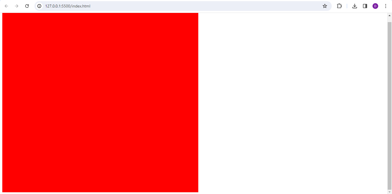
Notice how the height of the div is the entire height of the screen and the width of the div is half that of the screen.
Container-based Units
With the advent of the recent CSS container-queries, new units have emerged that help optimize container-based styling. These container-based units are very similar to viewport-based units, with the only difference being that the measurements are relative to the size of the parent container rather than the viewport’s dimensions. In a way, the viewport in this scenario is the element tagged as a CSS container. The units are the same as the viewport units but begin with the prefix “cq” for container query rather than “v” for viewport. They include container query width (cqw) and height (cqh), cqmin, cqmax. You may also encounter container query inline (cqi) and container query block (cqb), which work just like cqw and cqh, respectively. You can learn more about container-based units here.
Use Cases for Viewport-based Units
Viewport-based units will often come into play in trying to achieve the following:
- Responsive Design: By using viewport-based units, developers can create responsive layouts that adapt seamlessly to different screen sizes and resolutions. This ensures that content remains readable and accessible across a wide range of devices, from desktop computers to mobile phones and tablets.
- Dynamic Scaling: Viewport-based units provide a dynamic way to size elements, allowing them to scale proportionally with changes in viewport dimensions. This flexibility is particularly valuable for designing fluid and adaptable interfaces that maintain a consistent look and feel across various viewing environments.
- Full-Screen Elements: Viewport units can be used to create full-screen sections or elements that occupy the entire visible area of the browser window, enhancing immersive user experiences.
- Cross-Device Compatibility: By utilizing viewport-based units, developers can build web experiences optimized for small and large screens. This helps ensure a consistent user experience regardless of the device being used, enhancing accessibility and usability for all users.
Specialized Units
Specialized units in CSS cater to specific requirements beyond just size and dimension. Let’s explore some of these specialized units:
| Unit type | Units | Details |
|---|---|---|
| Time-based Units | s (seconds) | Represents time in seconds. Used in CSS animations and transitions to define durations. |
ms (milliseconds) | Represents time in milliseconds. Often used for precise timing in animations and transitions. | |
| Angle-based Units | deg (degrees) | Represents angles in degrees. Commonly used in CSS transform to specify rotations. |
rad (radians) | Represents angles in radians. Sometimes preferred in JavaScript calculations due to its mathematical properties. | |
turn (turns) | Represents angles as a fraction of a complete circle, where one turn is equivalent to 360 degrees or 2π radians. It provides a convenient way to express rotations in CSS, especially for animations and transformations. For instance, 0.25turn would represent a 90-degree rotation, 0.5turn would represent a 180-degree rotation, and so on. | |
| Resolution-based Units | dpi (dots per inch) | Represents resolution in dots per inch. Typically used in printing stylesheets to specify print resolution. |
dpcm (dots per centimetre) | Represents resolution in dots per centimetre. Similar to dpi, but measures resolution in centimeters rather than inches. Useful for specifying print resolution in metric units. | |
dppx (dots per pixel) | Represents resolution in dots per pixel. Used in media queries to target devices with specific pixel densities, such as high-resolution displays (Retina displays). | |
| Grid-based Units | fr (fractional unit) | Represents a fraction of the available space in a grid container. Used in CSS Grid Layout to define flexible grid tracks. For example, 1fr means one fraction of the available space, 2fr means two fractions, and so on. It’s an excellent way to create flexible and responsive grid layouts without having to specify fixed sizes for grid tracks. |
| Font-based Units | ex | Represents the height of the lowercase letter “x” in the current font. It’s less commonly used but can be helpful for precise vertical alignment in text layouts. |
ch | Represents the width of the “0” (zero) character in the current font. It’s useful for sizing elements based on character width, especially in cases where text needs to be aligned or positioned relative to character widths. |
Each of these specialized units serves a unique purpose and provides developers with precise control over various aspects of their designs. Whether timing animations, specifying angles, targeting specific device resolutions, creating flexible grid layouts, or fine-tuning font-related styling, these units offer a diverse toolkit for building modern and responsive web experiences.
Code Demo showing Angle and Time unit
The code example below shows the use of specialized units for angle (deg) and time (s) to control a simple CSS transition.
<!DOCTYPE html>
<html lang="en">
  <head>
    <meta charset="UTF-8" />
    <meta name="viewport" content="width=device-width, initial-scale=1.0" />
    <title>Document</title>
  </head>
  <style>
    body {
      display: flex;
      height: 100vh;
      justify-content: center;
      align-items: center;
    }
    .container {
      width: 400px;
      height: 400px;
      display: flex;
      justify-content: center;
      align-items: center;
      background-color: red;
    }
    .rotate {
      rotate: 45deg;
      transition: rotate 2s;
      background-color: blue;
      width: 100px;
      height: 100px;
    }
    .rotate:hover {
      rotate: 270deg;
    }
  </style>
  <body>
    <div class="container">
      <div class="rotate"></div>
    </div>
  </body>
</html>
Here, a div with a class name of rotate is styled to lie at a 45-degree (45deg) angle using the rotate property. When this div is hovered over, using the transition-duration property, the div is made to rotate from the initial 45 degrees to 270 degrees (270deg) over exactly 2 seconds (2s). This fine control is commonly seen in transitions and animations thanks to specialized units.
Output
The code block above will render as shown in the screen record below:
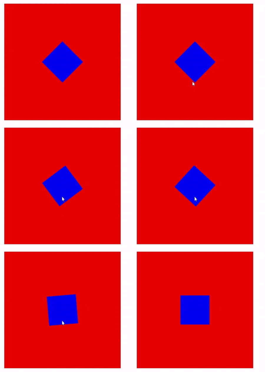
The screen record above shows the transition generated by the code block above. Notice how the div starts by leaning at a 45-degree angle and, when hovered over, rotates to lie at 270 degrees over 2 seconds.
Code Demo showing Grid fr unit
The code block below shows an example of using fr units on a grid type element. Here, a div with a class name of container and a display set to grid contains three children div whose width in the grid is specified using fr units.
<!DOCTYPE html>
<html lang="en">
  <head>
    <meta charset="UTF-8" />
    <meta name="viewport" content="width=device-width, initial-scale=1.0" />
    <title>Document</title>
  </head>
  <style>
    .container {
      width: 400px;
      height: 400px;
      display: grid;
      grid-template-columns: 1fr 4fr 2fr;
    }
    .box-1 {
      background-color: red;
    }
    .box-2 {
      background-color: blue;
    }
    .box-3 {
      background-color: yellow;
    }
  </style>
  <body>
    <h1>Grid fr unit</h1>
    <div class="container">
      <div class="box box-1"></div>
      <div class="box box-2"></div>
      <div class="box box-3"></div>
    </div>
  </body>
</html>
The units of the children divs are specified as ‘1fr’, ‘4fr’, and ‘2fr’ respectively. This means that the container width will be divided into seven equal parts to be shared among each of the children div in a ratio of 1/7, ‘4/7’, and ‘2/7’, respectively.
Output
The code block above will render as shown in the image below:
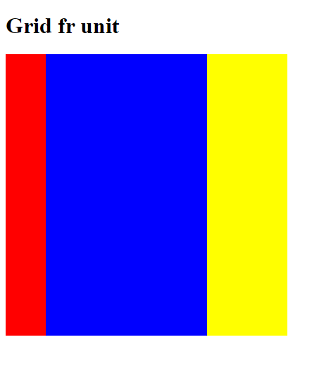
The image above shows the result of the code block using fr units in a grid element. A quick look and you can see the ratio of the distribution of each colored child div.
Code Demo showing font-size ch unit
The code block below demonstrates how ch can be used to tailor the size of containing elements to the size of the text within them. Here, a div with a class name of container holds two divs with a class name of text-box containing text, with the width of each text-box set to ‘10ch’.
<!DOCTYPE html>
<html lang="en">
  <head>
    <meta charset="UTF-8" />
    <meta name="viewport" content="width=device-width, initial-scale=1.0" />
    <title>Document</title>
  </head>
  <style>
    .container {
      width: 400px;
      height: 400px;
      display: flex;
      flex-direction: column;
      gap: 2rem;
      justify-content: center;
      align-items: center;
      background-color: navy;
    }
    .text-box {
      background-color: red;
      color: white;
      width: 10ch;
    }
  </style>
  <body>
    <div class="container">
      <div class="text-box">000000000000000</div>
      <div class="text-box">ABCDEFGHIJKLMNO</div>
    </div>
  </body>
</html>
Output
The code block above will render as shown in the image below:
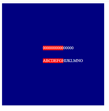
Following the example above, since a width of 10ch can contain 10 zeros, the text-box with 10 zeros fits perfectly, while the other text-box overflows with text. Also, notice how it does not take exactly 10 characters to overflow the second text-box. This is because ch is specifically based on how many zeros, not how many alphanumeric characters.
Performance Consideration for Different Types of CSS Units
When working with CSS units, it’s essential to consider their impact on webpage performance. While CSS units themselves don’t directly affect performance, how they’re used can influence loading times and the overall user experience. By considering the performance factors and employing optimization techniques discussed below, web developers can ensure that their use of CSS units contributes to a fast and responsive user experience.
File Size
Using certain CSS units, especially when defining large numbers of elements or complex layouts, can increase the size of CSS files. For instance, relative units like percentages (%) or viewport-based units like vw and vh often result in more compact CSS files compared to absolute units like pixels (px). This is because relative units adapt to different screen sizes and resolutions more efficiently, reducing the need for explicit dimension definitions for each viewport. This, in turn, can lead to longer load times for webpages, particularly on slower internet connections or mobile devices. Also, endeavor to use minification and compression techniques where possible, as they can help reduce the file size of CSS files, improving loading times.
Rendering Efficiency
Some CSS units, such as absolute units like pixels (px), can be less efficient for rendering on certain devices or screen resolutions. Using relative units or viewport-based units may offer better scalability and rendering performance across a range of devices. Where possible, stick to the use of layout tools like flexbox and grid where there is often no need for explicit sizing. Also, different browser rendering engines may handle certain CSS units differently, leading to variations in rendering performance. Hence, it is important to test webpages across multiple browsers and devices to ensure consistent performance.
Animation and Transitions
When animating elements or implementing transitions using CSS, the choice of CSS units can impact performance. Using hardware-accelerated properties with appropriate units again, preferably relative units, can help optimize animation performance and ensure smooth transitions.
Tips for Choosing the Right CSS Unit
Selecting the appropriate CSS units is crucial for achieving desired design outcomes while ensuring optimal performance and responsiveness. Here are some tips to help you choose the right CSS units for your web projects:
- Consider Design Goals: Understand the design requirements and goals of your project. Determine whether the layout needs to be fixed, fluid, or responsive to various screen sizes and devices.
- Prioritize Responsive Design: Embrace relative units and viewport-based units to create layouts that adapt gracefully to different viewport sizes and orientations. This ensures a consistent user experience across desktops, tablets, and smartphones.
- Use a Combination of Units: Combine absolute, relative, and viewport-based units strategically to achieve the desired balance between precise control and flexibility. For example, use pixels (
px) for fixed-width elements and percentages (%) for fluid layouts. - Test Across Devices and Viewports: Regularly test your website across different devices, screen sizes, and browsers to ensure that the chosen CSS units behave as expected and provide a consistent user experience.
- Optimize for Performance: Minimize the use of absolute units, especially for layout dimensions, to enhance scalability and reduce file size. Opt for relative units whenever possible to promote smoother rendering and faster load times.
- Consider Accessibility: Choose CSS units that accommodate users with varying accessibility needs, such as those who rely on screen readers or prefer larger text sizes. Ensure that text remains readable and interactive elements remain accessible across different viewport sizes.
- Stay Consistent: Maintain consistency in your choice of CSS units throughout the project to streamline development and maintenance. Consistent unit usage also promotes code readability and makes it easier for other developers to understand and collaborate on the project.
- Stay Informed: Stay updated on best practices and emerging trends in CSS unit usage, such as new viewport units or improvements in browser support. Experiment with new techniques and adapt your approach as technologies evolve.
By following these tips and carefully considering the specific needs of your project, you can choose the right CSS units to create visually compelling, responsive, and performant web experiences.
Summary
CSS units play a crucial and often overlooked role in web development. This article attempts to bring such roles to light by exploring the different CSS units and their use cases. Detailed as it is, this article is by no means exhaustive of all possible CSS units as the list updates ever so often; however, the reference section provides a guide for further reading to keep you up-to-date.
References
- https://blog.openreplay.com/understand-em-and-rem-in-css/
- https://css-tricks.com/container-units-should-be-pretty-handy/
- https://css-tricks.com/the-large-small-and-dynamic-viewports/
- https://developer.mozilla.org/en-US/docs/Web/CSS/CSS_Values_and_Units
- https://developer.mozilla.org/en-US/docs/Web/CSS/length
Gain control over your UX
See how users are using your site as if you were sitting next to them, learn and iterate faster with OpenReplay. — the open-source session replay tool for developers. Self-host it in minutes, and have complete control over your customer data. Check our GitHub repo and join the thousands of developers in our community.

