Exploring the Contain Property in CSS
The browser’s ability to distinguish between visible and non-visible parts of a webpage and to understand how specific elements affect the display is crucial for ensuring a smooth loading experience. The CSS contains properties representing containment in web standards and help browsers manage webpage performance more effectively. This property indicates whether the contents of an element are different from the rest of the page, making it easier to optimize specific sections and improve the user experience. This article will broaden the importance of the CSS
containproperty, explain how it works, and provide several examples of implementing it.

Discover how at OpenReplay.com.
CSS containment is a technique to enclose webpage elements within a virtual box. It helps improve webpages’ rendering efficiency by reducing the need for simultaneous layout, paint, size, and style calculations.
CSS containment aims to improve website performance by breaking the website into separate parts. Elements with the contain property can create a self-contained space that is not impacted by elements outside of it.
The contain property introduces four values: layout, paint, size, and style, which can be combined with other standard keywords to create two distinct combinations, depending on the webpage’s needs.
.container {
  contain: layout size paint style;
}
In this example, the class .container uses the CSS contain property, which specifies containment for layout, size, paint, and style calculations within the container. This means that elements within the container are isolated from the rest of the page regarding layout, size, paint, and style, enhancing rendering performance and minimizing the impact of any changes made within the container on other elements.
It’s essential to remember that even if performance improvements appear small in more minor cases, they can accumulate in larger applications. As confinement mainly focuses on performance, its effects may take time to notice in the user interface.
Types Of CSS Containment
The different types of CSS containment properties include size, style, paint, and layout. Soon, we will cover each category in more detail, discussing their significance, characteristics, and implementation methods.
Layout containment
Layout containment is a technique that involves creating a barrier around an element to protect its internal layout from outside interference and vice versa. This technique creates an independent stacking context for the component, making it a contained block. Within this context, elements are arranged hierarchically based on their relative positions, as determined by the stacking environment.
When an element is contained within a stacking context, it is placed on a separate layer on the page. This isolation prevents its contents from affecting the general layout or being influenced by components outside its borders.
This separation helps the browser’s rendering process by allowing it to treat the contained element as a self-contained unit, which reduces the complexity of layout computations. Instead of considering the entire page, the browser can focus only on the contents within the containment boundary, improving efficiency and preventing layout changes.
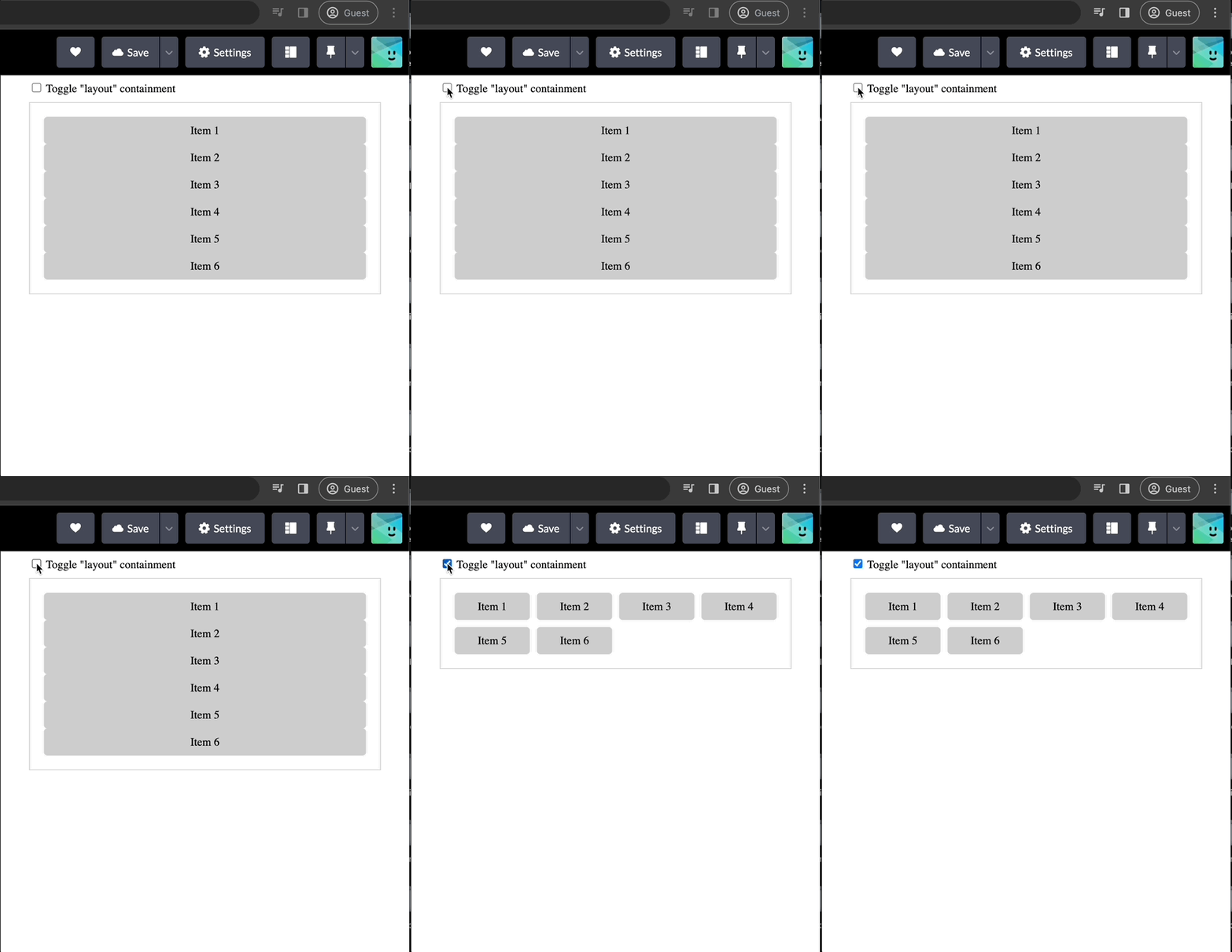
The illustration below demonstrates how layout containment accurately encapsulates all contents, including floating and fixed-position elements. This technique ensures that specific parts remain unaffected by external layout modifications. When switching between layout containment and no containment, the confined elements maintain their integrity despite any changes to the surrounding elements.
<div class="container">
  <div class="toggle-wrapper">
    <input type="checkbox" id="layout-toggle" />
    <label for="layout-toggle">Toggle "layout" containment</label>
  </div>

  <div class="content-wrapper">
    <div class="grid">
      <div class="item">Item 1</div>
      <div class="item">Item 2</div>
      <div class="item">Item 3</div>
      <div class="item">Item 4</div>
      <div class="item">Item 5</div>
      <div class="item">Item 6</div>
    </div>
  </div>
</div>
The HTML code above consists of a container and two primary sections: a toggle-wrapper and a content-wrapper. The toggle-wrapper comprises a checkbox input and a label that toggles the layout containment. The content-wrapper contains a grid structure, with multiple items displayed as div components.
.container {
  max-width: 500px;
  margin: 0 auto;
}

.toggle-wrapper {
  margin-bottom: 10px;
}

.content-wrapper {
  border: 1px solid #ccc;
  padding: 20px;
  background-color: #f8f8f8;
  overflow: auto; /* Ensuring overflow content is hidden */
}

.content-wrapper.with-layout-containment .grid {
  display: grid;
  grid-template-columns: repeat(auto-fill, minmax(100px, 1fr));
  grid-gap: 10px;
}

.item {
  padding: 10px;
  background-color: #ccc;
  border-radius: 5px;
  text-align: center;
}
The CSS code above manages webpages’ layout, appearance, and behaviors. It includes rules that specify font style, margin, padding, color, and alignment. Furthermore, it utilizes CSS variables to handle color values dynamically, enabling designers to personalize their choices based on the containment conditions.
const layoutToggle = document.querySelector("#layout-toggle");
const contentWrapper = document.querySelector(".content-wrapper");

layoutToggle.addEventListener("change", () => {
  contentWrapper.classList.toggle("with-layout-containment", layoutToggle.checked);
});
The JavaScript code above targets the layout toggle element and the content wrapper and listens for changes in the layout toggle’s status. Depending on whether the toggle is checked, the code adds or removes the with-layout-containment class from the content wrapper. This feature enables real-time adjustment of layout containment settings, ultimately leading to a better user experience and engagement.
Here is the final result of the code:
Paint containment
Paint containment is a technique that creates a clean boundary around an element, ensuring that its content is only displayed in the visible region. This optimization method significantly enhances the rendering process by instructing the browser to paint solely the visible parts of the element, disregarding any content outside its boundaries.
In more detail, paint containment enables the browser to intelligently determine which parts of an element necessitate rendering and which can be omitted. This selective rendering technique substantially reduces the browser’s overall workload, leading to faster page loading times and more consistent user experiences.
This technique benefits frequently hidden or partially visible components, such as menus with toggleable display states, collapsed parts, or dynamically revealing content.
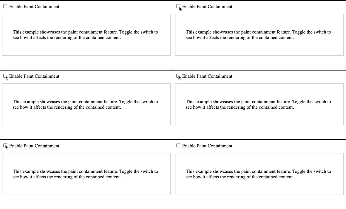
For instance, the example below shows a test of switching between no containment and paint containment.
<div class="container">
  <div class="toggle-wrapper">
    <input type="checkbox" id="paint-toggle" />
    <label for="paint-toggle">Enable Paint Containment</label>
  </div>

  <div class="content-wrapper">
    <div class="content">
      <p>
        This example showcases the paint containment feature. Toggle the switch
        to see how it affects the rendering of the contained content.
      </p>
    </div>
  </div>
</div>
The code snippet above displays an HTML structure that demonstrates the implementation of paint containment. It is divided into two primary sections: a toggle wrapper containing a checkbox labeled Enable Paint Containment and a content wrapper containing descriptive text showcasing the paint containment feature. By toggling the checkbox, users can observe the impact of paint containment on the rendering of the content.
:root {
  --containment-hue: 150;
  --containment-text-color: hsl(var(--containment-hue), 50%, 40%);
  --containment-bg-color: hsl(var(--containment-hue), 80%, 95%);
}

.container {
  max-width: 800px;
  margin: 0 auto;
}

.toggle-wrapper {
  margin-bottom: 15px;
}

.content-wrapper {
  border: 1px solid #ccc;
  padding: 20px;
  background-color: #f8f8f8;
}

.with-paint-containment .content {
  contain: paint;
  color: var(--containment-text-color);
  background-color: var(--containment-bg-color);
}

.content {
  padding: 15px;
  background-color: #fff;
  border-radius: 8px;
}
The CSS code above defines containment-related hues and colors using CSS variables, sets styling for container and toggle elements, and applies paint containment to content elements when toggled, enhancing visual consistency and customization.
const paintToggle = document.querySelector("#paint-toggle");
const contentWrapper = document.querySelector(".content-wrapper");

paintToggle.addEventListener("change", () => {
  contentWrapper.classList.toggle("with-paint-containment", paintToggle.checked);
});
The JavaScript code selects the paint toggle and content-wrapper elements and then adds an event listener to the paint toggle. When the toggle state changes, it toggles the presence of the with-paint-containment class on the content wrapper element, dynamically turning paint containment on or off based on user interaction.
Below is the final result of the code:
Size containment
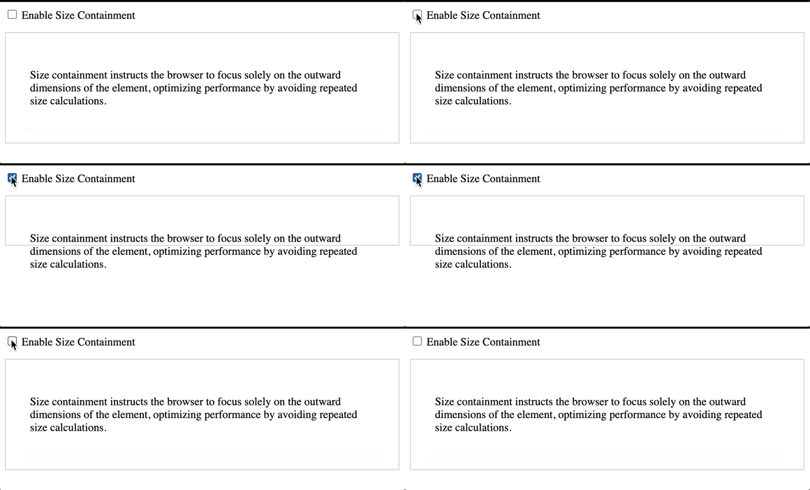
Size containment is a technique that instructs the browser to treat an element as if it has no content when calculating its size. This means the browser ignores the element’s fundamental dimensions and only considers the provided size values, such as width and height.
This technique is proper when an element’s size is changed dynamically using code like JavaScript, as it avoids an infinite loop of size calculations.
Size containment can be seen as instructing the browser to focus entirely on the outward dimensions of the element, treating it as an empty box. This method optimizes the browser’s performance by avoiding repeated size calculations when changing element content.
<div class="container">
  <div class="toggle-wrapper">
    <input type="checkbox" id="size-toggle" />
    <label for="size-toggle">Enable Size Containment</label>
  </div>

  <div class="content-wrapper">
    <div class="content">
      <p>
        Size containment instructs the browser to focus solely on the outward dimensions of the element, optimizing performance by avoiding repeated size calculations.
      </p>
    </div>
  </div>
</div>
The HTML code comprises a toggle switch to enable size containment, accompanied by descriptive content explaining its optimization benefits, encapsulated within a container structure.
.container {
  max-width: 800px;
  margin: 0 auto;
}

.toggle-wrapper {
  margin-bottom: 15px;
}

.content-wrapper {
  border: 1px solid #ccc;
  padding: 20px;
  background-color: #f8f8f8;
}

.with-size-containment .content {
  contain: size;
}

.content {
  padding: 15px;
  background-color: #fff;
  border-radius: 8px;
}
The CSS code above styles a container with specified dimensions and alignment, including a toggle-wrapper and content-wrapper with defined borders and padding. Additionally, it applies size containment to the content element when toggled, enhancing performance by focusing solely on outward dimensions.
const sizeToggle = document.querySelector("#size-toggle");
const contentWrapper = document.querySelector(".content-wrapper");

sizeToggle.addEventListener("change", () => {
  contentWrapper.classList.toggle("with-size-containment", sizeToggle.checked);
});
The JavaScript code selects the size toggle switch and content-wrapper elements and then adds an event listener to the toggle. Upon toggling, it dynamically toggles the presence of the with-size-containment class on the content-wrapper, turning size containment on or off based on user interaction.
Here is the final result of the Paint containment:
Style containment
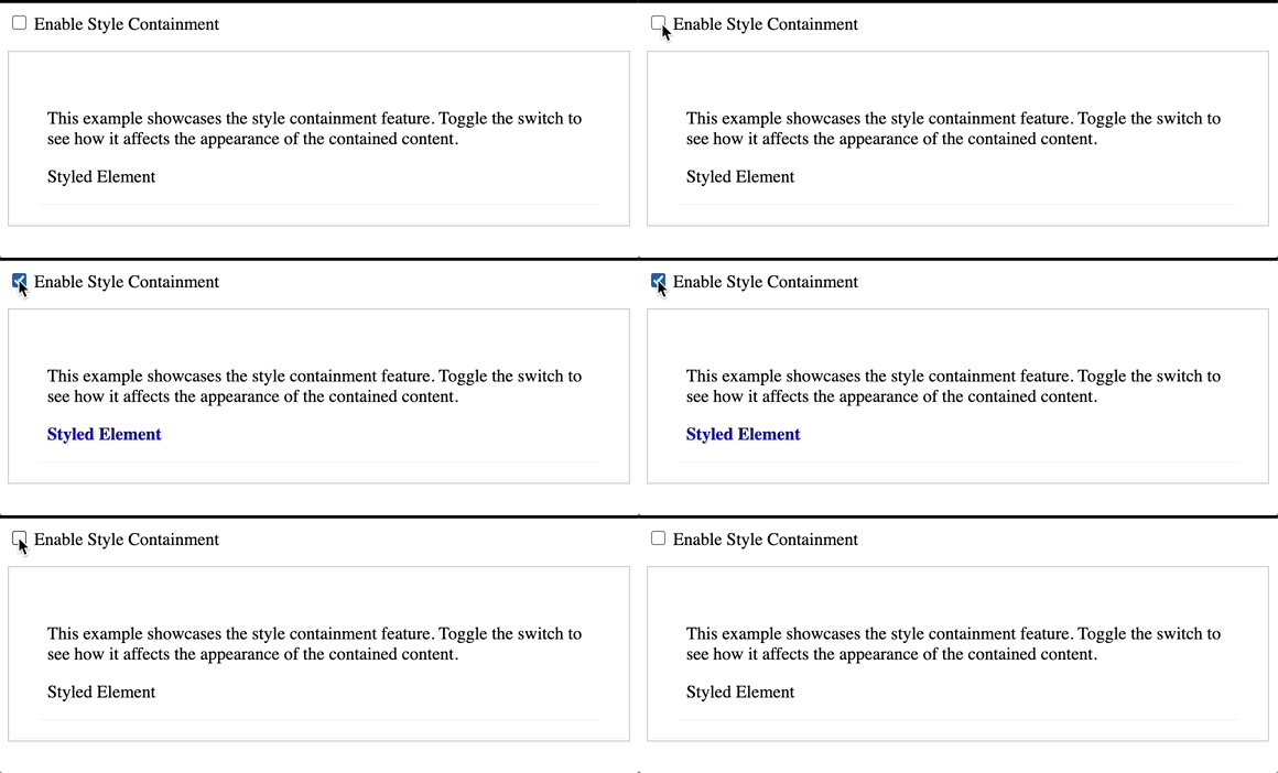
Style containment is a feature designed for counters and quotes. It works by limiting them to a specific document area and creating new instances instead of incrementing existing ones.
This feature can be beneficial sometimes, especially when using counters or quotes simply and straightforwardly. It offers a range of implementation benefits that can make document formatting more accessible and efficient.
<div class="container">
  <div class="toggle-wrapper">
    <input type="checkbox" id="style-toggle" />
    <label for="style-toggle">Enable Style Containment</label>
  </div>

  <div class="content-wrapper">
    <div class="content">
      <p>
        This example showcases the style containment feature. Toggle the switch
        to see how it affects the appearance of the contained content.
      </p>
      <div class="styled-element">Styled Element</div>
    </div>
  </div>
</div>
The HTML code above represents a container with a toggle switch for enabling style containment. Inside the container, there’s a wrapper for the toggle switch and a content wrapper containing a paragraph explaining the purpose of the example. Additionally, there’s a styled-element div inside the content wrapper, which will be affected by the style containment when toggled.
.container {
  max-width: 800px;
  margin: 0 auto;
}

.toggle-wrapper {
  margin-bottom: 15px;
}

.content-wrapper {
  border: 1px solid #ccc;
  padding: 20px;
  background-color: #f8f8f8;
}

.with-style-containment .styled-element {
  color: blue;
  font-weight: bold;
}

.content {
  padding: 15px;
  background-color: #fff;
  border-radius: 8px;
}

.styled-element {
  margin-top: 10px;
}
The CSS code above sets styles for a container, including a toggle-wrapper and content-wrapper. It applies specific styles to the styled element when style containment is enabled.
const styleToggle = document.querySelector("#style-toggle");
const contentWrapper = document.querySelector(".content-wrapper");

styleToggle.addEventListener("change", () => {
  contentWrapper.classList.toggle("with-style-containment", styleToggle.checked);
});
The JavaScript code toggles the class with-style-containment on the content wrapper based on the state of the style toggle checkbox.
The result of the code:
What Are Containment Shorthands?
All four primary values of the containment property can be combined and used in various ways. In addition, a few common shorthand values can be used.
The content value of the containment property specifies that the element’s content is separate from the rest of the document. This helps the browser improve rendering by isolating the element’s layout, paint, and style calculations.
The stringent shorthand value indicates all containment features, including layout, paint, style, and size. It provides strong isolation for the element and its subtree, making it suitable for cases requiring optimization across all rendering areas.
.contain-strict {
  /* contain: layout paint style size; */
  contain: strict;
}

.contain-content {
  /* contain: layout paint style; */
  contain: content;
}
The CSS code above applies strict containment rules, limiting layout, paint, style, and size calculations for elements with the class contain-strict. Similarly, elements with the class contain-content have their containment restricted to layout, paint, and style calculations.
Practical Applications of CSS Containment
This section will explore some practical CSS containment techniques that prioritize efficiency over aesthetics. We aim to recreate typical scenarios commonly found in web applications. Examining these examples allows you to experiment with CSS containment in your projects and assess their performance results.
However, it’s important to note that performance reports generated by development tools may not necessarily indicate improved results, especially for smaller scenarios. The browser’s ability to allocate resources and memory dynamically may vary. Therefore, after a few attempts, we can compare the average performance with and without containment and determine whether to proceed.
Layout Optimization
Imagine a webpage that uses JavaScript to add or load components dynamically to specific areas. These changes can happen when you take certain actions, such as clicking buttons or scrolling down the page.
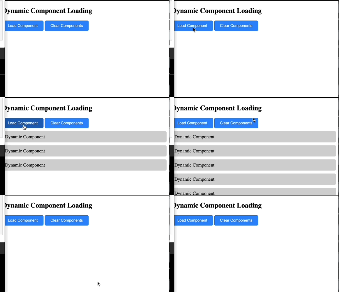
The implementation below provides you with the ability to test the layout both with and without CSS confinement.
<div class="container">
  <h2>Dynamic Component Loading</h2>
  <button class="button" onclick="loadComponent()">Load Component</button>
  <button class="button" onclick="clearComponents()">Clear Components</button>
  <div class="components"></div>
</div>
The HTML code above creates a container titled Dynamic Component Loading and two buttons labeled Load ComponentLoad Component and ClearComponents. When the LoadComponent button is clicked, the loadComponent() function is triggered to dynamically add a new component inside the container. Similarly, clicking the ClearComponents button executes the clearComponents() function to remove all existing elements from the container.
.container {
  max-width: 800px;
  margin: 0 auto;
  padding: 20px;
  border: 1px solid #ccc;
  background-color: #f8f8f8;
}

.component {
  padding: 10px;
  margin: 10px 0;
  background-color: #ccc;
  border-radius: 5px;
}

.button {
  padding: 10px 20px;
  background-color: #007bff;
  color: #fff;
  border: none;
  border-radius: 5px;
  cursor: pointer;
}

.button:hover {
  background-color: #0056b3;
}
The CSS styles the layout and buttons for a clean, readable design: the container has a centered layout with padding, border, and background, while buttons have defined padding, background, and hover effects.
function loadComponent() {
  const componentsContainer = document.querySelector(".components");
  const component = document.createElement("div");
  component.classList.add("component");
  component.textContent = "Dynamic Component";
  componentsContainer.appendChild(component);
}

function clearComponents() {
  const componentsContainer = document.querySelector(".components");
  componentsContainer.innerHTML = "";
}
The JavaScript functions enable dynamic component loading and clearing: loadComponent() creates a new div with the class components and appends it to the components’ container, while clearComponents() removes all child elements from the components’ container.
Here is the result of the code:
Animation Enhancement
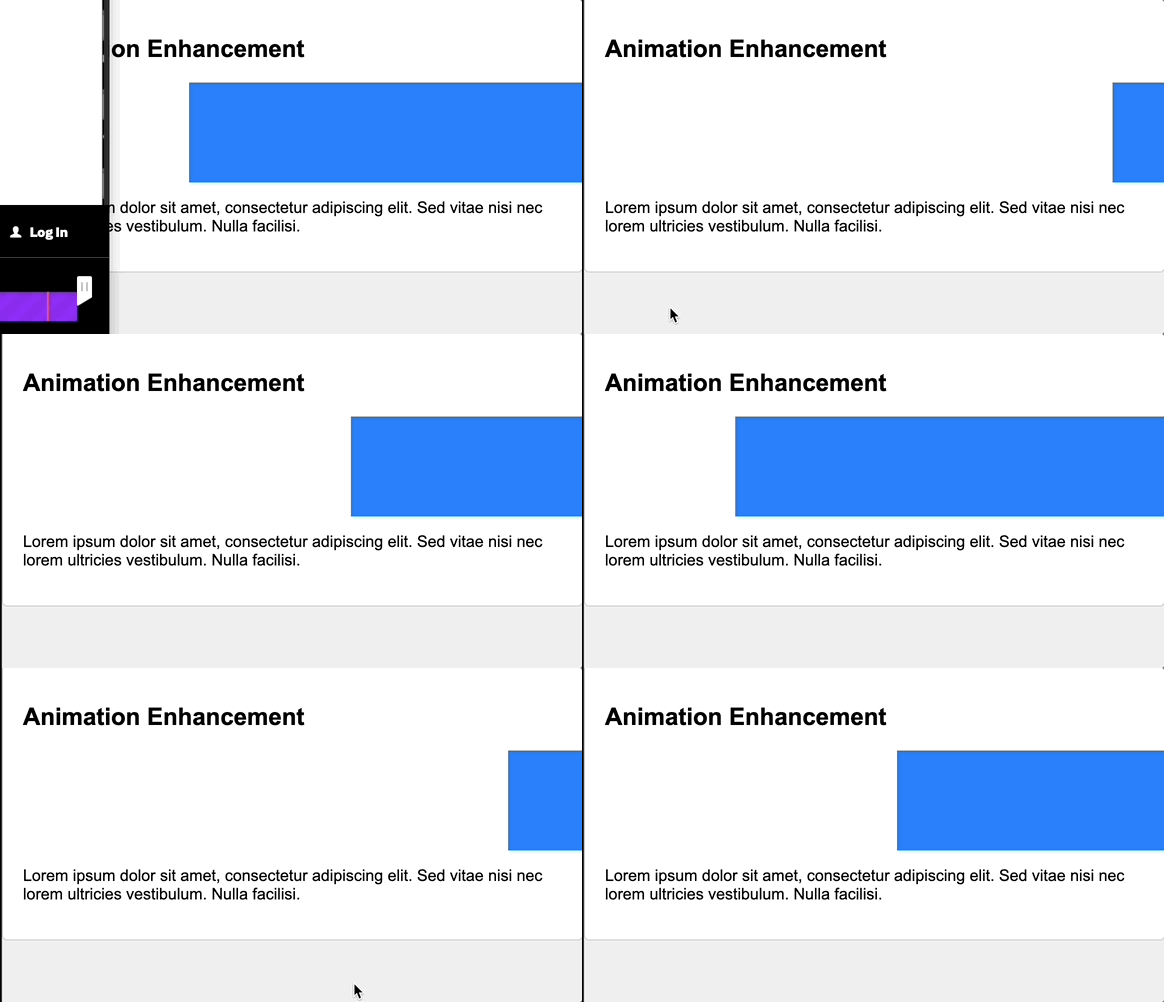
When working with CSS animations, you might encounter issues where the animation effects are not displayed correctly and disrupt the overall look and feel of the webpage. This happens when animated elements overlap or clash with other elements on the page.
To better understand this problem, here is an example of an animation that does not use the CSS containment. As a result, the animation breaks the page layout:
<div class="container">
  <h2>Animation Enhancement</h2>
  <div class="animation-container"></div>
  <p>
    Lorem ipsum dolor sit amet, consectetur adipiscing elit. Sed vitae nisi nec
    lorem ultricies vestibulum. Nulla facilisi.
  </p>
</div>
The HTML code provided above consists of a container with a heading (h2) titled Animation Enhancement and a paragraph containing placeholder text.
/* Base styles */
body {
  font-family: Arial, sans-serif;
  margin: 0;
  padding: 0;
  background-color: #f0f0f0;
}

.container {
  max-width: 800px;
  margin: 0 auto;
  padding: 20px;
  background-color: #fff;
  border: 1px solid #ccc;
  border-radius: 5px;
}

.animation-container {
  width: 100%;
  height: 100px;
  background-color: #007bff;
  animation: slide 2s linear infinite;
}

@keyframes slide {
  0% {
    transform: translateX(0);
  }
  100% {
    transform: translateX(100%);
  }
}
The provided CSS code sets base styles for the webpage, including font, margins, and padding. Additionally, it defines a sliding animation for an element within a container.
The result of the Animation Containment:
CSS Containment Browser Support
CSS containment is a feature widely supported by all major browsers, including mobile ones like Safari for iOS and Opera Mobile. Despite being supported by most browsers, developers do not commonly use it. It would be interesting to observe further advancements, increase awareness, and introduce new use cases for this enhancement.
Conclusion
We have explored various CSS containments through illustrated examples to understand their multiple applications better. Now, we know how each containment works independently and collaboratively.
While CSS containments can enhance your website’s performance, it’s essential to remember that they are not a universal solution. It’s critical to assess the performance impact of any changes before implementing them on the production site. Choose CSS containments judiciously for your layouts, taking into account their impact on overall performance and, consequently, the user experience on the website.
Gain control over your UX
See how users are using your site as if you were sitting next to them, learn and iterate faster with OpenReplay. — the open-source session replay tool for developers. Self-host it in minutes, and have complete control over your customer data. Check our GitHub repo and join the thousands of developers in our community.


