Hacking the Brain: Unleashing the Power of Neuroscience for Web Design

You remember Mr. Sally from elementary school and how his favorite shoes were red. You also remember the sadness you felt when you heard the news of his passing.
You vividly remember the fear and panic that surged through you when you woke up and saw ten flying cockroaches in your room.
What about the Nigerian-Korean 7-year-old girl next door? How is she so fluent in Korean and Igbo at that young age? Yes, her mother speaks Igbo to her and her father Korean, but at her tender age, how does she switch languages interchangeably between both parents?
One common thing between these seemingly unrelated memories and experiences is that they all demonstrate the human brain’s astounding capacity.
Neuroscience: the study of the brain and how people think.

Our brains possess an incredible ability to process information, make decisions, and adapt to new environments. In this article, we’ll harness the power of the brain to design a web site. Understanding the mind’s ability to process information, perceive visual stimuli, and make decisions allows designers to create intuitive, visually appealing interfaces designed to engage users.
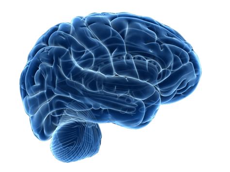
This article covers different ways we can leverage the principles of neuroscience to craft remarkable user experiences that will leave our visitors wanting more.
Don’t worry; this article isn’t a 20-hour case study, not at all. Also, we don’t have to be neuroscientists. My goal is to make this article as simple as possible. I promise to make it an engaging and entertaining ride for you.
The Brain Behind The Clicks.
We believe our decisions are made carefully. In reality, this isn’t the case. Most choices we make are decisions and actions we make unconsciously. Although some parts of your choices come from a rational place, many are based on emotion and automatic triggers that we react to from something we see on a website.
“Your web experiences are highly influenced by unconscious thoughts and actions that are controlled by various parts of your brain.” ~ Susan Weinscheck.
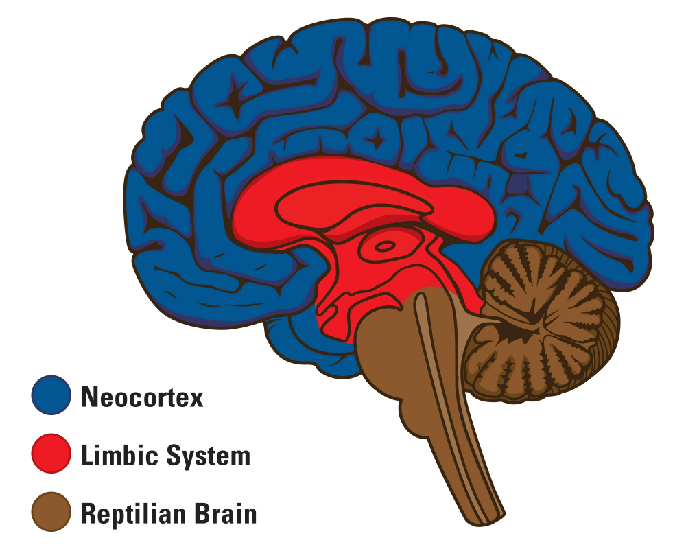
Neuroscientist and physician Paul MacLean proposed The Triune Brain Theory in the 1960s. He proposed that there are three major divisions of the brain based on evolutionary development:
- Reptilian Complex (The Primitive Brain or The Old Brain)
- Paleomammalian Complex (The Limbic System or The Mid Brain)
- Neomammalian Complex (The New Cortex or The New Brain)
Stay with me, I know it’s getting very scientific already, but we must understand this.
The Reptilian Complex (also known as the “primitive brain” or “old brain”) is responsible for our survival instincts and basic functions. This part of the brain automatically takes care of fundamental things such as digestion, movement, and breathing.
The Paleomammalian Complex (also known as the “limbic system”, “emotional brain,” or “midbrain”) is responsible for processing emotions. It regulates our emotional responses, including joy, fear, sadness, and anger. This part of the brain includes the amygdala, hippocampus, and hypothalamus.
The amygdala is responsible for processing and detecting emotions, particularly fear and threat detection. The hippocampus is involved in memory formation, particularly linking emotional experiences to long-term memory. The hypothalamus helps regulate emotional responses by releasing hormones that can impact our mood and physiological states.
The fear of the ten flying cockroaches in your room is a prime example of your midbrain at work.
The Neomammalian Complex (also known as the “new brain” or “the new cortex”) is responsible for higher cognitive functions such as language processing, speech, reading, listening to music, problem-solving, and conscious thinking. The Nigerian-Korean girl’s ability to effortlessly switch between Korean and Igbo exemplifies the new brain at work.
Your new brain is currently reading this article.
All websites have target behaviors. E-commerce websites, for instance, want us to buy products, travel websites want us to book flights, and community forums want us to engage in community discussions. But how do they get us to engage in the target behavior? How do they get us to create an account, click on a product, view more, add to a cart, and buy?
To get us to click, they must persuade us, but not logically.
Considering that most of our decisions are unconsciously made, we have unconscious parts of our brains making these decisions. The primitive brain and the limbic system are the key regions involved in decision-making.
The most effective websites are those that engage with all three brains. It is only after a website does this that we click on it. Let’s explore ways we can engage with all three brains and create amazing and engaging web designs.
Nailing The First Impression
According to Sweor.com:
- Approximately 50 milliseconds (0.05 seconds) is all it takes for users to form an opinion about your website that determines whether they will stay or leave.
- First impressions are 94% design related.
- It takes 2.6 seconds for a user’s eyes to land on the area of a website that most influences their first impression.
Do you see how crucial it is to nail the first impression?
When it comes to nailing the first impression, we must consider how the three parts of the brain respond to visual stimuli.
Let’s take a look at Nike’s website to understand how the three parts of the brain are considered:


When you first land on Nike’s website, your attention is instantly drawn to the captivating image that greets you. Your unconscious brain quickly scans the environment (in this case, Nike’s website). This is the old brain at work. Within seconds, you find yourself scrolling down, instinctively drawn to explore more. What you may not realize is that Nike’s website is strategically designed to engage all three parts of the brain.

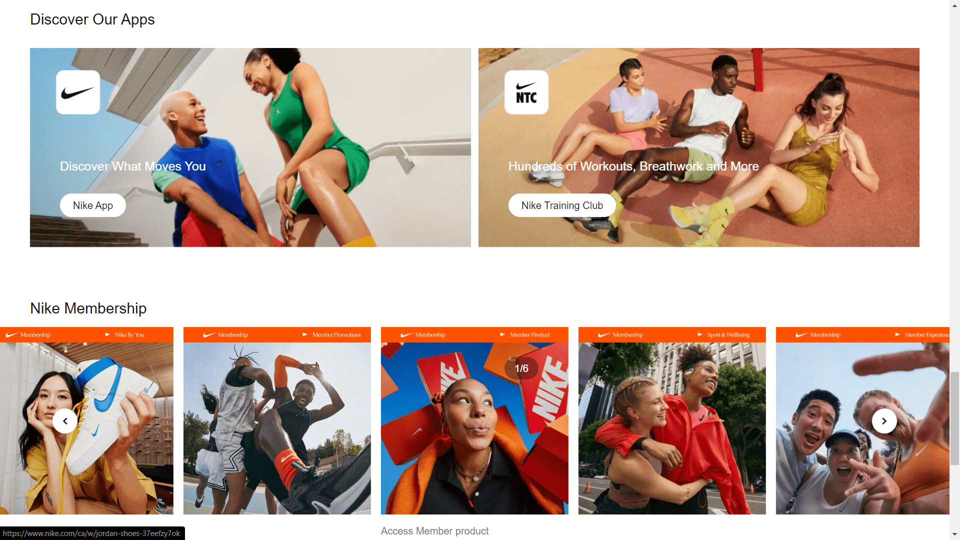
Bright, colorful imagery taps into the midbrain. With a simple and purposeful approach, Nike utilizes warm and energetic colors in a way that triggers positive emotions and resonates with users. This activation of the midbrain creates an emotional connection, compelling you to scroll further and discover more of what the website has to offer.
As you continue to explore, navigating through various sections and product categories, your new brain comes into play. In addition to a clean and intuitive interface, Nike’s website is well-organized and has a clear visual hierarchy. This thoughtful website design caters to the new brain’s need for logical processing and problem-solving. It allows you to easily find the information you’re seeking and make informed decisions.
In essence, Nike’s website successfully engages the old brain, midbrain, and new brain, leveraging visual stimuli and design elements to create a captivating user experience. In this way, Nike maximizes the chances of leaving a lasting impression on users and encouraging them to engage further with their brand.
Session Replay for Developers
Uncover frustrations, understand bugs and fix slowdowns like never before with OpenReplay — an open-source session replay tool for developers. Self-host it in minutes, and have complete control over your customer data. Check our GitHub repo and join the thousands of developers in our community.
Simplifying Navigation With Cognitive Ease
Users must navigate a website easily. The old brain seeks simplicity and efficiency, making it crucial to design clear and straightforward menus that enable users to find what they need effortlessly.
The midbrain craves cognitive ease and familiarity. By incorporating recognizable design patterns, we can improve user satisfaction.
A well-structured website benefits the new brain. With clear categorization and strategic content placement, we help the new brain process information more effectively.
Let’s take a look at Nike’s website once again.
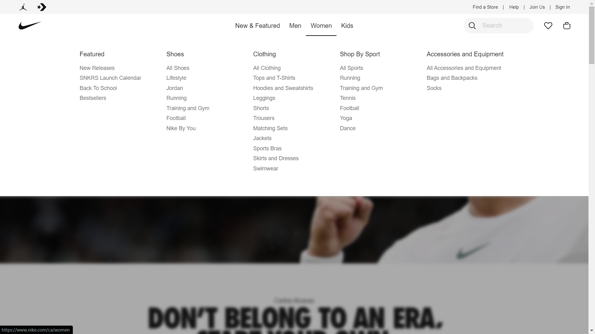
Nike’s navigational system demonstrates a user-friendly approach. The menu is positioned strategically, allowing easy access to various sections and product categories. With clear labeling and concise dropdown options, users can quickly find what they’re looking for and navigate seamlessly throughout the website.
Triggering Emotional Engagement
We process emotions in the limbic system or the midbrain. We can use visual storytelling techniques that appeal to the midbrain to trigger emotional engagement. A deeper understanding of the amygdala’s role in detecting danger and fear can also help us design experiences that do not trigger negative emotions. By creating a sense of safety and trust through design elements, we ensure that users feel comfortable and are more likely to engage positively with the website.
A good example of a website that triggers emotional engagement is Airbnb. Let’s analyze its website.
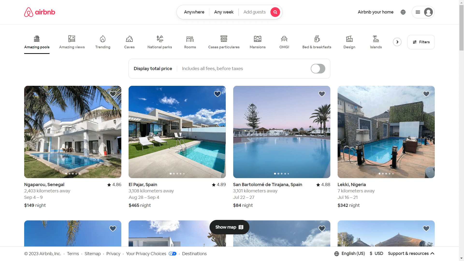
Using visual storytelling, Airbnb creates a memorable user experience. Their website showcases beautiful and inspiring imagery of unique accommodations and destinations, tapping into the midbrain’s desire for exploration and adventure. By using relatable imagery, such as the cozy living spaces above, you can spark emotional connections between the user and the product.


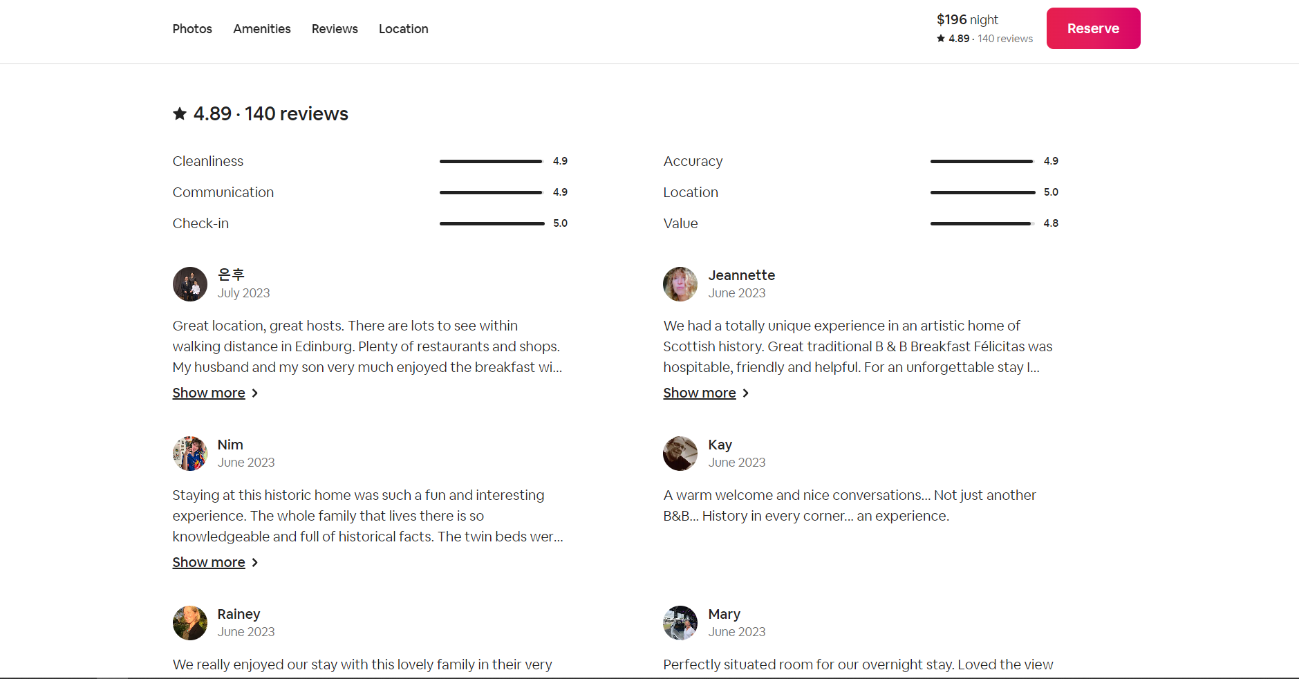
Furthermore, Airbnb prioritizes creating a sense of safety and trust. Verified reviews and detailed property descriptions establish credibility through design elements. As a result, users can book accommodations with confidence, alleviating any potential fears or concerns.
Persuasion Through Neuromarketing Techniques
To persuade, the limbic system and the old brain must work together. The key to persuading users is tapping into their innate drives. Using compelling design elements, clear messaging, and action-oriented language, we motivate the old brain to act.
Leveraging psychological biases, such as scarcity and social proof, can further influence user behavior. Our limbic system craves to be socially validated, so when we highlight limited availability or showcase positive reviews, we create a sense of urgency.
Let’s refer to Airbnb again. Airbnb employs persuasive techniques that engage the old brain and the limbic system to influence user behavior. Let’s take a look at the image below:
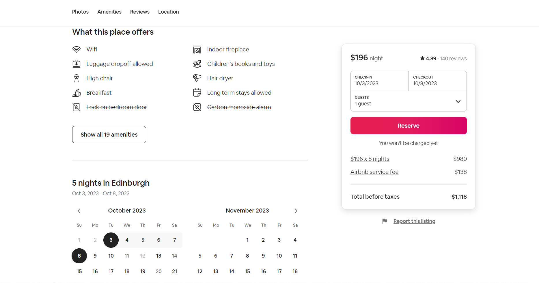
The “Reserve” button highlights the availability of the accommodation. This activates the old brain and encourages users to make bookings without hesitation.
As we discussed in the last section, adding reviews can also serve as a persuasion tool. The website displays reviews and testimonials from previous guests, leveraging the limbic system’s need for social validation. By highlighting positive feedback and ratings, Airbnb instills a sense of trust and confidence in potential users, making them more likely to book accommodations.
The Future of Neuro Design
Machine learning and artificial intelligence have become more popular recently. Machine learning and artificial intelligence will be able to quickly respond to users’ mental and emotional states as they develop. Engagement and pleasure will therefore increase with experiences that are specially catered to each person’s interests and goals.
But as we go towards this new era of personalized design, ethical issues take on more significance. Fostering trust and developing moral neural designs requires respecting user privacy, being transparent about data gathering and alteration, and providing users authority.
Conclusion
This article has probably introduced you to a completely new aspect of web design. As a developer, you will be more conscious of specific components you put to your website or even applications to draw in users.
We can create extraordinary user experiences that appeal to all three areas of the brain by utilizing neuroscience concepts. We design websites that leave users wanting more by nailing the first impression by appealing to the old brain and midbrain, streamlining navigation to accommodate all parts of the brain, triggering emotional engagement through the midbrain, and using persuasive techniques that are in line with decision-making processes.


