How to Improve Website User Experience Using Micro-interactions?

Micro-interactions are the difference between a product you love and one you tolerate. One of the most important things you can do to attract visitors to your website is to have an appealing website. However, top technology companies have other tools in their arsenal that they use subtly to attract visitors and keep them coming back.
If an app is addictive, its creators likely gave more thought to how well it connects with users emotionally using micro-interactions. They improve the friendliness and engagement of your website by providing users with feedback or a sense of accomplishment after completing specific tasks, no matter how small. They can be used to form habits in application users.
In this article, we’ll go over the basics of micro-interactions, why they’re important in applications, and when and how to use them. Using a sample React.Js application, we’ll also show how to easily implement them in our applications.
Basics of Website Interaction
Let’s begin by understanding what website interactions mean:
Web interactivity refers to interactive features that are embedded in websites that offer an exchange of information either between communication technology and users or between users using technology. This type of interactivity evolves with new developments of website interfaces. https://en.wikipedia.org/wiki/Interactivity
A website interaction is any movement, communication, or interactivity between users and our website. Interaction is not animation; it is not meaningless; it is used to give feedback to users; it is used to show the completion of an activity performed by the user. As a result, the user will feel heard and, hopefully, will have a better experience with the product.
Introducing Micro-interactions
Micro-interactions are like conversations. They begin with the trigger (typically a click, tap, or scroll done by a user) and end with feedback. This is a confirmation of a process.
For instance, if there is no feedback, indication of processing, or completion, it is difficult for a user to tell if a file has been successfully saved. A visual representation of progress can be more trustworthy and reassuring to the user, and they are indicating whether or not a task has been completed.
Micro-interactions communicate feedback about an action or a completed task, which aids in improving the outcome, preventing errors, and encouraging repeat actions.
They can also be used to reward users after they complete a task by making them smile, excited, entertained, etc.
The system itself can trigger some to draw the user’s attention. These are typically small, highly contextual changes in the user interface.
When done right, they stimulate dopamine release in the brain, resulting in small moments of delight. Which contributes towards improving the user experience and increases the likelihood that users will continue to use your product. This increases retention rates and returning visitors. They create WOW moments and improve branding.
All micro-interactions have one thing in common: they accomplish a specific task.
The Micro-interactions Model
As described in Dan Saffer’s book Micro-interactions, there are four important models and components to consider when we are designing a micro-interaction.
-
Trigger: Triggers are events that cause a micro-interaction to occur. A user action can initiate a micro-interaction. For example, when a user clicks a button. Also, triggers can be initiated by the system. The system can trigger the action when some specific (usually predetermined) conditions have been met. For example, when an email app checks a user’s inbox for updates automatically and notifies the user about new mail.
-
Rules: These are the guidelines that govern interaction; they define the actions that occur due to changing conditions (triggers). They define the flow of micro-interactions and what happens once they are triggered.
-
Feedback: This is the exciting part of micro-interactions because we can add humor, edutainment, etc. Feedback is the most important model, providing feedback details to the user. They can be audio, visual, imagery, vibration movement, or any combination of the above. The user is always kept informed of what is happening when the micro-interactions are triggered. They give users information about the status of a task.
-
Loops and Modes: The loop determines the length and frequency with which the micro-interaction repeats. Modes alter the way things usually function and operate. Loops and Modes are only used when the normal flow of micro-interactions is disrupted.
Examples of Micro-interactions at Some of Our Favourite Tech Companies
Some of the world’s leading technology companies are masters at creating habits with their products that keep users coming back for more to complete specific tasks. Here are some micro-interactions from popular technology websites we love.
Facebook ‘reactions’
‘Likes’ have always been a big part of the Facebook experience. The social media platform introduced a new set of ‘reactions’ in February 2016 that allowed people to express different emotions in response to the content they saw - the ‘like’ reaction was joined by love, laughter, shock, sadness, and anger reactions.
You will see a complete list of interactions if you tap and hold. Each emoji is animated and moves in real time, which adds to the fun. Because tapping and holding take a little longer than simply tapping, Facebook rewards the user with a slew of animated emojis.
Because the function is all about expressing emotion, this is extremely powerful. The animation of each icon emphasizes that feeling, allowing the user to express their reaction in a more visual and meaningful way.

Twitter’ likes’
Twitter’s little popping heart with glitters that appears when you like a comment is an excellent example of a micro-interaction. When you tap the heart icon, a halo of confetti appears around the icon as it turns red. This handy little animation not only makes you feel a little more satisfied when you “heart” a tweet but also tells you where and when you liked that particular comment. All of these responses help build a brand relationship with its customers.

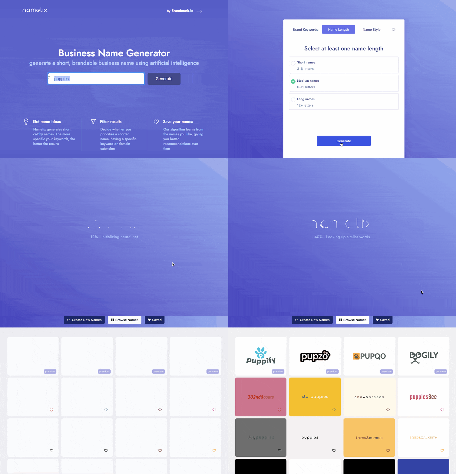
Namelix Form
Loading is a necessary evil, but micro-interactions can make it more enjoyable. If you have a site function that requires some loading time, consider implementing a micro-interaction to keep users entertained in the meantime. Namelix is an excellent example:
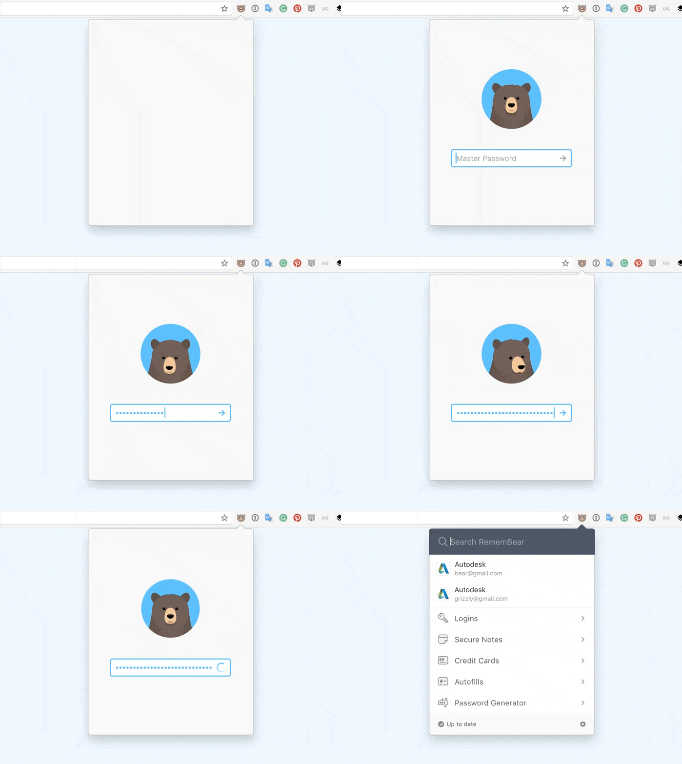
RememBear Login Form
This password error micro-interaction makes the list simply because it is an excellent example of how to alert the user in a subtle and non-obtrusive way that something is wrong.
RememBear is a password manager that remembers and fills in your passwords for you.
You only need to remember one password to log into RememBear and access all your other login details. Logging in is usually a dull experience, but RememBear brightens the mood by having the bear mascot watch you enter it. He turns red when you login incorrectly; green when you log in correctly. This enhances the overall impact of the process.
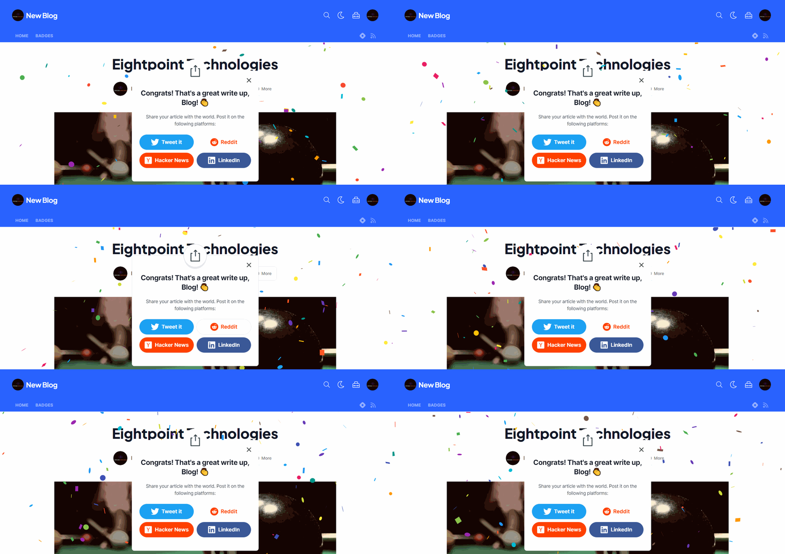
Hashnode confetti
Another excellent type of micro-interaction is the hashnode confetti, which can be used to induce users’ feelings and emotions when completing a task. After successfully publishing an article on the hashnode platform, users receive this confetti, making them eager to publish another article the next time.
WhatsApp (messaging feedback)
This list would be incomplete if we omit the micro-interactions of many messaging apps, such as WhatsApp, Slack, Discord, etc., which indicate that one of our contacts is typing or replying to a message.
Because users know a response is on the way, they remain engaged with the window open. It also tells users when to type and when to wait for the other person to finish typing their message.
This immediate feedback in response to action encourages user engagement and attention. If you know someone is typing back to you or is about to respond, you’re less likely to switch apps or put your phone away, right?

When Should You Use Micro-interactions?
Because they look cool is the absolute worst reason for using micro-interactions in our applications, especially if the sole reason for creating a micro-interaction is to show off an effect.
Let’s look at some places micro-interaction can be used.
-
Scrolling: Scrolling is commonly used to keep a page interesting and keep users informed of where they are on the website. Some websites even tell you how far you’ve progressed or how much of the page remains before you reach the bottom.
-
Loading: Loading screens are a familiar sight to anyone who has ever played video games. Over the years, they’ve become more and more impressive. Micro-interactions are a great way to provide feedback to users in scenarios such as slow page loading, long download, upload, or user experiencing network failure while performing a task.
-
Calls to Action: These are one of the most important things we want users to notice and click on. Micro-interactions can be added to this to entice users to click on it and return for more, and they can be used to make the experience appealing to users.
-
Errors: Micro-interactions can notify users of errors or prevent them from occurring by using warning signs triggered during or after an interaction. For example, filling out forms are a common source of frustration for many users; micro-interactions can be used to communicate to users whether their login details meet all requirements during this process.
-
Swipe actions: Allows the user to quickly explore various options. Micro-interactions assist in notifying users of their swipe.
Session Replay for Developers
Uncover frustrations, understand bugs and fix slowdowns like never before with OpenReplay — an open-source session replay tool for developers. Self-host it in minutes, and have complete control over your customer data. Check our GitHub repo and join the thousands of developers in our community.
Tips for Your next Micro-interactions
The following are tips you should consider when deciding about micro-interactions.
-
Do the Research Who are the targeted users? What do we know about them? Data collection will speed up the process and aid in the development of tailored solutions. Don’t start from scratch. Use your knowledge of your target audience to create the most compelling experiences for them.
-
Make Them Functional One of the most important properties of a micro-interaction is that it must be useful. Micro-interaction should not be aimed at decorating the website.
-
Keep Them Simple They should be micro, simple, brief (and appealing) as the name implies. They should be designed to improve the overall user experience.
-
Avoid Overusing They are minor aspects of the user experience, but they significantly impact the impression the product leaves with users. Micro-interactions are not meant to be present everywhere on our websites. They should be used strategically. They should never interrupt a user’s interaction with the site.
-
Collect User Feedback Real-world customer feedback can help improve the product experience. Listen to the target users and gather feedback. Then, evaluate what you’ve learned and make changes to upgrade and optimize micro-interaction usage. Boosting user engagement is what we are working towards.
-
Micro-interactions Must Be Long-lasting What appears to be enjoyable the first time may become irritating after the hundredth use.
-
Speak Human Make all micro-interactions as simple as possible. Remember, we’re making them for people. Thus, micro-interactions should be simple and easy to understand while guiding the user through our application. Bring humanity into the micro-interaction and concentrate on visual harmony. To bring the micro-interaction to life, the motion should feel natural.
The details are not the details. They make the design -Charles Eames
React provides access to a large ecosystem of libraries that can be used to create painless interactive UIs and micro-interactions for our applications.
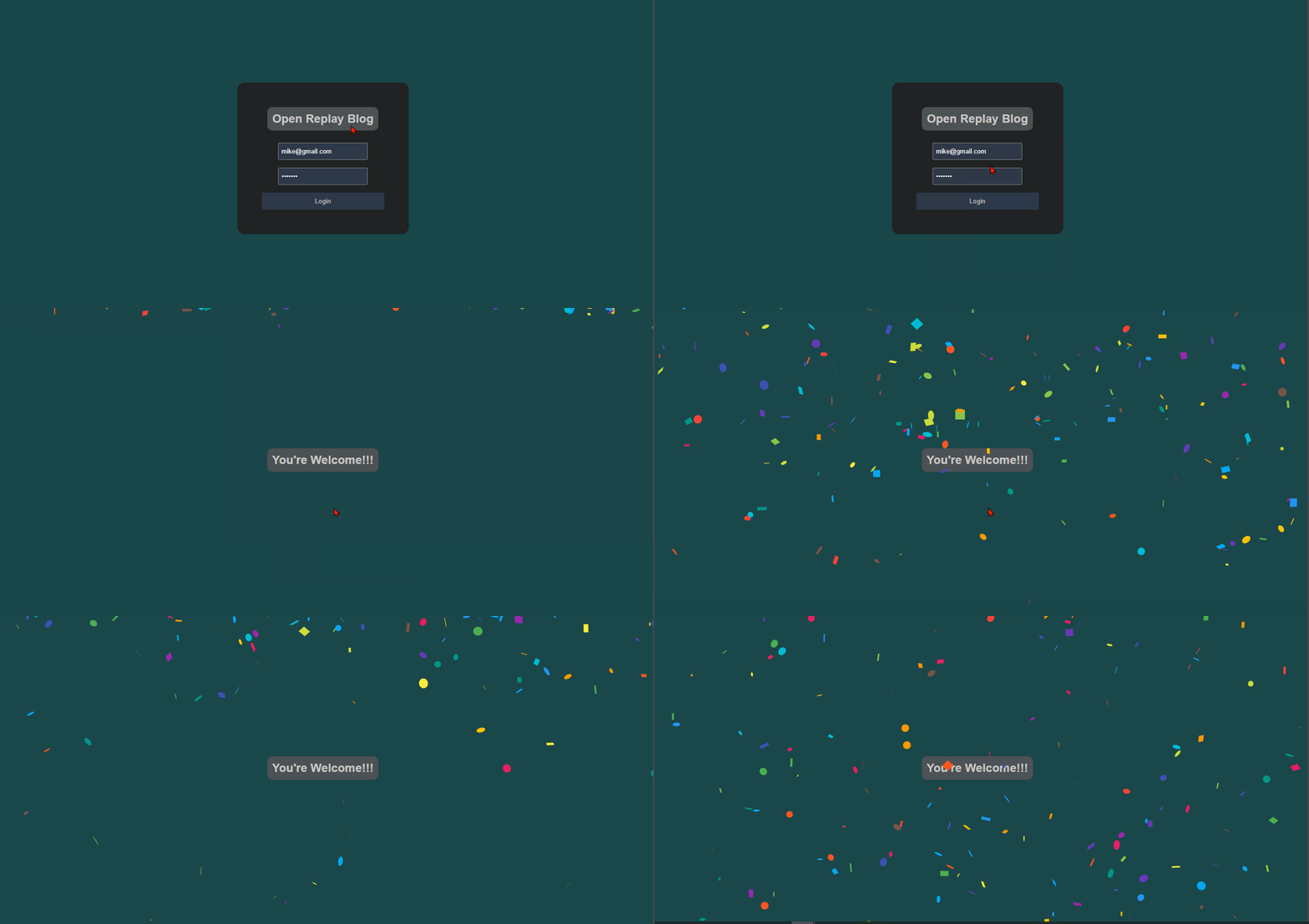
Next, let’s implement a micro-interaction by creating a simple confetti page to reward our users after a successful login.
Demonstrating Micro-interaction in a React Application
Micro-interactions are a quick way to make users fall in love with our app. We should use micro-interactions to make our website more interactive and appealing. Let’s look at an example of adding micro-interaction to a ‘React.js’ application.
First, use the following command in your terminal to create our react application.
npx create-react-app confettidemoNext, open the newly created application in your preferred IDE.
Run the following command in the application’s terminal
npm install react-confetti react-router-domBy installing react-confetti, we can add confetti to our React application, which can be used as a reward for users after they complete a specific task in our application and react-router-dom; this enables dynamic routing in our react application.
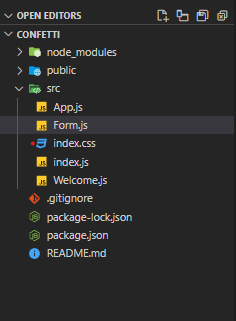
Next In the src folder, create two new files Form.jsx and Welcome.jsx
Our application should be structured looks like this now:
Insert the following code into App.js file in the src folder:
import Form from "./Form"
import {BrowserRouter, Routes, Route } from "react-router-dom"
import Success from "./Success";

function App() {
  return (
    <BrowserRouter>
      <Routes>
        <Route path="/" element={<Form />} />
        <Route path="/welcome" element={<Success />} />
      </Routes>
    </BrowserRouter>
  );
}

export default App;
Then the Form.jsx file will contain the below code to create our application’s login form:
import React from 'react'
import {useNavigate} from "react-router-dom"

const Form = () => {
    const navigate = useNavigate()

    const handleSubmit = (e)=> {
        e.preventDefault()
        navigate("/welcome");
    }

  return (
    <form onSubmit={handleSubmit}>
      <h2>Open Replay Blog</h2>
      <div>
        <input type="email" placeholder="Enter Email Address" />
      </div>
      <div>
        <input type="password" placeholder="Enter Password" />
      </div>
      <button>Login</button>
    </form>
  );
}

export default Form
Here is our form’s styling. Insert the following code into the index.css file:
*{
  margin: 0;
  padding: 0;
  box-sizing: border-box;
  font-family: 'Poppins', sans-serif;
}

body {
    background-color: rgb(20, 90, 95);
    display: flex;
    justify-content: center;
    align-items: center;
    min-height: 100vh;
    width: 100;
    overflow-x: hidden;
}

form {
    background-color: white;
    height: 100%;
    width: 350px;
    padding: 50px;
    display: flex;
    flex-direction: column;
    justify-content: center;
    align-items: center;
    border-radius: 15px;
}

h2 {
    border-radius: 10px;
    background: dimgrey;
    padding: 10px;
    text-align: center;
    margin-bottom: 25px;
}

input {
    padding: 8px 5px;
}

div {
    margin-bottom: 1rem;
}

button {
    background-color: #31455e;
    padding: 10px;
    width: 100%;
    color: white;
    border: 0;
}
Insert the following code into the Welcome.jsx file. Here we are importing the react-confetti library, which is then used to create confetti after a successful login.
import React, { useEffect, useState } from 'react'
import ReactConfetti from 'react-confetti'

const Welcome = () => {
    const [dimension, setDimension] = useState({
        width: window.innerWidth,
        height: window.innerHeight,
    })

    const showAnimation = ()=> {
        setDimension(!dimension);
        console.log("dhdf")
    }

   useEffect(()=>{
    window.addEventListener("resize", showAnimation)
    return ()=> {
        window.removeEventListener("resize", showAnimation)
    }
   },[dimension])

  return (
    <div onClick={showAnimation}>
      <ReactConfetti width={dimension.width} height={dimension.height} />
        <h2 style={{color: "white"}}>You're Welcome!!!</h2>
    </div>
  );
}

export default Welcome
Run the application:
npm startThis is how our application should look now:
Conclusion
Sweat the small stuff and make your application more than just usable. Micro-interactions make our applications utterly delightful. A bad user experience can make all the difference.
Not only can micro-interactions incentivize interaction and conversions, but they can also add to your brand tone of voice, especially when paired with great copywriting. However, when designing micro-interactions for users, it is essential to keep users in mind and make them functional and simple. We can add many fun and great libraries to our React applications to achieve a smooth and easy addition of micro-interactions.
A TIP FROM THE EDITOR: For more on micro-interactions, check out our Micro-interactions Using Anime.Js article.

