Shadows in CSS

Our shadow doesn’t leave us behind as long as we step outside each day to go to work, shop, or do anything else that exposes us to light. Shadows would naturally be recognizable to our eyes. Shadows reveal an object’s size, and adding shadows to our designs can improve our user interface. Let’s check to see if this is true.
The various applications of the Box-shadow effect will be the main emphasis of this article, and we’ll cover these three topics below:
Layered Shadows
It’s not precisely accurate that the Box-shadow CSS feature was developed to promote expressiveness or reveal the qualities of a shadow in real life. However, adding a simple Box-shadow property may increase our selection.
We can closely resemble a natural shadow and have control over how shadows are created by using the Layered Box-shadow. To produce this look, numerous shadows are created and separated by commas. We’ll examine how it’s done below.
Claymorphism
Claymorphism combines inner and outer shadows to create the illusion of depth and shape in HTML elements. Claymorphism aims at getting a 3D inflated look. It’s fairly simple to make. You may almost finish it by simply adding a hazy shadow underneath the element. It has increased in prominence recently in UI design forums, and the Web 3 space uses it more frequently. You often find NFTs have this design pattern. The implementation is discussed below.
Neumorphism
Neumorphism has gained massive recognition in the design community. We could even see companies like Google using this design pattern:

The term “soft UI” also refers to Neumorphism. To make items seem to float above the UI, it employs the CSS highlights and Box-shadow attributes. The visual depiction of this design is the search bar above. The implementation is discussed below.
Prioritizing the significance of shadow designs like Neumorphic, Claymorphic, and Layered shadows aids in understanding the value of the Box-shadow feature. This raises the question of the Box-shadow feature and how to use it to create specific patterns. The following section offers solutions.
What Is Box-Shadow?
Box-shadow is used to add shadows to an element in our application. These shadows, uniquely used, result in a better webpage aesthetic.
Box shadow is not poetry, so it’s not complicated, though there are many parts to it. We will dive into all the values we can place here, and some crucial details we need to know to apply shadow patterns to an element. Since it allows two to six attributes, the box-shadow property is slightly peculiar. We’ll start with two; from there, we can increase it.
I want a box down below. This can be accomplished by giving a div a class and styling it with our desired proportions. Additionally, we will apply two Box-shadow properties to this element to observe how it performs;
//Html
<body class="Body">
    <div class="Box">
        <h4>Open Replay</h4>
    </div>
</body>

//Css
.Box {
    background-color: white;
    height: 100px;
    width: 400px;
    box-shadow: 20px 20px;
    text-align: center;
}
The values could be in pixels, EMs, or REMs. The only thing you cannot do is increase it by a certain percentage. Let’s emphasize the Box-shadow attribute seen above:
box-shadow: 20px 20px;Below is a textual representation of what it looks like without the values:
box-shadow: Horizontal offset, Vertical offsetKnowing the values are represented horizontally and vertically, we could play around with them a little;
- Let’s switch our Horizontal value to 0 with
box-shadow: 0px 20px;and push our shadow down.

- Let’s switch our Vertical value to 0 with
box-shadow: 20px 0px;and we see the opposite.

- We could as well add negative values to;
box-shadow: -20px -20px;and shift the shadow to the left.
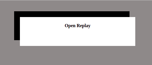
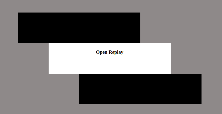
- If you frequently go on walks, you might notice that depending on the sun’s angle on you and reflected light, you could have two shadows. The shadows can be distinguished in this way:
box-shadow: 200px 200px, -200px -200px;
Earlier I talked about us starting with two properties, and then we advance. The third value of the Box-shadow property is a Blur Radius.
box-shadow: Horizontal offset, Vertical offset, Blur-radiusSimply blurring the shadow with the value supplied is what the blur-radius function does. This is how it is put into practice, with box-shadow: 20px 20px 10px;

One thing you can’t do is connect a negative number to the blur; it won’t accept it. You can make the blur greater by increasing the value from 10px to anything, even till you lose your shadow; that’s up to you.
The fourth property we have here is the Spread. This takes the blur property and spreads it by any value being passed. To understand this better, we will remove the Horizontal and vertical offset property and focus on the Blur and spread:
box-shadow: NO-Horizontal offset, No-Vertical offset, Blur-radius, SpreadFor example, we could have box-shadow: 0px 0px 10px 10px;
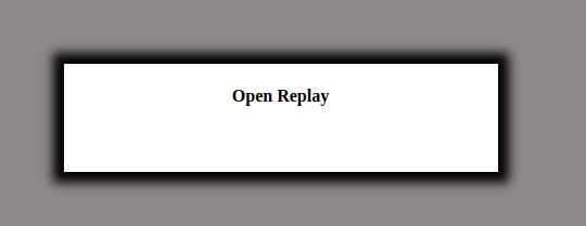
Unlike Blur being unfriendly with the negative value passed to it, Spread isn’t.
The fifth property is Color. Since shadows are never red, the default color in Chrome is black, which is ideal. However, using CSS, we will need greater control over our elements’ appearance. The execution appears to be as follows:
box-shadow: Horizontal offset, Vertical offset, Blur-radius, Spread, color;An example is box-shadow: 0px 0px 10px 10px blue;:
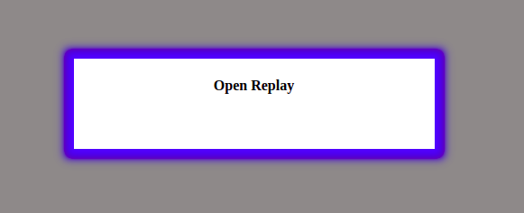
The last property is the Inset. The Inset takes the shadow right inside the element, and it is used for advanced design; below are implementations:
box-shadow: Inset, Horizontal offset, Vertical offset, Blur-radius, Spread, color;We can see a case with box-shadow: inset 0px 0px 10px 10px blue;

I want to call your attention to a previous comment that the Box-shadow property comprises six properties. These attributes must be described since knowing how they are implemented can assist designers in adding shadow design patterns to objects.
Open Source Session Replay
OpenReplay is an open-source, session replay suite that lets you see what users do on your web app, helping you troubleshoot issues faster. OpenReplay is self-hosted for full control over your data.
Start enjoying your debugging experience - start using OpenReplay for free.
Implementing Layered Shadows
Box-shadow property, with commas separating values, could help you stack layers of shadows. A little sentence but a lot of information to carry, the code explains it better ;
box-shadow:0px 2px 4px 0px rgba(0, 0, 0, .5);The CSS code above will give you this:
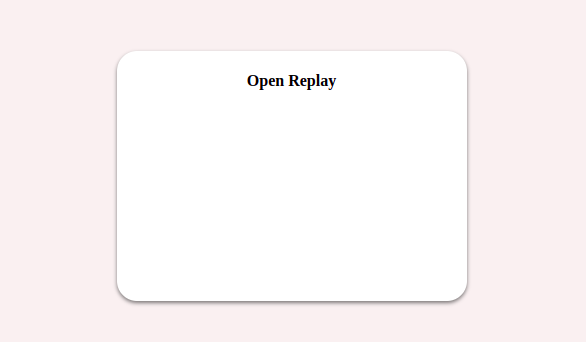
The image up there is clean. If we add a comma and more values to it, it becomes thicker:
box-shadow: 0px 2px 4px 0px rgba(0, 0, 0, .5),
            0px 4px 8px 0px rgba(0, 0, 0, .5);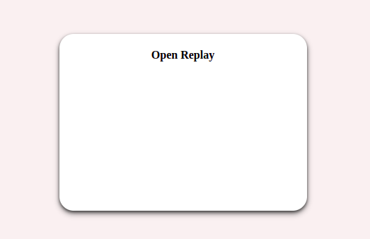
Adding more Box-shadow effect with a comma makes it more attractive, although a lot of it will make it messy, as it is in life, an overdose kills, and your design is not an exemption.
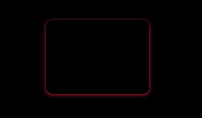
The above example is limiting the beauty of what layered shadows could bring; the below example with color makes it more appreciative:
.Body {
    height: 100Vh;
    display: flex;
    align-items: center;
    justify-content: center;
    background: black;
}
.Box {
    background-color: black;
    height: 250px;
    width: 350px;
    box-shadow: 0px 2px 8px 0px rgba(224, 75, 82, 0.5), 0px 4px 16px 0px rgba(224, 75, 82, 0.5);
    text-align: center;
    border-radius: 20px;
}
Try this yourself; feel free to stack more of the values with a comma.
Implementing Claymorphic Shadows
The effect creates the appearance of clay in 3D by using two inner shadows, with the top being lighter than the button. The approach is as follows:
box-shadow: Inset   -Horizontal offset   -Vertical offset   Blur-radius  color,
            Inset    Horizontal offset    Vertical offset   Blur-radius  color,
                     Horizontal offset    Vertical offset   Blur-radius  color;
Here is an example of the clay effect:
box-shadow: inset -0.6em -0.6em 1em #bfd1ff,
            inset 0.4em 0.4em 0.5em #eff3ff,
                    0.8em 0.8em 2em   #bfd1ff;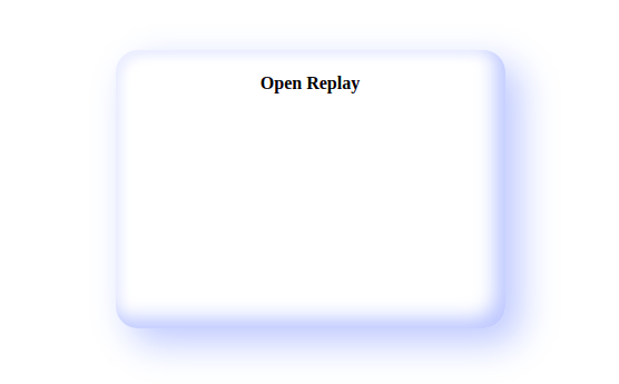
Implementing Neumorphic Shadows
This design is appealing. It came from skeuomorphism, which tried to replicate objects precisely as they would appear in real life. This effect makes these components look like they float above the web page.
The implementation looks like this:
    box-shadow: -Horizontal -Vertical Blur-radius collor(rgba(0,0,0,0.5)),
                 Horizontal Vertical Blur-radius collor(rgba(0,0,0,0.5));
    //INSET
    box-shadow: inset Horizontal Vertical Blur-radius collor(rgba(0,0,0,0.5)),
                inset -Horizontal -Vertical Blur-radius collor(rgba(0,0,0,0.5));
We will have two Boxes so we can be able to show the Inset:
<body class="Body">
    <div class="Box"></div>
    <div class="Box2"></div>
</body>
Add Neumorphic shadows:
.Box {
    height: 200px;
    width: 200px;
    border-radius: 50px;
    box-shadow: -10px -10px 30px rgba(255, 255, 255, 0.5),
                    10px 10px 30px rgba(70, 70, 70, 0.12);
}
.Box2 {
    height: 200px;
    width: 200px;
    border-radius: 50px;
    box-shadow: inset 10px 10px 30px rgba(70, 70, 70, 0.12),
                inset -10px -10px 30px rgba(255, 255, 255, 0.5);
}
A work of art, yes? Take a break now and experiment with this design, particularly with the blur. The light is overexposed when the blur is reduced, and vice versa. Depending on what you want to accomplish, it is advised that you maintain a moderate attitude.
The Box-shadow property is not supported in all browsers, and you can check it out here to see where it’s limited. Using the -WebKit extensions while styling shadows is advised.
Conclusion
As I previously stated, having too much of anything often leads to a mess, and your design is no exception. To avoid encountering a confusing user interface, applying the Box-shadow effect with a guide like this article when starting out is advisable. We could improve our UI by using the Box-shadow property in several ways.
A TIP FROM THE EDITOR: To build the best possible design, you should also consider our Understanding CSS positioning article.
