Prototypes, Mockups, Wireframes: what's the difference?

The terms “prototype,” “mockup,” and “wireframe” are frequently mentioned in design. However, each of these terms has a distinct meaning and serves a unique purpose in the design process. Understanding their differences is crucial for designers, developers, and stakeholders alike. This article delves into the definitions of these terms and underscores the importance of distinguishing between them.

Discover how at OpenReplay.com.
Let’s start with three definitions:
- Wireframes: Think of a wireframe as the skeletal structure of a building but for a digital product. It is a basic, visual representation that outlines the primary layout and functionality of an application or webpage. Typically devoid of intricate design elements, colors, or graphics, a wireframe focuses on the placement of elements, user navigation paths, and the overall flow of a user’s journey through the interface. It is the starting point in the design process, laying the groundwork for more detailed design stages.
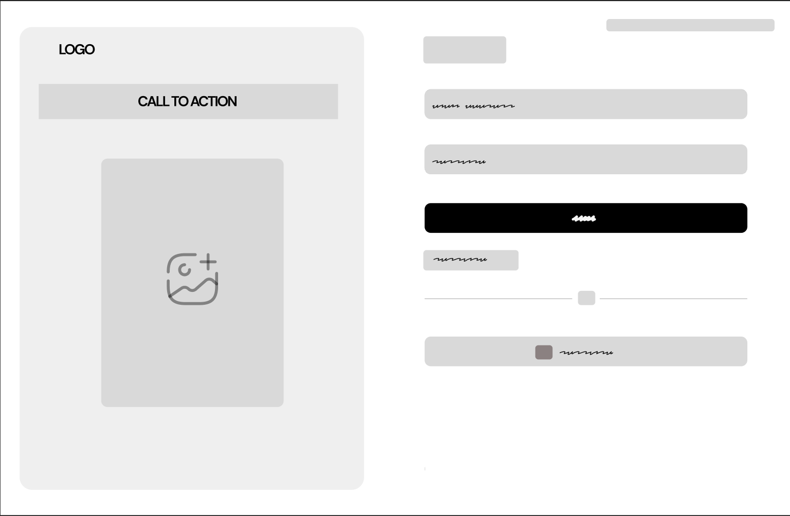
- Mockups: Moving a step further in the design journey, we encounter mockups. A mockup is a visual guide that represents the design’s visual elements in a more refined manner. Unlike wireframes, mockups dive into the details, showcasing colors, typography, images, and the overall look and feel of the product. However, it is essential to note that mockups are static. They give a visual snapshot of the design but lack interactivity.
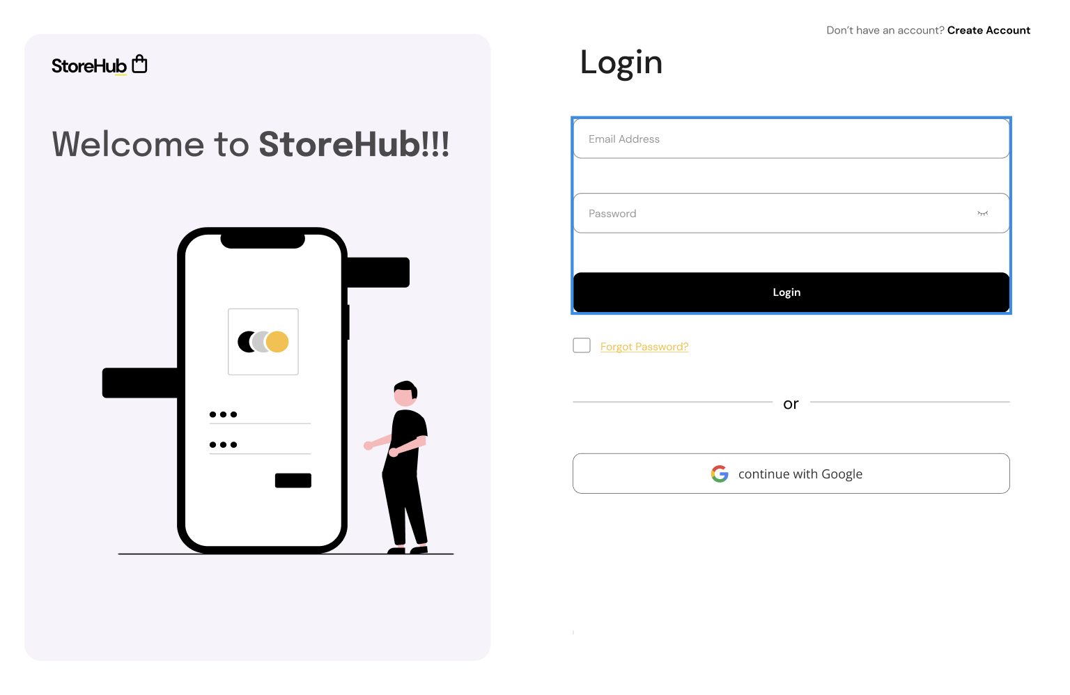
- Prototypes: A prototype serves as an interactive model of the end product, enabling users to explore, click, and engage with it as if interacting with the finished version. It acts as a conduit between initial static designs and the ultimate product, creating an environment conducive to user trials and input. Even though a prototype can closely mirror the end product in appearance and interaction, it is typically crafted with tools that facilitate swift modifications, reflecting user responses and suggestions.
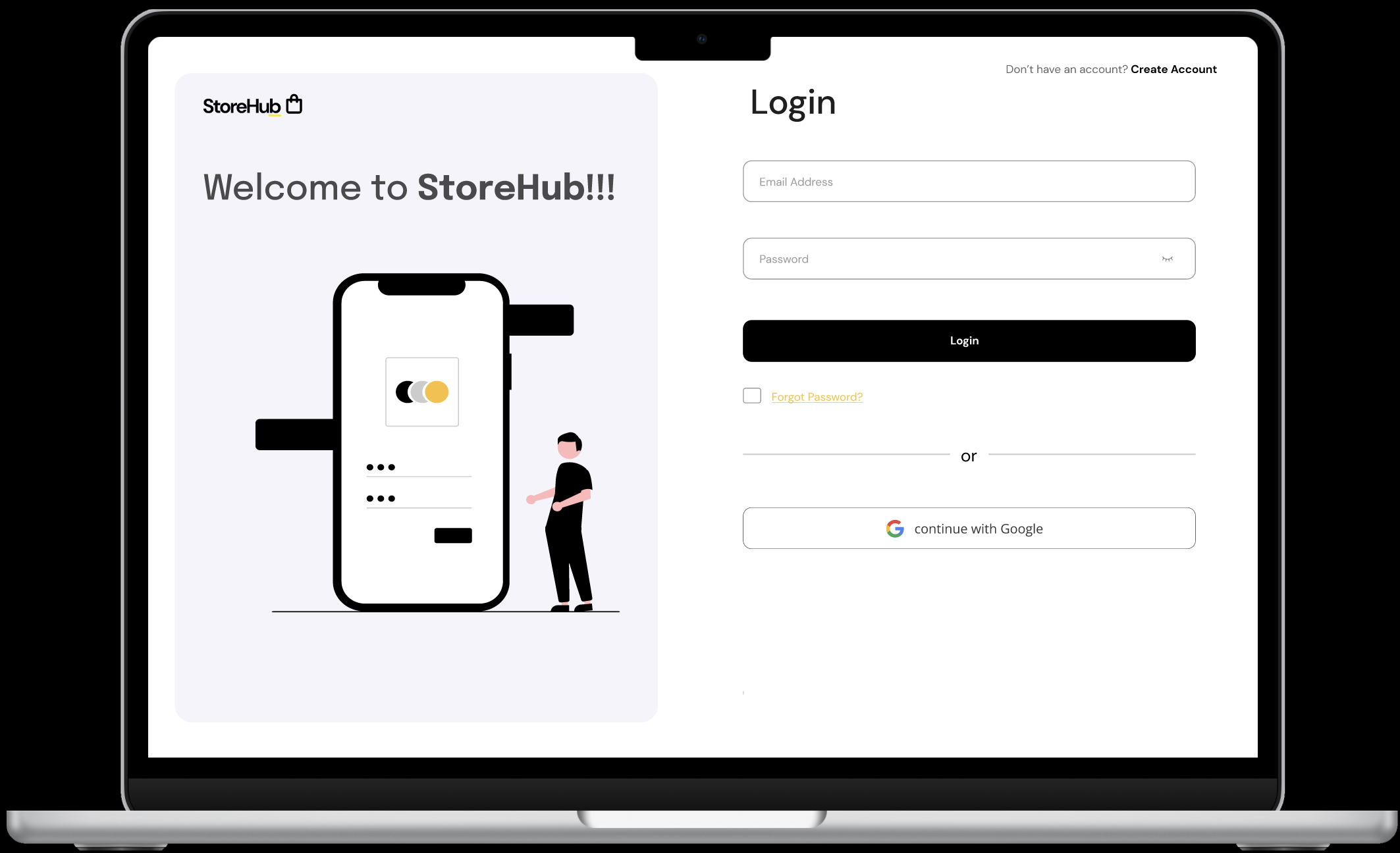
Why is it important to understand their differences in design?
- Clear Communication: In the design realm, clarity is paramount. Misunderstanding or misusing these terms can lead to confusion, misaligned expectations, and wasted resources. For instance, presenting a mockup when a wireframe is expected can overwhelm stakeholders with design details too early in the process.
- Efficient Workflow: Each tool serves a specific purpose. Wireframes lay the foundation, mockups refine the visual design, and prototypes test functionality. Using the right tool at the right stage ensures a streamlined and effective design process.
- Stakeholder Expectations: Setting the right expectations is crucial. Stakeholders should understand the purpose and limitations of each design phase, ensuring aligned feedback and revisions.
- User-Centric Design: Prototypes, in particular, allow for user testing, ensuring the final product is user-friendly and meets user needs. By understanding the differences between these tools, designers can create products that resonate with their target audience.
- Resource Allocation: Knowing what each tool entails helps allocate resources effectively. A wireframe might require less time than a high-fidelity prototype, and understanding these nuances ensures efficient use of time and resources.
Wireframes
Wireframes, often considered the backbone of the design process, serve as the foundational blueprint for digital projects. Their primary role is to provide a clear and tangible representation of the structure, layout, and functionality of a webpage or application. But what sets wireframes apart from other design representations? Let’s delve into the defining characteristics of wireframes.
- Simplicity: Wireframes purposefully omit complex design details. They often forgo vibrant colors, detailed images, and intricate fonts. This stripped-back approach focuses on the foundational layout and operational aspects, sidelining visual embellishments.
- Focus on Structure and Layout: A hallmark of wireframes is their concentration on how elements are positioned and related on a page. They illustrate the arrangement of various parts, like headers, footers, navigation bars, and content sections, highlighting their interplay and layout.
- Interactivity (in some cases): While basic wireframes are static representations, interactive wireframes (or clickable wireframes) offer a simulation of user navigation. They provide a rudimentary idea of how users will move from one section or page to another, offering insights into the user journey.
- Annotations and Notes: Wireframes often come with annotations – brief notes or comments that provide additional information about a particular element or functionality. These annotations offer clarity, ensuring that designers, developers, and stakeholders have a shared understanding of the design’s intent.
- Scalability: Wireframes provide a bird’s-eye view of the design, allowing designers to see how elements scale in relation to one another. This ensures the design remains cohesive and balanced across different sections or pages.
- Rapid Iterations: Given their basic nature, wireframes can be quickly modified and iterated upon. This agility allows designers to test multiple layouts or structures, refining the design based on feedback and requirements.
- Platform and Device Agnostic: Wireframes offer a versatile representation of a design, independent of any particular device, platform, or display dimension. They present a broad perspective of the layout, allowing for subsequent customization to fit diverse devices, ranging from desktop computers to smartphones.
- User Flow Representation: Beyond individual pages, wireframes can also depict the flow between different pages or sections, highlighting the broader user journey. This helps in understanding how users will navigate the entire application or website.
- Absence of Distractions: By eliminating detailed design elements, wireframes ensure that stakeholders and team members are not distracted by colors, graphics, or branding elements. This allows for focused discussions on functionality and user experience.
- Cost-Effective: Creating wireframes is relatively inexpensive, especially compared to high-fidelity designs or prototypes. This makes them an effective tool for brainstorming and initial discussions, even when budgets are tight.
Purpose and Types
Wireframes enable designers, stakeholders, and developers to collectively envision the final product’s appearance and organization. Acting as a unifying platform, wireframes foster open communication, ensuring everyone aligns on the project’s objectives. They are instrumental in charting the user’s journey, aiming for an intuitive experience. Due to their adaptable nature, wireframes facilitate swift modifications, allowing designers to efficiently incorporate feedback. Moreover, they provide a cost-effective approach to trial designs, ensuring optimal resource allocation before delving into intricate design or development phases.
Wireframe Types
Depending on the project’s stage and the level of detail required, wireframes can vary in their fidelity and complexity. Let’s delve into the different types of wireframes to understand their unique characteristics and applications.
- Low-Fidelity Wireframes
-
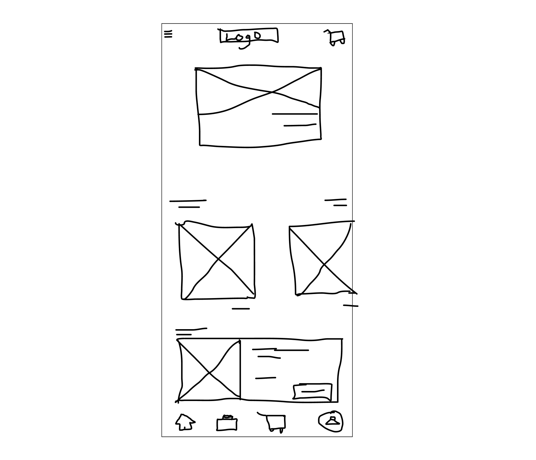
Definition: Low-fidelity wireframes are rudimentary sketches that represent the initial concept or idea. They are often the first step in the design process, providing a basic visual representation of the layout and structure.
-
Characteristics
- Simplicity: Typically devoid of detailed design elements, they focus on basic shapes and placeholders.
- Speed: Hand-drawn or quickly drafted on digital platforms, they allow for rapid iterations.
- Abstract Representation: They use generic icons, boxes, and lines to represent content, images, and other UI elements.
-
Usage: Ideal for brainstorming sessions, early-stage feedback, and quick design iterations. They help set the foundational layout and flow without getting bogged down by design specifics.
- High-Fidelity Wireframes:
- Definition: High-fidelity wireframes are detailed, digital representations that closely mirror the final design regarding layout, structure, and interactions. They offer a comprehensive view, capturing the design’s intricacies.
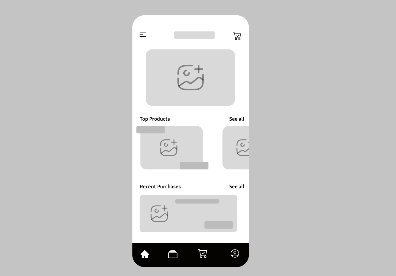
These are their characteristics:
- Precision: They showcase the exact placement, spacing, and sizing of elements.
- Interactivity: Some high-fidelity wireframes are clickable, offering a dynamic preview of user interactions and flows.
- Design Elements: While they might still lack final color schemes and graphics, they often include detailed typography, icons, and other design elements.
- Usage: Utilized in the later stages of the design process, high-fidelity wireframes are essential for final reviews, detailed user testing, and as a reference for developers during the development phase.
Tools and methods for wireframe creation
Whether you’re designing a complex web application or a simple mobile app, wireframing provides clarity, reduces misunderstandings, and acts as a reference point throughout the development process.
Let’s delve deeper into the tools and methods employed for effective wireframe creation.
- Pen & Paper: The most basic and immediate tool. Sketching on paper can be a quick way to get ideas out without distractions.
- Whiteboard: Great for collaborative sessions where teams can brainstorm and sketch ideas together.
- Sketch: A popular design tool for macOS that offers a wide range of plugins and integrations. It is great for wireframing, prototyping, and UI design.
- Figma: a cloud-based interface design tool that allows designers to collaborate in real time.
- Adobe XD: Adobe’s UX design and prototyping tool. It integrates well with other Adobe products and offers powerful design and interactive features.
- Balsamiq: A tool that focuses specifically on wireframing with a drag-and-drop interface. It is designed to mimic the experience of sketching on a whiteboard.
- Axure RP: A comprehensive tool that offers wireframing, prototyping, and documentation tools. It is known for its advanced interactions and dynamic content.
- InVision: While primarily a prototyping tool, InVision also offers wireframing capabilities. It Is cloud-based and allows for real-time collaboration.
- Wireframe.cc: A simple online tool for creating wireframes directly in your browser without any frills.
Mockups
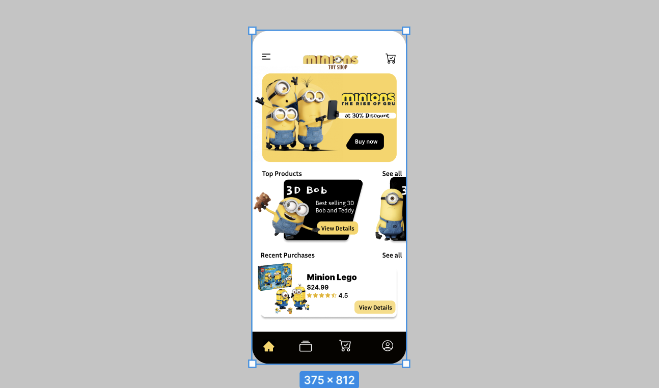
Mockups, as mentioned earlier, are visual guides that often showcase typography, colors, images, and the overall look and feel of the design. They are more detailed than wireframes and provide a closer representation of the final product.
Key Features
It is essential to recognize the role of mockups in translating abstract ideas (wireframes) into a visual format that is not only understandable but also aesthetically close to the final product.
Let’s explore the key features that elevate mockups as an indispensable tool in the design journey.
-
High-Fidelity: Mockups are typically high-fidelity, which is detailed and close to the final design.
-
Static Design: Unlike prototypes, mockups are usually static and don’t have interactive elements.
-
Visual Elements: They include actual design elements, such as color schemes, typography, and graphics.
-
Layout and Spacing: Mockups give a clear picture of the layout, spacing, and positioning of various elements.
-
Platform-specific: Mockups can be tailored for specific platforms, such as web, mobile, or tablet, showcasing how the design adapts to different screen sizes.
Distinction from wireframes
While mockups and wireframes are essential tools in the design process, they serve different purposes and are used at different stages of the design journey.
- Detail Level: Wireframes are low to mid-fidelity, focusing on structure and layout without detailed design elements. Mockups, on the other hand, are high-fidelity and showcase the visual design in detail.
- Purpose: Wireframes are used to plan the functionality and layout of a page, while mockups visualize the look and feel of the design.
- Interactivity: Wireframes can sometimes be interactive, allowing for basic user flow testing. Mockups are typically static.
- Visual Elements: Wireframes often use placeholders and lack detailed visual elements, while mockups include actual design components.
Importance in Design Iteration and Client Presentations
Mockups are pivotal in bridging the gap between the initial wireframes and the final product. Here are some of the notable importance in design design iteration and client presentations;
- Visual Representation: Mockups provide a clear visual representation of the final product, making it easier to understand the design’s direction.
- Feedback Loop: Presenting mockups to clients or stakeholders allows for feedback early in the design process. This iterative approach ensures the design aligns with the client’s vision and objectives.
- Design Refinement: Mockups allow designers to refine the visual aspects of a product, such as color combinations, typography choices, and imagery, before moving to the development phase.
- Stakeholder Buy-in: A well-designed mockup can help get stakeholder buy-in, as it provides a tangible representation of the final product.
- Cost-Efficient: Making changes at the mockup stage is more cost-effective than making changes after development has begun.
Prototypes
Prototypes are interactive simulations of a product, often used to test and refine the design before the final development phase. Unlike wireframes and mockups, primarily visual representations, prototypes are functional, allowing users to interact with the design, navigate through pages, and experience the product’s flow.

Unique Attributes
- Interactivity: Prototypes are dynamic, allowing users to click, scroll, and interact with various elements, simulating the experience of the final product.
- Realistic Experience: They offer a close-to-real experience, often including transitions, animations, and interactions.
- Multiple Fidelity Levels: Prototypes can range from low-fidelity (simple clickable wireframes) to high-fidelity (detailed and interactive designs closely resembling the final product).
- Platform-Specific: Prototypes can be tailored for specific platforms and devices, showcasing responsive and adaptive designs.
- Iterative Development: They can be continuously refined based on user feedback and testing results.
Roles and benefits in the design process
Prototypes serve not merely as interactive representations but as tangible embodiments of design thinking, user-centricity, and iterative refinement. Prototypes let us see and interact with our ideas before they’re fully built. By using prototypes, designers can better understand what works and what doesn’t, making sure the end result is the best it can be. Let’s dive into why prototypes are so important in the design process.
- User-Centered Design: Prototypes place the user at the forefront, ensuring that designs are tailored to user needs and preferences.
- Feedback Collection: They allow designers to gather feedback from stakeholders, clients, and users, leading to more informed design decisions.
- Error Identification: By simulating user interactions, prototypes help identify usability issues, navigation challenges, and potential pain points.
- Stakeholder Alignment: Prototypes provide a tangible representation of the product, ensuring that all stakeholders have a unified vision.
- Cost-Efficiency: Identifying and rectifying design issues during the prototyping phase is more cost-effective than making changes post-development.
- Improved Collaboration: Interactive prototypes foster collaboration between designers, developers, and other team members, streamlining the design-to-development transition.
Use for usability testing and user validation
Prototypes play a pivotal role in usability testing, where potential users interact with the design to evaluate its usability, efficiency, and overall user experience. Some of the benefits of usability testing and user validation are:
- Real-World Feedback: Usability testing with prototypes provides real-world feedback, revealing how users would interact with the final product.
- Task Completion: Users can be given specific tasks to complete, helping designers understand if the design is intuitive and user-friendly.
- Identify Friction Points: Testing can highlight areas where users get confused, frustrated, or stuck, guiding designers on where improvements are needed.
- User Validation: Beyond usability, prototypes can validate design concepts, ensuring that the product aligns with user expectations and needs.
- Refinement: Based on testing results, designers can refine the prototype, iterating on the design until it offers an optimal user experience.
Design Workflow
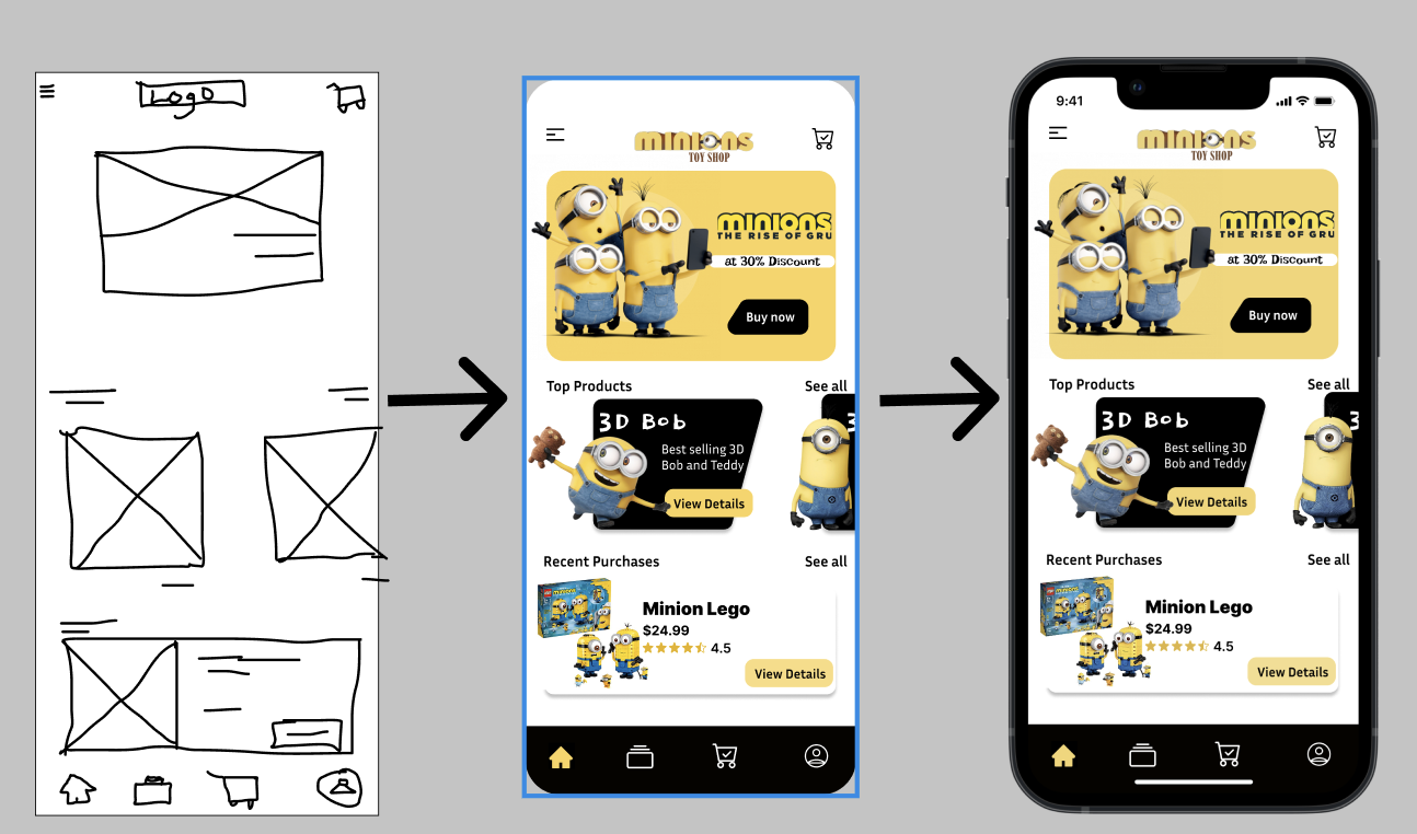
Translating wireframes to mockups
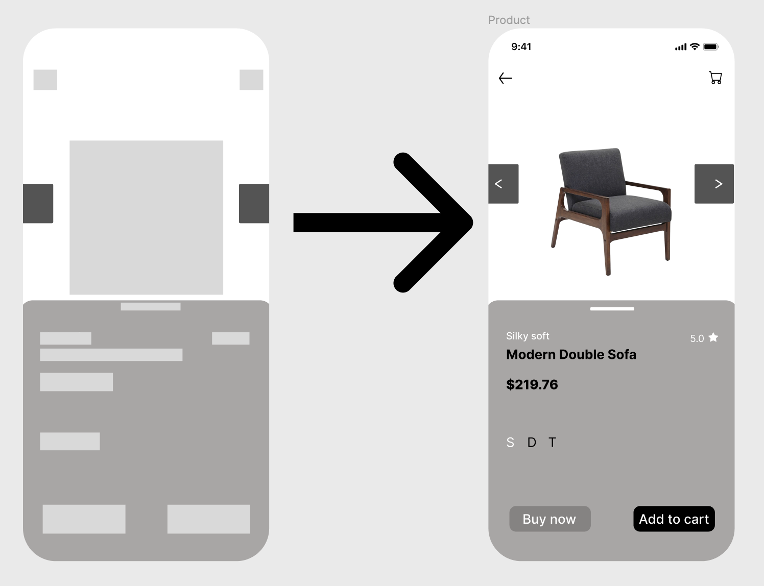
Wireframes are typically monochromatic, focusing on functionality, user flow, and content placement rather than design aesthetics. When we talk about translating wireframes to mockups, we’re essentially discussing adding a visual layer to this skeletal framework. This transition involves:
- Introducing Color: While wireframes are usually grayscale, mockups introduce a color palette that aligns with the brand’s identity.
- Typography: Fonts are chosen and applied, giving text its style and personality.
- Graphics and Imagery: High-quality images, icons, and other graphical elements are integrated.
- UI Elements: Realistic buttons, sliders, and other user interface components replace the placeholders in the wireframe.
By the end of this stage, what was once a bare-bones layout now resembles a static version of the final product.
Evolving mockups to interactive prototypes
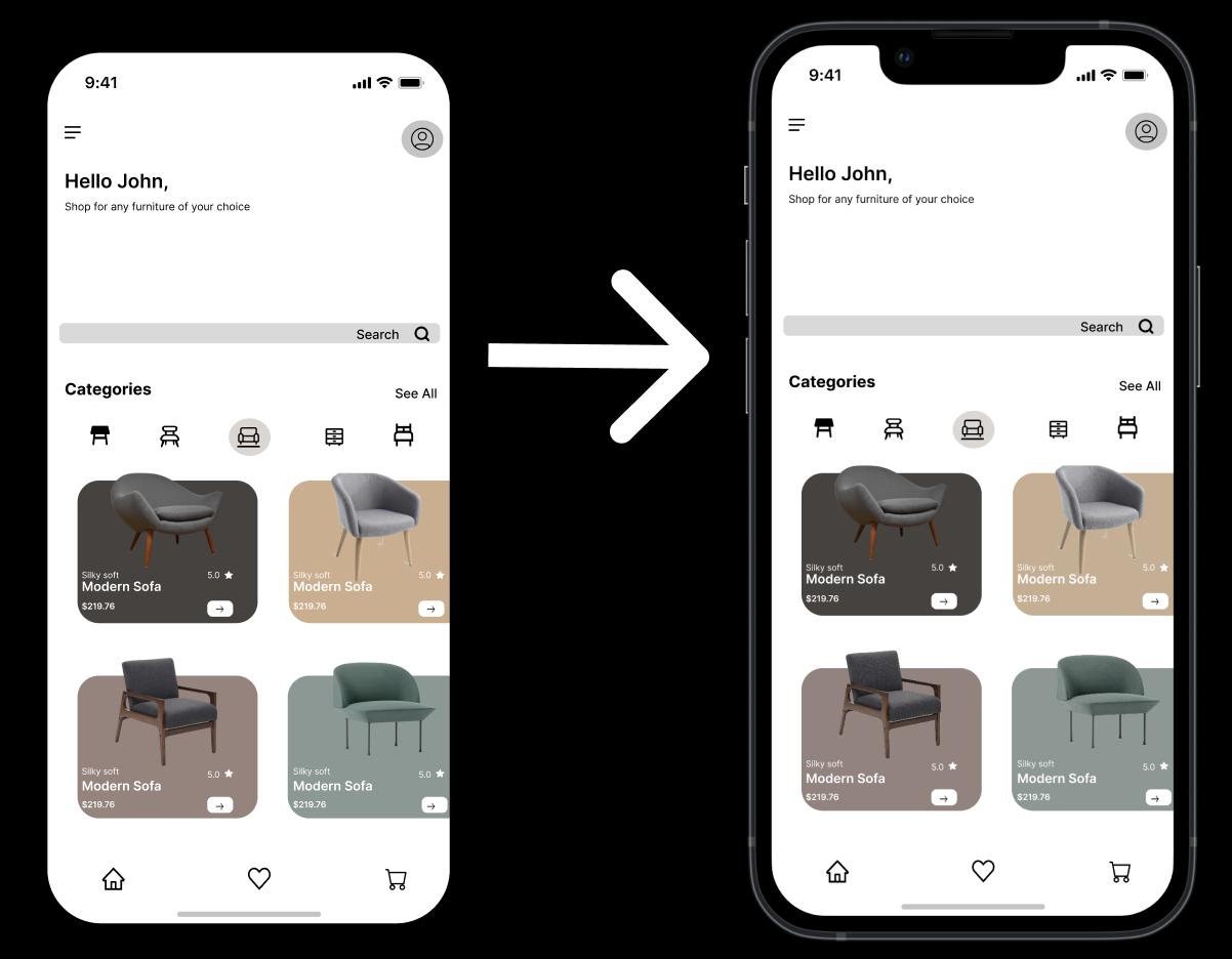
Mockups are detailed visual guides that showcase the design’s look and feel. However, they’re static, meaning they don’t offer any interactive elements. They give stakeholders a visual understanding but lack the dynamic user experience. Prototyping transforms these static mockups into dynamic, interactive models. This evolution involves:
- Interactivity: Elements like buttons, links, and sliders become clickable.
- Transitions and Animations: Movement is introduced, whether it is the smooth transition between pages or a button’s hover effect.
- User Flow Simulation: Users can navigate from one section or page to another, offering a hands-on experience of the product’s flow.
- Feedback Mechanisms: Some advanced prototypes can even gather user feedback directly.
The result is a working model that stakeholders can interact with, offering a tangible experience of the final product.
Integrating user feedback and refining designs
In design, feedback is gold. It offers a window into the user’s mind, highlighting what works and what doesn’t. Whether it is a button that is not intuitive or a navigation flow that’s confusing, user feedback shines a light on potential pitfalls.
The Refinement Process: Integrating this feedback is a dance of analysis, iteration, and validation:
- Analysis: All feedback, whether from stakeholders or users, is collected and analyzed to identify common themes and critical issues.
- Iteration: Based on this analysis, the design is tweaked. This could mean moving a button, changing a color, or even overhauling an entire section.
- Validation: The revised design is then retested to ensure that the changes are effective and that the feedback has been addressed adequately.
This cycle might be repeated multiple times, ensuring that the final design is not only beautiful but also user-friendly and functional.
Each stage, from mockups to prototypes, builds upon the previous, adding depth, detail, and functionality, and at every step, user feedback ensures that the design remains grounded in user needs and preferences, leading to digital products that truly resonate.
Conclusion
The design journey is a blend of creativity, foresight, and practicality. From the skeletal structure provided by wireframes to the visual depth of mockups and the tangible interactivity of prototypes, each tool offers a unique lens through which the design evolves. Each stage in the design process, from wireframes to mockups and prototypes, is more than just a step; it is a layer that adds depth and clarity to an initial concept, turning it into a user-focused digital solution.
Importance of clear communication and understanding
These stages serve as vital links, connecting designers with stakeholders, developers, and users. Through these design tools, we bring ideas to life, gather valuable feedback, and make necessary tweaks. By being clear and precise at every stage, we ensure a seamless transition from design to development, reduce potential confusion, and promote teamwork. Adopting this comprehensive approach helps designers effectively tackle the challenges of digital design, bringing their ideas to fruition in a way that truly resonates with users.
Truly understand users experience
See every user interaction, feel every frustration and track all hesitations with OpenReplay — the open-source digital experience platform. It can be self-hosted in minutes, giving you complete control over your customer data. . Check our GitHub repo and join the thousands of developers in our community..


