
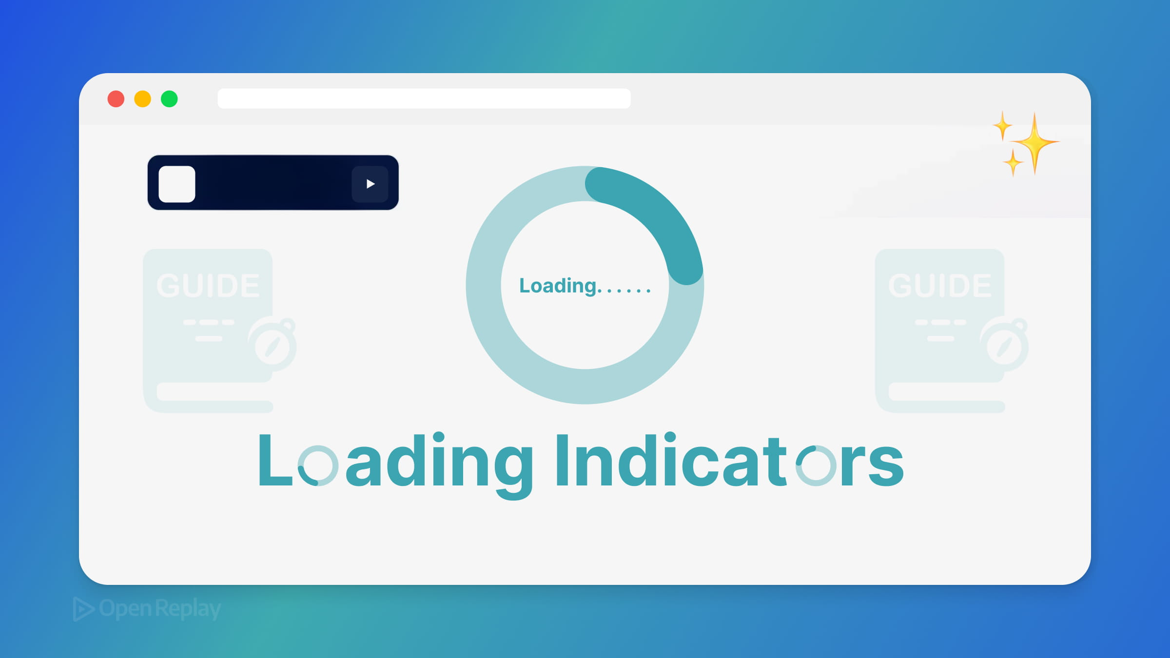
A Quick Guide to Loading Indicators in Web Apps

Your users clicked a button. Something’s happening—but what? Without clear feedback, they’ll assume the worst: the app is broken, their action failed, or they need to click again. Loading indicators solve this, but the wrong approach creates new problems.
This guide covers modern loading indicator UX, from choosing the right pattern to implementing React Suspense loading states and Next.js App Router loading.tsx conventions—while keeping INP Core Web Vitals healthy.
Key Takeaways
- Global spinners block interaction and hurt both user experience and INP scores—use localized, progressive feedback instead.
- Match the indicator to the situation: spinners for brief waits, skeletons for content loading, progress bars for measurable operations, and optimistic UI for instant-feeling actions.
- React Suspense boundaries and Next.js
loading.tsxenable segment-scoped loading states that let users interact with unaffected parts of your app. - Accessibility is non-negotiable: use
aria-busy, live regions, and respect reduced motion preferences.
Why Global Spinners Are Usually Wrong
Full-page spinners block everything. Users can’t read content, navigate elsewhere, or do anything productive. Worse, they hurt perceived performance even when actual load times are reasonable.
The modern approach: localized, progressive feedback. Show loading states only where content is actually loading. Let users interact with everything else.
This matters for INP (Interaction to Next Paint), the Core Web Vital that measures responsiveness. Global loading overlays that block interaction can negatively impact your INP scores. Localized indicators keep the rest of your UI responsive.
Choosing the Right Indicator
Different situations call for different patterns:
Spinners
Best for brief, indeterminate waits under 3 seconds. Use them inline—inside buttons, next to form fields, or within small content areas. Avoid centering a spinner on an otherwise empty screen.
Skeleton Screens
Ideal for initial page loads or content sections. Skeletons show the shape of incoming content, reducing perceived wait time and preventing layout shift. They work especially well for lists, cards, and text-heavy areas.
Progress Bars
Reserve these for determinate processes: file uploads, multi-step operations, or anything where you can calculate actual progress. Fake progress bars that don’t reflect reality frustrate users more than honest spinners.
Optimistic UI
For actions like saving, liking, or toggling, update the UI immediately and reconcile with the server afterward. Users perceive instant responsiveness. Handle failures gracefully with rollback and clear error states.
Framework Patterns That Work
React Suspense Loading States
React’s Suspense boundaries let you declare loading UI declaratively. Wrap async components in <Suspense> with a fallback, and React handles the rest. React 19 improves this further by making async transitions and pending UI states first-class, reducing visual jank when navigating between states.
The key insight: nest Suspense boundaries strategically. A single top-level boundary gives you a global spinner—exactly what you’re trying to avoid. Multiple granular boundaries let different sections load independently.
Next.js App Router loading.tsx
The App Router’s loading.tsx convention provides automatic loading UI per route segment. Drop a loading.tsx file in any route folder, and Next.js shows it while that segment loads.
Critical detail: this is segment-scoped, not a universal global loader. Each route segment can have its own loading state. A loading.tsx in /dashboard only affects the dashboard segment, not the entire app shell.
This pairs naturally with streaming SSR—content renders progressively as data becomes available, with loading.tsx filling gaps.

Discover how at OpenReplay.com.
View Transitions API
For page and route changes, the View Transitions API is increasingly a viable alternative to traditional loading spinners. Instead of showing a loader while the next page prepares, the browser can animate smoothly between states. This feels faster even when actual load times are similar.
The API works across frameworks and provides CSS hooks for customizing transition animations. It’s particularly effective for same-origin navigations where you control both pages.
Accessibility Requirements
Loading indicators must work for everyone:
aria-busy="true": Apply to containers whose content is loading. Screen readers announce the busy state.role="status"with live regions: For loading messages that should be announced. Usearia-live="polite"to avoid interrupting users.- Reduced motion: Respect
prefers-reduced-motion. Replace spinning animations with static indicators or subtle opacity changes. - Never rely solely on visuals: Pair animated indicators with text labels or ARIA announcements. “Loading your dashboard…” beats a silent spinner.
Common Mistakes
Showing loaders for fast operations: If something completes in under 100ms, a loading indicator creates flicker. Debounce your loading states—only show them after a brief delay.
Blocking interactivity unnecessarily: Unless an action genuinely requires waiting (like a payment confirmation), let users continue using the app.
Misleading progress bars: A progress bar stuck at 99% for two minutes destroys trust. If you can’t measure real progress, use an indeterminate indicator instead.
Hiding content that’s already loaded: When refreshing data, show stale content with a subtle refresh indicator rather than replacing everything with a skeleton.
Conclusion
Good loading indicator UX comes down to honesty and locality. Tell users what’s happening, where it’s happening, and let them do everything else. Modern patterns like React Suspense loading states, Next.js App Router loading.tsx, and the View Transitions API make this easier than ever—while keeping your INP Core Web Vitals in check.
Start by auditing your current loading states. Replace global blockers with localized feedback. Your users—and your performance metrics—will thank you.
FAQs
Use skeleton screens when loading content with a predictable layout, such as lists, cards, or text blocks. Skeletons reduce perceived wait time by showing the shape of incoming content. Spinners work better for brief, unpredictable waits or inline feedback within buttons and form fields.
Add a short delay before showing the loading indicator, typically 100 to 200 milliseconds. If the operation completes before the delay expires, skip the indicator entirely. This prevents jarring flicker while still providing feedback for genuinely slow operations.
No. The loading.tsx file is segment-scoped, meaning it only affects the route segment where it is placed. A loading.tsx in the dashboard folder only shows while that segment loads. The rest of your app shell remains interactive and unaffected.
Apply aria-busy true to containers with loading content. Use role status with aria-live polite for loading messages that should be announced. Always pair visual indicators with text labels or ARIA announcements so users who cannot see animations still receive feedback.
Gain Debugging Superpowers
Unleash the power of session replay to reproduce bugs, track slowdowns and uncover frustrations in your app. Get complete visibility into your frontend with OpenReplay — the most advanced open-source session replay tool for developers. Check our GitHub repo and join the thousands of developers in our community.
