The Role of Motion UI in Modern Web Development

Motion UI is a concept that has emerged as a game-changer in modern web development. Why is it so, and what exactly does it mean? It’s the strategic use of several dynamic transitions or animations to enhance the user interface of a website. It plays an important part in bringing a website to life while engaging users with its interactive elements. This article aims to dive deep into the world of Motion UI concerning web development: we will explore the elements, its design principles, and most importantly, its roles in modern web development.

Discover how at OpenReplay.com.
Motion UI is the art of bringing a web UI design to life through well-thought animations and transitions. Here, you use strategic movements and elements to enhance the user experience of a website. Some of these strategies and elements include:
- Animations: These are dynamic and creative visual effects applied to certain elements on a web application to bring them to life. Animations can include scroll-triggered animations, loading animations, hover effects, etc, which add interactivity and engagement to the web app.
- Transitions: This is one key element and is used between page elements, which creates smooth and visually appealing shifts between pages on a web app. Transitions can include many things ranging from slides, fades, rotations, etc, enhancing the flow of the web app and user experience as it helps with easy navigation.
- Microinteractions: These are the subtle and small animations that respond to user actions. An example of a micro-interaction includes a button that changes color when hovered over or a loading spinner indicating an action is in progress. Microinteractions provide feedback and guide users through their interactions with a web app.
Motion UI goes way back to the days of early web design. As of then, web designers used it only for decorative purposes, and it has evolved significantly since the advancement in web technology and browsers. The introduction of CSS and HTML5 brought with them the potential for smoother transitions and animations without the need for resource-heavy plugins. Today, motion UI has reached a level of sophistication beyond decoration, as it now serves a lot of other benefits.
Compared to static web design, Motion UI has the upper hand in many areas. The web pages in static design remain largely unchanged when loaded. Static design may be appealing, but it lacks flexibility, interactivity, and dynamics. Here’s a quick breakdown of the differences between static web design and Motion UI:
- Engagement: Unlike static design, Motion UI does a good job of captivating users using dynamic animations that encourage interaction. Static design relies only on stationary texts and images that may prove to be mundane to many users.
- User guidance: Motion UI uses several elements to guide users through several website sections through animations and transitions. In a static design, a user will have to navigate through the website without the help of visual cues.
- Storytelling: Motion UI enhances the narrative of a website by enabling storytelling with the help of animated sequences. A narrative backed up with animated storytelling only leads to enhanced engagement with a website. A basic understanding of Motion UI, its evolution, and how it differs from a static web design helps with a clearer picture of how it works. It is not just a design trend but also a dynamic tool that can transform user experiences.
Principles of Effective Motion UI
The effectiveness of Motion UI doesn’t just rely on its animation; it rests on applying a few important principles that ensure that these animations are visually appealing and serve a purpose. In this section, we will dive into the principles of effective motion UI to understand how it elevates modern web design. With that said, here are a few.
-
Purposeful Animations: For Motion UI to be effective in this regard, it needs to have a purpose to be fulfilled. Instead of creating animations just for the sake of it, you should create them with several objectives in mind. User guidance is one of the main elements of purposeful animations. Web animations should be created in a way that they can guide user actions. These animations can help direct users to the important content on a web app. Animations that do not serve any purpose on your web app may be a nuisance to some of your users. This is because the animations don’t serve as a guide but as some sort of distraction that the users may not welcome on a web app. Animations should be created to work better with users and make their experience seamless.
-
Consistency in Motion Design: Another important principle is ensuring the motion design is consistent throughout a web app. When creating animations and transitions, designers should create consistent patterns such as consistent speed and ease of easing functions. This consistency allows users should be able to anticipate how the motion will occur when an element moves or changes on a web page. The motion design should also align with the website’s branding. For example, a playful style of design will not be suitable for a corporate financial website. The motion design should stay consistent to help reinforce a brand’s identity to a user. This consistent motion design makes learning and understanding a web app’s interface easier for a user.
-
Performance Considerations: In addition to the two principles above, it is also important to try to balance performance and aesthetics. A performance consideration to keep in mind is the loading times, as too many or overly complex animations can end up causing the loading times of a web app to slow down, frustrating users. Consideration should also be given to how animations perform on mobile devices with limited processing power. Implementing a responsive design with mobile devices in mind helps to ensure a consistent experience across all platforms. To find the right balance, it is important to go through a stage of thorough testing and optimization.
Roles/Use Cases of Motion UI in Modern Web Design
From what we have discussed so far, it’s evident that the applications of Motion UI go beyond its visual appeal. In this section, we will dive deeper into its roles in crafting an immersive and engaging web journey for users. Some of these roles/use cases include the following.
Navigational Animations
 These are crucial in how users navigate and interact with a web app. Earlier in this article, we pointed out the several principles of Motion UI and how having purposeful animations is one of them. Navigational animations are purposeful animations that play a role in creating smoother, engaging elements of a web app. Examples of navigation animations include:
-
Drop-down Menus: Navigational animations are very useful when it comes to creating smooth animations for drop-down menus. When a user hovers over a particular navigational item, a well-crafted animation can reveal a drop-down menu in a captivating style. This helps to add a touch of interactivity to your website while also enhancing user experience. These drop-down animations guide users by making it known that several options are available. This way, a user can understand a web app’s content and structure. A well-animated drop-down menu should reduce cognitive load, meaning a user doesn’t need to recall an entire menu structure but can explore the options as they are visually presented.
-
Transition Effects between Pages and Sections of a Website: Navigational animations also cover the transition effects between the pages and the sections on a website. These animations make it seamless for a user to switch pages without confusion or disorientation. The transition effect also helps to provide a sense of continuity to the users of a website. For example, a smooth transition can provide some context or connection between the previous and present pages. It can also enhance storytelling by smoothly revealing different parts of a story as they go through your website. Beyond the practical benefits of transitions, they also enhance the visual appeal of a website.
Feedback Animations
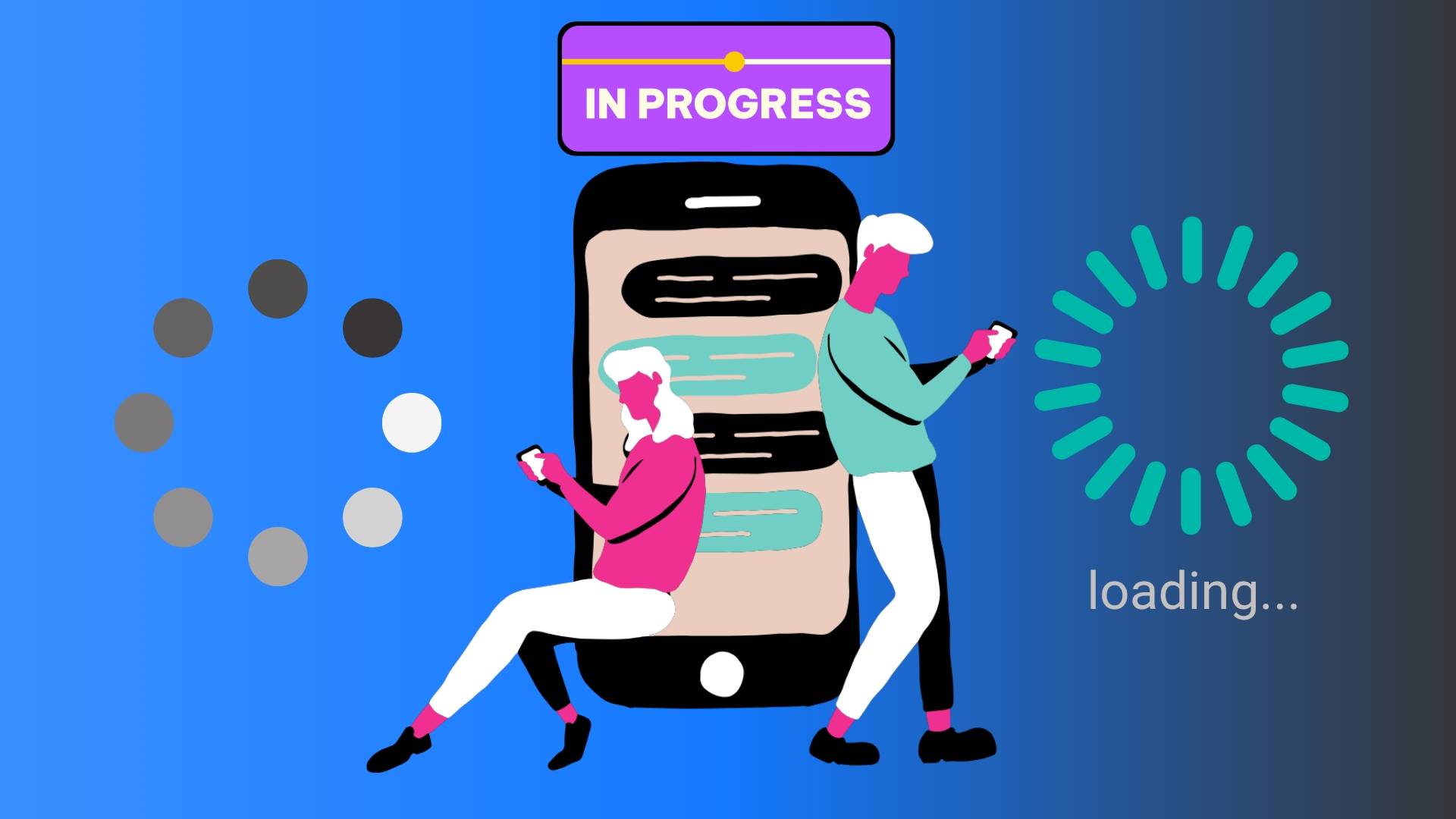 These aim to provide users visual cues and real-time information as they interact with a website. Like navigational animations, feedback animations are also used in several ways; some examples range between the following.
-
Animated Form Validation: This is one of the most user-friendly options to guide users as they input data. When a user tries to submit a form, an animation can provide feedback on the accuracy of their inputs, notifying the user if anything needs to be changed or if everything seems perfect. These animations help prevent unnecessary errors and make corrections to them in real-time. For example, if a user types an invalid character into the input field, an animation can display a cue stating that a correction needs to be made to proceed.
-
Progress Bars or Loading Spinners: These help to offer loading feedback to users, keeping them informed on the progress of whatever content they are trying to load or access. Without progress bars and loading spinners, users will be confused because they will have no idea if content is on the way or not. These progress bars and loading spinners also help to improve a user’s patience. A user is more likely to wait for content when they receive a visual cue that their desired content is on the way. It can also give users a timeframe, allowing users to explore other aspects of the website before the progress bar is complete.
Storytelling through Animation
 This is one of the most engaging approaches to using Motion UI in modern web design. It guides users through several narratives while leveraging motion to convey information, creating an immersive experience. Here’s an example of how storytelling through animation is effectively used.
- Animated Infographics that Dynamically Convey Information: Animate infographics play a role by bringing data and information to life. When complex statistics and facts are presented through animated charts and visual elements, they become more understandable and engaging. These infographics are mainly used by websites whose primary focus is on education, as they help to transform static information into dynamic lessons.
Product Showcases
 Motion UI offers endless opportunities for showcasing products engagingly and interactively. It allows businesses to provide their customers and potential customers with a closer look at their products and services. This method allows users to become immersed in a product even before it becomes accessible. Some examples include:
-
Using Rotations and Zoom Animations: An extremely effective way to showcase a product is by using a 360-degree rotation and zoom animation. The main advantage of this feature is that it allows users to interact with the product as though they are holding it in their own hands at the moment. Users can rotate the product in any direction or zoom on it for better inspection. This 360-degree product rotation and zoom animation help users understand a product’s characteristics comprehensively. It also enhances a user’s sense of control over the product, which can prove to be quite engaging. The 360-degree product rotation and zoom animation are particularly effective for products that have intricate details, like fashion items, electronics, and even collectibles. The animation immerses users in an engaging experience that allows them to explore an item and raise their confidence in their purchase decision.
-
Product Demos and Animations to Showcase Product Benefits: These are essential as they help to better communicate how a product works and what users stand to benefit from after a purchase. Here, animations are used to explain the features of a product while also showcasing its benefits. For example, in the case of newly launched software, animations can be used to better explain the key features and their functions so users can easily comprehend how it works. In the case of a physical product, these animations can explain how the product is assembled, how it is used, and the various tricks to use for added benefits. These animations transform static products and instill them with life, making them interactive and engaging to users who will be more convinced to purchase an understanding of what the product offers.
-
Product Comparison Tools with Interactive and Dynamic Visual Elements: Some users love to make informed decisions about a purchase, and product comparison tools are an invaluable asset to these users. Instead of static tables that compare one product to another, users can gain access to dynamic elements that compare both products side by side. Animations, toggles, and interactive sliders can be used to highlight key product differences and features. The above approach simplifies the comparison process and makes things much more engaging for a user. The users can see how several products stack up against each other, interactively exploring them. These comparison tools with interactive elements are beneficial for categories offering a wide range of options, like vehicles, electronics, and appliances, where users must make choices based on numerous criteria.
Examples of Motion UI Modern Web Development
In the above, we discussed the strategies of Motion UI in modern web development with very few examples. In this section of the article, we will offer some examples in depth and provide better insights on how they work. The examples include:
-
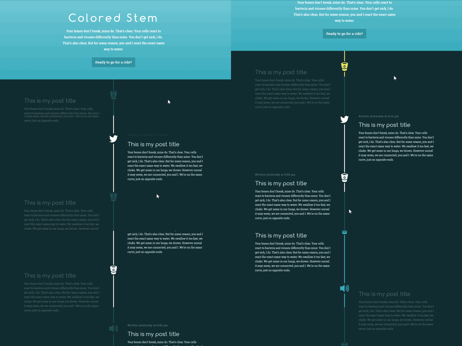
Scroll-triggered Animations: One of the best and most implemented examples is using scroll-triggered animations. As a user scrolls through a web page, the elements can fade in, slide, scale, or create a dynamic and visually appealing experience. It looks something like the below:
-
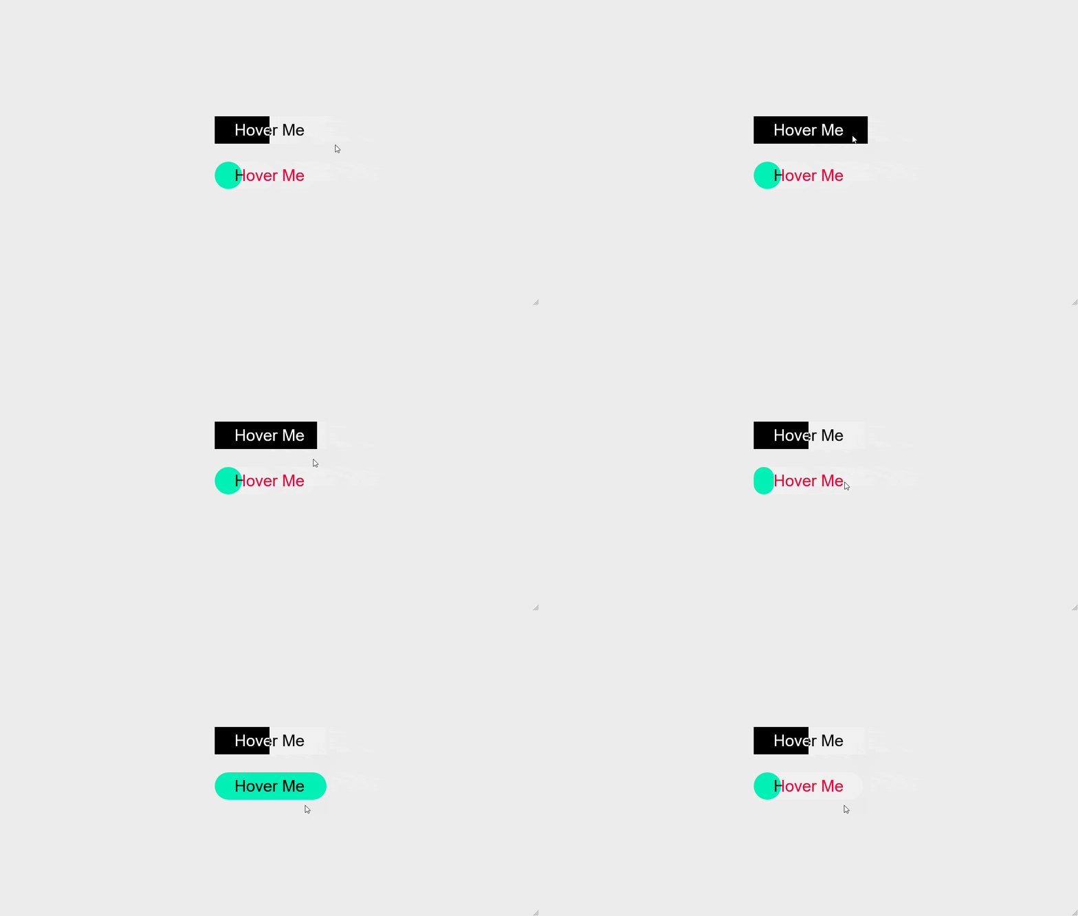
Hover Effects: These are effects applied to an element such that when a user hovers over them, it provides instant visual feedback. The visual feedback can vary from color changes to scaling and even more complex transformations to create a responsive interface. It can be used on various elements on a website, ranging from a link button to a product you’re trying to showcase. Here’s a simple view of how it works:
-
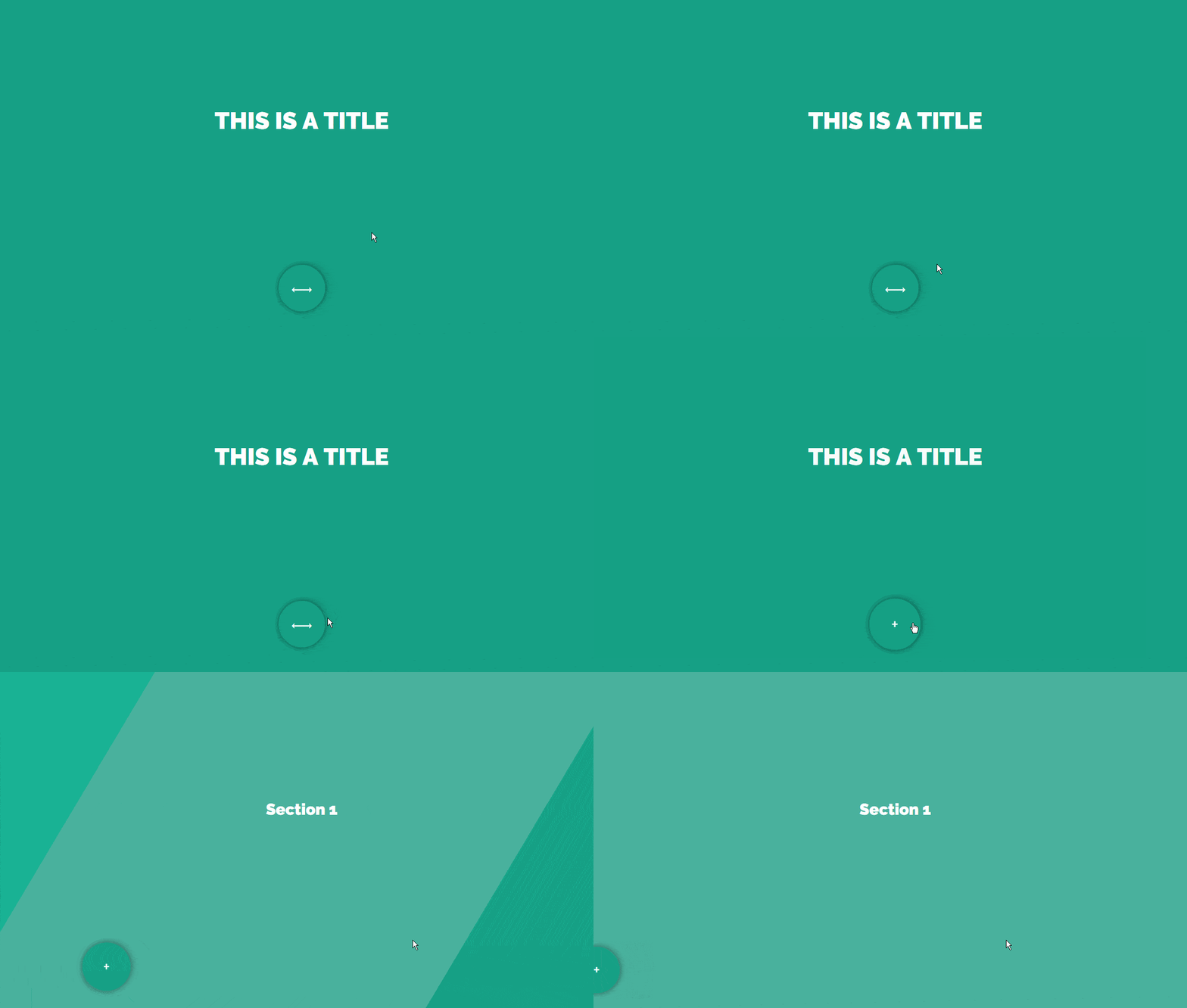
Page Transitions: This creates a smooth transition between sections or pages on a website for a seamless experience. When clicking the next page or a link, a page will slide or fade into view. These animated page transitions help maintain user interest while navigating the website. Here’s an example of page transitions:
-
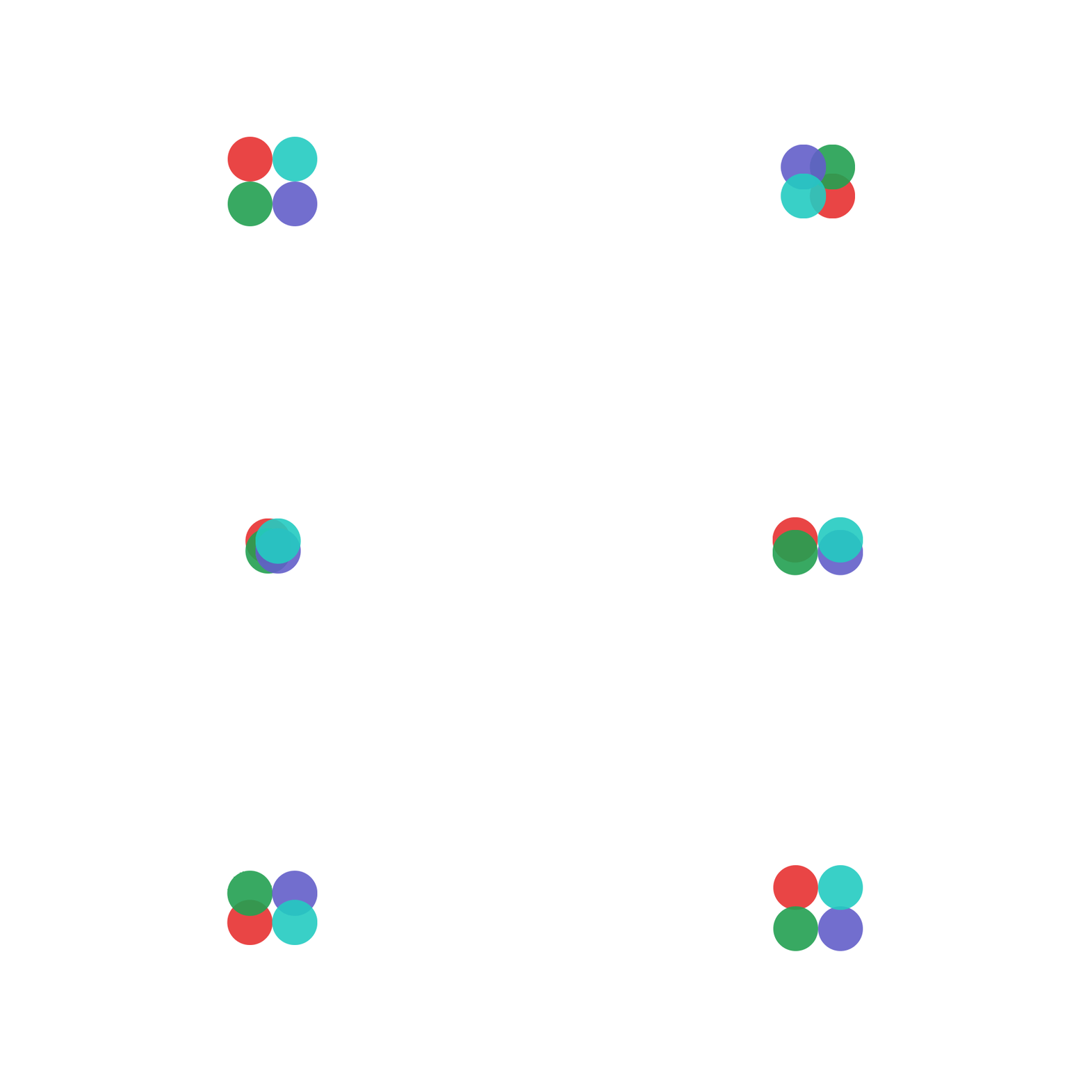
Loading Animations: Loading animations can help to entertain users during page load times. This type of animation can vary from simple loading spinners to a more complex visual display. Whether it’s a travel website using a globe animation or a more abstract visual, the key to loading animations is to find a balance between functionality and entertainment. Below is an example of a loading animation:
-
Parallax Scrolling Effect to Create Depth: As users scroll through a website, the background and foreground elements move at different speeds to create an illusion of depth, immersing the user in the website’s content. The parallax scrolling effect is mostly effective for websites that center around storytelling as it mimics the experience of going through a narrative. Here’s a peek view of a parallax scrolling effect.

Conclusion
Motion UI is a crucial tool for web developers and designers who intend to transform a static website into something dynamic, interactive, and engaging. Throughout the length of this article, we have explored several of its use cases in modern web development, and they range between navigational animations, feedback animations, product showcasing, and even storytelling through animation. In the world of web design, Motion UI will continue to be a major factor that contributes to user engagement and the boost of a website’s aesthetic. The future potential for motion UI is quite vast, and we can look forward to a lot of exciting web experiences in the years to come.
Truly understand users experience
See every user interaction, feel every frustration and track all hesitations with OpenReplay — the open-source digital experience platform. It can be self-hosted in minutes, giving you complete control over your customer data. . Check our GitHub repo and join the thousands of developers in our community..

