Skeleton Screens vs. Loading Screens -- An UX Battle

Providing the best user experience (UX) is key, so what do you show while a page is loading? This article compares two strategies, skeleton screens and loading screens, so you can decide what suits you.

Discover how at OpenReplay.com.
Have you ever looked at a blank white screen while waiting for a page to load? Or you’ve observed a spinning circle for what seemed like an eternity. In today’s web age, waiting for content to load can be frustrating.
To address this, developers devised two key strategies: skeleton screens and loading screens. Understanding the differences between these two strategies is crucial for delivering an excellent user experience (UX).
In this article, we’ll closely examine the skeleton and loading screens. We’ll discuss the key differences between these two techniques and where they fit in. By the end, you’ll be able to select the most appropriate technique for the job, keeping your users satisfied and engaged.
Problems of Poor Loading Time
Poor loading times can significantly negatively impact your website or app in several ways. They can increase your website’s return rates; many users will simply click away and go to a competitor’s site, leading to a significant loss of potential customers or visitors.
Also, users may think your app or website is out-of-date, careless, or unprofessional. This can damage your brand reputation and lead to negative reviews.
Page speed is one ranking criterion that Google and other search engines consider. Websites with loading problems usually have a lower search engine ranking, making it harder for potential customers to find you.
Understanding Skeleton Screens
A Skeleton Screen is a temporary placeholder in web design that offers users a glimpse of the content layout before the actual content loads in the background. It is crucial in optimizing the user experience by mitigating the frustration associated with content loading delays.
Skeleton screens are visual representations of content’s layout and structure that appear in place of actual content while the data is being fetched or loaded. They often feature light gray squares, rectangles, circles, or monochromes as a visual representation of where each piece of content will appear.
Its primary objective is to provide users with a sense of progress and continuity, thereby minimizing perceived loading time and enhancing overall satisfaction.

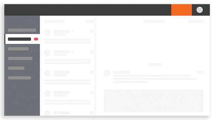
The image above shows a dashboard that is loading due to a weak network connection or a huge amount of data being retrieved from the server.
Imagine walking into an event arena and seeing chairs arranged where people are meant to sit before their arrival. This relates to a skeleton screen.
This approach offers the following benefits:
- Improved User Engagement: By showing the layout upfront, users can anticipate the content and stay focused on the app or website. This prevents them from navigating away due to the delay.
- Seamless Transition: After loading, each piece of content appears in the exact position. The size, shape, and type of content are maintained. If it were a circle picture, it would appear as such.
- Awareness: Users can see where content will appear, reducing the feeling of emptiness during loading and thus creating a sense of awareness.
Types of Skeleton Screens
We will examine three types of skeleton screens based on how they behave during loading and before content appears.
Static Placeholder
A static placeholder represents the absence of the actual element. It occupies the space where the final content will eventually appear.
Static placeholders are the most basic form of placeholder used in skeleton screens. They lack animation and provide a basic structure for the data being fetched.

The image above shows a static placeholder without any form of animation, which imitates the layout and structure of the actual content pending when loading is completed.
Pulse Placeholder
This refers to the animation applied to a skeleton screen that simulates a pulsing or flickering effect. This animation helps grab the user’s attention and indicates that the content is still loading.
Pulse placeholders are convenient when the loading time is unpredictable, or the content loads all at once.

In a pulse placeholder, as seen in the illustration above, there is a low transition in the opacity of the screen. The opacity reduces and fills slowly during the loading process. The content loading progress is stimulated by a pulsating effect.
Waving Placeholders
A waving placeholder skeleton screen is another animation technique used to breathe life into skeleton screens. Unlike the pulsating effect, which fades elements in and out, a waving animation creates a more dynamic visualization.
Waving placeholders are often used when content loads progressively, such as a long list of items or a large image. The waving animation suggests the content is filling in section by section.

This type of skeleton screen has a gradient and/or shadow that moves horizontally across the screen’s content.
Best Practices for Implementing Skeleton Screens
Skeleton screens are implemented using various techniques, such as CSS animations, libraries, and frameworks. It is critical to follow best practices in design and integration to maintain consistency and clarity in the visual representation of content placeholders. These guidelines include:
- Consistency: To avoid breaking trust, there should be no change in position, size, or type of content on the user interface after the content is done loading.
- Control animation speed: Always go for fast motions since slow motions give the perception of slow loading.
- Avoid overuse of skeleton screens: As contents start loading, the placeholders should be replaced progressively. The screens should not be left on for too long.
- Test across devices: Ensure your skeleton screens function properly across various devices such as desktops, mobile, and tablets.
- Use error message: Have a clear error message in place if the data fails to be fetched. This technique allows users to retry or take alternative actions.
- Accessibility: Ensure your skeleton screens are accessible to users with visual impairments by using appropriate color contrast and providing alternative text descriptions for placeholders.
Understanding Loading Screens
Loading screens are interface elements displayed to users during the loading process. They are graphical elements that inform users that their requests are being processed.
Loading screens may include a progress bar, spinners, or a simple message informing users that data is being fetched.
There are various ways that a well-designed loading screen can improve the user experience. These approaches include:
- Communication: Loading screens pass information that the system is working to fetch data, thus preventing users from wondering if there is a breakdown in the system. Imagine flipping a light switch, but there is a delay before the room illuminates. A loading screen acts like a sign on the switch saying, “Hold on, light is coming!”
- Manage Expectations: Loading screens give users an idea of how long they have to wait. This could be a simple progress bar that fills up as content loads.
- Maintain Engagement: Loading screens contain basic animations like a spinning circle or informative messages, which can keep users engaged.
Types of Loading Screens
Loading screens come in various types, each with its description. Here is a breakdown of the common types.
Static Screens
Static screens are the simplest form of loading screens. They mostly display a logo or generic message like “Loading.” They are easy to implement. An example is opening a new app and seeing the app’s logo displayed while the contents load in the background.
Static screens are often used in cases where contents load almost instantaneously or in simple apps and websites with predictable loading times.

The above image is an example of a static screen with the generic message “loading,” informing the user that the server is fetching data or loading responses.
Progress Bars
They are typically like bars that fill up as the contents load. They are sometimes accompanied by a percentage indicator. For example, when downloading a log file, a bar shows the percentage of the file downloaded and the estimated time remaining.
Progress bars provide specific details about the loading process. Users can know how long they’ll have to wait or what percentage is complete.

The image above displays the progress of data loading. As soon as the movement fills the bar, loading will be completed.
Progress bar with percentage indicator: Some progress bars are accompanied by a number showing the task’s completion percentage. It’s usually displayed alongside the progress bar itself.

The above image shows a progress bar accompanied by a percentage indicator counting from 1% to 100% to show the rate at which data is loading.
Spinners
Spinners are animated elements that spin or rotate continuously, indicating ongoing background activity. An example is clicking a link on a website, and a small rotating circle appears next to the link while the new page loads.

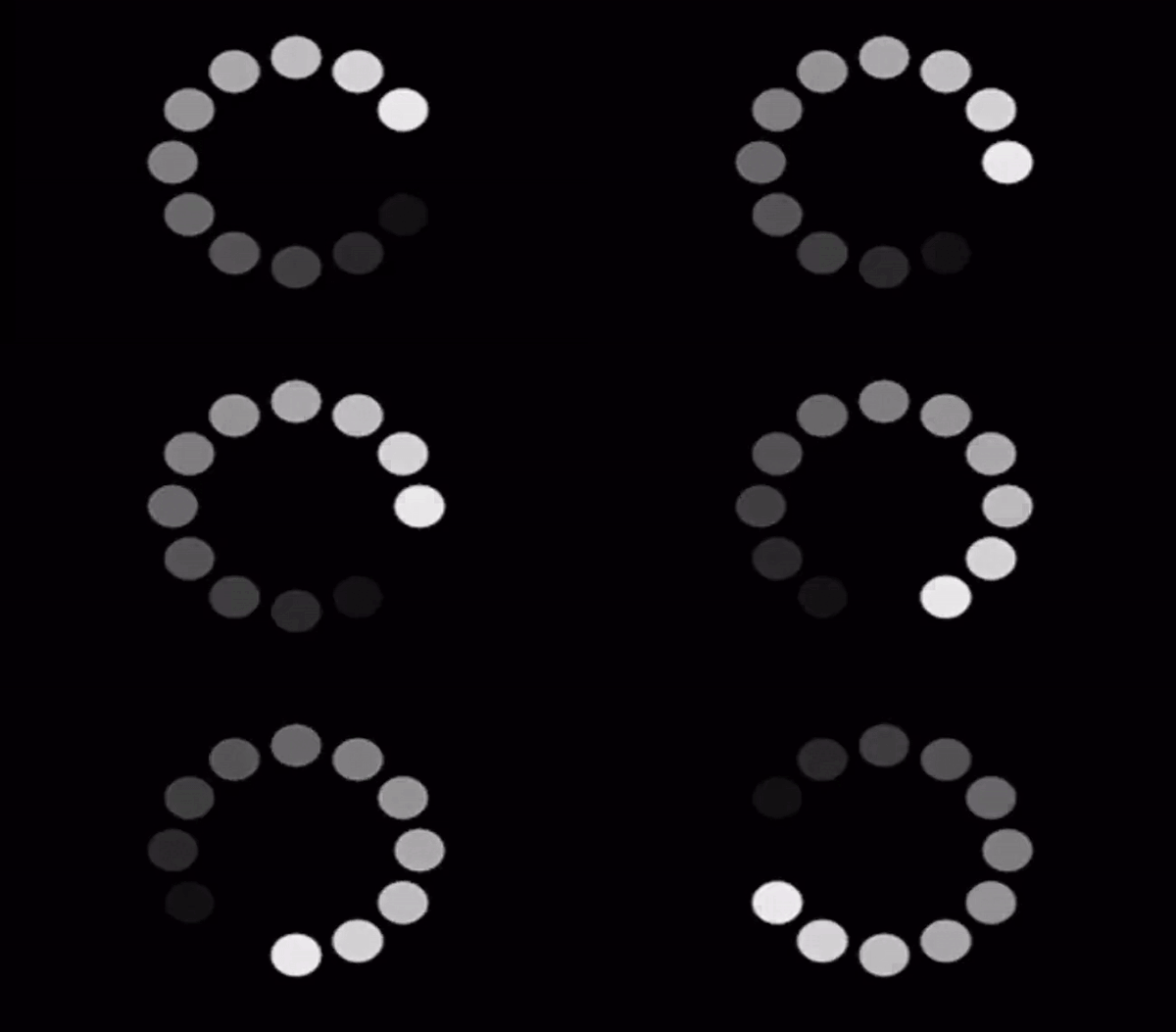
The illustration above is an example of a loading spinner; it shows pulsating dots in continuous circular movement.
Best Practices for Implementing Loading Screens
Proper implementation of loading screens can significantly impact user experience. Here are some key best practices to consider.
- Clear message: The message conveyed by loading screens should be clear and easy to understand.
- Engage users: Keep users occupied by using subtle animations or informative messages to keep them engaged during the wait.
- Brand consistency: Incorporate your logo or color scheme to maintain brand consistency and a cohesive user experience.
- Provide alternative options: Put in place options for users to retry, troubleshoot, or contact support so that in a situation where data fails to load, they will not be left hanging.
- Screen Compatibility: Ensure the design elements and texts can easily be read on a compact screen.
- Offer snippets of tips: You can offer users snippets of information, tips, or facts while they wait for the load.
Comparisons Between Skeleton and Loading Screens
Both the skeleton and loading screens appear when you wait for content to load to create a seamless user experience, but each has a different approach impacting the brand and target audience.
This session will expose some contrasting features between skeleton screens and loading screens.
| Skeleton Screens | Loading Screens |
|---|---|
| Use skeleton screens when more than one element is loading at the same time | Use loading screens when content loading times can vary significantly due to factors like internet speed or severe load. |
| Avoid skeleton screens when it comes to uploads, downloads, and file conversion. | Progress bar is a better option when it has to do uploads, downloads, and file conversion |
| Skeleton screens are best considered for minimizing perceived wait time | Loading screens are prioritized for providing accurate loading communication |
| Skeleton screens provide limited information about specific loading progress | Loading screens convey adequate information about the loading process |
| Skeleton screens act like ghosts of the final content, showing an empty layout that gradually fills in with the actual content as it loads. | Loading screens are temporary screens that display as contents fetch in the background. |
| Use skeleton screens when websites and apps have a lot of traffic. | Use loading screens for longer applications with potentially longer loading times. |
| Use skeleton screens when loading data takes more than three seconds | Use loading screens if your app or website does not offer alternative functionalities while content loads. |
The table above discusses the differences between the skeleton and loading screen, as well as when to use and not use each.
Conclusion
Both skeleton screens and loading screens play a crucial role in the user experience during content loading times. They bridge the gap between user interaction and content delivery, but they achieve this in distinct ways, impacting user perception differently.
By understanding the concepts, benefits, use cases, and limitations of each, as covered in this article, they can be effectively adopted to improve the overall user experience.
Truly understand users experience
See every user interaction, feel every frustration and track all hesitations with OpenReplay — the open-source digital experience platform. It can be self-hosted in minutes, giving you complete control over your customer data. . Check our GitHub repo and join the thousands of developers in our community..


