Style your Toast Messages with React Toastify
Improving the user experience on a website is important. Notifications keep users informed about what is happening in the application, whether through their actions or behind the scenes. This article will look at implementing toast notifications in a React application using the popular package, React-Toastify.

Discover how at OpenReplay.com.
Toast notifications are small, rectangular pop-up messages that usually appear in the corner of a website or an application screen. They alert users to important actions or events, such as when a form is submitted incorrectly, a login is successful, an issue in fetching data, etc.
Toast notifications aim to enhance the user experience. By providing immediate feedback, users can understand what is happening on the application or website and are guided on what to do next.
These notifications keep users informed without interrupting them. They can be swiped or clicked on to be dismissed quickly. Still, these brief notifications typically disappear after a few seconds, long enough to inform or prompt the user of the next course of action.
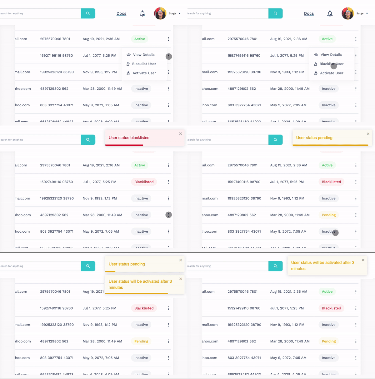
As shown in the image above, the user is immediately notified of how their actions, in this case, a pending and a blacklisted state activation, are being processed by the website. This allows the user to stay informed of anything happening on the website.
When to use toast notifications
There are various scenarios where adding toast notifications is important for the user experience. These may include:
-
General notifications: Placing general notifications in an application is important. This involves relevant event triggering like form submission, state changes, the completion of actions, and many more.
-
Error handling and input validation: Errors are common on websites, especially when filling out a form. When a user inputs incorrect information, doesn’t fill out all required fields, or encounters errors from an API, displaying a notification is a great way to inform the user of what caused the error or the necessary steps to avoid such errors.
-
Pending activities: Usually, when there is a call to an API like a bank transaction, user verification, or activation, informing the user about the pending state, especially if it may take a while to determine if the process is successful or not, creates a better experience for the user.
-
Successful events: Alerting users of successful events like logins, registrations, or any CRUD operations helps to confirm their actions.
-
Warning alert: To prevent a user from making potential errors on a website, displaying a warning notification is important. This way, the user is guided on how to correct their action beforehand.
React-Toastify package
React-Toastify is a popular library for toast messages in React applications. It is simple to set up and customizable based on your preferences. This package has many amazing features, like dark mode, RTL support, drag-and-drop removal, a controllable progress bar, and much more. Plus, it is an open-source project you can view and contribute to.
A standard toast message consists of a container, an icon, a progress bar, and a message. Each of these can be customized individually, and depending on the type of notification used, they appear differently.
Before we look into the different types of notifications react-toastify offers, let’s set up our application.
Set up
As mentioned earlier, setting up react-toastify is super easy. First, install the package in your React application:
npm install --save react-toastifyNext, in your App.js or index.js component, import the toast and ToastContainer components from react-toastify and render them. This will enable the package to be used for all components. Also, remember to import its CSS file to get the styling.
import React from "react";

import { ToastContainer, toast } from "react-toastify";
import "react-toastify/dist/ReactToastify.css";

function App() {
  const notify = () => toast("Wow so easy!");

  return (
    <div
      style={{
        display: "flex",
        alignItems: "center",
        justifyContent: "center",
        height: "100vh",
 }}
    >
      <button onClick={notify} style={{ margin: "auto" }}>
 Notify!
      </button>
      <ToastContainer />
    </div>
 );
}

export default App;
The package is now ready to use. In the example above, when the ‘Notify!’ button is clicked, a toast notification with the provided message pops up.
Types of React-Toastify notifications
The react-toastify library provides five basic toast notifications based on the color of the progress bar:
- Default (multi-color)
- Success (green)
- Error (red)
- Warning(yellow)
- Info (blue)
Each of these also has its unique icon by default to depict the type of notification used. For a demo, I will display a range of notifications using a single button:
import React from "react";

import { ToastContainer, toast } from "react-toastify";
import "react-toastify/dist/ReactToastify.css";

function App() {
  const displayNotifications = () => {
    toast("Default Notification");
    toast.success("Success Notification");
    toast.error("Error Notification");
    toast.warning("Warning Notification");
    toast.info("Info Notification");
 };

  return (
    <div
      style={{
        display: "flex",
        alignItems: "center",
        justifyContent: "center",
        height: "100vh",
 }}
    >
      <button onClick={displayNotifications} style={{ margin: "auto" }}>
 Display All Notifications
      </button>
      <ToastContainer />
    </div>
 );
}

export default App;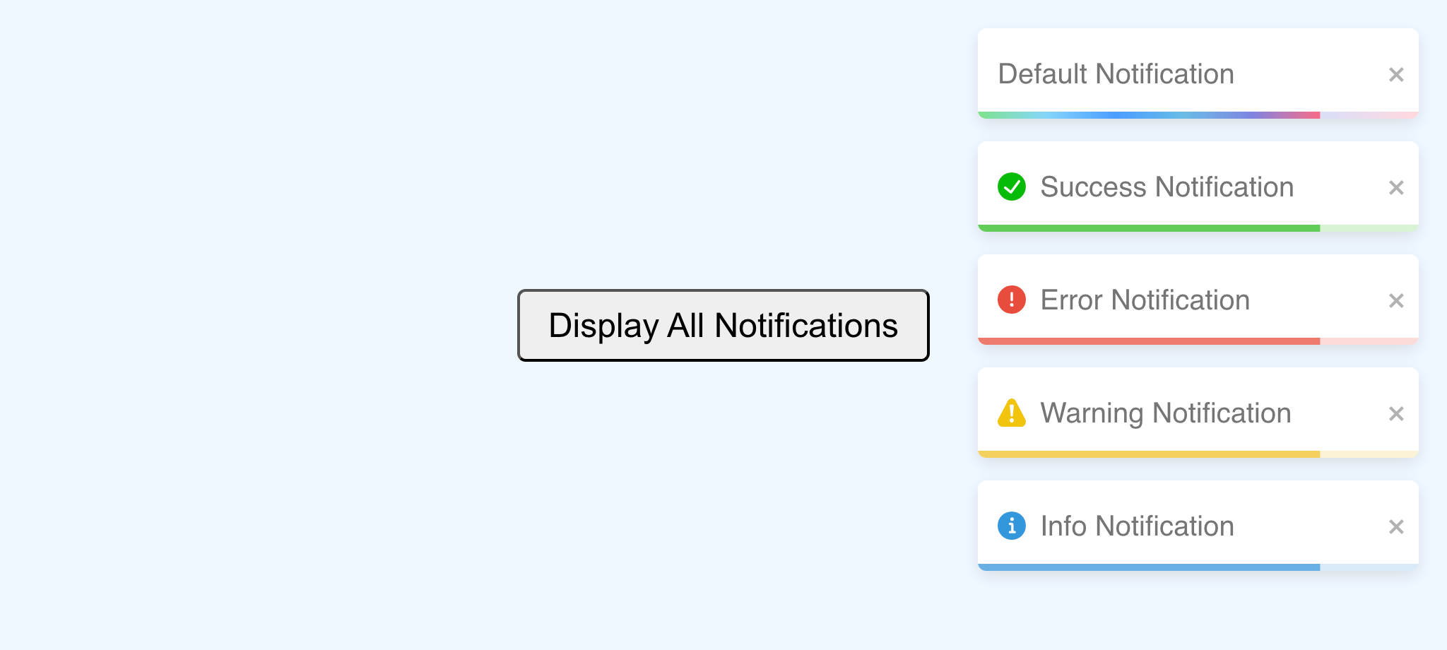
Apart from the default notification message, you need to use the following methods to create different types of toast notifications:
.info()for informational notifications,.success()for successful notifications,.warning()for warning notifications,.error()for error notifications.
Also, note that the toast notifications appear at once and in the order in which the code is written, not randomly.
How to position toast messages
Toast messages are positioned in the top-right corner of a site by default but can be set to five other positions on the website: top-left, top-center, bottom-left, bottom-right, and bottom-center.
To position a toast message, you need to include it in the options object. Toast notification is divided into the message to be displayed and the options object. This object is necessary for customizing the style of a toast message.
...
  const displayNotifications = () => {
    toast("Default Notification", { position: "bottom-center" });
    toast.success("Success Notification", {position: 'top-center'});
    toast.error("Error Notification", {position: 'bottom-left'});
    toast.warning("Warning Notification", {position: 'top-left'});
    toast.info("Info Notification", {position: 'bottom-right'});
 };
...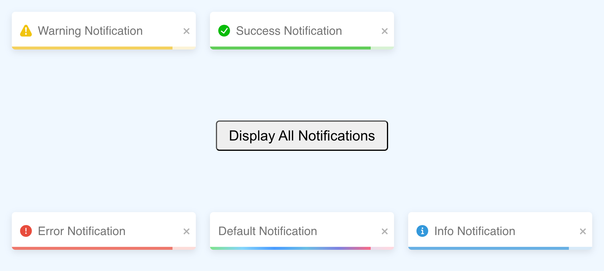
All the notifications are triggered at once and appear at their given positions using the position option prop.
Customizing toast messages
There are several ways to customize a toast notification. In this article, we’ll examine the commonly used ones.
Theme
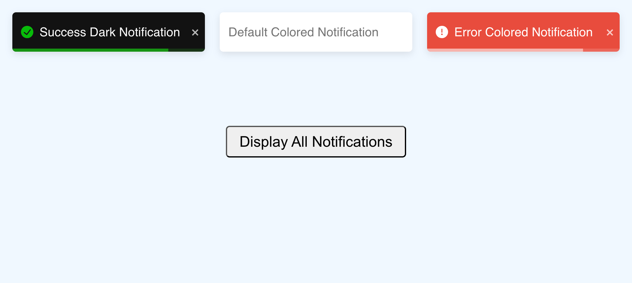
Using the theme option changes the white background color of the toast message. The three available themes are:
- Light: By default, the theme is
light, i.e., a white background. - Dark: The
darktheme changes the white background to a dark grayish color. - Colored: The background of these toast messages changes to match the initial color of their progress bars, while the progress bars are given a lighter opacity of their original color. For the default toast notifications, the
coloredtheme simply removes its multi-colored progress bar.
...
  const displayNotifications = () => {
    toast("Default Colored Notification", {
      position: "top-center",
      theme: "colored",
 });
    toast.success("Success Dark Notification", {
      position: "top-left",
      theme: "dark",
 });
    toast.error("Error Colored Notification", {
      position: "top-right",
      theme: "colored",
 });
 };
...
There is also an option to remove the progress bar regardless of the theme by setting hideProgressBar to true.
...
  toast.success("Success Dark Notification", {
    position: "top-left",
    theme: "dark",
    hideProgressBar: true,
 });
  toast.error("Error Colored Notification", {
    position: "top-right",
    theme: "colored",
    hideProgressBar: true,
 });
...
Even without the progress bar, the toast notification will still disappear once the allotted time (5 seconds) is up. Most notifications include a progress bar to let the user know when it will disappear from the screen.
Transition
Bounce is the default transition for react-toastify. Other transitions include Slide, Flip, and Zoom, which must be imported before use.
import { Flip, Slide, ToastContainer, Zoom, toast } from "react-toastify";

...
  toast("Default Notification", {
    position: "top-left",
 });
  toast.success("Success Notification", {
    position: "bottom-left",
    transition: Flip,
 });
  toast.error("Error Notification", {
    position: "top-right",
    transition: Zoom,
 });
  toast.warning("Warning Notification", {
    position: "bottom-right",
    transition: Slide,
 });
...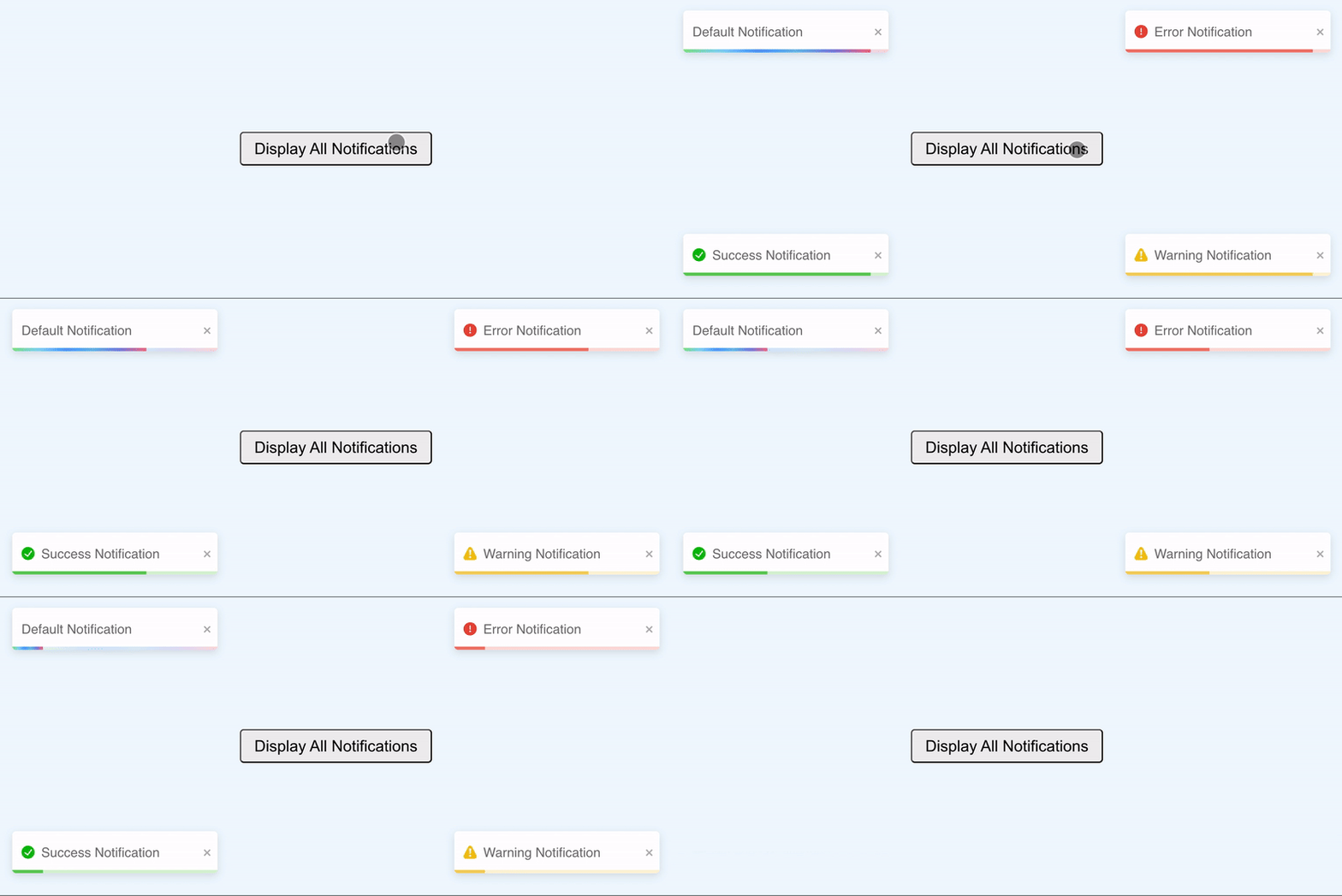
Adding a transition is based on your preference, but it’s better to stick to a single transition for consistency throughout your code.
Class Styling
There are several ways to style toast notifications. The common ones are to override the existing react-toastify CSS variables and classes and use options props. The CSS classes include:
progressClassName(progress bar styling),className(container styling),bodyClassName(toast body),toastClassName(toast wrapper).
# index.css

.success-background {
  background-color: blue !important;
  color: #fff !important;
}

.success-progress-bar {
  background-color: lightblue !important;
}

.error-background {
  background-color: rgb(14, 13, 14) !important;
  color: #fff !important;
}

.error-progress-bar {
  background-color: rgb(113, 113, 113) !important;
}
...
const displayNotifications = () => {
toast.success("Success Notification", {
position: "top-left",
className: "success-background",
progressClassName: "success-progress-bar",
});
toast.error("Error Notification", {
position: "top-right",
className: "error-background",
progressClassName: "error-progress-bar",
});
};
...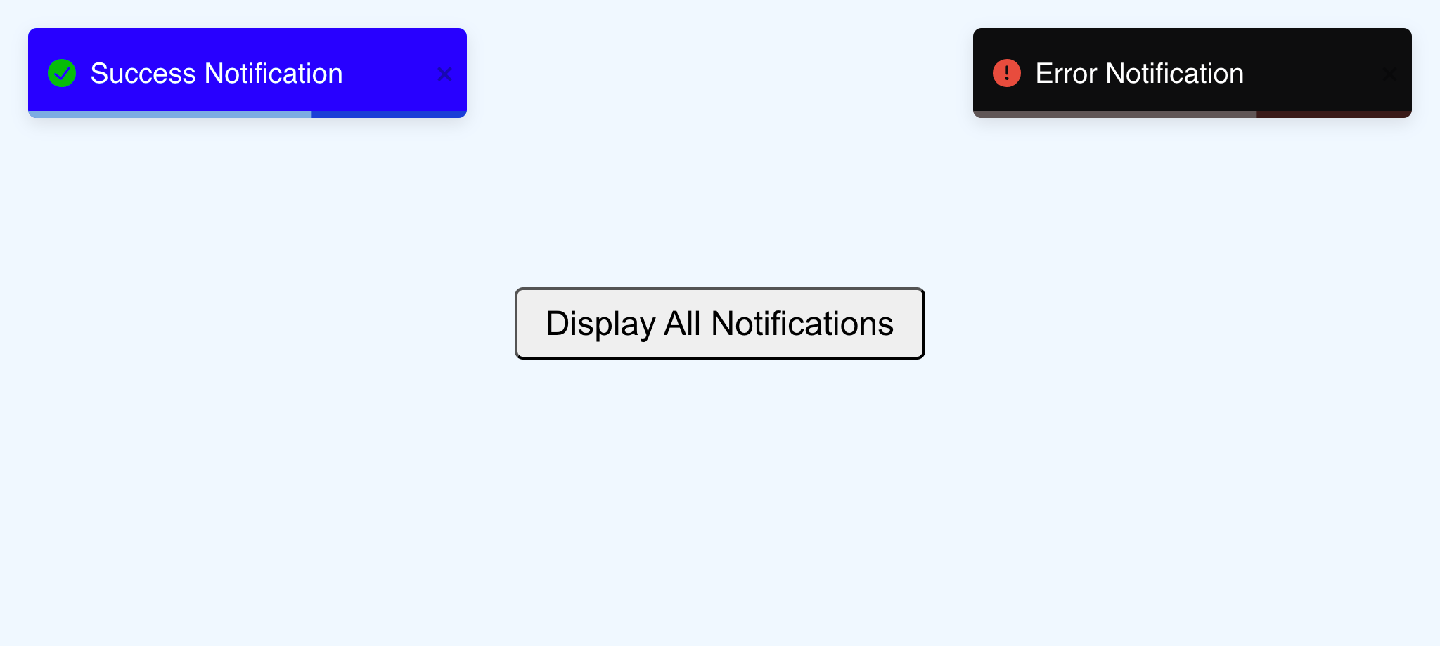
By using the index.css file to style the notification classes, you can customize the background and progress bar colors. This styling can also be done with a CSS framework or custom CSS, depending on your application’s setup.
Custom Icon
Each type of toast message—info, success, warning, and error—comes with a default icon that can be customized as desired. You can also choose to remove the icon. To remove the icon for a specific toast, set the icon option prop to false:
...
  toast.error("Without icon", {
    icon: false
 });
...
To disable icons across all toast messages, add the icon prop to the main toast container:
<ToastContainer icon={false} />With this code, icons can’t be shown in any of the notifications in the application.
If you want to use a custom icon, ensure that you do not disable all icons. You’ll also need to provide the custom icon and set it in the icon option:
...

const MyIcon = () => {
  return (
    <svg
      width="12"
      height="12"
      viewBox="0 0 12 12"
      fill="none"
      xmlns="<http://www.w3.org/2000/svg>"
    >
      {/* content */}
    </svg>
 );
};

function App() {
  const displayNotifications = () => {
    toast.success("Success Notification With Icon", {
      position: "top-left",
      icon: MyIcon,
 });
    toast.error("Error Notification With No Icon", {
      position: "top-right",
      icon: false,
 });
 };
...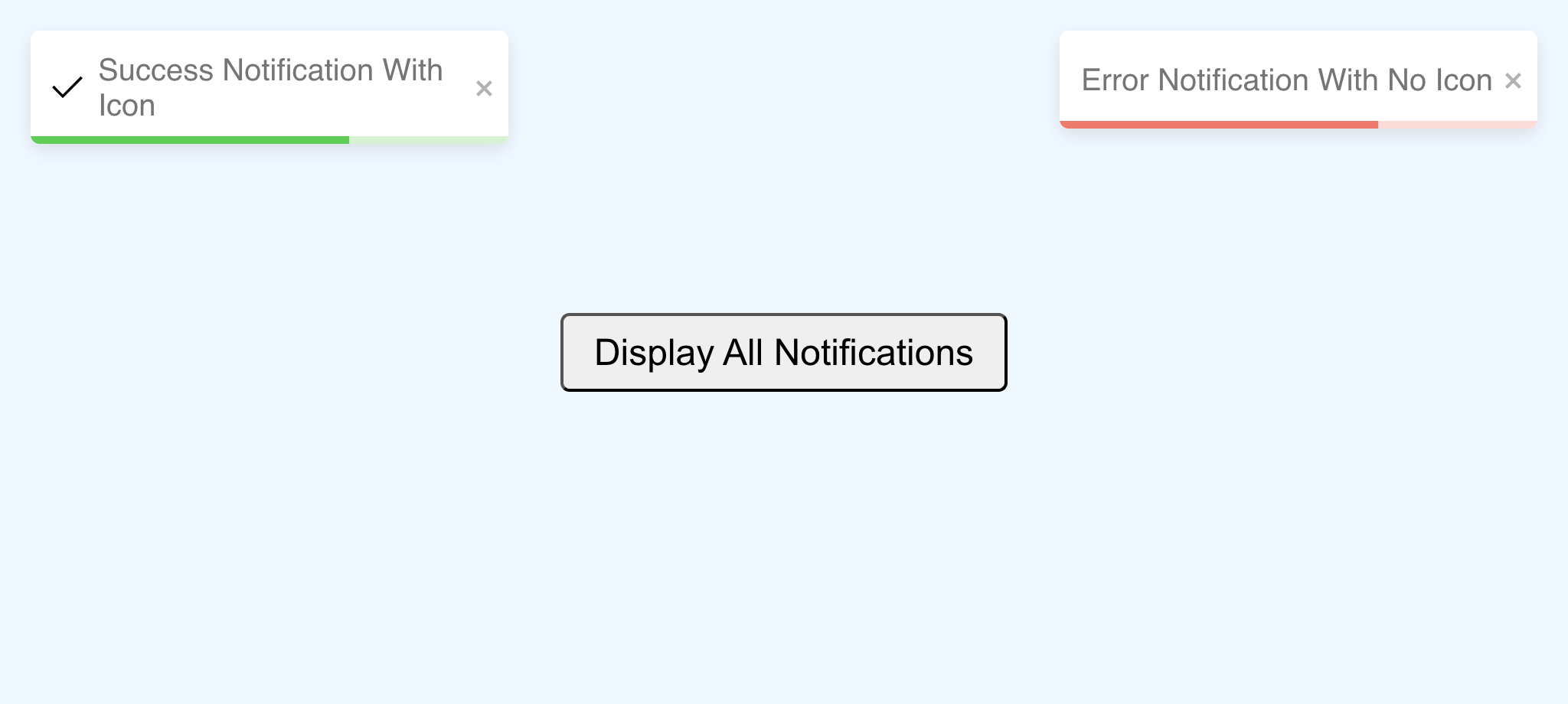
In this example, a black icon replaces the default icon of the success notification, while the error notification has no icon. Adding or removing an icon should align with the overall design and styling of the website.
Other features
While the common customizable features are covered in this article, there are more to explore like:
- Undoing an action using a toast.
- Stacking notifications.
- Customizing the animation.
- Limiting the number of notifications to be displayed.
- Updating a toast.
To learn more, make sure to check out the library for more details about these features.
Conclusion
The react-toastify package has so much to offer, and in this tutorial, we were able to look at what toast messages are, when to use them, and how to use the library for basic and customized toast notifications. While we covered a lot, it is always important to look at the documentation provided.
There is documentation that outlines other usages of the library from the basic to the complex, and a playground to view the code as you update changes while also enabling your display in real-time.
Always make use of toast notifications on your website whenever necessary to improve your UI.
Gain Debugging Superpowers
Unleash the power of session replay to reproduce bugs, track slowdowns and uncover frustrations in your app. Get complete visibility into your frontend with OpenReplay — the most advanced open-source session replay tool for developers. Check our GitHub repo and join the thousands of developers in our community.

