Tailwind CSS vs Bulma CSS

Tailwind CSS is a highly customization and low-level CSS framework that provides a set of utility classes for building fast and responsive web interfaces. Unlike other CSS frameworks, Tailwind focuses on providing a small set of pre-designed utility classes that you can use to quickly style your HTML elements without having to write a lot of custom CSS code. Tailwind provides a wide range of utility classes for styling typography, colors, spacing, layout, and other aspects of your website’s design. It also includes a powerful responsive design system that enables you to easily create layouts that adapt to different screen sizes and devices.
Bulma is a modern CSS framework based on Flexbox, a layout model that provides a simple and flexible way to build complex and responsive interfaces. This open-source project has gained popularity due to its ease of use, simple syntax, and comprehensive documentation. With Bulma, you can quickly and easily create attractive and functional user interfaces without writing a lot of CSS code from scratch. Bulma provides a variety of pre-designed UI components such as buttons, forms, cards, modals, and more, which can be easily customized to match your website’s design. It also provides a set of Sass variables and mixins that allow you to fine-tune the look and feel of your website without having to write a lot of custom CSS code.
Why Developers Use Tailwind CSS
It can’t be overstated, and most developers will agree, how important it is to be able to design a user interface without being constrained. Tailwind does not force developers to make design decisions, unlike Bootstrap or Bulma. This implies that every UI element could be created from scratch.
Another advantage is that developers still find diagnosing and monitoring stylistic mistakes reasonably simple even though the arrangement of Tailwind’s markup files is complex. It is simple to scan the Tailwind markup file and make any adjustments required to reflect the developer’s purpose. Projects with a predetermined interface, layout, or design aesthetic are best suited for Tailwind, and developers can decide each component’s design with few restrictions.
Why Developers Use Bulma CSS
For developers who have little prior experience creating user interfaces, Bulma is a fantastic choice. With Bulma, a UI can be set up and functional with just a few classes. With Tailwind, it’s difficult to accomplish this. Even the simplest interface in Tailwind requires a thorough understanding of the various classes that make up the framework.
Additionally, Bulma provides great flexibility, making it simple for developers to customize. In comparison, related frameworks like Bootstrap have rather substantial modification requirements. Due to this complexity, most Bootstrap developers employ the framework’s default template, which accounts for the identical appearance of most Bootstrap websites.
In this article, we’ll compare Tailwind CSS and Bulma CSS, stating their:
- Advantages,
- Disadvantages
- We’ll give an example of creating a responsive button with both Tailwind CSS and Bulma CSS.
- Also comparing them using data from stateofcss.com.
Tailwind CSS
In this section, we’ll look at its advantages and disadvantages, and how it can be used to create a responsive button.
Advantages of Tailwind CSS
Let’s take a look at some advantages of Tailwind:
-
Faster CSS Styling: There is no faster framework than Tailwind when it comes to styling HTML. As a result, you can easily create good-looking layouts by styling elements directly. This is possible because Tailwind offers thousands of built-in classes that do not require you to create designs from scratch.
-
Highly Customizable: When it comes to styling web applications, Tailwind is a distinctive CSS framework since, unlike other CSS frameworks, it does not come with a pre-installed theme. For instance, even if you utilize the same components, you may give each project a unique appearance (color palette, size, etc.). It is one of the few CSS frameworks that has no preconceived notions about how you ought to style your project.
-
Security and Responsiveness: You can simply design the layout in an HTML file using Tailwind’s pre-built classes. It becomes a very responsive, mobile-friendly CSS framework as a result. Apart from that, since its original release, Tailwind has shown itself to be a reliable framework. Because top-tier developers created the framework, there aren’t many flaws or breakdowns.
-
Utility-first approach: Tailwind provides a wide range of utility classes for styling typography, colors, spacing, layout, and other aspects of your website’s design. This makes it easy to style your HTML elements quickly without writing a lot of custom CSS code.
-
Ease of use: Tailwind has a simple and intuitive syntax that makes it easy to use, even for developers new to CSS frameworks. The framework’s comprehensive documentation and active community of developers also make it a great choice for building fast, responsive, and user-friendly websites.
-
Compatibility: Tailwind CSS is compatible with modern browsers and works well with other front-end tools and libraries.
Disadvantages of Tailwind CSS
While Tailwind CSS has many advantages, there are also some potential disadvantages that developers should consider before using it:
-
Customisation limitations: Tailwind CSS provides a lot of customization options, but its utility-first approach may not be suitable for all projects. Some developers may find it difficult to customize the framework to match their website’s design requirements.
-
Learning curve: While Tailwind CSS is designed to be simple and intuitive, it has a different syntax and approach compared to traditional CSS frameworks. This may require a learning curve for some developers, especially those new to the utility-first approach.
-
Limited pre-designed UI components: Unlike other CSS frameworks such as Bootstrap or Bulma, Tailwind CSS provides only a limited set of pre-designed UI components. This may require developers to write more custom CSS code to build complex interfaces.
-
Opinions: Tailwind CSS has a strong and opinionated design system, which may not be suitable for all projects. Some developers may prefer a more flexible and open-ended CSS framework that allows for greater creativity and customization.
Here is a simple example of how Tailwind CSS can be used to create a responsive button:
<button class="bg-blue-500 hover:bg-blue-700 text-white font-bold py-2 px-4 rounded">
  Button
</button>;
In this example, the button class uses several Tailwind CSS utility classes to define its appearance:
bg-blue-500sets the background color to blue.hover:bg-blue-700changes the background color to a darker blue when the button is hovered over.text-whitesets the text color to white.font-boldsets the font weight to bold.py-2sets the vertical padding to 0.5 rem.px-4sets the horizontal padding to 1 rem.roundedadds rounded corners to the button.
Using these utility classes lets you quickly and easily create a responsive button without writing any custom CSS code. You can also easily change the button’s appearance by using different utility classes or modifying the default utility classes provided by Tailwind CSS.
Session Replay for Developers
Uncover frustrations, understand bugs and fix slowdowns like never before with OpenReplay — an open-source session replay tool for developers. Self-host it in minutes, and have complete control over your customer data. Check our GitHub repo and join the thousands of developers in our community.
Bulma CSS
Let’s also look at its advantages, disadvantages, and how we can use it to create a responsive button.
Advantages of Bulma CSS
Let’s now examine some Bulma CSS benefits:
-
Flexible layout: Bulma is based on Flexbox, a layout model that provides a simple and flexible way to build complex and responsive interfaces. This makes it easy to create layouts that adapt to different screen sizes and devices.
-
Pre-designed UI components: Bulma provides a variety of pre-designed UI components, such as buttons, forms, cards, modals, and more, which can be easily customized to match your website’s design.
-
Basic Syntax: Bulma is known for its simple and intuitive syntax, which makes it easy to use, even for developers who are new to CSS frameworks.
-
Utilizing Flexbox: It enables our front-end development specialists to create elaborate designs with built-in Flexbox.
-
Comprehensive documentation: Bulma has well-written and comprehensive documentation that makes it easy to learn and use the framework.
-
Community support: Bulma has a large and active community of developers who have contributed to its development and provide support to users.
-
Responsive design: Bulma provides a responsive design system that enables you to easily create layouts that adapt to different screen sizes and devices.
Disadvantages of Bulma CSS
Here are some of the disadvantages of using Bulma CSS:
-
No JavaScript integration: Bulma is a pure CSS framework and does not include any JavaScript components. This may require developers to use additional JavaScript libraries or write their own custom JavaScript code to build interactive interfaces.
-
Limited customization options: While Bulma provides a set of Sass variables and mixins that allow you to customize the look and feel of your website, some developers may find it limited compared to other CSS frameworks.
-
Large file size: Bulma generates a large CSS file, even for simple projects. This can slow down your website’s load time and affect its performance on slow or low-end devices.
Here is a simple example of how Bulma CSS can be used to create a responsive button:
<button class="button is-primary">Button</button>In this example, the button class sets the basic style for the button, and the is-primary class sets the color scheme. The is-primary class is one of the predefined color classes in Bulma CSS, and it sets the button’s background color to a blue hue and its text color to white.
By using the is-primary class, you can quickly and easily create a responsive button with a custom color scheme. You can also use other predefined color classes, such as is-link, is-info, is-success, and is-danger, to set different color schemes for your buttons.
In addition to the color classes, Bulma CSS also provides several other classes for controlling the size, shape, and style of buttons, such as is-small, is-medium, is-large, is-outlined, and is-inverted. By combining these classes with the basic button class, you can create a wide variety of responsive buttons with different styles and sizes.
A Direct Comparison
Despite the fact that we’ve talked about the advantages/disadvantages of both frameworks and how we can use them to create a responsive button, the major reason we’re here (to contrast Tailwind CSS with Bulma CSS) hasn’t been covered. That’s what we’ll be doing in this section.
Note: Each piece of information displayed below was statistically obtained from stateofcss.com, which undertakes an annual study of in-depth analysis, research, and observation.
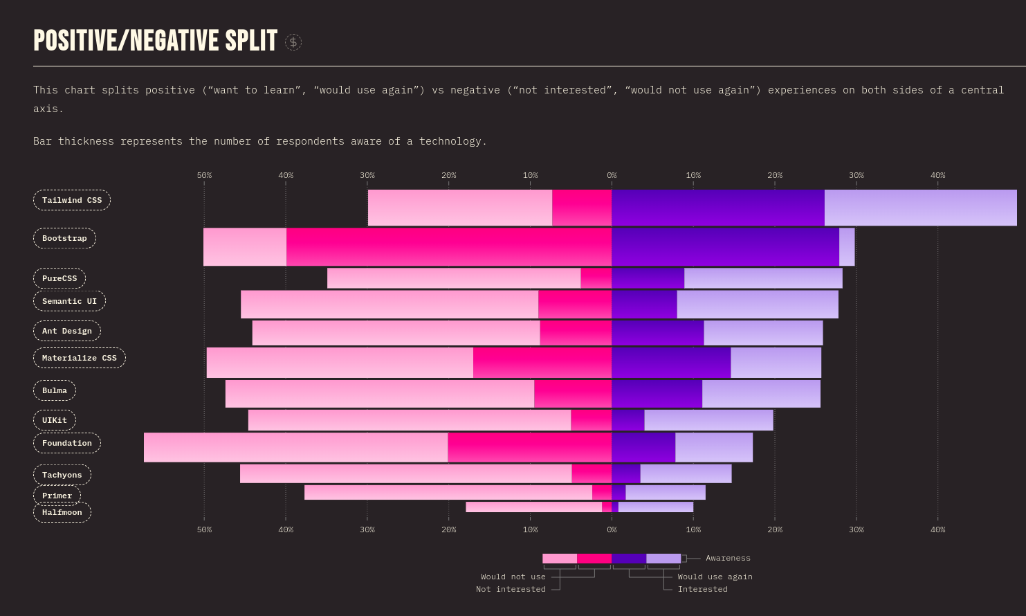
Positive/Negative Split
This positive/negative split graph contrasts good and bad experiences on either side of a central axis (i.e., “want to learn,” “would use again,” and “not interested,” “would not use again”).

According to the aforementioned data, Tailwind CSS is preferred by more people than Bulma CSS.
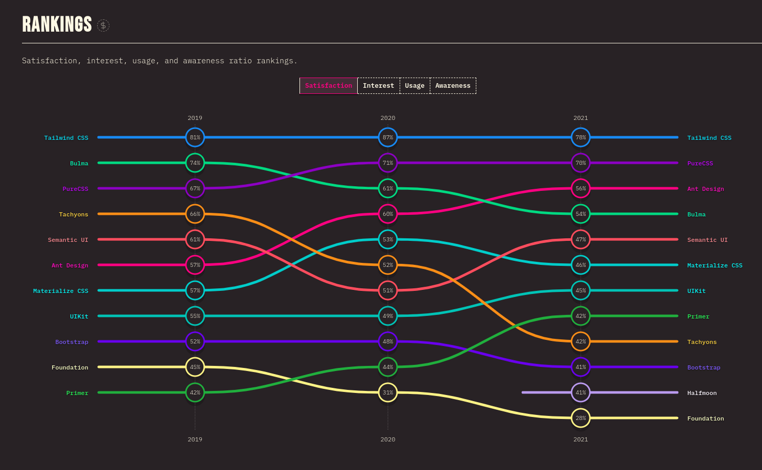
Rankings
This ratio rankings shows the users’ satisfaction, interest, usage, and awareness of Bulma and Tailwind CSS.

Tailwind CSS continues to perform better than Bulma CSS in terms of satisfaction, interest, usage, and awareness.
Conclusion
In our technologically driven environment, Tailwind CSS has definitely generated some attention. Using Tailwind CSS can be quite advantageous for you if your application is very massive. By dividing up difficult components and achieving maximum responsiveness, you can increase the efficiency of your project. You can add extra interactivity to your website or application designs by using the pre-packaged styling options.
Bulma is a good option if you need to construct a user interface rapidly and are looking for predefined interfaces and components. Consider Tailwind if you’re searching for a utility-first framework that enables you to create bespoke components from scratch.

