The Power of Visual Hierarchy in Web Development


Visual hierarchy is an arrangement of design elements in a way that directs users’ attention and shows them what’s most important first, then moves to the next, and so on. This concept is key for developers and designers, and this article shows how to apply it efficiently.

Discover how at OpenReplay.com.
When you arrive at a website, what do you see first? After that, what do you see next? Is it an image, the head text, or a glowing CTA (call to action) button? Whatever it is, it was likely intentional; the web designer wanted you to see it in that order to tell a bigger story.
So one might ask, how does this concern a web designer? Well, the truth is, you can’t create an effective website without a good understanding of hierarchy. When users visit your site, they need you to guide them through it in the easiest way possible—what to click on, how to navigate through a path, and how to feel with the big image they just saw. It all tells a story that enhances the aesthetic appeal of a website, making it more attractive to visitors.
In this article, we will cover:
- How to use principles like contrast, size, and color to convey visual hierarchy
- The role of visual hierarchy in web development
- Practical use of visual hierarchy in designing a hero section
Understanding Visual Hierarchy
When users visit your site, you can use a visual hierarchy to direct and guide them on what to do first. Whether it’s a button to click or a food picture that should first provoke a tasty desire before showing them a subtle button that says “order now” to take action, visual hierarchy helps dictate the movement. By using visual hierarchy effectively, you can ensure users notice and interact with the important elements of your website.
The Role of Perception and Psychology
Visual hierarchy is deeply rooted in perception and psychology. It depends on our human brain to react normally to certain cues and principles. For example, there is a higher chance of you buying a shoe if you can visually see how good it looks on other real people’s legs with different color variants and styles. That’s why most e-commerce sites will show you different colors and views of their products in real use cases. Also, our brain can easily notice things that are bigger in size, brighter in color and have high contrast.
Key Principles of Visual Hierarchy
Here are some key principles of visual hierarchy:
- Size: The bigger the size, the more users tend to notice it quickly.
- Color: Bright colors stand out and seek attention.
- Contrast: High contrast between elements makes the difference noticeable.
- Alignment: Proper alignment creates a clean, organized look.
- Repetition: Repeating patterns or styles creates cohesion.
- Proximity: Grouping related items together helps users understand better.
- Whitespace: Space around elements highlights them and gives breathing room for a cleaner design.
- Texture and Style: These can add depth and interest.
Examples of Visual Hierarchy in Everyday Life
Visual hierarchy is not just a concept we talk about; we see it play out in the things we use and read in our everyday lives. For example, when you pick up a magazine or newspaper to read, the front page headlines are always larger to capture your attention first. Alternatively, an image might be large with a bold headline. Visual hierarchy is even common in advertisements; advertisers use visual hierarchy to draw your eyes to key messages they want to convey.
The Role of Visual Hierarchy in Web Development
Before now, we have seen how to use visual hierarchy to draw users’ attention, but how can we use it on our website to achieve the same? Let’s look at that:
Enhancing User Experience and Navigation
It is proven that users decide whether to stay on your website or not within three seconds. This highlights the level of impatience users have developed with technological advances over the years. Having a website with a strong visual hierarchy can help improve your site navigation, making it easier for users to quickly find what they are looking for, thereby increasing satisfaction.
Guiding Users’ Attention to Key Elements
Visual hierarchy helps focus attention on the things that really matter, like those call-to-action buttons that can increase conversion rates or any other information you wouldn’t want your users to overlook.
Improving Readability and Comprehension
This is particularly beneficial to people with disabilities, such as color blindness. Implementing some visual hierarchy principles can make content much easier to read and understand.
Establishing Brand Identity and Consistency
Some modern fashion brands now prioritize visual hierarchy. You can see this from their magazine design style to their overall look. Brutalism is one such modern design style popularly used even in today’s website design. This consistency helps build brand recognition, trust, and uniqueness among users.
Case Study: A Successful Implementation of Visual Hierarchy
Let’s see how some websites have used visual hierarchy well in their design and what we can learn from them.
Tesla

Anytime you open the Tesla website, you can’t help but notice their cars’ bold and strong display, with images that make you feel the need to own one. The bold headlines and concise text provide essential information about the cars. The Tesla website features a simple layout with many visual elements to convey their message and persuade you.
Their design choice was intentional, including the different color variants and models shown as you scroll through the site, with a call-to-action button on every single section.
Nike
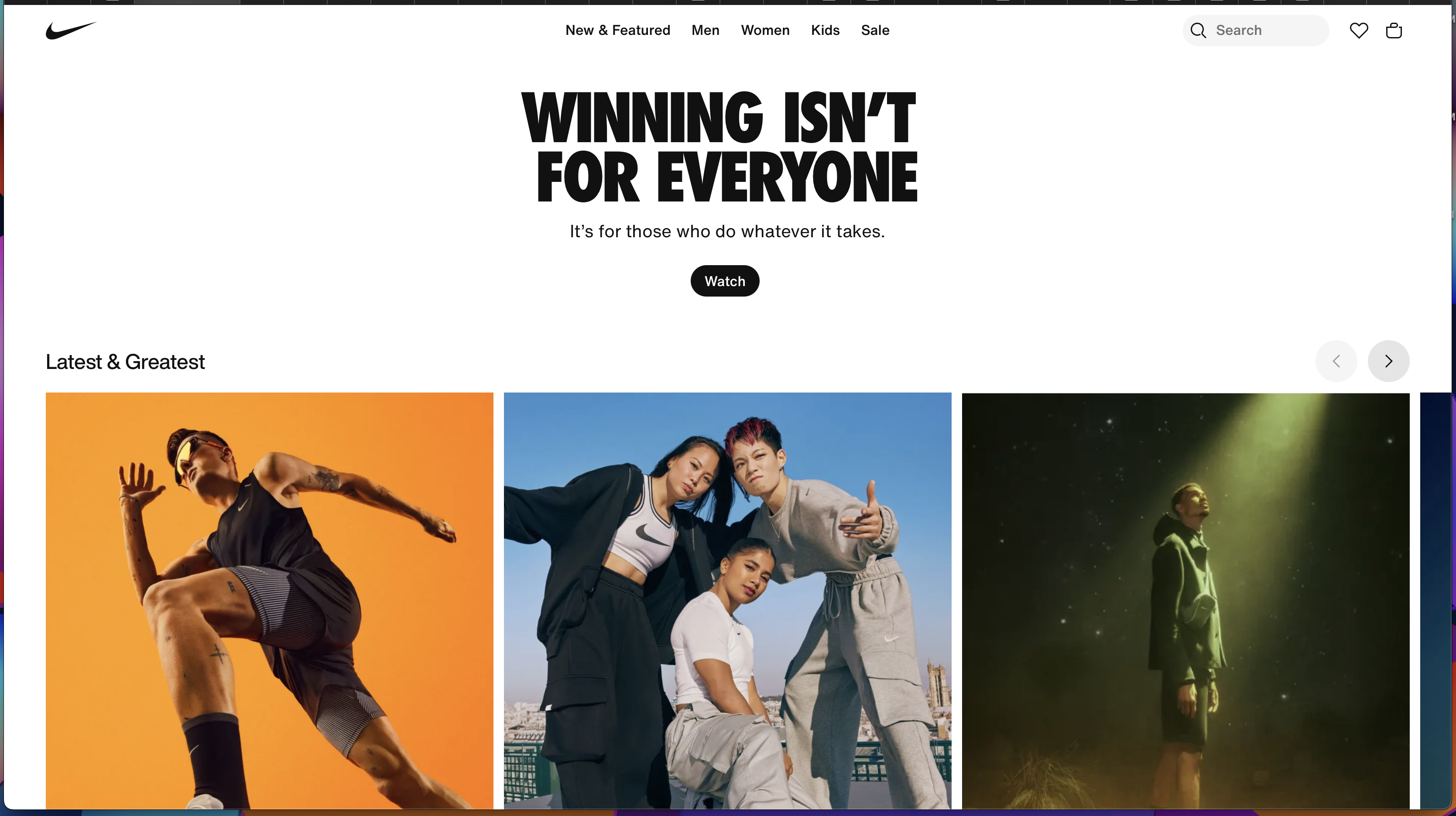
First, you saw the contrasting images, then read the headline. Next, you moved down to the dark-colored call-to-action button to check what it said before moving back to the subtext.
This is pure visual hierarchy in play. I told you, it’s like a journey.
Nike is a perfect example of a visually hierarchical website, and it needed to be. They sell shoes in a fashionable way and want you to see why they are special through their site. From images of different variants of Nike shoes to large, contrasting pictures of people engaging in different activities like running, playing football, and hanging out in groups, all wearing Nike shoes automatically gives you a sense of durability, fashion, style, and their vibes. You surely would want to be a part of the coolness you see in the pictures.
If a website can present itself in such a way and make you feel like you want to be part of what you are seeing and what is happening in it, that is more than enough to make you do anything or take any action they want from you. This not only improves their user experience but also serves as a persuasive strategy.
Practical Implementation of Visual Hierarchy in Web Development
Now that you understand how important visual hierarchy can be for your site let’s put it into practice. Here is a step-by-step guide on how you can apply the key principles of visual hierarchy to design a hero section of a food website.
Step 1: Planning and Wireframing
This initial step is crucial. Think of it as sketching out your ideas. Decisions at this point are not fixed, so they can change anytime because we are only ideating. Start by listing everything your design will contain. For example, in your food hero section, you can have things like:
- Navigation bar
- Logo
- Hero imagery
- Hero header and subtext
- CTA (call-to-action) button
Step 2: Assigning Visual Hierarchy
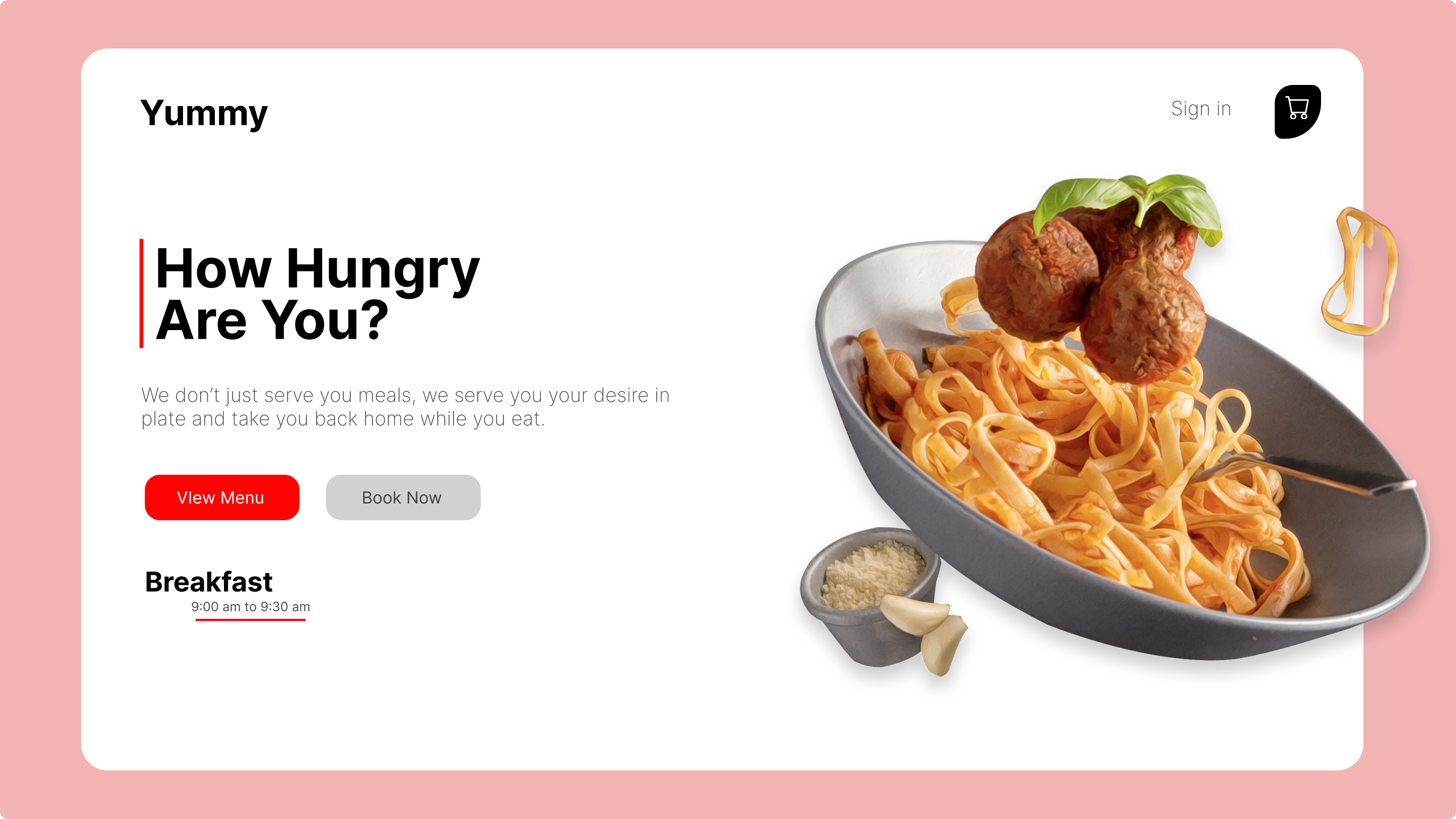
The next phase would be to assign a visual hierarchy with numbers to each of your listed elements. This will determine how you want your users’ eyes and attention to travel when they first arrive at your site. How do you want your users to start their journey? The starting point should be assigned number one, then the next should be number two, and so on. In the image example below, the starting point is the hero image because we want to first make them feel hungry and desire to eat something before leading them to act.
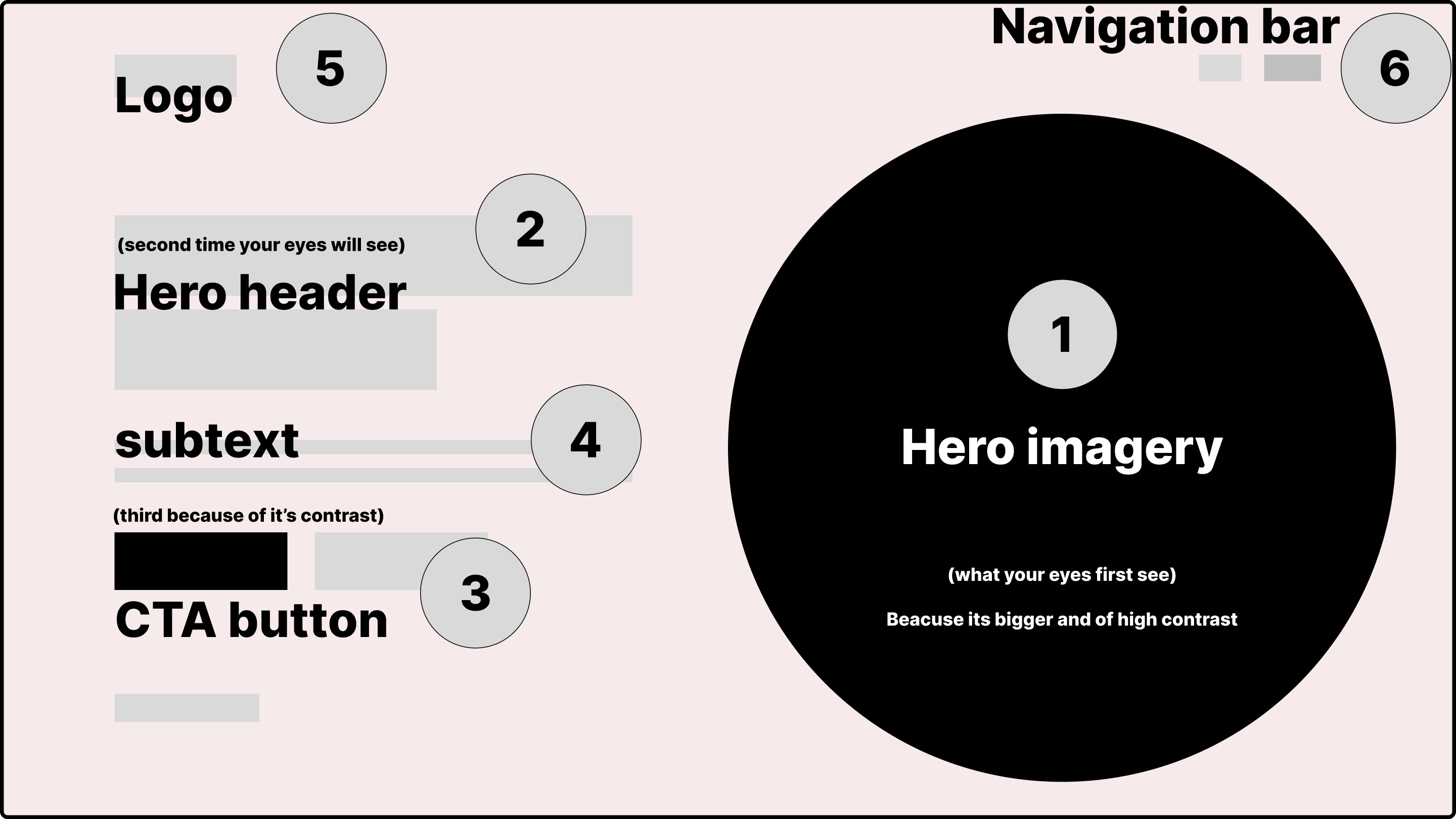
Remember, size isn’t the only factor in drawing attention. Color, high contrast, and good use of whitespace can also be effective principles when highlighting an element for users to see.
Step 3: Layout and Design
When combining elements in your design canvas, start with the one with the highest visual hierarchy since it’s the most important communicating element. The number of elements will determine your choice of layout. For convenience, this whole process can be done using a design tool like Figma.
Common Mistakes to Avoid
Keep your design as simple and clear as possible. Make good use of whitespace and maintain consistent styles throughout to ensure balance.
Another common mistake to avoid while designing is ignoring how responsive your design is on both mobile and desktop views. Even though you get your visual hierarchy right on the desktop view and fail to get the eye flow pattern right on the mobile view, that might still mislead users, causing a bad user experience for your design.
Lastly, pay close attention to how accessible your design is. Always try to factor in “all users” in your design thinking. For those with visual disabilities, good use of contrast, colors, whitespace, and providing alternative-text for images that refuse to load due to poor internet connection is a good way to design for everybody using the principles of visual hierarchy.
Conclusion
As you have seen, visual hierarchy can greatly impact your website’s user experience and engagement. By applying the key principles of visual hierarchy (size, color, contrast) mentioned in this article, you will not only have a beautiful design, but your website will also be able to easily direct and convert new visitors to take desired actions.
Truly understand users experience
See every user interaction, feel every frustration and track all hesitations with OpenReplay — the open-source digital experience platform. It can be self-hosted in minutes, giving you complete control over your customer data. . Check our GitHub repo and join the thousands of developers in our community..