Theming React Native Applications with Styled Components

Theming has become an essential part of mobile applications. Giving users the ability to switch between dark and light mode goes a long way in improving user experience and accessibility. In this article, we will be looking at how to implement dark mode in a mobile application using React native and Styled Components.
Styled components is CSS in JS solution for styling React and React native applications. This means you can write CSS in your JavaScript code rather than keeping styles in a separate stylesheet. Some of the advantages of this method are:
- Eliminates classname bugs: As developers, sometimes we might misspell a class name or run into specificity issues due to duplicate styles. Styled components solve this by generating unique class names for your styles.
- Automatic critical styles: Another disadvantage of traditional CSS is loading the entire stylesheet for every page opened, and component rendered even when some of the styles aren’t applied to elements in the page. Styled components only inject styles of components rendered which helps in improving performance
- Simple dynamic styling: You can adapt the style of a component based on the props of a component without having to create separate styles.
Getting Started
We will be building a demo blog app with the Expo framework to show how we can use Styled components in a React native application. To get started, run the code below:
npm install -global expo-cliThe above command installs the [expo-cli](https://docs.expo.dev/workflow/expo-cli/), a tool used in bootstrapping react native applications with Expo.
After installation, run expo init theming-mobile to create a react native application theming-mobile. An interactive prompt will show up to select a template, choose blank and press the enter/return key to continue the installation

Run the code below after the installation to install the necessary libraries we will need for our demo blog app.
expo install @react-native-async-storage/async-storage expo-linkingOnce the process is complete, you’ve successfully bootstrapped an expo react-native application. To run the application, navigate to the project directory in a terminal and run the code expo start to start the expo development server. You will be presented with an interactive menu similar to the screenshot below

The Expo dev server allows you to test your application locally while in development. You will need an emulator or the Expo Go App to run the app. The installation of an emulator isn’t covered in this article. Nevertheless, you can check here on how to install an emulator on your computer or the Expo Go app on your mobile device.
Assuming you have an emulator installed, press the relevant key that applies to the emulator, and it’ll run the app on the emulator.
Integrating Styled Components
We will be creating a Blog app to illustrate how to use styled-components. As earlier explained, Styled-components is used in styling React native applications. To get started with styled-components, run the code below at the root of your project to install the styled-components library
expo install styled-componentsNext, create a style.js file in the root of your project directory and paste the code below.
import styled from 'styled-components/native';
import Constants from 'expo-constants';

export const Container = styled.SafeAreaView`
    background-color: #fff;
    flex: 1;
    align-items: center;
    justify-content: center;
    padding: 20px;
    padding-top: ${Constants.statusBarHeight + 'px'};
`;
export const Header = styled.View`
    display: flex;
    width: 100%;
    flex-direction: row;
    justify-content: space-between;
    align-items: center;
    padding: 20px;
`;
export const ThemeButton = styled.Pressable`
    padding: 10px;
    border: 1px solid #000;
`;
export const ThemeButtonText = styled.Text`
    font-size: 16px;
    color: #000;
`;
export const TitleText = styled.Text`
    font-weight: 600;
    font-size: ${(props) => props.fontSize || '18px'};
    color: #000;
`;
export const PostContainer = styled.View`
    padding: 10px 20px;
    width: 100%;
`;
export const PostText = styled.Text`
    color: #73737d;
    font-size: 16px;
    padding: 10px 0 0;
    font-weight: ${(props) => props.fontWeight || '400'};
`;
We are using style.js to house all our styled components to be reused in other components. Styled components work by wrapping a react native component with custom styles in template literals.
export const Container = styled.SafeAreaView`
    background-color: #fff;
    flex: 1;
    align-items: center;
    justify-content: center;
    padding: 20px;
    padding-top: ${Constants.statusBarHeight + 'px'};
`;
In the example above, we create a styled component Container that wraps the react-native SafeAreaView component. We can also pass the components’ props and other valid JavaScript code as the styles are wrapped in template literals as you can see in the following example:
export const PostText = styled.Text`
    color: #73737d;
    font-size: 16px;
    padding: 10px 0 0;
    font-weight: ${(props) => props.fontWeight || '400'};
`;
We can complete the application now that we’ve created our styled components. Create a data.js file in the application directory and paste the code below
export default [
    {
        id: 1,
        body: 'Top 3 design patterns used to create React.JS components that you should know about',
        title: '3 React Component Design Patterns You Should Know About',
        date: '11th Jan 2022',
        url: 'https://blog.openreplay.com/3-react-component-design-patterns-you-should-know-about',
    },
    {
        id: 2,
        body: 'Generate Github issues directly from the OpenReplay interface',
        title: 'Integrating OpenReplay with GitHub',
        date: '5th Nov 2021',
        url: 'https://blog.openreplay.com/integrating-openreplay-with-github',
    },
    {
        id: 3,
        body: 'Learn how to create JIRA tickets directly from an OpenReplay session',
        title: 'Integrating OpenReplay with Jira',
        date: '24th Sept 2021',
        url: 'https://blog.openreplay.com/integrating-openreplay-with-slack-in-a-web-application',
    },
];
This file will hold the mock blog data we will be using in our application. Create another file called PostItem.js file in your project directory and insert the code below
import * as Linking from 'expo-linking';
import { PostContainer, TitleText, PostText } from './style';
const PostItem = ({ item }) => {
    return (
        <PostContainer>
            <TitleText onPress={() => Linking.openURL(item.url)}>{item.title}</TitleText>
            <PostText>{item.body}...</PostText>
            <PostText fontWeight='600'>{item.date}</PostText>
        </PostContainer>
    );
};
export default PostItem;
The PostItem component will display a single blog post item that comprises the Blog title, body, and date the blog article was published. As you can notice, we aren’t using any React native component here directly but the styled-components we created.
Now open the App.js file and replace the code in the file with the code below
import { useState, useEffect } from 'react';
import { StatusBar } from 'expo-status-bar';
import { FlatList } from 'react-native';
import PostItem from './PostItem';
import data from './data';
import { Container, Header, ThemeButton, ThemeButtonText, TitleText } from './style';
export default function App() {
    return (
          <Container>
              <Header>
                  <TitleText fontSize='24px'>Blog</TitleText>
                  <ThemeButton>
                      <ThemeButtonText onPress={() => null}>
                          Dark Mode
                      </ThemeButtonText>
                  </ThemeButton>
              </Header>
              <FlatList data={data} renderItem={PostItem} keyExtractor={(item) => item.id} />
              <StatusBar style='auto' />
          </Container>
    );
}
Like what was done in the PostItem.js component, we use our styled components to replace the default components. We also introduced a FlatList component to render the mock data from the data.js file in the PostItem component.
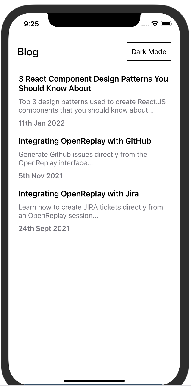
Save and reload your emulator. You should get something similar to the screenshot below.

Open Source Session Replay
OpenReplay is an open-source, session replay suite that lets you see what users do on your web app, helping you troubleshoot issues faster. OpenReplay is self-hosted for full control over your data.

Start enjoying your debugging experience - start using OpenReplay for free.
Theming
Now that we have our application up and running, the next step is applying the themes. We already have a default light mode theme. We will implement a dark mode theme in this section. Create a theme.js file and paste the code below
const darkTheme = {
    PRIMARY_COLOR: '#000',
    SECONDARY_COLOR: '#73737d',
    TITLE_COLOR: '#fff',
    BACKGROUND_COLOR: '#111216',
    BUTTON_COLOR: '#fff',
};
const lightTheme = {
    PRIMARY_COLOR: '#fff',
    SECONDARY_COLOR: '#73737d',
    TITLE_COLOR: '#000',
    BACKGROUND_COLOR: '#fff',
    BUTTON_COLOR: '#000',
};
export { lightTheme, darkTheme };
This file contains the theme colors we will be using in the application. Now go back to the style.js code and replace the code with the code below
import styled from 'styled-components/native';
import Constants from 'expo-constants';
export const Container = styled.SafeAreaView`
    background-color: ${(props) => props.theme['PRIMARY_COLOR']};
    flex: 1;
    align-items: center;
    justify-content: center;
    padding: 20px;
    padding-top: ${Constants.statusBarHeight + 'px'};
`;
export const Header = styled.View`
    display: flex;
    width: 100%;
    flex-direction: row;
    justify-content: space-between;
    align-items: center;
    padding: 20px;
`;
export const ThemeButton = styled.Pressable`
    padding: 10px;
    border: 1px solid ${(props) => props.theme['BUTTON_COLOR']};
`;
export const ThemeButtonText = styled.Text`
    font-size: 16px;
    color: ${(props) => props.theme['BUTTON_COLOR']};
`;
export const TitleText = styled.Text`
    font-weight: 600;
    font-size: ${(props) => props.fontSize || '18px'};
    color: ${(props) => props.theme['TITLE_COLOR']};
`;
export const PostContainer = styled.View`
    padding: 10px 20px;
    width: 100%;
`;
export const PostText = styled.Text`
    color: ${(props) => props.theme['SECONDARY_COLOR']};
    font-size: 16px;
    padding: 10px 0 0;
    font-weight: ${(props) => props.fontWeight || '400'};
`;
We’ve replaced the colours with props that will be passed down depending on the theme selected, so if a user selects dark mode, we’ll apply the colours from the darkMode theme in the theme.js folder to the styled-components.
Now go to the App.js file and paste the code below.
/** Previous code **/
import { ThemeProvider } from 'styled-components/native';
import { darkTheme, lightTheme } from './theme';

export default function App() {
    const [theme, setTheme] = useState('light');
    const toggleTheme = async () => {
        const themeValue = theme === 'dark' ? 'light' : 'dark';
        setTheme(themeValue);
    };
    return (
        <ThemeProvider theme={theme === 'dark' ? darkTheme : lightTheme}>
            <Container>
                <Header>
                    <TitleText fontSize='24px'>Blog</TitleText>
                    <ThemeButton>
                        <ThemeButtonText onPress={() => toggleTheme()}>
                            {theme === 'dark' ? 'Light' : 'Dark'} Mode
                        </ThemeButtonText>
                    </ThemeButton>
                </Header>
                <FlatList data={data} renderItem={PostItem} keyExtractor={(item) => item.id} />
                <StatusBar style='auto' />
            </Container>
        </ThemeProvider>
    );
}
Styled components have theming support by default which is available with the ThemeProvider component based on React context. The ThemeProvider component allows us to pass data through the component tree without drilling props down through every component level.
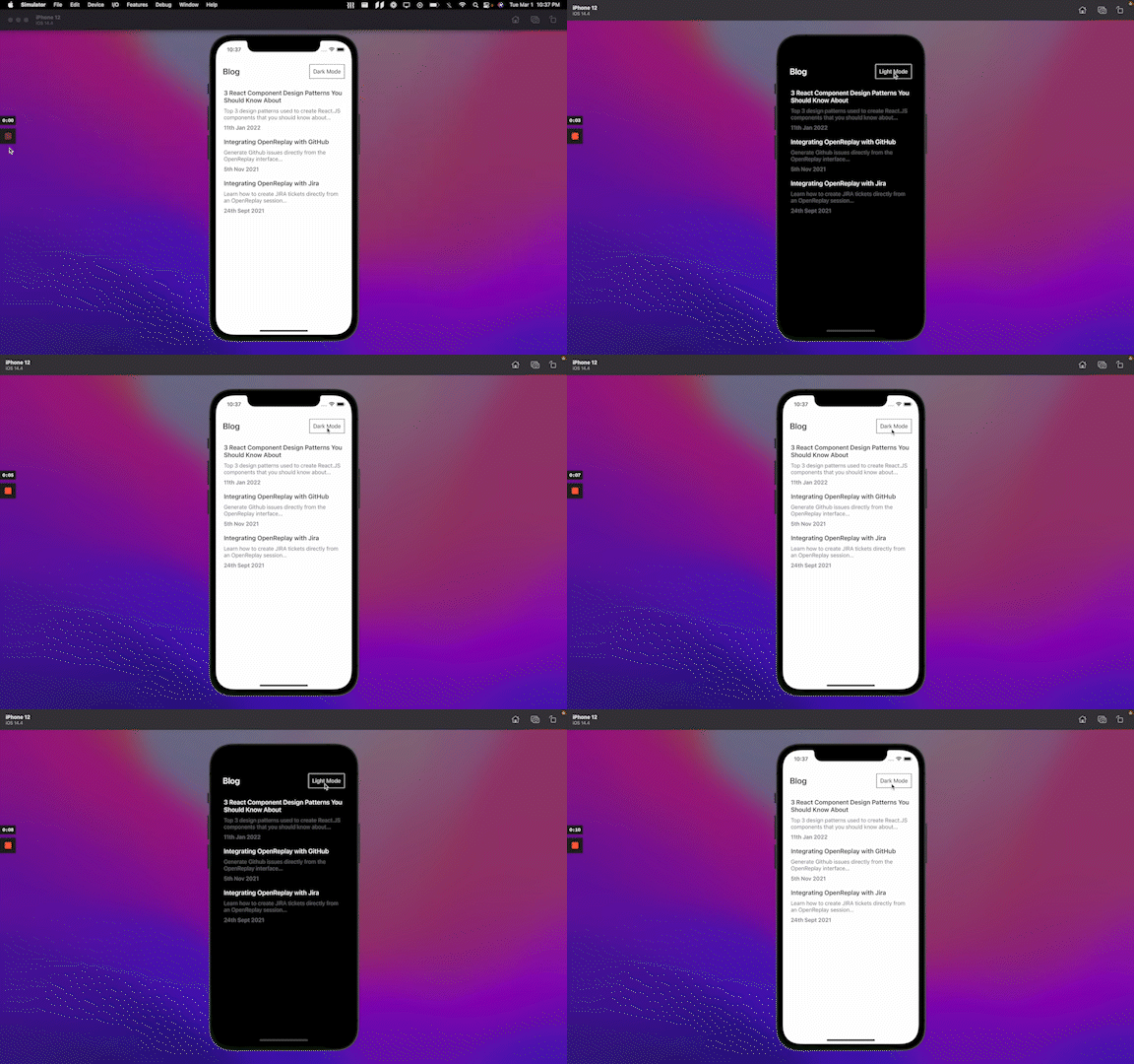
<ThemeProvider theme={theme === 'dark' ? darkTheme : lightTheme}>We pass the theme value down, which returns a theme object that depends on the state, so when a user toggles the theme, we update the theme state with the correct theme value and pass down the colours of the chosen theme to the styled-components. Reload the app, and now when you click the Dark mode button, it should switch the theme

Persisting the theme
We have now successfully created two themes for the application: light mode and dark mode, which is the aim of this article, but there is a small problem. If you reload the app, you’ll notice the theme resets back to light mode even after switching to dark mode.
To fix that, we will be using a React native library called Async Storage which provides a persistent storage that we can use to store string data. The idea is to store the current theme so that we can fetch the stored theme when the app is loaded and apply it to the application.
Go to your App.js file and insert the code below:
/** Previous code **/
import AsyncStorage from '@react-native-async-storage/async-storage';

export default function App() {
    const [theme, setTheme] = useState('light');
    useEffect(() => {
        getTheme();
    }, []);
    const getTheme = async () => {
        try {
            const themeValue = await AsyncStorage.getItem('@theme');
            if (themeValue) setTheme(themeValue);
        } catch (error) {
            console.log(error);
        }
    };
    const toggleTheme = async () => {
        const themeValue = theme === 'dark' ? 'light' : 'dark';
        try {
            await AsyncStorage.setItem('@theme', themeValue);
            setTheme(themeValue);
        } catch (error) {
            console.log(error);
        }
    };
    return(
      /** Previous code **/
    )
}
There are two functions to note in the code above the getTheme and toggleTheme functions. When the app loads for the first time, we check if there is an existing theme in the Async storage. If there is, we replace the default theme in the state with the existing one. If a user toggles the theme, we store the current theme in the Async storage and the theme state.
Now refresh your app again. You’ll notice even when you quit and open the app again. It still uses the last saved theme.
Conclusion
At this point, you should be able to implement theming in your mobile applications. You could do so much more with Styled components, such as creating a design system and extending the styled-components. Please endeavour to check the Styled component docs. You can also try extending the app we created to include other themes. I’d love to see what you come up with. The complete code for this article is available here.
