Using the CSS gap property: a full guide


Discover how at OpenReplay.com.
Cascading Style Sheets (CSS) is an essential technology enabling developers to bring life and style to the digital realm. The gap property is a convenient addition to CSS, simplifying the creation of layouts with consistent spacing between elements. It effectively replaces the need for combinations of margins and paddings, providing a cleaner and more intuitive approach to design. Both experienced and those aspiring to the craft, web developers constantly seek tools that boost their productivity and encourage cleaner, more maintainable code. The gap property offers a more streamlined and expressive way to handle the spaces between elements within a layout.
Beyond its role in cleaning up code, the gap property carries built-in benefits for creating layouts. It provides a consistent and visually pleasing spacing mechanism, whether applied to grid structures, flexbox arrangements, or multi-column layouts. This uniformity enhances the appearance of a webpage and contributes to a more precise and polished user experience. In the subsequent sections of this article, we will explore the syntax, supported values, and practical applications of the gap property, revealing its potential to improve your CSS skills.
Syntax
The gap property is a shorthand for row-gap and column-gap, making it concise. Its syntax is:
gap: <row-gap> <column-gap>;You can specify individual values for each gap or provide a single value to apply horizontally and vertically.
Supported Values and Units
Let’s look at the supported values and units in this section.
Length Values: px, em, rem, %
One of the primary strengths of the gap property lies in its versatility in accepting various length values. Lengths can be expressed in pixels (px), providing a fixed unit of measurement ideal for achieving pixel-perfect precision.
.container {
  gap: 20px;
}
Also, using relative units like em and rem allows for scalability, making the layout responsive to changes in font size. It is particularly useful in creating layouts that adapt seamlessly to different screen sizes and devices.
.container {
  gap: 1.5em;
}
The percentage unit is another valuable option, enabling dynamic spacing relative to the size of the container. It is convenient when designing fluid layouts that need to adapt to varying viewport dimensions.
.container {
  gap: 5%;
}
Keywords: normal, initial, inherit
The gap property also supports keywords that provide shorthand solutions for common scenarios. For instance, the normal keyword ensures the browser applies its default spacing between elements.
.container {
  gap: normal;
}
The initial keyword sets the gap property to its default value, providing a clean slate for further customization.
.container {
  gap: initial;
}
Similarly, the inherit keyword allows the gap property to inherit the value from its parent element, promoting consistency throughout the layout.
.container {
  gap: inherit;
}
Calc Expressions: Combining Lengths and Other Values
The calc function within the gap property opens up possibilities for developers seeking granular control over spacing. This feature allows the combination of different lengths and values, empowering developers to create complex and adaptive layouts.
.container {
  gap: calc(20px + 2em);
}
Here, the calc function combines a fixed pixel value with a relative em value, resulting in a spacing that adapts to font size and layout requirements. This level of precision exemplifies how the gap property, with the support of calc, can cater to complex design specifications.
Difference between margins and gap in CSS
Let’s break down the differences between margin and gap in a tabular manner:
| Features | Margin | Gap |
|---|---|---|
| Applies to | Space around element’s border | Space between grid lines |
| Maintainability | Requires adjusting each element’s margin individually. | Easily adjustable by modifying the container’s gap property, promoting cleaner and more maintainable code. |
| Visual Consistency | Prone to inconsistencies if margins are not applied consistently. | Ensures consistent spacing between elements without the risk of individual adjustments causing disparities. |
| Applicability | Suitable for scenarios where fine-tuned control over individual elements is necessary. | Ideal for creating consistent and responsive layouts, particularly in flexbox and grid contexts. |
Now, Let’s look into the differences through code examples.
Using margins
The margin property defines the spacing outside an element’s border, effectively pushing away neighboring elements.
Consider where you want to create space around a box.
The HTML Code:
<!DOCTYPE html>
<html lang="en">
  <head>
    <link rel="stylesheet" href="styles.css" />
  </head>
  <body>
    <div class="box"></div>
  </body>
</html>
The CSS Code:
.box {
  width: 100px;
  height: 100px;
  background-color: #cbc026;
  margin: 20px;
}
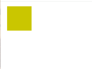
Here, a div element with the class .box is styled with a width, height, and a strong yellow background. The important part here is the margin: 20px; property, which adds a margin of 20 pixels around the box. This results in space between the box and the surrounding elements.
The Output:

The margin pushes the box away from the edges, creating a visual space around it.
Using gap
Unlike margin, gap doesn’t impact the element itself but focuses on the spaces between the elements.
The HTML Code:
<!DOCTYPE html>
<html lang="en">
  <head>
    <link rel="stylesheet" href="styles.css" />
  </head>
  <body>
    <div class="container">
      <div class="box"></div>
      <div class="box"></div>
      <div class="box"></div>
    </div>
  </body>
</html>
The CSS Code:
.container {
  display: grid;
  grid-template-columns: repeat(3, 100px);
  gap: 20px;
}

.box {
  width: 100px;
  height: 100px;
  background-color: #cbc026;
}
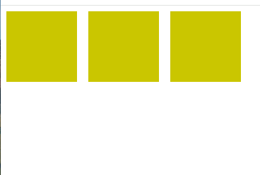
A grid container with three boxes is created. The important line is gap: 20px;, which sets a gap of 20 pixels between each column. Unlike the margin, this gap is confined to the spaces between the boxes.
Output:

The boxes are neatly arranged with a consistent gap of 20 pixels between them, showcasing the precision that the gap property brings.
While both margins and the gap properties achieve the goal of creating space in CSS layout, the latter offers a more modern and efficient approach, particularly in the context of grid and flexbox layouts. The choice between them depends on the specific layout requirements and the level of control needed over individual elements.
How to use gap Property in CSS
In this section, we will look at how to use the gap property to elements and discuss how to adjust the gap size for optimal layout design.
Applying gap to Elements
To apply the gap property, you must first ensure that the parent container is a grid or flex container. Once that’s established, you can set the desired gap values. Applying the gap property is a straightforward process. In the example below, let’s use a grid-container to effectively illustrate how to apply the gap property.
<!DOCTYPE html>
<html lang="en">
  <head>
    <link rel="stylesheet" href="styles.css" />
  </head>
  <body>
    <div class="grid-container">
      <div class="box"></div>
      <div class="box"></div>
      <div class="box"></div>
    </div>
  </body>
</html>
.grid-container {
display: grid;
grid-template-columns: repeat(3, 100px);
gap: 50px;
}
.box {
width: 100px;
height: 100px;
background-color: #e74c3c;
}Output:

This setup ensures a consistent gap between each box within the grid.
Adjusting the Size of the gap
Customizing the gap size is an important aspect of effectively utilizing the gap property. It can be achieved by using different units or values.
For example:
<!DOCTYPE html>
<html lang="en">
  <head>
    <link rel="stylesheet" href="styles.css" />
  </head>
  <body>
    <div class="flex-container">
      <div class="item"></div>
      <div class="item"></div>
      <div class="item"></div>
    </div>
  </body>
</html>
CSS Code:
.flex-container {
  display: flex;
  gap: 1em;
}

.item {
  width: 100px;
  height: 100px;
  background-color: #cbc026;
}
Explanation:
-
.flex-container: This class is assigned to the container div, making it a flex container. -
display: flex: This CSS property establishes the container as a flex container. -
gap: 1em: Thegapproperty sets a gap of 1em between flex items.
Output:

The items within the flex container are now spaced with gap: 1em, showcasing how adjusting the gap size can be customized based on design preferences.
Gap-property Layout
Let’s look into its applications in different layout techniques: Grid Layout, Flexbox, and Multi-Column Layout. Each of these techniques offers opportunities to create well-organized and visually pleasing designs.
In Grid Layout
Grid Layout is a two-dimensional system that allows for creating complex web layouts with rows and columns. In this context, the gap property defines the space between these rows and columns.
<!DOCTYPE html>
<html lang="en">
  <head>
    <meta charset="UTF-8" />
    <meta name="viewport" content="width=device-width, initial-scale=1.0" />
    <link rel="stylesheet" href="styles.css" />
    <title>Grid Layout with Gap</title>
  </head>
  <body>
    <div class="grid-container">
      <div class="grid-item"></div>
      <div class="grid-item"></div>
      <div class="grid-item"></div>
    </div>
  </body>
</html>
.grid-container {
display: grid;
grid-template-columns: repeat(3, 1fr);
gap: 20px;
}
.grid-item {
background-color: #cbc026;
height: 100px;
}Output:

The grid-container creates a grid with three equal columns, and the gap: 20px ensures a 20-pixel gap between each column. The background color and height of .grid-item are set for visualization.
In Flexbox
Flexbox is a one-dimensional layout system that distributes space along a single axis. The gap property in Flexbox defines the spacing between flex items within a flex container.
<!DOCTYPE html>
<html lang="en">
  <head>
    <meta charset="UTF-8" />
    <meta name="viewport" content="width=device-width, initial-scale=1.0" />
    <link rel="stylesheet" href="styles.css" />
    <title>Flexbox with Gap</title>
  </head>
  <body>
    <div class="flex-container">
      <div class="flex-item">Box 1</div>
      <div class="flex-item">box 2</div>
      <div class="flex-item">Box 3</div>
    </div>
  </body>
</html>
.flex-container {
display: flex;
gap: 2rem;
}
.flex-item {
background-color: #cbc026;
flex: 1;
height: 100px;
text-align: center;
}The .flex-container creates a horizontal row of three equal-width flex items with a 2rem gap between them. The flex: 1 property ensures that each item takes up equal space.
Multi-Column Layout
Multi-Column Layout is perfect for presenting large bodies of text, and the gap property ensures seamless spacing between columns.
For Instance:
<!DOCTYPE html>
<html lang="en">
  <head>
    <meta charset="UTF-8" />
    <meta name="viewport" content="width=device-width, initial-scale=1.0" />
    <link rel="stylesheet" href="styles.css" />
    <title>Multi-Column Layout Example</title>
  </head>
  <body>
    <div class="multi-column-container">
      <p>
        Lorem ipsum dolor sit amet consectetur adipisicing elit. Deserunt odit
        nulla ea eveniet quo? Eos.
      </p>
      <p>
        I love OpenReplay Lorem ipsum dolor sit amet consectetur adipisicing
        elit. Excepturi inventore, incidunt consequatur quam consequuntur enim
        omnis totam et voluptatum id.
      </p>
      <p>
        Lorem ipsum dolor sit amet consectetur adipisicing elit. Pariatur
        deleniti non itaque exercitationem, illum quas tempora earum fugit velit
        distinctio numquam officia vitae cupiditate aperiam porro quisquam
        veniam hic aliquid?
      </p>
      <!-- More paragraphs as needed -->
    </div>
  </body>
</html>
.multi-column-container {
column-count: 3;
column-gap: 20px;
}
/* Additional styles for paragraphs can be added as needed */
.multi-column-container p {
margin-bottom: 15px;
background-color: #cbc026;
}Output:

Here, the column-count property sets the number of columns to three, and column-gap defines the space between them. This creates a visually appealing multi-column text layout.
Browser Compatibility
Most modern browsers, including Chrome, Firefox, Safari, Edge, and Opera, fully support the gap property. However, venturing into older browsers requires a bit more navigation.
Modern Browsers and Full Support:
-
Chrome: Versions 84 and later offer full support for the
gapproperty. -
Firefox: Versions 84 and later provide complete compatibility with the
gapproperty. -
Safari: Versions 14.1 and later fully provide compatibility with the
gapproperty in grid and flexbox, not multi-column. -
Edge: Versions 108 and later offer comprehensive support for the
gapproperty. -
Opera: Versions 71 and later provide full compatibility with the
gapproperty.
These modern browsers enable developers to utilize the gap property without concerns about browser-specific inconsistencies.
Ensuring Consistent Rendering:
To guarantee consistent rendering across different browsers, developers can implement various strategies:
-
Prefixes for Legacy Browsers: Using prefixes like
-ms-grid-rows-gapand-ms-grid-columns-gaphelps ensure functionality in older browsers like Internet Explorer. -
Polyfills: JavaScript libraries can emulate the
gapproperty’s behavior in browsers that lack native support. -
Feature Detection: Checking browser support before applying the
gapproperty allows for graceful fallback options in incompatible environments. -
Progressive Enhancement: Implementing basic layout functionality without the
gapproperty and enhancing it with the property for browsers that support it ensures a smooth experience across all devices.
Conclusion
The gap property is a game-changer for web design, simplifying layout creation and ensuring consistent spacing between elements. This article provides the tools and knowledge needed to get used to this tool and craft beautiful, user-friendly web pages. By understanding the syntax, supported values, and key differences from the margin, you can effectively apply the gap property to various layout strategies, including grids, flexbox, and multi-column layouts. While older browsers may require prefixes or alternative solutions, you can ensure consistent rendering across different environments by implementing feature detection and progressive enhancement strategies.
Gain control over your UX
See how users are using your site as if you were sitting next to them, learn and iterate faster with OpenReplay. — the open-source session replay tool for developers. Self-host it in minutes, and have complete control over your customer data. Check our GitHub repo and join the thousands of developers in our community.

