Web Design -- The Power of Storytelling

Telling stories is something humans naturally love. Since forever, people have been captivated by storytelling. No matter where or when, stories have had a strong appeal. Web designers can tap into this by incorporating narratives into their websites. This creates an engaging experience where visitors feel part of the story. Websites that trigger emotions stick in people’s minds better than ones that just provide facts, and this article will show you how to achieve that.

Discover how at OpenReplay.com.
Imagine landing on a website. It’s visually appealing, but the information feels flat, bombarding you with text and features. It’s a struggle to find what you’re looking for, and after a few clicks, you find yourself bouncing away, leaving no trace of your visit.
Now, picture another website. This one draws you in from the moment you arrive. Images and text work together to tell a story, guiding you on a journey that reveals the brand’s message and the product’s value. You feel a connection, an understanding that goes beyond technical specifications. This website leaves a mark, sparking your interest and fostering a desire to learn more.
This is the power of storytelling in web design.
Today, people get bored easily online. Websites fight for our attention with tons of information. This is where storytelling shines. By making websites like stories, designers can grab users attention and make them care. This way, users remember the website more than just facts or figures.
Let’s delve into how storytelling elevates web design and fosters deeper user connections.
The Human Connection of Storytelling
Stories have a special power. They can get past our thinking brains and connect with us on a deeper level. Stories make us feel things, imagine things, and understand information better. This connection between stories and people works great for websites, too! Here’s why using stories in web design is a good idea:
- Increased Engagement: Stories capture attention and keep users interested. A captivating narrative makes users want to see what happens next, encouraging them to explore different website sections.
- Emotional Connection: Stories build trust and create a positive brand association. By connecting with users emotionally, websites can build a sense of loyalty and brand affinity.
- Improved Brand Recall: Having stories on a website boosts brand recall. When there’s a captivating narrative, visitors are more likely to remember the company and its website long after they’ve left.
Examples of Effective Storytelling in Web Design
We’ve talked about why stories are powerful for web design. Now, let’s see some ways to actually use storytelling on our website. Here are a few popular methods that make websites more interesting for users:
Content as Narrative
Forget fancy words and confusing tech talk! Transform your website content into a story. Talk directly to your visitors in clear, easy-to-understand language. Don’t just list features like “customizable” or “secure”—show how they benefit your visitors. Tell a story about a customer who gets help right away thanks to 24/7 support or describes someone feeling great after using your fitness plan.
Use active voice to make your writing even more engaging. Instead of saying, “Your problems are solved by our software,” say, “Our software solves your problems.” Active voice makes your website more like a conversation, helping visitors connect with your brand. By using storytelling, you create a website that’s interesting and memorable, ultimately leading visitors to take action.
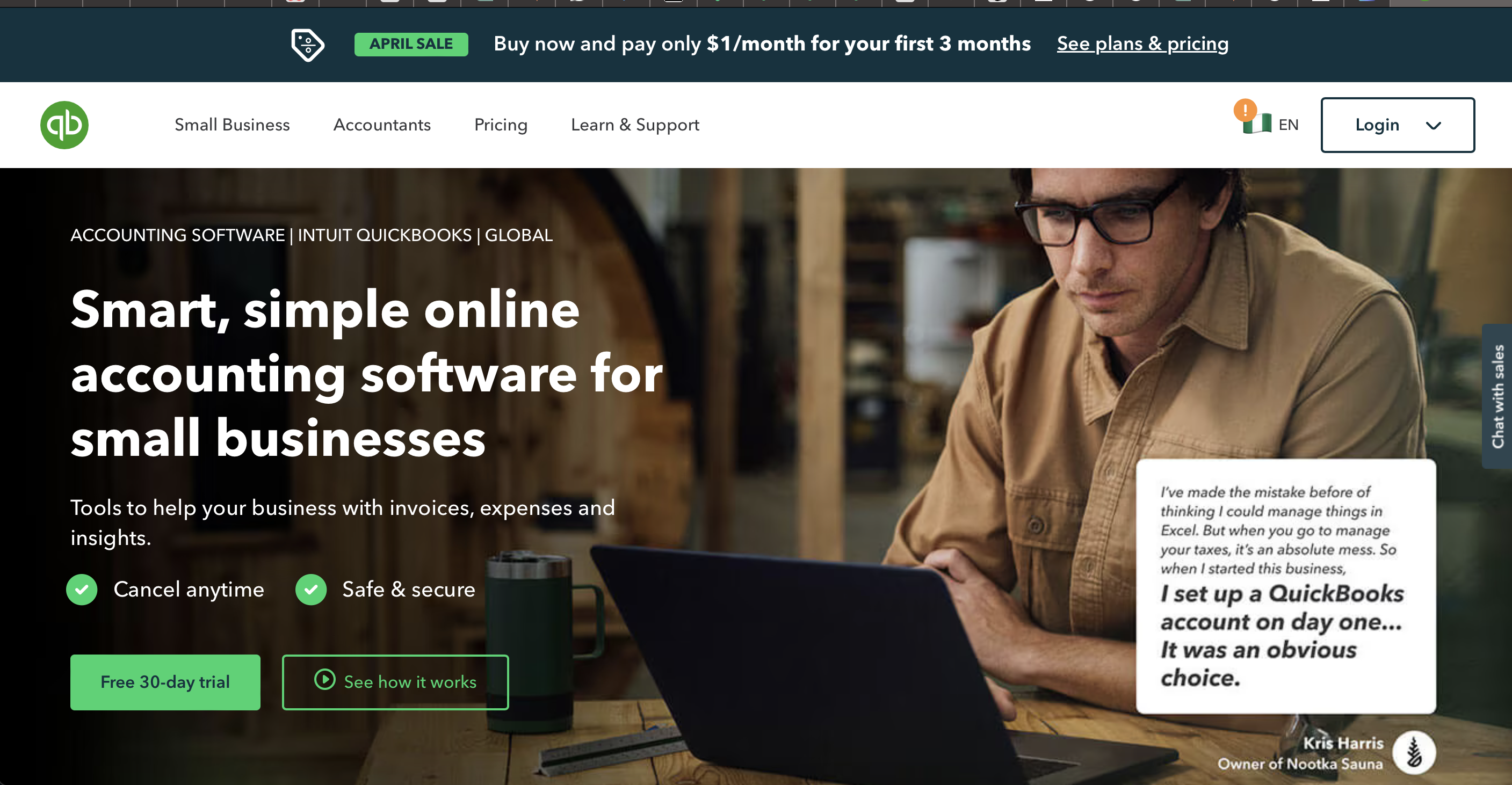
For example, let’s see how QuickBooks leverages the Hero’s Journey framework on their website. The Hero’s Journey Framework is a simple way to think about stories. It imagines the hero (or main character) going on an adventure to achieve a goal. We can use this adventure to make website visitors take actionable steps. Here’s how:
- Call to Adventure: Begin by showing visitors where they currently stand and the issues they’re dealing with. This sets the stage for their journey on your site. For example, QuickBooks doesn’t just say, “We help manage finances.” They showcase the transformed life possible with their software. Images of smiling business owners working confidently and charts depicting growth pique the visitor’s desire for a similar outcome.
- The Journey Begins: Use eye-catching images or interesting content to show how your product or service can help solve their problems. This grabs their attention and gets them involved in the adventure. QuickBooks does this well on its homepage, showing a stressed person surrounded by invoices and receipts.
- Meeting the Mentor: Acknowledge any concerns or doubts they might have, such as worries about cost or uncertainty. Position yourself as the expert who can guide them through these concerns. QuickBooks positions itself as the trusted advisor. Testimonials from satisfied customers and informative articles establish them as a knowledgeable guide for small business finance management.
- Crossing the Threshold: Make it easy for visitors to take the next step by offering clear options, like a free trial or a “Learn More” button. This helps them continue their journey with your brand. QuickBooks, for example, provides straightforward calls to action such as “Start a free trial” or “Get a personalized demo,” guiding visitors toward overcoming their financial management challenges.
Visual Storytelling
Pictures and videos are super strong tools for your website! They have the power to evoke feelings, convey messages instantly, and leave a lasting impression on visitors. For instance, picture a happy family enjoying a sunny beach vacation. That image instantly captures the essence of relaxation and joy that dove provides.
Pick pictures that represent your brand and resonate with your audience. Use videos to explain complex concepts, like showcasing your software’s features in a product demo, which is more effective than plain text. Deliberate visual choices are key. Opt for visuals that convey your message clearly, reinforcing your brand identity and ensuring lasting recall among visitors.

For example, Dove champions diversity and body positivity through its visuals. They showcase images of real people of all shapes, sizes, and ethnicities, reinforcing their message of inclusivity and self-acceptance.
Interactive Storytelling
Don’t just tell your brand story – invite visitors to live it! Turn them from passive viewers into active participants in your adventure. Calls to action (CTAs) are more than just buttons. Think of them as guideposts on an adventure. Don’t use generic “Learn More” buttons. Instead, make your CTAs clear, exciting, and directly tied to your story. For example, a website following the Hero’s Journey might have a CTA like “Find Your Perfect Adventure,” guiding users to the next step in their quest. Place these CTAs strategically to keep visitors engaged and moving forward with your story.
Also, make it easy for visitors to follow along, a user-friendly interface is key for a smooth interactive storytelling experience.
Here’s how to make it easy for visitors to follow along:
- Clear Navigation: Don’t confuse your visitors! Make sure your navigation menus are clear, and your website is well-organized. Think of it like chapters in a book. Visitors should be able to easily follow the flow of your story.
- Visual Cues: Use design to help people understand your story. Imagine setting the stage in a play. Use bigger fonts and contrasting colors to highlight important parts of your story, just like a spotlight on an actor. By making things clear and easy to follow, your website’s interactive story can truly come alive!
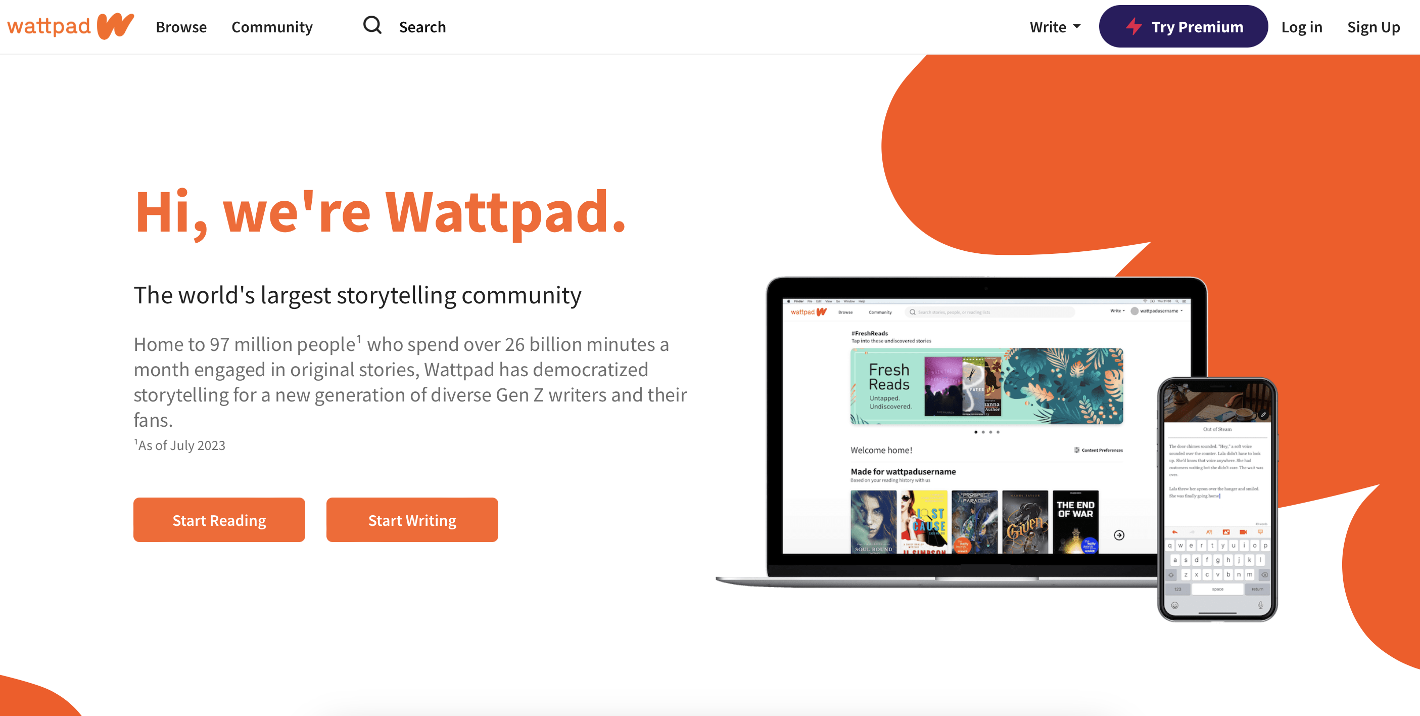
For example, Wattpad is a prime example of interactive storytelling, engaging users to become active participants in the narrative. With compelling calls to action (CTAs) like “Read Next Chapter” and a user-friendly interface, Wattpad seamlessly guides readers through captivating stories.
Gamification
Have you ever gotten so into a game that you lost track of time? Websites can be like that, too! We can use game ideas to make websites more engaging. This is called gamification.
Think about points, badges, and leaderboards you might see in a game. Websites can use these things, too! They can reward users with points for doing things on the website, like watching videos or completing tasks. Badges can be like little trophies for reaching goals. Leaderboards show how users compare to each other, making it a friendly competition. All of this makes using the website more exciting and helps users stay interested.
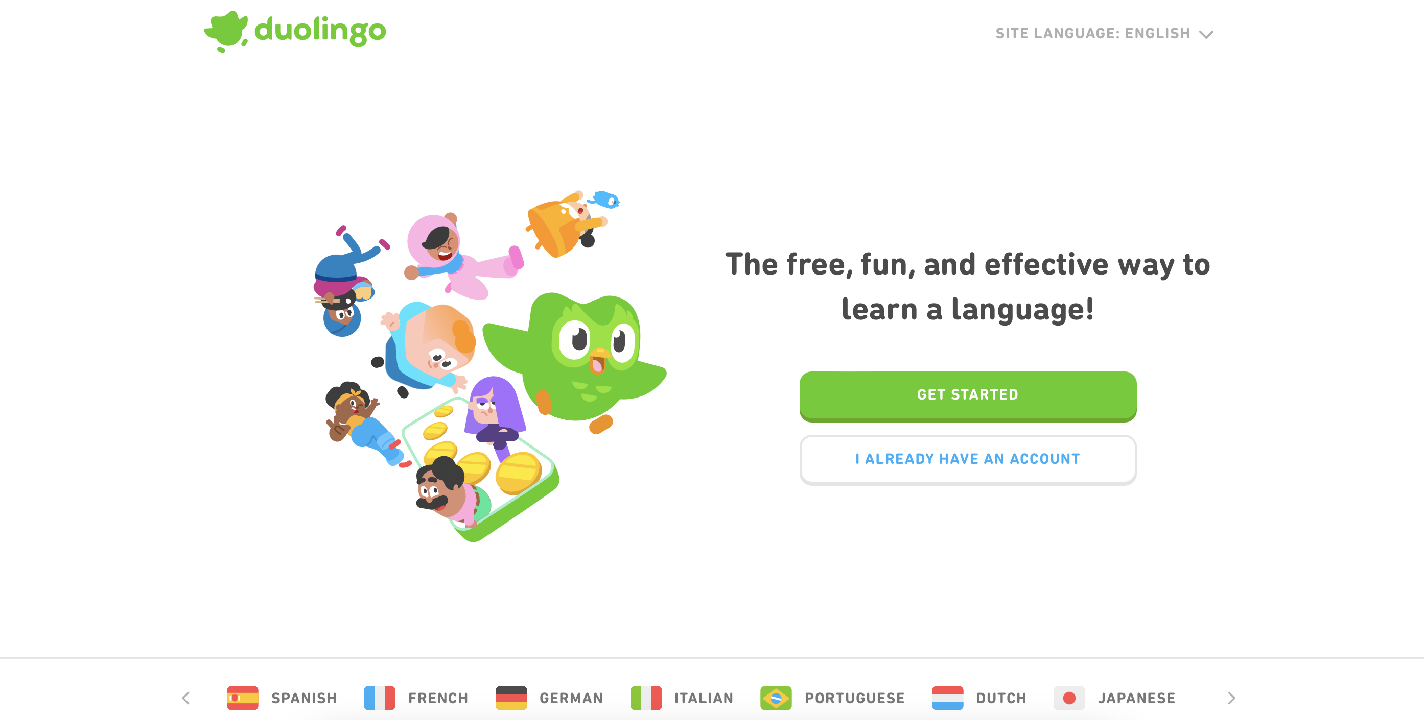
Take Duolingo, the language learning app, for instance. It’s a pro at gamification. You earn points for finishing lessons, get badges when you hit goals and can compete with friends on leaderboards. This fun setup keeps users hooked, turning language learning into an exciting journey.
By adding gamification to your website, you can turn it from a dull info hub into an interactive storytelling adventure. Users dive into the story, driven to explore, learn, and reach their goals.
Practical Demonstration
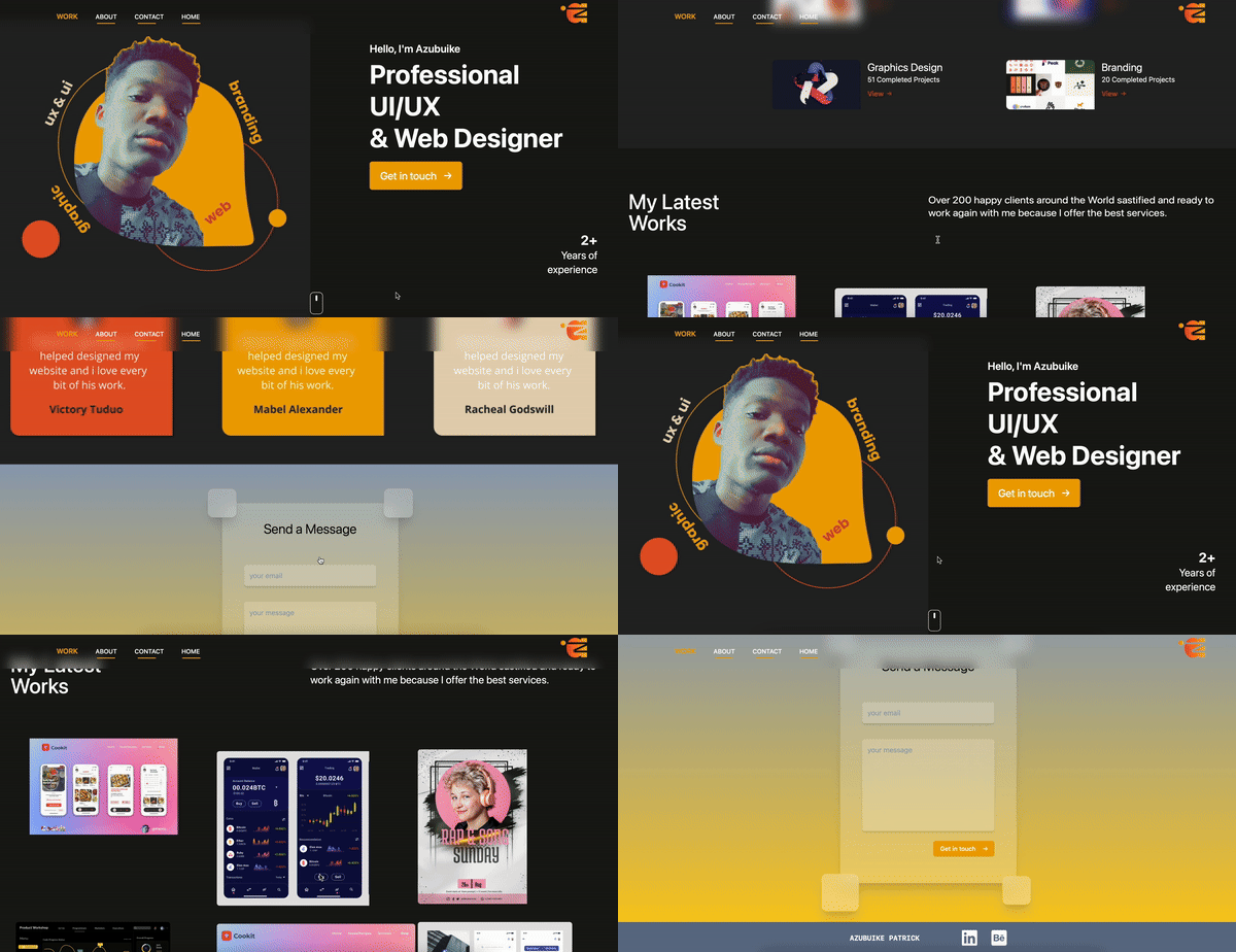
Let’s take a step-by-step approach to transforming a real portfolio website into a captivating narrative using storytelling techniques. We’ll dissect the portfolio of Azubuike, a close friend of mine. He has given me permission to analyze and identify areas where storytelling can enhance user engagement in his portfolio.
Define Your Hero and Their Journey
Before you create your story, know who your ideal clients are. Are they design agencies, tech startups, or freelancers? What challenges do they face? Do they need a designer who understands their brand or has expertise in specific software?
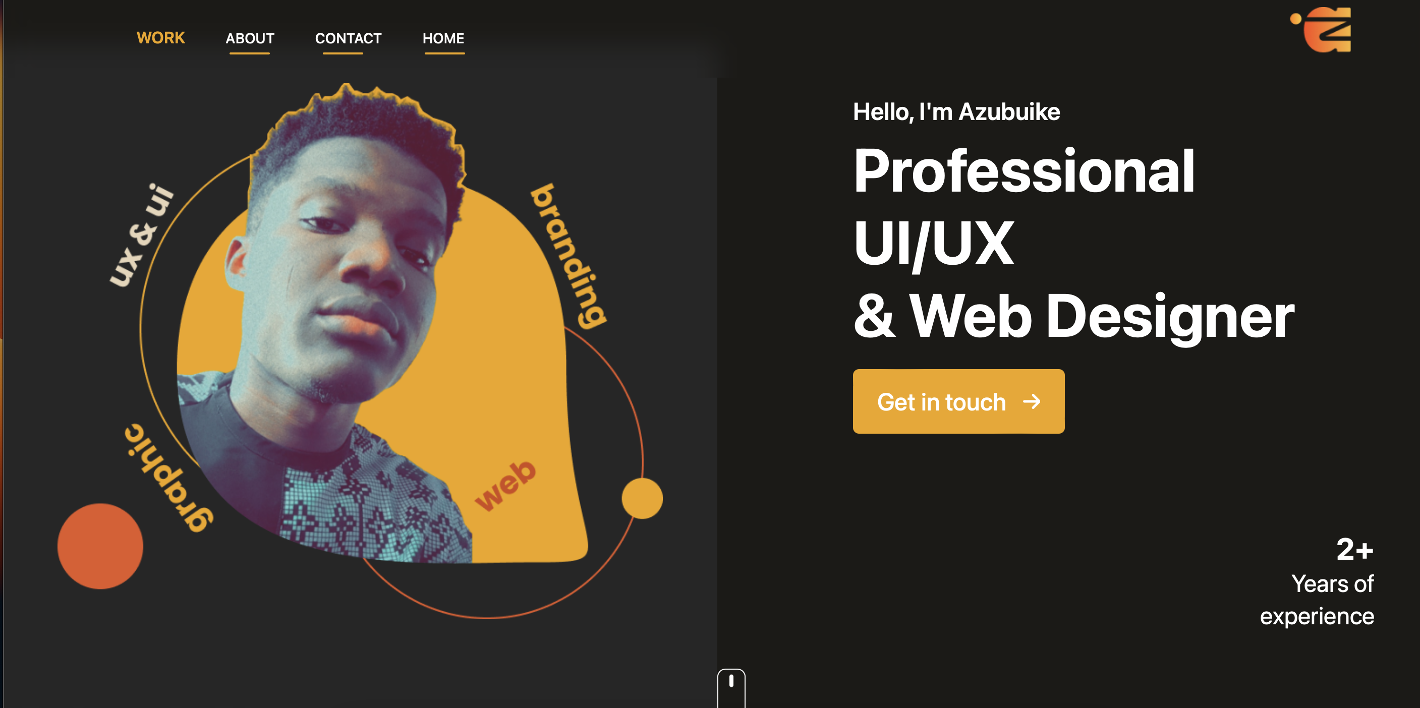
Azubuike’s portfolio is good, but it could focus more on its target audience. The extra elements in his image might confuse people. While being versatile is good, consider targeting a specific industry or niche to create a clearer narrative. This helps potential clients understand your expertise better.
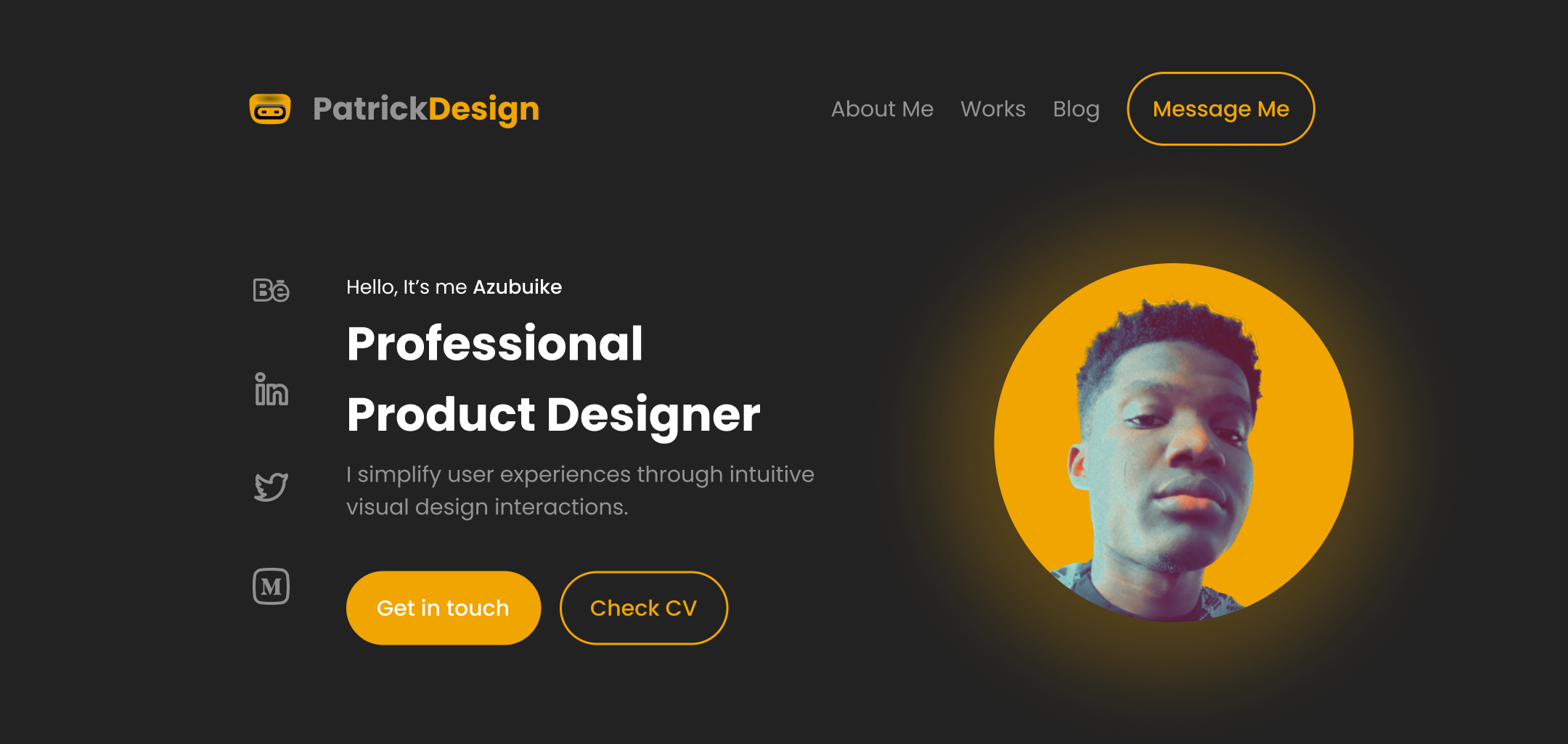
Now, let’s simplify the main image. Make it clear what Azubuike specializes in, like a clean, modern design with hints of his skills. This strengthens his message and avoids confusion.
The revised design:
Create a Compelling Website Copy
Your website text should be interesting and engaging, not boring! Instead of just listing your skills, use clear descriptions to show what you’re good at. Explain how you’ve used those skills to help clients solve problems or achieve specific goals.
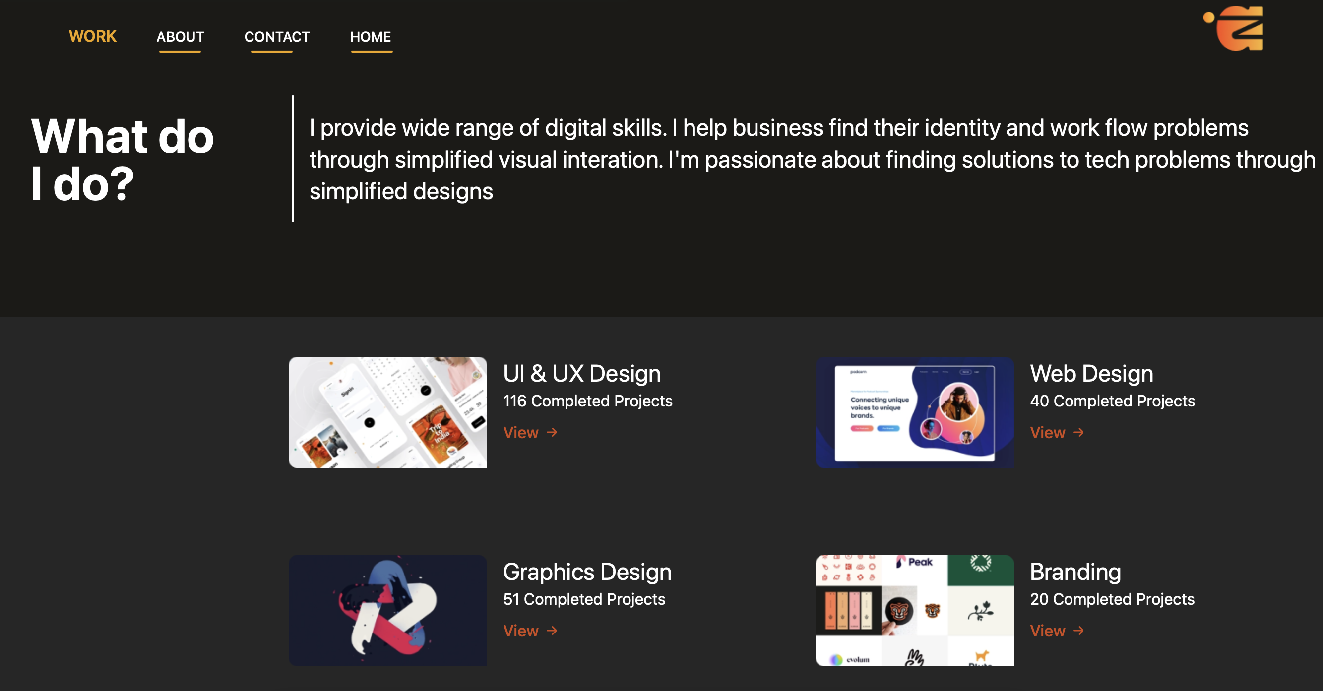
For example, Azubuike’s website uses bullet points to list skills in the “About Me” section. This doesn’t tell a story or connect with the reader.
Azubuike could rewrite this section to be a short story. Imagine something like: “I love designing websites that are easy to use. Once, I helped a local business redesign their website, and it led to a 20% increase in sales! Seeing this impact made me want to help others achieve similar success.” This personal story shows his expertise and its impact in a way that’s much more interesting.
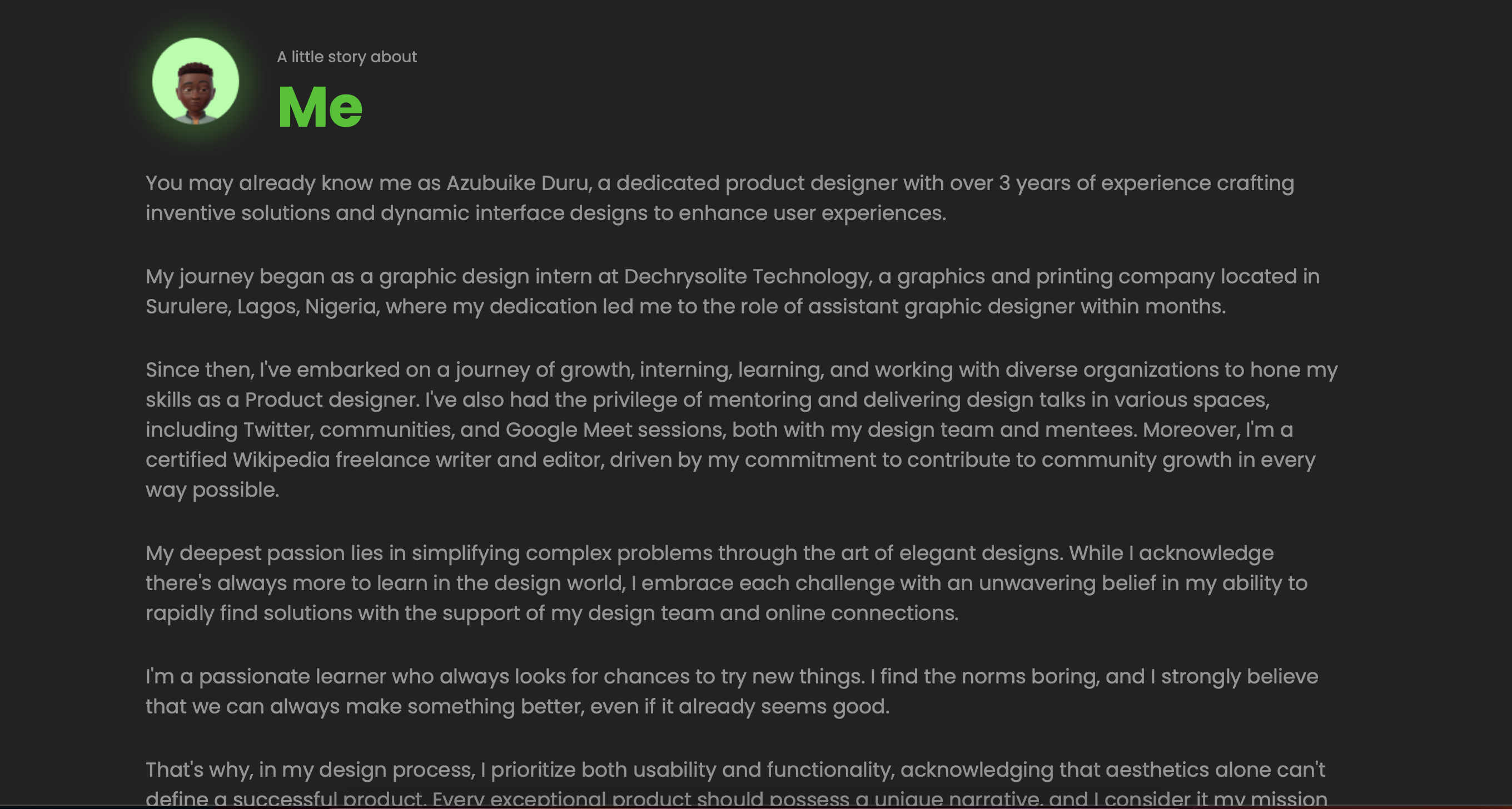
Alternatively, Azubuike could enhance the personal touch by featuring a picture of himself and his family on vacation or engaging in an activity, conveying a sense of responsibility and dedication to both his loved ones and his work.
Harness the Power of Visuals
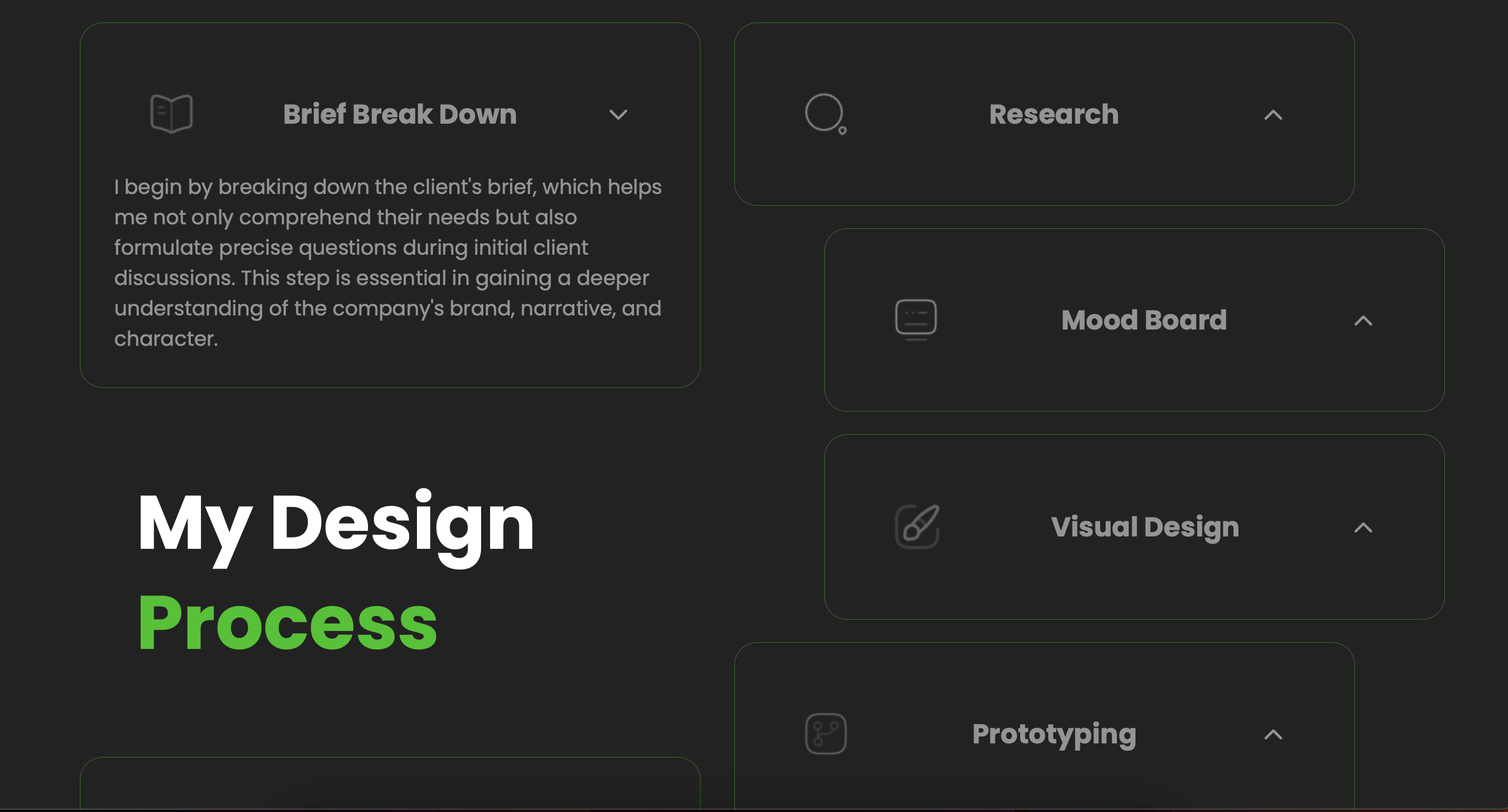
Choose high-quality visuals that directly tie back to your narrative. Showcase your work in a way that reflects your brand personality. They can help you tell your story and show off your skills better than words alone.

Azubuike’s portfolio features strong visuals showcasing his design projects. Azubuike could also consider adding a section explaining his design process for a specific project. This would provide a deeper look into his approach and further engage the user.
Earn Visitors Trust
On Azubuike’s portfolio, it’s important to build credibility. Using the same testimonial message from different clients might seem suspicious and raise doubts about their authenticity. Effective testimonials should show unique feedback from satisfied customers. Additionally, highlighting relevant awards or certifications and providing clear information about Azubuike’s background can help gain the trust of potential clients.
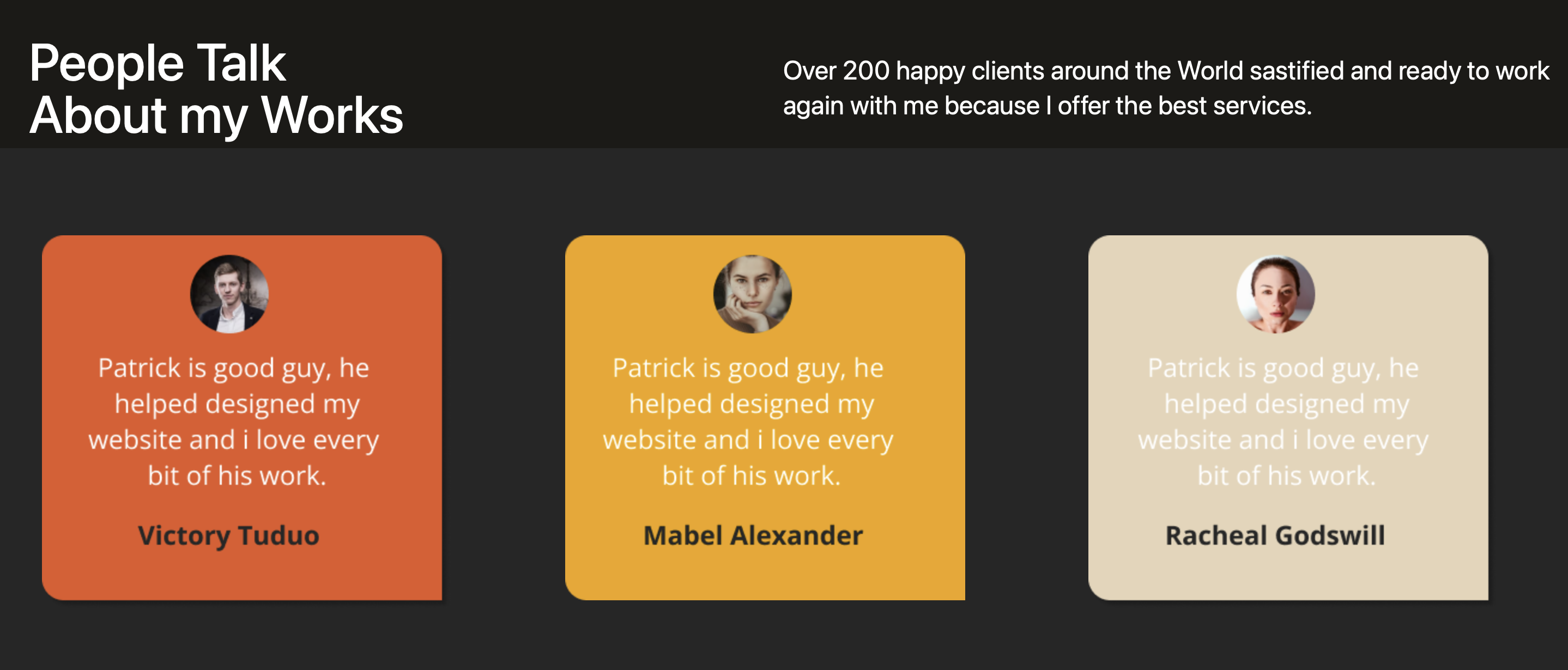
To enhance the portfolio, let’s prioritize a user-friendly design layout that makes it easy for visitors to read and navigate testimonials. Also, only use genuine and unique reviews from clients or business partners to strengthen credibility.
Like this:

Conclusion
In wrapping up, storytelling is a game-changer in web design. It’s a powerful force that can completely reshape how users engage with websites. Throughout this discussion, we’ve seen how storytelling taps into something deep within us, forging connections and making experiences memorable.
By understanding the psychology behind storytelling, designers can create websites that draw users in and keep them hooked. From the way content is structured to the visuals used, every aspect plays a role in creating a compelling narrative.
Looking ahead, it’s clear that storytelling will remain at the forefront of web design. As web designers, embracing this power can lead to more impactful and meaningful digital experiences for users.
Let’s remember the significance of storytelling in web design. It’s not just about making pretty websites; it’s about creating experiences that resonate and leave a lasting impression.
Reference
- The Importance of Storytelling in Web Design
- The Art of Storytelling In Web Design
- Why a business should use storytelling in web design
- Three Websites Using Storytelling
Truly understand users experience
See every user interaction, feel every frustration and track all hesitations with OpenReplay — the open-source digital experience platform. It can be self-hosted in minutes, giving you complete control over your customer data. . Check our GitHub repo and join the thousands of developers in our community..

