What is AMP (Accelerated Mobile Pages)?

AMP is an acronym for Accelerated Mobile Pages. The AMP Open-Source Project created AMP, an open-source HTML framework. Google originally developed it to compete with Apple News and Facebook Instant Articles. AMP is designed to make web pages load more quickly and is suited for mobile web usage. AMP pages may be stored in a CDN’s cache, such as the AMP caches offered by Cloudflare or Microsoft Bing, allowing for faster page delivery. By enabling you to design online pages and advertisements that are consistently quick, attractive, and high-performing across devices and distribution channels, the AMP project seeks to “build the future web together”.
You probably already visited an AMP page; you simply weren’t aware of it. You might have only noticed how quickly the website loaded after you clicked. Earlier, a lightning bolt icon ⚡ was used to identify AMP pages in the search results but was later dropped.
AMP page as compared to a normal web page :

As AMP limits HTML/CSS and JavaScript, it enables the quicker rendering of mobile web pages, which explains why AMP sites load immediately. For quicker load speeds on Google search, AMP sites are automatically stored by Google AMP Cache in contrast to standard mobile pages.
Users have specific expectations when using a mobile device; they want quicker, more relevant, and more meaningful experiences. AMP is your best option if you want to meet these expectations for your target audience.
Google initiated the AMP project to develop a framework that would outline precisely how to produce optimized mobile web page experiences. More than 4 billion AMP pages have been produced across 25 million domains since its inception.
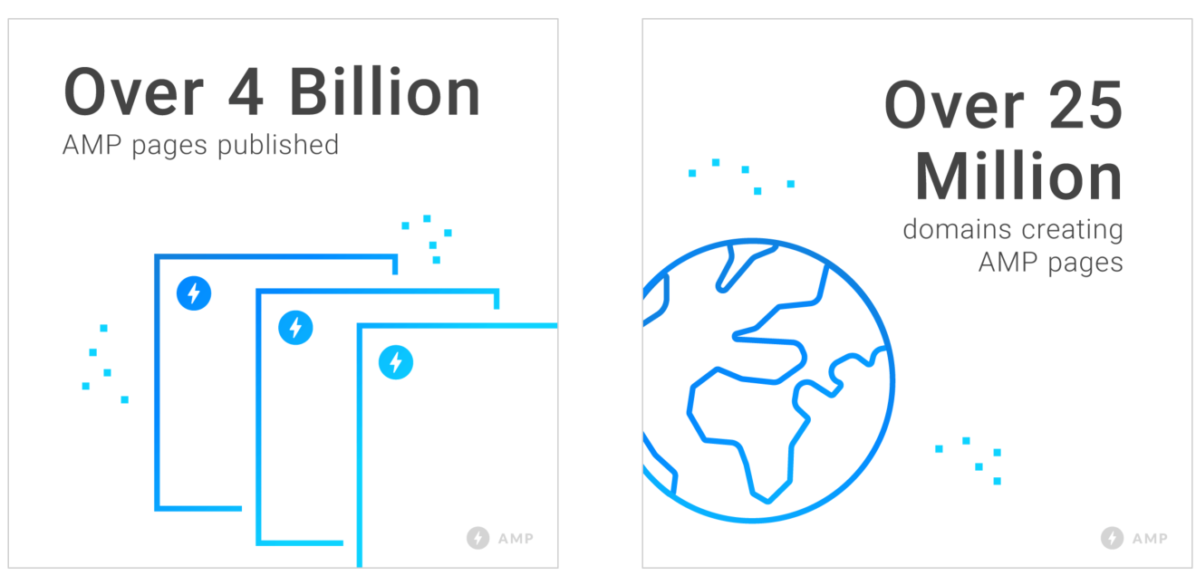
Source: https://blog.amp.dev/2017/10/19/amp-two-years-of-user-first-webpages/
For a speedier mobile browsing experience, AMP enables businesses to build simplified, clear, and relevant versions of their websites. Users engage more with AMP pages than conventional mobile web pages, as AMP pages load around four times quicker than standard web pages. With the reasons for adopting AMP pages now clear, let’s examine how AMP operates.
How does AMP work?
The three basic elements form the basis of AMP pages:
AMP HTML
The most basic AMP HTML file appears as follows:

Most tags in AMP HTML are standard HTML tags, although certain HTML tags have AMP-specific tags in their place. These distinct tags, known as AMP HTML components, make it straightforward to execute common tag patterns in a performant way. The HTML element helps search engines and other platforms find AMP pages. Your page can have both an AMP version and a non-AMP version or only the AMP version.
AMP JavaScript (JS)
The AMP JS library ensures that AMP HTML pages are rendered quickly. A quick page rendering is ensured by the JS library’s implementation of all the AMP’s best performance techniques, including inline CSS and font triggering. This controls resource loading and provides you with custom HTML elements.
Everything from the external resources is made asynchronous by AMP JS, thus nothing on the page can stop anything from rendering. Other performance-enhancing methods employed by the JS include sandboxing for all iframes, pre-calculating the layout of each page element before resource loading, and removing sluggish CSS selectors.
AMP Cache
The Google AMP Cache provides cached AMP HTML pages. All valid AMP documents are sent via the proxy-based content delivery network(CDN) known as the AMP Cache. The Cache automatically enhances page speed by retrieving and caching AMP HTML pages.
To maintain maximum page efficiency, JS files and all pictures are loaded by AMP Cache from the same origin through HTTP 2.0. A built-in validation system in AMP Cache ensures that a page is guaranteed to function and is not dependent on outside factors that can cause it to load slowly. The validation system checks several claims to see if the page’s markup complies with the AMP HTML specifications.
Each AMP page has a different validation system version accessible alongside it. This version allows you to view the intricate changes in your code that might affect performance and user experience by logging validation issues straight into the browser’s console as the page is loaded. To enable rapid page loading, AMP’s three essential components operate together.
Pros of AMP
Mobile users prefer to spend more time on AMP-enabled web pages since AMP loads rapidly and remove many irritating parts of a website (like advertisements). This stay time transmits positive site signals to Google, enhancing your ranks.
Visitors may interact more readily with your website, thanks to AMP. A unique, prominent position in the mobile search results is reserved for AMP content. Increased prominence in the AMP carousel will boost the number of clicks to your website. You gain a competitive edge using AMP. You’ll find that your keyword ranks surpass your rivals if you include AMP before them.
Captivates audiences
As AMP sites often load in under a second, users can rapidly find what they’re searching for when they land on an AMP website. Because the website loads quickly, visitors spend more time on it.
Maximises profits
Your conversions decrease by 12% for every extra second it takes for your website to load. This implies that if you want to engage audiences and boost your ROI, you must make sure that your mobile website meets the users’ speed expectations. You can provide consumers with a quicker experience anywhere using the AMP framework, including on advertising, landing pages, and websites.
Keep your control and flexibility
When you use the AMP format, you may benefit from the web components that are optimized for AMP while still maintaining your own identity. You may utilize dynamic content to fetch data as necessary and CSS to modify the design of your website.
Simplify your procedures by reducing the complexity
Making AMP pages is a really easy and uncomplicated procedure. If you use a CMS like Drupal or WordPress, you have the option of converting your whole archive. No specialized knowledge is required to optimize the code for each AMP page because the AMP format is portable, and the AMP pages always load quickly, no matter how the user accesses them.
Increase your ROI
Once generated, AMP pages may be simultaneously published across multiple different platforms at the same time. Due to the ability to have your advertisements delivered on both AMP and non-AMP pages, you can create your ads only once and give an unforgettable brand experience across the board.
Make the future sustainable
The AMP project safeguards the web’s future by assisting everyone in providing a better, quicker mobile user experience. Joining the AMP project will allow you to create a long-lasting future for your company on a faster, more open web.
Enhance the user experience
Naturally, implementing faster mobile landing pages will result in significantly improved user happiness, which is the most evident benefit. When one in every two users doesn’t bother waiting even 10 seconds for a website to load, speeding up the process by 15-85% can significantly impact user satisfaction.
Get a boost in SEO
Page speed and mobile responsiveness are factors considered by Google’s algorithm. Your page will be rated better in search engine results if it loads quickly on mobile.
CONS of AMP
The following are the drawbacks of AMP.
Slow-loading video material
With AMPs, not all material is displayed with lightning speed. If a significant amount of the material on your website is video, AMP might not serve it as rapidly as other types of content. Videos will render at their own, typically slower, pace.
Hard for Non-Developers
It is challenging to put AMP into practice without a WordPress plugin for non-programmers. There is no straightforward AMP plugin available on any other CMS (content management system), so utilizing AMP on other CMS platforms requires coding knowledge.
Widgets & Features are Limited
A minimal amount of CSS, HTML, and JavaScript are used by AMP. As a result, only a limited number of widgets are available on AMP. In other words, you are unable to include additional widgets and features on your mobile AMP page, like Facebook “like” boxes and opt-in email forms.
Limited Support for Analytics
Only Google Analytics is supported by AMP for WordPress users. Other analytics tools like Adobe Analytics, Heatmap Analytics, Crazy Egg Analytics, and Kissmetrics Analytics are not flexible enough to be accepted.
No JavaScript from a third party
You must say goodbye to the analytics and monitoring tools that let you provide highly targeted advertising experiences since you are unable to employ third-party JavaScript. Additionally, because Google’s lighter version of JavaScript does not support data transfers, AMP pages cannot employ page components that can.
No tracking via Google Analytics
One of the reasons AMP sites load so quickly is that Google serves visitors a cached version of the pages rather than requesting data from your servers. Although the cache speeds up page load times, Google Analytics does not monitor user visits unless specific adjustments are made, and unique tracking codes are added to your AMP pages.
Why would devs work with AMP?
The following are a few scenarios in which developers would consider choosing AMP over normal pages.
When a large percentage (or all) of your traffic comes from mobile devices
The transition from desktop to mobile internet usage patterns contributed to the creation of AMP. In reality, mobile devices now account for over 54% of all internet usage worldwide, with desktop usage falling to roughly 46%.
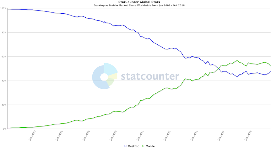
Source: https://gs.statcounter.com/
Providing for mobile web visitors is more crucial than ever. If mobile devices account for the vast majority of visitors to your website and you want to maintain a competitive edge in the mobile market, AMP has to be on your radar. It’s the ideal method to maximize your mobile-first strategy, bringing in more mobile visitors and keeping it there with improved page performance and SEO.
Whenever your page loads slowly
Since the main objective of AMP is to increase the speed at which mobile pages load, this is one of the more apparent use cases for the framework. Websites with AMP support load almost instantly, in only tenths of a second, as opposed to the typical 22 seconds it takes for regular mobile pages to load.
This may occur in several different ways, a few of which are as follows:
- Both scripts and content load concurrently
- Font triggering that works well
- Only GPU-accelerated animations
- Resource loading with a priority
Faster page loads result in improved user experiences for website visitors. In terms of business, it may be the difference between making a sale, winning over a client, or boosting profits. This is supported by data from Amazon, Walmart, and Yahoo:
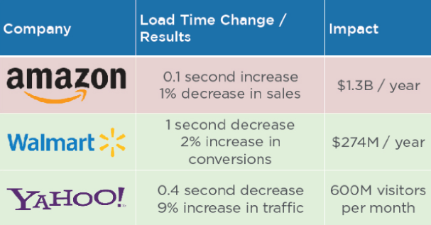
All three samples show how even tenths of a second may affect each site, proving that AMP pages significantly improve user experience.
When you want to lower your bounce rate
Google claims that 53% of users leave pages that take longer than three seconds to load, and 79% leave sites that perform poorly.
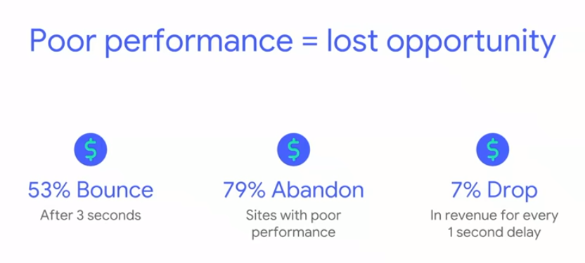
Source: https://www.google.com/
This implies that with the best site performance, you just have 3 seconds to grab a user’s attention who liked and clicked your ad. Faster page speeds enhance overall usability and engagement, which encourages users to stay on your site longer. AMP for websites is essential in this situation.
Think about these three instances:
According to Forrester Consulting’s Total Economic Impact study, AMP results in a 10% boost in traffic and a 2x increase in time spent on a page (commissioned by Google). Due to AMP sites loading faster than non-AMP pages, Twitter saw a 10% decrease in bounce rates:
According to research from Chartbeat, users interact with AMP material for an average of 48 seconds, which is 35% longer than the average amount of time for mobile web content (just 36 seconds).
All of the above proves that an enhanced user experience with AMP is important for grabbing and retaining users’ attention while reducing the bounce rate.
When you invest a lot of money in paid advertisements
In keeping with the Amazon statistics from #2, an increase in page load time of only one-tenth of second results in a $1.3 billion decrease in sales for the e-commerce giant. This demonstrates how significantly AMP’s quick page load times may affect income.
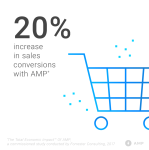
Comparing e-commerce sites to non-AMP web pages, e-commerce sites often see a 20% boost in sales conversions:
Source: https://blog.amp.dev/2017/10/19/amp-two-years-of-user-first-webpages/
If your Quality Score and page experience is both too low
Conversions depend on both Quality Score and the post-click landing page experience. Your advertising gain from Quality Score by:
⦁ Lowering CPC ⦁ Increasing eligibility for ad extensions and other ad formats ⦁ Improve Ad position
Additionally crucial is a good post-click landing page experience. Providing a wonderful experience each time increases the likelihood that visitors will come back, as it sometimes takes several interactions with your website before someone decides to finish a conversion.
Fortunately, AMP post-click landing pages can assist in simultaneously resolving two issues: They improve the user experience for visitors, which inevitably results in a higher Quality Score.
How to create AMP?
Let us now have a look into how exactly an AMP is created.
Starter Code
<!doctype html>
<html amp lang="en">

<head>
  <meta charset="utf-8">
  <script async src="https://cdn.ampproject.org/v0.js"></script>
  <title>Hello, AMPs</title>
  <link rel="canonical" href="https://amp.dev/documentation/guides-and-tutorials/start/create/basic_markup/">
  <meta name="viewport" content="width=device-width,minimum-scale=1,initial-scale=1">
  <style amp-boilerplate>
    body {
      -webkit-animation: -amp-start 8s steps(1, end) 0s 1 normal both;
      -moz-animation: -amp-start 8s steps(1, end) 0s 1 normal both;
      -ms-animation: -amp-start 8s steps(1, end) 0s 1 normal both;
      animation: -amp-start 8s steps(1, end) 0s 1 normal both
    }

    @-webkit-keyframes -amp-start {
      from {
        visibility: hidden
      }

      to {
        visibility: visible
      }
    }

    @-moz-keyframes -amp-start {
      from {
        visibility: hidden
      }

      to {
        visibility: visible
      }
    }

    @-ms-keyframes -amp-start {
      from {
        visibility: hidden
      }

      to {
        visibility: visible
      }
    }

    @-o-keyframes -amp-start {
      from {
        visibility: hidden
      }

      to {
        visibility: visible
      }
    }

    @keyframes -amp-start {
      from {
        visibility: hidden
      }

      to {
        visibility: visible
      }
    }
  </style><noscript>
    <style amp-boilerplate>
      body {
        -webkit-animation: none;
        -moz-animation: none;
        -ms-animation: none;
        animation: none
      }
    </style>
  </noscript>
</head>

<body>
  <h1 id="hello">Hello World!</h1>
</body>

</html>
The body content is rather simple, but the head has some extra code.
| Rule | Description |
|---|---|
<!doctype html> | HTML standard |
<html amp> tag | AMP page identifier |
<head> and <body> tags | Optional in HTML but compulsory in AMP |
Use <meta charset="utf-8"> right after <head> tag | Encoding identifier for the page |
Use <script async src="https://cdn.ampproject.org/v0.js"></script> tag inside the <head> tag. As a best practice, you should include the script as early as possible | Includes and loads the AMP JS library |
Use <link rel="canonical" href="$SOME_URL"> tag inside their <head> | Href points to the page itself |
Use <meta name="viewport" content="width=device-width" /> tag inside their <head> tag | Used to create Responsive AMP |
Use AMP boilerplate code in their <head> tag | CSS boilerplate is used to initially hide the content until AMP JS is loaded |
Including an Image
The majority of HTML tags may be used directly in AMP, but some, like the <image> element, need to be swapped for their AMP equivalents. Using the <amp-img> element, we’ll add an image to our website using the AMP method. The code below should be copied and pasted into the body.
<amp-img
  src="https://source.unsplash.com/random/600x400"
  width="600"
  height="400"
></amp-img>;
Make your image responsive
The layout method of AMP is one of its strong advantages. It is relatively simple to develop responsive pictures that automatically alter their size to the available space on a page, thanks to AMP’s layout system. The finest part is that it accomplishes this while ensuring layout consistency and preventing content jumps. The <amp-img> element can be easily modified to add layout=“responsive” to our picture, making it responsive right away. Change the preview window size in the playground after upgrading your amp-img to match the code below to test it out for yourself.
<amp-img
  src="https://source.unsplash.com/Ji_G7Bu1MoM/600x400"
  width="600"
  height="400"
  layout="responsive"
></amp-img>;
Now, our picture is tightly contained within our viewport and changes size in response to the viewport size!
Modify layout
While non-AMP pages frequently style elements using CSS, AMP adheres to tighter guidelines to prevent content layout shifts and other performance-related issues. Every AMP component has a layout, and every layout has various requirements for dimension declaration. For instance, the flexible style in our image necessitates width and height. A validation error will appear if you delete the width property from the playground! But don’t worry—we can remedy this in several ways! Restoring the width attribute is one option; however, changing the established layout attribute is another. Aim to replace “responsive” with “fixed-height.”
<amp-img
  src="https://source.unsplash.com/Ji_G7Bu1MoM/600x400"
  height="400"
  layout="fixed-height"
></amp-img>;
Our validation mistake has been eliminated there. This kind of layout flexibility enables us to work with what we already know, like a certain height but not the width, while still ensuring a positive user experience.
Adding style
Since AMP pages are just web pages, any style of the page and its components is done with the help of common CSS attributes. However, AMP mandates that all CSS be included within a special style element called style <amp-custom> in the document’s head. The document’s “head” section must have the <style amp-custom> tag. If necessary, styles may also be specified within the text. Try including these styles on your page:
<style amp-custom>h1 {
  margin: 1rem;
}

body {
  background-color: blue;
}

</style>
Plug-and-play components
A wide library of AMP components may be used to build both typical widgets and distinctive web elements. For instance, a user interface control to gather and save a user’s cookie consent; or an accordion that collapses and extends content portions. We’ll utilize amp-base-carousel to transform the single picture on our initial page into an image carousel.
Import the script
The amp-base-carousel component is an expanded component as opposed to amp-img. Specifically only loading javaScript for components a page requires keeps AMP sites small and light. We must import the script tag of the amp-base-carousel component to use it. Copy the tag below and paste it into in the document’s header.
<script
  async
  custom-element="amp-base-carousel"
  src="https://cdn.ampproject.org/v0/amp-base-carousel-0.1.js"
></script>;
Add a second <amp-img> element behind the first one, then enclose both in <amp-base-carousel> tags, as seen below:
<amp-base-carousel width="600" height="400" layout="responsive">
  <amp-img
    src="https://source.unsplash.com/Ji_G7Bu1MoM/600x400"
    width="600"
    height="400"
    layout="responsive"
  ></amp-img>
  <amp-img
    src="https://source.unsplash.com/4yCXNMLP9g8/600x400"
    width="600"
    height="400"
    layout="responsive"
  ></amp-img>
</amp-base-carousel>;
Component attributes
You may have seen that we have layout, width, and height declared, which are common properties. AMP uses attributes everywhere, just as in HTML. However, AMP makes use of extra properties to modify the behavior of components. Some are general elemental characteristics, while others are unique to certain components. Let’s incorporate more photos and add the loop feature, setting it to true:
<amp-base-carousel loop="true" width="600" height="400" layout="responsive">
  <amp-img
    src="https://source.unsplash.com/Ji_G7Bu1MoM/600x400"
    width="600"
    height="400"
    layout="responsive"
  ></amp-img>
  <amp-img
    src="https://source.unsplash.com/4yCXNMLP9g8/600x400"
    width="600"
    height="400"
    layout="responsive"
  ></amp-img>
  <amp-img
    src="https://source.unsplash.com/QrgRXH81DXk/600x400"
    width="600"
    height="400"
    layout="responsive"
  ></amp-img>
  <amp-img
    src="https://source.unsplash.com/8QJSi37vhms/600x400"
    width="600"
    height="400"
    layout="responsive"
  ></amp-img>
</amp-base-carousel>;
Specific to amp-base-carousel, the loop property aids in defining its behavior. We may add more characteristics to our carousel, like auto-advance!
Actions and events
Interactive user experiences are encouraged by AMP. However, it’s merely carried out a little bit differently than in non-AMP sites for efficiency and user experience assurances. The on property in AMP is used to add event handlers to elements. We’ll log a fundamental event for our first page—a user click—and then reply with the hide action.
Create a button and give it the on property.
<button on="">Goodbye World!</button>;AMP employs the event type tap for a user’s mouse click on a desktop computer or touch on a mobile device.
<button on="tap">After that, we include a colon and specify the target’s id, on which our operation should have an impact. After the colon character, let’s add “hello” so that our h1 id="hello"> element will be hidden.
<button on="tap:hello">The action is defined after the last period. It’s concealed in this instance.
<button on="tap:hello.hide">Now, the <h1> element is hidden if we click our button!
Final Page
You’ve successfully created your first AMP page; congrats! It should be like the illustration below :

<!doctype html>
<html amp>

<head>
  <meta charset="utf-8" />
  <title>My AMP Page</title>
  <link rel="canonical" href="self.html" />
  <meta name="viewport" content="width=device-width" />
  <style amp-boilerplate>
    body {
      -webkit-animation: -amp-start 8s steps(1, end) 0s 1 normal both;
      -moz-animation: -amp-start 8s steps(1, end) 0s 1 normal both;
      -ms-animation: -amp-start 8s steps(1, end) 0s 1 normal both;
      animation: -amp-start 8s steps(1, end) 0s 1 normal both
    }

    @-webkit-keyframes -amp-start {
      from {
        visibility: hidden
      }

      to {
        visibility: visible
      }
    }

    @-moz-keyframes -amp-start {
      from {
        visibility: hidden
      }

      to {
        visibility: visible
      }
    }

    @-ms-keyframes -amp-start {
      from {
        visibility: hidden
      }

      to {
        visibility: visible
      }
    }

    @-o-keyframes -amp-start {
      from {
        visibility: hidden
      }

      to {
        visibility: visible
      }
    }

    @keyframes -amp-start {
      from {
        visibility: hidden
      }

      to {
        visibility: visible
      }
    }
  </style><noscript>
    <style amp-boilerplate>
      body {
        -webkit-animation: none;
        -moz-animation: none;
        -ms-animation: none;
        animation: none
      }
    </style>
  </noscript>
  <script async src="https://cdn.ampproject.org/v0.js"></script>
  <script async custom-element="amp-base-carousel" src="https://cdn.ampproject.org/v0/amp-base-carousel-0.1.js"></script>
  <style amp-custom>
    h1 {
      margin: 1rem;
    }

    body {
      background-color: greenyellow;
    }
  </style>
</head>

<body>
  <h1 id="hello">Hello World!</h1>
  <amp-base-carousel loop="true" width="600" height="400" layout="responsive">
    <amp-img src="https://source.unsplash.com/phIFdC6lA4E/600x400" width="600" height="400" layout="responsive"></amp-img>
    <amp-img src="https://source.unsplash.com/WeYamle9fDM/600x400" width="600" height="400" layout="responsive"></amp-img>
    <amp-img src="https://source.unsplash.com/f9qtLeroLNQ/600x400" width="600" height="400" layout="responsive"></amp-img>
    <amp-img src="https://source.unsplash.com/LtnPejWDSAY/600x400" width="600" height="400" layout="responsive"></amp-img>
  </amp-base-carousel>
  <button on="tap:hello.hide"> Goodbye World! </button>
</body>

</html>
Session Replay for Developers
Uncover frustrations, understand bugs and fix slowdowns like never before with OpenReplay — an open-source session replay tool for developers. Self-host it in minutes, and have complete control over your customer data. Check our GitHub repo and join the thousands of developers in our community.
AMP success stories examples
The understated are a couple of examples of success stories of companies that made huge profits by using AMP.
Gizmodo employs AMP pages to make its mobile site three times faster
Since half of Gizmodo’s traffic comes from mobile devices, the website’s speed and clarity are crucial if they want users to interact with their content on these devices. Gizmodo places a strong emphasis on user experience.
The blog employed a variety of optimization approaches to boost mobile engagement, including faster page loads, the elimination of pointless page scripts, slow-loading page components below the fold, and the setup of a fallback font for web fonts. The Gizmodo team still believed that there was room for improvement in the mobile user experience.
Josh Laurito, head of Gizmodo’s data analytics, considered the following to be their primary obstacle:
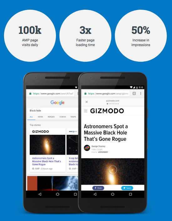
We provided identical (huge) JavaScript & CSS payloads to customers on desktop and mobile, making it challenging to enhance one without impairing the other. Gizmodo used the AMP framework in May 2016 and now publishes all of its content on AMP sites, even making AMP copies of older pieces. This was the solution to their issue. Gizmodo currently has over 24,000 AMP pages, and these pages get 100,000 daily visitors.
Source: https://amp.dev/success-stories/gizmodo
Gizmodo improved user experience by using AMP. Over 80% of Gizmodo’s traffic from AMP sites is new traffic, compared to under 50% of all mobile sessions, and AMP has helped make Gizmodo mobile pages 3x quicker than the normal mobile website. Additionally, AMP has increased the blog’s impressions per page view by 50%.
AMP helps TransUnion enhance conversions
Slow-loading mobile sites was a concern for TransUnion, leading to higher bounce rates and poorer mobile conversion rates compared to desktop conversion rates. To enhance user experience and obtain a high return on investment, the credit reporting agency sought to develop a best-in-class mobile website using their CMS, HP TeamSite.
TransUnion began utilizing AMP with the hopes of improving mobile conversions and lowering cost per order. TransUnion launched AMP pages in a week without having to change the content because their website was already mobile-friendly. In contrast to non-AMP sites that took 7.1 seconds to load on a 3G connection, AMP pages load in just 1.6 seconds. Users spent 2.5 times as much time on TransUnion’s AMP pages, which rapidly started bringing 3% higher conversions and 26% less bounce rate:
A diagram showing the process TransUnion used to design a top-notch mobile website:

Source: https://amp.dev/success-stories/transunion
Myntra, the leading online retailer of fashion and lifestyle goods in India, deployed AMP on all of their primary post-click landing sites on Google since these pages saw the majority of their traffic but had significant bounce rates. The business was pleased with the outcomes of its AMP implementation:
- The page load time was lowered by 65% overall
- The bounce rate fell by 40%
- Higher mobile ROI by a significant margin
Conclusion
AMPs are a wonderful option if your mobile pages have high bounce rates and low visitor engagement due to delayed page load times. By using AMP pages, you can give customers a quicker mobile experience, which lowers bounce rates and boosts conversions. Creating AMP pages increases your chances of conversion when trying to attract mobile users.
The AMP framework uses optimization methods to improve page performance as well as provide consumers with a wonderful mobile experience. You may send optimized, quick, and pertinent landing pages to your visitors by creating AMP ad landing pages.

