XML vs. Jetpack Compose: A Comparison
Mobile App development is a hot topic, and many tools are available. This article will compare two alternatives, XML and Jetpack Compose, both of which can be successfully applied to Android mobile development.

Discover how at OpenReplay.com.
Mobile Application development is a rapidly growing field in Software development as the demand for mobile apps is growing fast. According to the report from Statista, the download of Mobile Apps has been consistently increasing from 140.68 billion downloads in 2016 to 257 billion downloads in 2023. So, as a developer, choosing the path to mobile app development must cause you no regrets.
In this article, we are going to compare User Interface development tools, XML(eXtensible Markup Language) and Jetpack Compose, for Android Mobile apps which dominate the mobile app market by over 80% as per this report. Here, you will gain a better understanding of what XML and Jetpack compose are, compare them, get to know when and why they got into the field of app development, use them comparatively in designing a simple mobile app interface, and finally get to decide which one to stick on for your UI development roles.
To gain a lot from this article, make sure you have Android Studio installed on your machine (PC), have some programming experience, and be a mobile app development enthusiast. Without taking any other seconds, let’s dive right into the most interesting parts;
XML vs. Jetpack Compose in Short
XML (eXtensible Markup Language) is a markup language used to store and transfer data. When developing Android apps, it is used to define layouts and User Interface (UI) components. XML describes the format and visual elements of the UI, including the placement of buttons, text views, and other UI elements.
On the other hand, Jetpack Compose is Android’s recommended modern toolkit for building native UI. It simplifies and accelerates UI development on Android.
To begin the comparison between XML and Jetpack Compose, take a look at the summary table below:
| XML | Jetpack Compose | |
|---|---|---|
| Syntax | Verbose, declarative and too much text | Declarative, programmatic and concise |
| Language | Java or Kotlin | Kotlin only |
| Code structure | Each layout has a separate XML file. Sometimes complex and hard to maintain | Inline UI Kotlin code and easy to maintain |
| Reactivity | Non-reactive | Reactive |
| Learning curve | Easy to learn | Easier to learn than XML |
| Customization | Customizable | Higly customizable than XML |
| Adoption | Widely used in old/earlier projects | Widely used in recent projects |
| Community | Extensive | Rapidly growing |
| Era | Old | Modern |
| Owner | W3C | Google Inc. |
The History of XML in Android Development
According to sources, XML came to be what it is in 1998 where it was mostly used in Web development. It was adopted for designing UI layouts by Android in 2008 in the earlier Software Development Kit (SDK) versions. As years passed, more SDK versions were released, which enabled the creation of a wider range of UI elements.
The release of Android Studio as the official IDE for Android development in 2013 was a stepping stone for easing the use of XML in developing UI layouts. In 2014, Google released Material Design, which gave XML the ability to design complex and beautiful UI components easily.
The release of ConstraitLayout, a flexible layout manager, in 2016 simplified UI creation further as it enables developers to define the relationship between UI elements in a declarative manner. With this layout manager, you can build your UIs by dragging and dropping instead of writing XML from scratch.
The History of Jetpack Compose in Android Development
Jetpack Compose was first announced by Google in 2019 as their go-to solution for developing complex android app UIs. It aimed to provide a declarative approach to UI development, as seen in Flutter, Swift, Xamarin, and React Native. First, the Alpha release was in 2020, the Beta version came in 2021 around May, and finally, the Stable release was in July 2021, and that’s when companies started adopting Jetpack Compose for production purposes. To date, even giant tech companies like X (formerly Twitter), Reddit, Dropbox, and much more use Jetpack Compose for their Android apps.
According to sources, hundreds of thousands of developers are learning Jetpack Compose, and recently, it has been extended to a cross-platform toolkit that is it can be used not only to develop android based applications but also develop iOS apps, and desktop apps through Compose Multiplatform.
Using XML for Android UI Design
Here, we are going practical by experimenting with XML for UI development in Android Studio. We are going to design a login page using ConstraintLayout. Get your machine ready, and let’s jump in.
Let’s start by understanding the view or screen for designing UIs in Android Studio while using XML. It is shown in the image below:
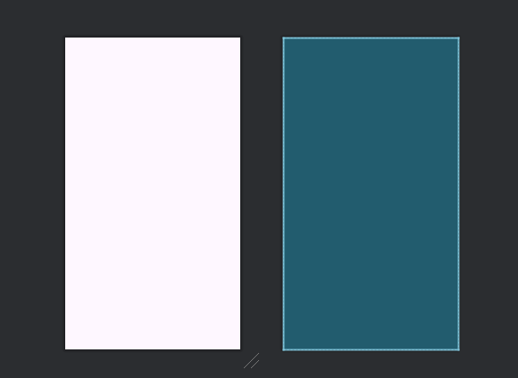
The left-sided white view is called the Design view, where the developer can visualize in real time how a given component would look on a device. On the right is the blueprint view, which visualizes the constraints of each component in the UI. In simple terms, it shows the UI wireframe and, hence, enables a developer to understand the UI structure without destruction by color, eye-catching designs, and so on.
With that, the images below show how every UI component is constrained to each other.
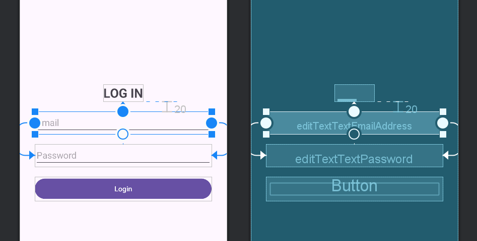 Fig.1 Constraining the email input text field
In the image above (Fig.1), the editTextEmailAddress component is constrained to the LOGIN TextView towards the top, and its left and right sides are constrained to the left and right sides of the editTextPassword component respectively.
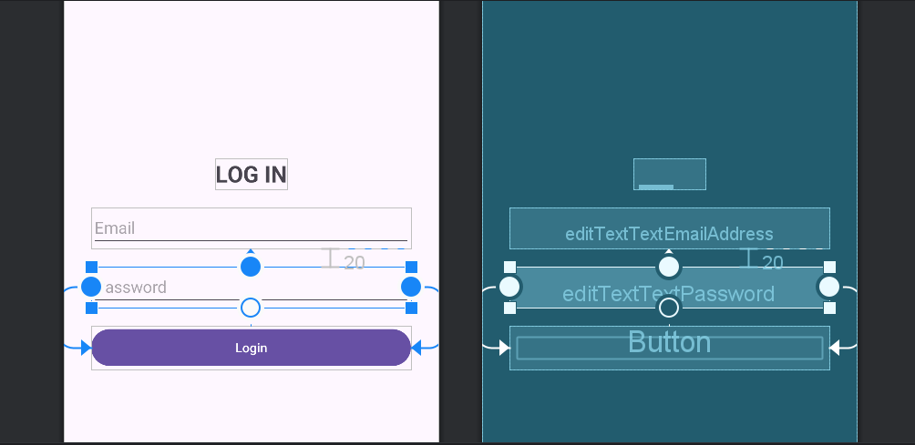 Fig.2 Constraining the password input text field
In Fig.2, the editTextPassword component is constrained to the editTextEmailAddress component towards the top, and its left and right sides are constrained to the left and right sides of the login Button component, respectively.
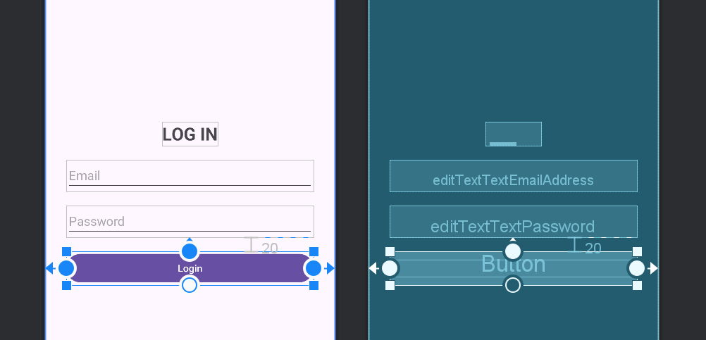 Fig.3 Constraining the login button
From the above image, the login Button component is constrained to the editTextPassword component towards the top, and its left and right sides are constrained to the Layout or parent.
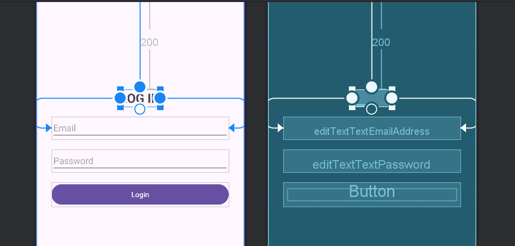 Fig.4 Constraining the LOG IN TextView
In Fig.4, the LOG IN TextView component is constrained to theLayout or parent from the top and its sides are constrained to the left and right sides of the editTextEmailAddress component respectively.
All of the above are achieved by dragging and dropping a given component, setting its constraints to the neighboring components, and then customizing the attributes.
The XML code generated after using the ConstraitLayout above is shown below:
<?xml version="1.0" encoding="utf-8"?>
<androidx.constraintlayout.widget.ConstraintLayout xmlns:android="http://schemas.android.com/apk/res/android"
 xmlns:app="http://schemas.android.com/apk/res-auto"
 xmlns:tools="http://schemas.android.com/tools"
 android:layout_width="match_parent"
 android:layout_height="match_parent"
 tools:context=".MainActivity">

 <TextView
 android:id="@+id/textView"
 android:layout_width="wrap_content"
 android:layout_height="wrap_content"
 android:layout_marginTop="200dp"
 android:text="LOG IN"
 android:textSize="25sp"
 android:textStyle="bold"
 app:layout_constraintEnd_toEndOf="@+id/editTextTextEmailAddress"
 app:layout_constraintStart_toStartOf="@+id/editTextTextEmailAddress"
 app:layout_constraintTop_toTopOf="parent" />

 <EditText
 android:id="@+id/editTextTextEmailAddress"
 android:layout_width="fill_parent"
 android:layout_height="wrap_content"
 android:layout_marginStart="30dp"
 android:layout_marginTop="20dp"
 android:layout_marginEnd="30dp"
 android:ems="10"
 android:hint="@string/email"
 android:inputType="textEmailAddress"
 app:layout_constraintEnd_toEndOf="@+id/editTextTextPassword"
 app:layout_constraintStart_toStartOf="@+id/editTextTextPassword"
 app:layout_constraintTop_toBottomOf="@+id/textView" />

 <EditText
 android:id="@+id/editTextTextPassword"
 android:layout_width="fill_parent"
 android:layout_height="wrap_content"
 android:layout_marginStart="30dp"
 android:layout_marginTop="20dp"
 android:layout_marginEnd="30dp"
 android:ems="10"
 android:hint="@string/password"
 android:inputType="textPassword"
 app:layout_constraintEnd_toEndOf="@+id/button"
 app:layout_constraintStart_toStartOf="@+id/button"
 app:layout_constraintTop_toBottomOf="@+id/editTextTextEmailAddress" />

 <Button
 android:id="@+id/button"
 android:layout_width="fill_parent"
 android:layout_height="wrap_content"
 android:layout_marginStart="30dp"
 android:layout_marginTop="20dp"
 android:layout_marginEnd="30dp"
 android:text="@string/login"
 app:layout_constraintEnd_toEndOf="parent"
 app:layout_constraintStart_toStartOf="parent"
 app:layout_constraintTop_toBottomOf="@+id/editTextTextPassword" />
</androidx.constraintlayout.widget.ConstraintLayout>
When you run this on the emulator, the output is as follows:
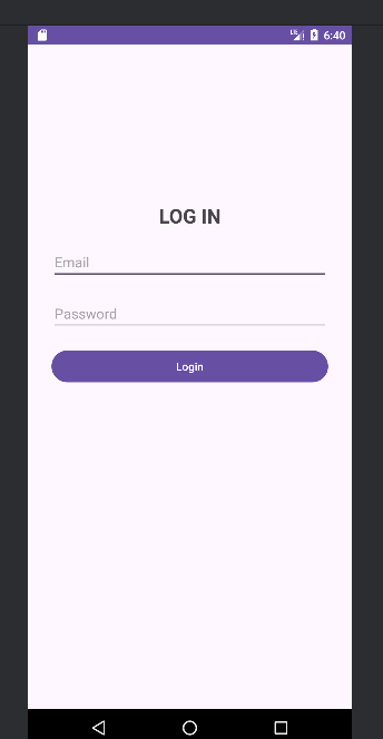 Fig.5 Login screen developed in XML
Using Jetpack Compose for Android UI Design
Here, we will experiment with Jetpack Compose for UI development in Android Studio. We shall design a login page with the Jetpack Compose’s programmatic and declarative approach using Kotlin. Get your machine ready, and let’s dive in.
Let’s start by analyzing the code given below:
package com.ajikadev.compose

import android.os.Bundle
import androidx.activity.ComponentActivity
import androidx.activity.compose.setContent
import androidx.compose.foundation.layout.Arrangement
import androidx.compose.foundation.layout.Column
import androidx.compose.foundation.layout.fillMaxSize
import androidx.compose.foundation.layout.fillMaxWidth
import androidx.compose.foundation.layout.height
import androidx.compose.foundation.layout.padding
import androidx.compose.material3.Button
import androidx.compose.material3.OutlinedTextField
import androidx.compose.material3.Text
import androidx.compose.runtime.Composable
import androidx.compose.runtime.getValue
import androidx.compose.runtime.mutableStateOf
import androidx.compose.runtime.remember
import androidx.compose.runtime.setValue
import androidx.compose.ui.Alignment
import androidx.compose.ui.Modifier
import androidx.compose.ui.text.font.FontWeight
import androidx.compose.ui.unit.dp
import androidx.compose.ui.unit.sp

class MainActivity : ComponentActivity() {
 override fun onCreate(savedInstanceState: Bundle?) {
 super.onCreate(savedInstanceState)
 setContent {
 LoginScreen()
 }
 }
}

@Composable
fun LoginScreen() {
 var email by remember { mutableStateOf("") }
 var password by remember { mutableStateOf("") }

 Column(
 modifier = Modifier
 .fillMaxSize()
 .padding(16.dp),
 verticalArrangement = Arrangement.Center,
 horizontalAlignment = Alignment.CenterHorizontally
 ) {
 Text(
 text = "LOG IN",
 fontSize = 25.sp,
 fontWeight = FontWeight.Bold,
 modifier = Modifier.padding(bottom = 30.dp)
 )

 OutlinedTextField(
 value = email,
 onValueChange = { email = it },
 label = { Text("Email") },
 modifier = Modifier
 .fillMaxWidth()
 .padding(bottom = 16.dp)
 )

 OutlinedTextField(
 value = password,
 onValueChange = { password = it },
 label = { Text("Password") },
 modifier = Modifier
 .fillMaxWidth()
 .padding(bottom = 16.dp)
 )

 Button(
 onClick = {
 // Perform login action
 }, modifier = Modifier
 .fillMaxWidth()
 .height(50.dp)
 ) {
 Text("Login")
 }
 }
}
Let’s break down what this code does:
The setContent function in the onCreate method sets the content view to the LoginScreen composable function. This function (LoginScreen) defines the UI for the login screen. Under it, two mutable state variables, email and password, are declared using the remember function. They hold the current values of the given variables.
The Column composable arranges the UI elements vertically, and inside it is the Text composable that displays the ‘LOG IN’ with customized text properties like fontSize and fontWeight. The two OutlinedTextField composables are for the email and password input fields. They are bound to the email and password variables for their values and onValueChange callbacks.
The Button composable is for the login button. It has an onClick callback which performs the login function. All the UI elements are arranged using modifiers like fillMaxSize, fillMaxWidth, padding, and height to control their sizes and positions. To implement the button’s functionality, the logical code is written under the onClick callback.
When the above code is run, the output below is displayed on the emulator:
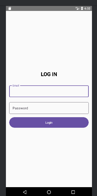 Fig.6 Login screen developed in Jetpack Compose
I hope you can now notice some differences in the UIs. For example, the input text fields when using XML are not as modern as those obtained when using Jetpack Compose. However, with the use of Material Design, XML has improved greatly, and this style can be obtained from the Material Design components.
Which UI Design Tool Should You Choose for Your App?
To consider which tool to choose, let’s get to an in-depth comparison of the UI development technologies:
Syntax and Structure
XML follows a hierarchical structure and has a strict syntax. Let’s have a look at the illustration below:
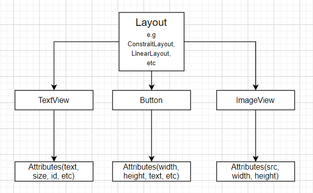 You notice that the root element is the Layout, followed by the UI elements and their various attributes.
Have a peek at the simple XML syntax in the code below:
<LinearLayout
 attribute1="value1"
 attribute2="value2">

 <TextView
 attribute1="value1"
 attribute2="value2"
 attribute3="value3" />

 <Button
 attribute1="value1"
 attribute2="value2" />

 <ImageView
 attribute1="value1"
 attribute2="value2"
 attribute3="value3" />
</LinearLayout>
The above code is a basic representation of the illustration in the image above.
In Jetpack Compose, even though UI layouts are defined in Kotlin code, the structure, and syntax are hierarchical. Below is an illustration for this:
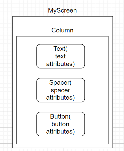
From above, the composable MyScreen contains a Column composable. In it, there are UI components Text for displaying text, Spacer to add spacing and a Button which are all displayed vertically.
The syntax followed in Jetpack Compose is shown in the code below:
@Composable
fun MyScreen() {
 Column {
 Text(text = "Hello, Compose!")
 Spacer(height = 16.dp)
 Button(onClick = { /* Do something */ }) {
 Text(text = "Click Me")
 }
 }
}
MyScreen() is a composable function that represents a screen.
It uses a Column composable to vertically arrange its children.
Inside the Column, there’s a Text displaying “Hello, Compose!”, a Spacer adding space, and a Button. When clicked, the Button triggers an action defined by onClick, and it contains a child Text displaying “Click Me.”
Language
When using XML for UI development, you can decide to use any of the programming languages, either Java or Kotlin, to make the UI components functional, handle data, define application behavior, and implement logic. Here, the Java or Kotlin code interacts with the XML layout files by referencing the UI elements defined in XML, thus handling UI events.
On the other hand, in Jetpack Compose, Kotlin defines the entire UI, including the layout structure, UI elements, styling, and behavior. This means that XML is not used for development anywhere.
Features
XML follows a declarative approach where properties are defined in a structured manner. Here, attributes are specified to control the UI appearance. There is also the separation of logic (Java or Kotlin code) from the XML UI development code. The XML layout files are separated from the logic and can only be linked by referencing from the logical code. There is resource management when using XML that is colors, strings, drawables, and others are defined in separate resource files. This promotes consistency and maintainability. XML is a traditional approach to developing Android UI; hence, it is suitable for both existing and old projects.
In Jetpack Compose, both a declarative and programmatic approach is followed for developing UI for mobile apps. That is, functions known as composable functions are written, and in these functions, attributes of a given component are then defined as per the developer’s needs. This enables reusing and configuring UI components; thus, it is a dynamic and flexible approach. Also, there is built-in support for reactivity using state management. This enables the development of interactive and data-driven UIs with minimal boilerplate (repeated) code.
Learning curve
As a markup language, XML is easier to master for developers with a background in other markup languages like HTML, and newcomers can learn it faster from zero. The ConstraitLayout in XML is also easier to learn for users because of its drag-and-drop feature.
Jetpack Compose is much easier to learn for developers with programming experience as it follows a programmatic approach. Also, developers with a background in React Native or Flutter take less time to learn how to use it.
Customization
Layouts in XML allow developers to customize UI elements using attributes like width, height, padding, margin, color, and many more. XML provides various layout containers like ConstraitLayout, LinearLayout, and RelativeLayout. Developers can thus customize these layouts by nesting them, specifying the layout attributes, and controlling their alignment and arrangement.
In Jetpack Compose, a rich set of modifiers can be used to customize the appearance of UI components. These modifiers can be applied to individual components or composables to adjust size, padding, margin, alignment, background, and other properties. Jetpack Compose comes with a library of Material Design components with rich and complex UI components that can be customized concerning the UI developer’s needs.
Community and adoption
The community of XML developers used to be very big before the release of Jetpack Compose. But now it is noticed that even the Android Developer’s forum has over 90% of resources on Jetpack Compose than XML. The good thing about XML is that most of the earlier projects in Android are in XML. On the other hand, most new Android projects are done in Jetpack Compose.
The developer community for Jetpack Compose is rapidly growing evident with 18.5k Github stars and in very active discussions on the Android Developer’s forum. It is a tool that most emerging Android developers use for their UI development. This means that there are many resources available on the web that could teach you Jetpack compose and even help you troubleshoot code problems.
Integration
It is possible to integrate Material Design Components into both XML and Jetpack Compose, which enables the development of complex UI layouts. Recent versions of Android Studio already include this library. Also, more current libraries support integration into Jetpack Compose than XML as they are developed with a future focus.
Use cases
XML is mostly used by developers working on old projects and in academia by researchers working on Mobile Application-related works and students in the course unit Mobile Application Development.
As for Jetpack Compose, it is widely used by emerging companies and developers, and also old companies are shifting to use of it for the development of their mobile apps. Note that migrating from XML to Jetpack Compose can lead to more opportunities as the demand for Android Developers is increasingly growing. Also, most jobs that advertise for these roles mostly include knowledge of using Jetpack Compose as a requirement.
Conclusion
As always, when dealing with comparisons, there is usually no winner, as each tool is always good at what it does. The choice of which tool to use depends on the developer and the work.
For developers interested in crafting UI layouts for the modern era, Jetpack Compose would be a good fit. For developers dealing with old projects, XML is the best choice to avoid moving the whole project to the current tools, e.g., Jetpack Compose.
In this article, we discussed almost everything you need to know to guide you in choosing a tool for Mobile App development.
To find out more about Android development, I recommend joining the developer community by clicking here -> Android Developer Community.

